Polar Plots
Microsoft Excel offers a number of circular charts, but none of them is usually a particularly good choice for displaying data. You can search this blog for “pie chart” and see numerous examples of badly applied pie charts. If you hunt for “radar chart” or “spider chart” you’ll see a class of charts that’s even more deceptive. A major part of the deficiency of radar plots is that they pretend to show a physical, geographical relationship which isn’t present at all.
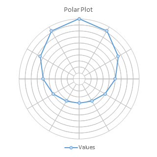
Polar Plots, on the other hand, can be used to map information that has a true geographical component. Ironically, this includes actual radar feedback. The data for a polar plot is given in polar coordinates, which is given as R-theta, where R is the distance from the origin (center of the plot) and theta is the angle from a reference angle, such as north or conversely the positive horizontal axis of overlaid cartesian coordinates.
A Polar Plot is not a native Excel chart type, but it can be built using a relatively simple combination of Donut and XY Scatter chart types. We need to build the grid using a donut chart, then overlay the physical data using applicable XY Scatter chart types.
Preparing the Data
We’ll use a donut chart for the circular grid. The data we need is simple, as shown below. I have 9 columns for the 9 concentric donuts (the smallest donut hole is 10% of the diameter, so this hole plus 9 rings of 10% make 100%). Each ring has 12 segments, so each comprises 30° of the 360° circle of the chart.

Our data is provided in polar coordinates in columns A and B below, where R is the distance from the origin to the data point, and theta is the angle from our reference angle (due north) to the point. These are converted to X and Y in columns C and D. The formula in C2and D2 are:
C2:  =A2*SIN(B2/180*PI())
D2:  =A2*COS(B2/180*PI())
These are filled down to C14 and D14.

Making the Chart
To create the grid, select the blue shaded cells in the top table, and insert a donut chart (below left). The default diameter of the donut hole is 75% of the diameter of the whole chart, so all of the rings are scrunched together. Select any of the donuts and press Ctrl+1 (numeral one) to open the Format Series dialog or task pane, and set Donut Hole Size to 10%, the smallest possible value (below right). While you’re at it, shrink the ridiculously large chart title, if you need it at all.
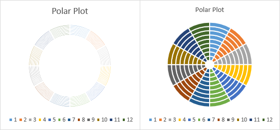
Format each donut series so it has no fill and uses a thin (0.75 point) light gray (25% gray) border (below left). Our grid is ready for real data.
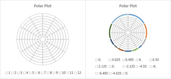
Select the orange shaded range of XY values in the second table above, and copy. Select the chart, and click the Paste Special button on the Paste dropdown on the Home tab of the ribbon to add the data (below right). The data is added as another concentric donut on the outside of the chart.
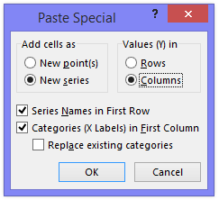
Use the following settings in the Paste Special dialog: Add cells as New Series, Values in Columns, Series Names in First Row, and Categories in First Column.
Right click on the new series, that is, on the added ring of data, and choose Change Series Chart Type from the pop-up menu. Choose one of the XY types. Here I’ve selected the line and markers option (below left); if you were plotting the advance of alien spacecraft you’d probably want the markers only option.
Excel has plotted the XY data on secondary axes: the axis labels of both are plainly visible in the left chart below. Format each secondary axis scale in turn so the minimum and maximum are equal but with opposite signs; in this case min is -10 and max is +10. Format the axis so there are no tick marks and no tick labels, and use the same line style as the donut grid borders, 0.75 points thick and 25% gray (below right).
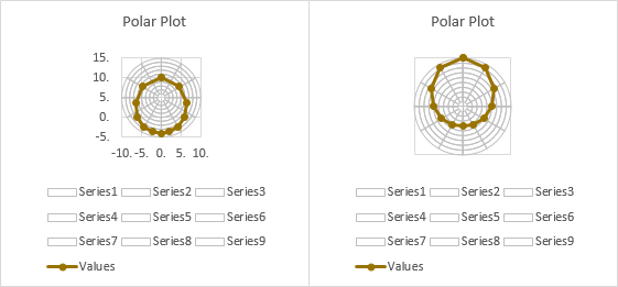
Remove the major vertical and horizontal gridlines (below left). Remove the unwanted legend entries; click once to select the legend, then once more to select the unwanted entry, then click Delete (below right). If there is only one series of XY points, you can probably dispense with the legend.

Expand the size of the plot area (below left), and format the series lines and markers if desired (bottom right).
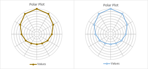
This may be complete enough for you, but as always, there are embellishments available to the clever chartmonger.
Modified Grid
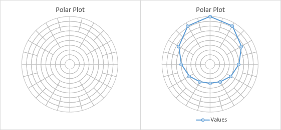
You can change the grid if you like. If I use the following expanded data, the inner few donuts have only 4 arcs, each covering 90° of the ring. The next few have 12 arcs, as above, each covering 30°. The last few have 24 arcs, covering 15° each.

The resulting grid is shown without data below left, and with data below right.

You can show the central circle (donut hole) without the crosshairs if you format the secondary axes to use no line color instead of 25% gray.
Compass Point Labels
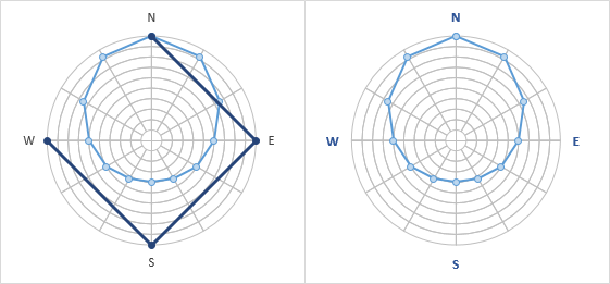
Suppose this is an actual geographic representation and you want to label the points of the compass. Set up data as shown below left. Copy the green range, select the chart, and use Paste Special as above. This series is plotted using the same chart type as the previous paste series was converted to, XY scatter with lines and markers.

Add labels to the new series; the default Y values are used in the labels (below left). Remove the title and legend, or shrink the plot area to make room for the labels.
Change the label positions to Above (for the north label), Right (east), Below (south), and Left (west).
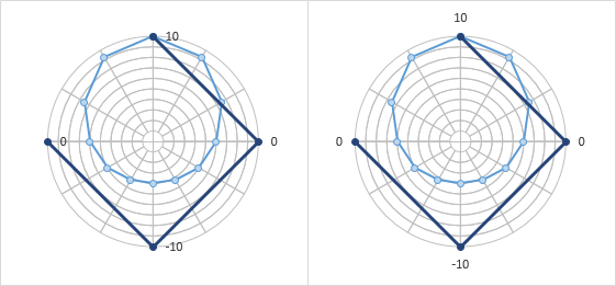
Change the labels as appropriate (below left). You can use one of these approaches:
- Select each label (click to select the series of labels, then click again to select the individual label), double click to edit the label’s text, and type the label you want.
- Select each label (click to select the series of labels, then click again to select the individual label), type an equals sign in the formula bar, and click on the cell containing the label you want. The formula bar will show the link, e.g., =WorksheetName!$F$2.
- Download and install Rob Bovey’s free Chart Labeler from http://appspro.com. This allows you to assign labels from a worksheet range to the points in a chart.
- If you’re using Excel 2013, you can format the labels to use Values from Cells, and select the range of cells containing your labels.
Finally, format the last data series so it uses no lines and no markers (below right).


Don Pistulka says
The only use I have ever found for radar charts is monthly seasonal patterns. I used a line chart and a heat map for the same numbers, but found the radar chart the easiest to understand. You can find the workbook at the link below:
http://pistulka.com/Excel_Shared/Seasonal.xlsx
Alex Kerin says
Hi Jon, these (and radial bar charts) are also pretty good for time period charts where the data has a cyclical nature – think maybe of temperature by week of year, or likelihood of a car crash by hour of day, especially where without them you may lose any nuances around the start and end of the series as they flow back around. If you create these, you often end up having to subtract or add pi/2 to get the 0 hour or month to be at the top, and sometimes even a -ve symbol so that the chart flows clockwise as expected. Hope all is good, Alex.
Jon Peltier says
Hi Alex –
Doing well, very busy and I still manage to write a new post once in a while.
The problem with radar charts, as I outlined in Radar Charts are Ineffective, is that data in radar charts is not measured parallel to a given axis, so it is hard to compare data points which are not immediately adjacent. In that example, it was not apparent in the radar chart that web site traffic had a bimodal distribution over the course of a day, but in a line chart it was obvious. In addition, a radar chart loses resolution for small values because everything is spaced so much more closely.
Glynn Hammond says
Hi Jon,
This is more of a generic comment. I really enjoy your site and have found a lot of the articles very useul in designing new graphs. However the index seems to have disappearred. If I had a few minutes spare I would wander down it and cherry pick an article to read. Yesterday I was trying to find something on stacked panel style graphs and could not find it.
Keep up the good work,
Regards,
Glynn
Jon Peltier says
Hi Glynn –
Thanks for the note. A couple months ago I changed hosting companies, and some pages may have gotten lost. Do you have the old link? Perhaps I can redirect you.
Alex Kerin says
Interesting point – yes. In the work that I do mostly (time punch data) the period and behavior around 55 minutes to 5 minutes past the hour is often the most important. I have found that using a bar chart or line with 0/59 in the middle works quite well, but using the radial bar works best for explaining it to an audience.
Bradley Stone says
Jon,
I have really gotten a lot out of your blog, but I especially want to thank you for this posting. I normally have to use MatLab for all of my RADAR charts, and I use a lot of them, as my work typically uses values that change depending on an angle. I am not sure why they are deemed “ineffective”, as they are really the best option for plotting angular data. (Maybe they aren’t very effective when used with cyclical data, but I would argue that other plot types would be more appropriate for those situations.)
Thank you for your contributions to Excel usefulness!
John says
Not working for me. Everything is fine until I try to paste the data. The special paste menu comes up, I fill it out as per your instructions, click ok and nothing. No extra ring, no data.
John-
John says
I got it. Weird. I had data with every other row a blank. I did a sort to eliminate the blanks and then copy and pasted the data for the Column A, B in the example. It pasted, but when I copied those values, no blank rows, it did not paste into the chart. Now I just copy and past with the blank rows and it works fine. Don’t understand it, but it works.
Thanks,
John-
Dennis Thompson says
Hi Jon, great tools here. I hope you still check this since it’s been a while since anyone has posted to this forum.
A few quick questions: Is there a way to change the reference point from top dead center to the very center of the chart? I’m guessing this would change the formula arithmetic? Any way to ascertain those numbers? (flip sin and cos?) I need to plot points from the center to X angle (whatever that number might be) at Y distance. I’m already bald so I don’t have anymore hair to pull out. Please let me know if you need more information.
Thanks!
Jon Peltier says
Dennis –
The system I’m using starts at the top point of the circle, or X=0, Y=1, and positive movement is clockwise. Do you want to start at the right edge (1,0) and move counter-clockwise, like the unit circle in trigonometry? Just switch the formulas so column C (X) has COS and column D (Y) has SIN.
Dennis Thompson says
Thank you very much for the response Mr. Peltier. Unfortunately my background isn’t in math, thus, I’m “self-learning” as I go. What I am trying to accomplish SHOULD be relatively simple, but that doesn’t seem to be the case.
I work in industrial balancing. We calibrate machines and instruments. When we do so, we spin a cylindrical rotor with two separate wheels as “planes” several times and we determine “heavy spots”. We generate a hand written report with all kinds of crazy numbers and plot our findings on a polar chart. We have to do this by hand and that makes no sense in this day and age.
I really wish I knew how to explain this more clearly, but since we spin a cylinder, dead zero has to be in the center of the graph, Theta has to be the angle from dead zero and R has to be the distance from dead zero. An X-Y Axis makes the most sense in this situation, but again, it’s circular, so what we have to give to our clients needs to be as such. And there’s that little law thing we have to abide by as well.
I’m actually somewhat proficient in excel, but this exceeds all my knowledge. I can scan and e-mail an example of the graph we have to plot if that would help. If that would be helpful and you have the time, please use the e-mail I used to send this board posting.
Gratefully, Dennis.
Bob Niels says
Hi, Jon. Great article, as I need to plot some electronic data that really could use a polar plot. Everything works up to the point of selecting the “Paste Special” dialog box; I only get a “Paste” box, with no options. I am using Microsoft Office Professional Plus 2013. Do you know of any compatibility problems with that version?
Thanks.
Bob
Jon Peltier says
Bob –
On the Home tab, the Paste button has a dropdown if you click the bottom part of the button. Paste Special is on the dropdown.
Bob Niels says
Thanks, Jon. Now that you’ve pointed that out, I see that was part of your original instructions. I missed it.
Francisco says
Hi John,
I really want to thank you for the excellent resource. I wanted to use this to plot a cash flow cycle to plot cash on hand against 1) a short fall threshold (a circle) 2 a normalized profit spiral showing growth.
Duplicating the logic here and filling in new numbers, I got each of the plots to work individually, but whenever I add a second or third set of data 1) the data skews to the right rather than being centered 2) the graph is compressing on the x axis (a pure circle looks like an egg.)
The exact same data plotted individually shows as expected. Do you have any suggestions?
Very glad to have discovered this site!
Jon Peltier says
Francisco –
You seem to be ignoring my warning about using polar plots for data that has no true geographical component. I’ve written about the deficiency of radar/polar plots for nominally cyclical data in Radar Charts are Ineffective and other posts.
Plotting on a horizontal line chart would be more cognitively effective, if “boring”. Your short fall threshold would be a horizontal line, and the normalized profit spiral would be a sloping line.
But if you insist, I have a suggestion. Make sure the hidden secondary axes for the XY data have reasonable and symmetric scales. This means the X and Y axes should have the same min and max, and the min should be the negative of the max.
Tom Cunningham says
Jon:
This worked (almost) really great; I needed to overlay two series of data with different angular spacing. But when I pasted in the actual data (just the first series to begin with), the polar grid disappeared. Only 1 little piece of Series 9 is visible near the center. Thanks for this post and any help that you can provide!
Tom Cunningham says
After I’d added the actual data, the polar grid disappeared except for a small segment of series 9. If this happens to you, by right-clicking on a series, and picking “Change Series Chart type”, you can re-assign Series 1-9 to the “Doughnut” Type and they should re-appear. I also had to reset the minimum for the donut hole to 10%, but I’m back in business. Excel 2103, Windows 10 pro.
Francisco Uribe says
Thank very much for the useful tutorial.
I have been able to replicate and understand it, due to the clean an clear instructions.
What I have not been able to properly do is to change from 12 to 7 spokes. I can change the background donut, but I cannot get the plot to properly translate and show the coordinates of the new set of seven points.
Any suggestions?
Jon Peltier says
Francisco –
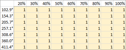
Your donut chart data has to be smaller, like this:
Stuart says
Hi Jon,
Thanks for this, really glad that I found this site of yours as it turned out to be a lot easier than I imagined to draw this graph. I am plotting rainfall over 10 years ( so ten data series plotted on the graph, each of the 12 axes is a month, and the radius is the rainfall for the month). Can you think of a way to label the radius for me at all please? I have labelled the secondary vertical axis but half the values are negative which is clearly not what I want to portray!
Cheers
Stuart
Jon Peltier says
Stuart –
Two points.
1. Labeling the axes. You can use custom number formats.
To show zero and positive numbers, use a format like 0; or 0.00;
To show only positive numbers, use a format like 0;; or 0.00;;
2. While your data is cyclical in nature, it has no circular symmetry, so all of my criticisms of radar charts still hold. For one thing, if rainfall is uniform throughout the year, a line chart would show a horizontal line while a radar chart would show a circle or a regular polygon. It is much easier to see deviations from a horizontal line than deviations from a perfect circle or from a regular polygon (and deviations include offsetting the center of a circle or centroid of the polygon from the center of the chart). It is also much easier to compare nonadjacent months in a line chart than a circular chart, where nonadjacent months point in arbitrary non-parallel directions.
Stuart says
Thanks Jon, useful comments
Point 1 works a treat, thank you
Point 2 – the purpose of this exercise was both to learn how to draw a graph in this fashion (I have another use for this style which I think will be better) and to compare this version to a line graph I have already to see which displays better. I will stick with the line I think, but I’m pleased to have learned how to draw this style- thanks for your help.
Stuart
Andy says
I have managed to create the initial polar chart with my 23 sectors that I need – however, how do I then alter the ‘R’ column to reflect these 23 sectors?
Jon Peltier says
Andy –
That depends on what you are plotting. I was just making a closed circuit that approximated a circle, and my R values lay approximately on this circle.
Andy says
Hi Jon, I want to create an ‘equaliser’ type chart, so each of my 23 sectors increase from the centre out with a corresponding colour. Is this possible?
Jon Peltier says
Andy –
Can you link to a picture of what you want?
Andy says
something like this, so each sector can be increased/decreased dependent on data quantity.

Sorry to be a nuisance – I’m still learning!
Stuart says
I’ve got a polar chart that I’m pleased with, 100%, 90%, 80% doughnuts as instructed. I’ve removed the lines from the dougnuts so they can’t be seen, but would like concentric circles to mark the 50, and 100% points… any ideas please? If I put the 50% doughnut I get two rings, at 50% and 60%….I just want a single line at 50%.
Cheers
Stuart
Jon Peltier says
Andy –
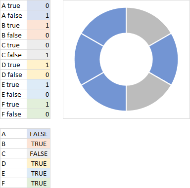
What you want is a bit more involved. You will need two points per segment, one for when the segment should appear lit up, the other when it is unlit. I’ll demonstrate with a six-segment donut.
Here are the data table for six segments (twelve points) and the donut with six segments (twelve half segments). The data for each half segment is 0.5, but it will be adjusted to be 1 for true and 0 for false.
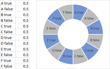
Here the two half segments for A are linked to the value of A in the table below. A is color coded blue, B orange, etc. All values are true. Note that the labels for the false points are centered on the zero-value points between 1-value blue wedges.

Here is the chart with the labels removed.
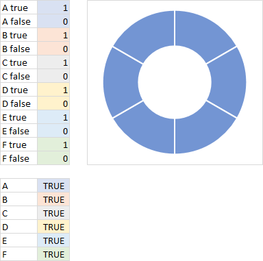
Here is the same chart, but with A and C false in the table and gray in the chart.
Constructing a multiple-ring donut is the same. The starting values for every half segment is 0.5, so it’s easy to format each half segment in the chart. Each ring has its own color for the “true” wedges in that ring.
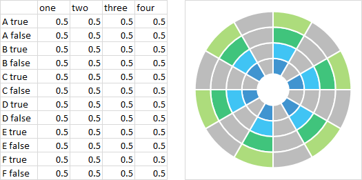
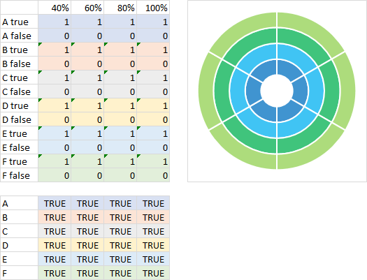
The values in the half segment table are now linked to the true/false values below (and color coded). All values are true.
All A and F values are true, for a full scale equalizer display. The outer ring of B is false, the outer two of C are false, the outer three of D are false, and all rings of E are false.
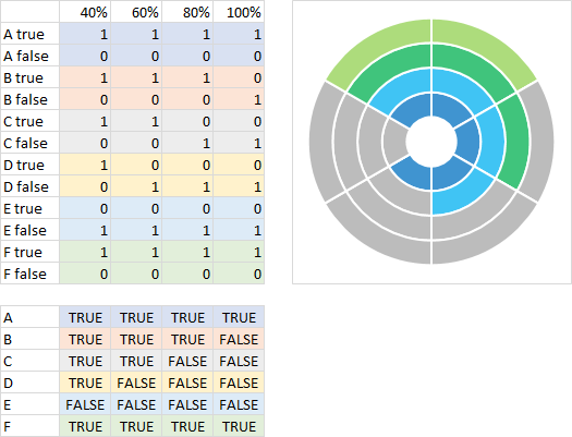
The true-false table is now linked to a table of values for A through F.
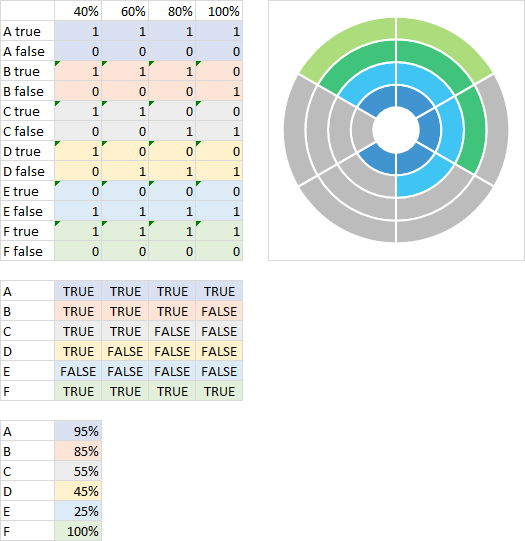
Here the half segment table is directly linked to the table of values for A through F, bypassing the intermediate true/false table.
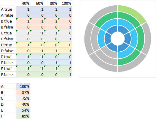
Jon Peltier says
Stuart –
Add an XY Scatter series with no markers and smoothed lines that has points at R=0.5. I’ve plotted a thick black line on top of the working plot from the example.
Stuart Patterson says
Thanks Jon,
Probably should have worked that one out for myself! Nevertheless, all seems to work fine, and thanks for your help – appreciated.
Stuart
Chad Allaire says
Hello Jon.
I’m working with rotating machinery and I need a chart that always shows 0 to be in the center of the polar chart. I can make the polar chart you described, but the 0 point always moves across the chart away from center as the data values change. How do I influence the data to flow outwards from the center of the chart and not horizontal across?
Thank you.
Chad
Jon Peltier says
Chad –
If you set your scatter chart axis min and max values (i.e., so they are not automatic), the 0,0 center of the scatter chart should remain in the center of the circular pattern.
Matthew Malanga says
Hello John, Thanks for the great tutorial. I have a x – y data from a CMM, where an ID profile was scanned giving my 1000 points. I’m struggling to see the profile and magnify the features using the Cartesian axes. Is there a way to magnify the scales so the profile is more exaggerated?
Jon Peltier says
Matt –
I assume this isn’t related to a polar plot, otherwise I can’t envision what you need.
Did you try changing the axis scale? Double click the axis, and change the minimum and maximum values.
Matthew Malanga says
Jon,
The X-Y data is for a inner diameter profile scan and I was trying to recreate the X-Y plot the CMM gave me. I’ve tried adjusting the min and max scales, it just doesn’t give me the same resolution the CMM plot does.
It’s like I was +/- 20 micron resolution only in a specific range of the x and y axis.
Jon Peltier says
Oh, I understand. You want to exaggerate the roughness of the inner cylindrical surface. Adjusting the scales will not help. You need to change your data in one of two ways:
1. “Unroll” the data, so you plot R (radius) as Y and Theta (circumferential position) as X. Now just expand the Y (R) scale.
2. Transform R so instead of an absolute radial dimension, it rescales the variation in R. This could be something like
R’=k(R-Ravg)
or
R’=k(R/Ravg-1)+Ravg
where R’ is the new R to be plotted at each Theta, R is the measured radius at each Theta, Ravg is the average R, and k is some scaling factor.
Guilherme says
I have followed every step and it was incredible. Now I need to make a centroid (mean value for XY plotted values). I have tried to take the average value for each X and Y and insert to the chart and convert to line, but didnt work. Can you help me?
Jon Peltier says
Guilherme –
Converting to a line chart will fail, because the chart had been an XY Scatter type. The way I set it up, the formulas used the polar coordinates to compute the cartesian coordinates needed to plot the data. You could either compute averages in the R-theta and plot them in the cartesian axes (probably the better option), or simply average the converted X-Y values and plot them.
If you could share your data (i.e., upload your workbook to a file sharing site), I could take a peek at it.
Peter says
Thanks for this blog, Jon. Very useful
I wanted to plot parallels of latitude looking down on the North Pole (so that they became visually closer together as you approached the equator), so was thinking of asking how do you make irregular width balloons. Then it occurred to me to try:
– Make a balloon chart with 1 balloon. Follow your instructions altering the balloon
– Create tables of equal latitude points as would be viewed from above the north pole for 0 to 360 degrees and add as XY graph (smooth). (Add a *cos(90-lat) to R). Set line style, thickness, colour to the same as the balloon. Unfortunately Excel doesn’t smooth the end points together.
BTW, one might be able to ensure that Excel keeps X,Y scaling the same by starting with a balloon chart, add your data as you describe, then set the transparency of the balloon to zero. Worked on 1 test I did.
I hadn’t found a solution before, but haven’t looked for a while. I don’t know how this would work with other chart types than XY.
Jon Peltier says
Peter –
I’m not sure what you mean by “balloon” plot. But I think I’ve constructed the chart you want.
I made a polar view plot starting with a pie chart to get my wedges (below left). I added XY series to draw the circles at the appropriate radius, using thin gray lines to match the pie chart borders. I used an XY point every 10 degrees around the pole, from 0 to 360; 10 degrees doesn’t show much of a polygon (below center). Then I added the XY series I wanted to plot on the polar diagram (below right).
Evgeni says
Dear Jon,
thank you for your explanation, it was really helpful for me when constructing a polar diagram about dispersion of light from tiny particles. I designed it in such a way so as to devide the circle in 360 degrees (using the additional information from you) and it worked pretty well.
Thank you a lot!
Pete says
Love this excel hack. I’d quite like to plot negative and positive values on the same polar plot. Is there a work around?
Jon Peltier says
Pete –
A negative value on a polar plot is a positive value, 180° away. How would you distinguish the negative from a positive in the same region of the chart? I talked about this difficulty in Composite Baseball Player Evaluation. The topic there was radar charts, not polar plots, but the analysis is still appropriate.
Rodney Hughes says
Truly BRILLIANT for plotting electrical phasors of Current and Voltage.
Much better than straight X:Y plots which get mucked up with relative dimensioning of the horizontal and vertical axis scales!!! :(
I can derive by Magnitude and Angle; and convert those back into x:y co-ordinates for use on this diagram, especially if the magnitude is converted into a Per Unit quantity
colin says
I want to plot a radial or radiating lines modulus (real and imaginary) all from the centre so I can examine amplitude and phase and how they ‘add up’ to a vector total.
Rodney Hughes says
@colin that is exactly what I use it for.
I have magnitude and angle of the three vectors of a three-phase electricity system shown on this polar plot
I can easily multiply two vectors using normal maths function:
multiple magnitudes and add the angles
Excel even has auto function for that
if I need to add vectors, it gets more steps
I convert each to X & Y coords
add the X values to get total X
add the Y values to get total Y
then convert back to mag and angle to plot
:)
Jon Peltier says
Colin –
In the example below I want to plot three vectors, starting from the origin and reaching to the XY pairs in the top left cells. The XY values can be converted from polar coordinates or can be whatever you want.
Each vector requires two points, (0,0) and the endpoint listed to the left. There are three vector data sets, each color coded to match the color Excel gives to each chart series.
Select the blue range and insert an XY chart (you could add it to a polar plot you’ve already constructed, by copying and using Paste Special as described further below). This is the first chart. I have made it fancier by adding a data label with the coordinates to the last point, and by adding an arrow to the end of the line (middle chart).
To add the additional vectors, copy each color coded range, select the chart, and use Paste Special from the Paste dropdown on the Home tab’s Paste icon. Make sure to paste new series, in columns, with both first row and first column checkboxes checked (if the top left of each copied range is a blank cell, like here, Excel guesses right nearly all the time). This is the third chart.
As noted, this is a plain XY chart, and not a polar plot described in this tutorial.
Rodney Hughes says
Hi
Have a look at these examples of 3 electrical phasors on a polar plot using this great spreadsheet :)
https://ideology.atlassian.net/l/c/cUFTGXnM
The phasors have been converted from [Magnitude and Angle] to [X and Y] so they can be plotted.
Simon says
Great instructions. One tweak is required in more recent versions of Excel (I’m in Office 365 (2019??)). In the section “Making the Chart”, when you Paste Special the data as a new ring and change its type to “X Y (Scatter)”, don’t select “X Y (Scatter)” in the left pane of the window that pops up. That will change all the series to X Y which makes the chart look totally different and wrong. Instead, you should select “Combo” in the left hand list, and in the main pane of that window, you’ll then see all the series listed at the bottom. The new one will be last (titled “Values” if you’re following the steps exactly). Only change that one, leaving the rest as Doughnut.
Jon Peltier says
Simon –
Actually, this has not changed. You have to right click on the new series in the chart (not just anywhere on the chart), then select Change Series Chart Type from the popup menu. I have reworded that sentence in the instructions to make this more clear.
JB says
Hello!
I am trying to use a polar chart to represent the impacts of a certain design strategy based on 3 factors: x, y, z.
Similar to the vector example this past summer posted here, but I want it to map out the tips of vectors into an “blob”. How is that done? I’m a complete and total newbie to these graphs and making them in excel. Any help would be fantastic!
Jon Peltier says
Could you link to an example of what you want to do? I can’t visualize it.
MUNAWAR KARIM says
Hello John
I am trying to plot a vector field using Excel. I came across your blog. It may be the nearest thing to what I am trying to do.
Each point (r, theta) has a two-component vector associated with it. Either in polar or cartesian coordinates. How do I enter the individual vectors? I need this to plot the field of an electrical dipole. The vectors are computed numerically so not amenable to using a formula to generate the field components.
I am sure your method can be adapted to produce the polar map. Please advise.
Thanks
Jon Peltier says
You can use the approach in Connect Two XY Series with Arrows to generate the arrows. You don’t even need to plot the points being connected, just calculate the coordinates, add the data to the chart, and format the series lines.
