A reader named Felix posted a comment on the blog, asking how he could make a line chart which has two time series, in which each time series has data for different dates. What makes his question more challenging is that Felix is using Excel 2007. This was such a good question, it deserves its own post.
Felix provided the following data:

I’ll describe the various techniques available in Excel 2003 and earlier, with pros and cons, and I’ll compare them to the same techniques as followed in Excel 2007.
Time Series in Excel 2003
The two time series are plotted separately below. Time series A has weekly data, but with two values omitted. Time series B has more data points, at irregular intervals, over a shorter time span.
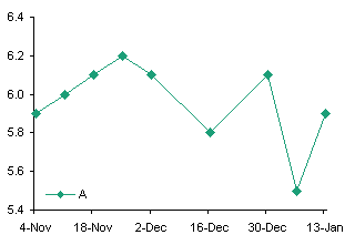
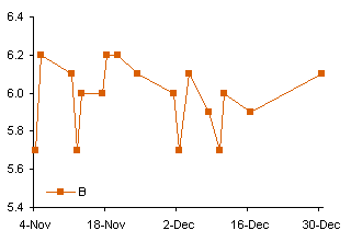
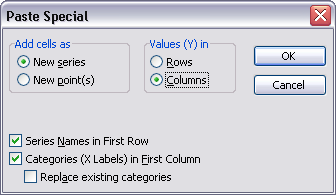
Create the Time Series A line chart above left, copy the Time Series B data, select the chart, and use Paste Special to add the data as a new series, using the options as shown.
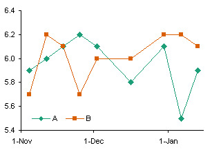
This illustrates a limitation with Line charts in Excel: the category labels or dates are defined by the first series. Any additional series are forced to use the same X values or labels, and if the added series has more points than the first series, those extra points are omitted.
The obvious alternative is to make an XY chart with the two data series. The X and Y values of separate series in an XY chart may be completely independent.

The data is plotted correctly, but the date axis isn’t as nice as the one we had in the line chart. A line chart lets you put a tick on the first of every month, but since the length of a month is not constant, this doesn’t work in an XY chart.
So how can we plot multiple time series on a chart with nice date labels?
The limitation that all series in a Line chart must use the same dates is not completely true. All series on the primary axis use the dates for the first primary axis series, while all series on the secondary axis use the dates for the first secondary axis series. Format series B in the two-series line chart so it resides on the secondary axis.

There are drawbacks to this approach. First, it ties up the secondary axis with data that otherwise fits the primary axis, so you are limited to how else you can embellish the chart. You can always hide the secondary date axis to clean up the chart, but you cannot remove it altogether. Second, the two date axes must be manually synchronized each time the data changes. Third, you are limited to two different sets of dates.
There is an alternative combination chart that gets around these limitations. Make the first series a Line chart series, so you have a nice date scale axis, then add any additional series and change them to XY type series. At first, Excel associates the XY series with the secondary axis, but you can override this setting and assign it to the primary axis, and it will use the nicely formatted date scale of the Line chart. You are not limited to two sets of dates, and you do not have the added responsibility of synchronizing the time axis scales.
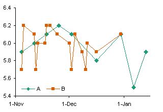
But there’s an easier way.
Unfortunately this never occurs to me until I’ve already made a Line-XY combination chart. You can combine the data in the following way, putting the Series B dates below the Series A dates, and the Series B values below and one column offset from the Series A values.
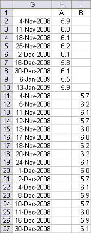
You don’t even need to sort the dates, because a line chart internally sorts the dates before plotting the points, so that it connects them in date order. In contrast, an XY chart connects the points in the order they appear in the worksheet.
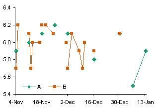
Select this larger data range and create your line chart. The points are plotted according to their own dates. The only problem is that, by default, Excel leaves a gap between points if there is a blank value cell between these points (below left). However, it’s easy enough to change this behavior. Go to Tools menu > Options > Chart, and in the top section, choose the option that makes Excel interpolate across the gaps (below right).

Now why didn’t I think of that before I made all those complicated charts?
Time Series in Excel 2007
Excel 2007 works much the same way as earlier versions, but there are a few notable exceptions.
In a line chart, all series use the same categories or dates as the first series, and any extra points are truncated. Just like in Excel 2003.

Two time series can be plotted together, with one on the secondary axis, and the times will be kept independent. This approach is subject to the same limitations as in Excel 2003.
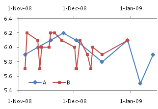
You can change the second series to an XY type series, and when plotted on the secondary axis it works just fine. (Note: you can remove the secondary Y axis and both series will use the primary Y axis.)
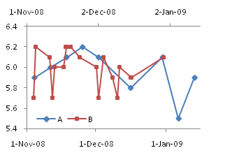
The limitation here is that you are tying up the secondary axis with the XY series, thus limiting your ability to use the secondary axis for other tricks. You are not limited to two series, because any number of XY series can be plotted independently on the secondary axis.
In Excel 2003 we could assign the XY series to the primary axis, and it would coexist with the line chart series and use the same axis. However, when we try this in Excel 2007, we notice two flaws. First, it’s unclear what scale the XY series is using for its X values, but it’s unrelated to the primary category axis. Second, there are only as many XY series points shown as there are Line series points in the first series. Whoa! How’d that get through QA?
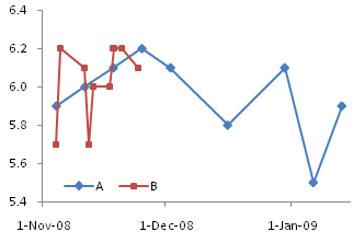
These glitches are not too important for this particular use of a Line-XY combination chart, but there are other uses which are completely broken by the changed behavior.
Fortunately the easiest method of all, the one which uses the combined data, works just fine in Excel 2007. The dual chart first appears with gaps, but you can change the behavior by opening the Select Data dialog, clicking on the Hidden and Empty Cells button in the bottom left corner, and selecting Connect Data Points with Line.
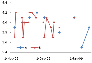
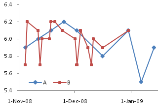
This is one more example of my favorite phrase: You can spend five minutes with your data, and save yourself five hours of frustration and aggravation.


Felix Marusic says
Jon,
Thanks for the excellent feedback-it works like a charm! I was totally unaware of why excel was doing this. As far as you know is there anyway you could possibly automate the creation of such a graph….for those really needy end users? When dealing with a number of series, it could get potentially tedious and be error prone.
Best Regards,
Felix M.
Jon Peltier says
Felix –
Glad you like it.
As far as I know, there’s no utility readily available to generate these charts from separate ranges. It would not be a big deal to write something that would combine the ranges and create the chart.
Lester Beasley says
To avoid disjointed looking graphs you might replace missing data with #N/A. Excel will interpolate missing data points.
Jon Peltier says
Lester –
True, you could replace all the blanks with #N/A or with the formula =NA(), and Excel will draw lines across the gaps. But I think changing the Tools-Options setting is easier and neater.
If you’re dealing with formulas, of course, you must use NA(), because Excel will plot “” as if it is a zero. There is no way in Excel of making a formula return something that is interpreted as a blank cell.
Arnold says
Thanks as always, Jon.
1 more question, if series A is monthly data, i.e. column A only has month input like Jan. Feb,…. Can we still plot in one graph like you did?
Jon Peltier says
Arnold –
If your monthly data is to be plotted as markers, you need some kind of day to go with the month. Pick one that makes sense: the first, the last, the 15th.
Or you could do a combination line-bar chart, with line on the primary and bar on the secondary (or vice versa), and fudge around with the two axes so the month axis (category or text type) and the day axis (time or date scale) match up as well as possible.
Steven says
I was aiming to do something very similar to what you are doing here, except I wanted the second graph to be a bar chart (I want to show % of things bought while tracking the price over time).
My problem is I’m showing 2 years worth of data, and multiple products being tracked, (the user selects the product and what months data) and the graph switches its ranges. So I can’t format it into one great big table,
Is there any way to get a Bar chart and a Line (line or xy scatter) to plot on 1 time line (x axis)?
Jon Peltier says
I presume you mean a column (vertical bar) and a line together? Use the last approach, where three columns include the dates in column 1 and the two series in columns 2 and 3. Start with a line chart or a column chart, then right click the other series, select Change Chart Type from the pop-up menu, and select the type you want.
Tom says
This discussion was helpful.
But what if you wanted the chart to be stacked lines, showing a cumulative total of two sets of data being tracked, where the amounts for each line fluctuate on different days, but you want to see the combined sum plotted over time? Is that possible?
Jon Peltier says
Tom –
In order to stack two series, you should have a value at each category (date) for each series. In this case, you can’t keep the blanks in the data. It is probably easiest to sort by date, then interpolate to fill the blanks, either manually or with formulas.
Bill says
I have a similar problem, but in Excel 2003. Another added complication is that I need to plot the two data series on different axes, left and right.
Whatever I try, the data does not plot according to the date, but rather plots each data point sequentially. So the monthly data over the same time period takes up only a quarter of the graph taken up by the weekly data.
Do you know how to work around this?
Jon Peltier says
Bill –
Have you ensured that you have a Date (Time-Scale) Axis? In the base unit defined as Days?
Are your dates numerical or text? It only takes one text value to mess up the whole list.
christopher says
Hey John,
Kindly assist me in plotting a XY Graph with Coulombs on X-axis,on the Y-axis I need Phosphate as primary (on the left hand side) and pH secondary (on the right hand side).I use Office 2007 and sometimes Ofiice 2003 and I did manage to plot the graph of Phosphates Vs Coulombs but I am struggling to add pH on the right hand side of the same graph.Please find the sample of the data that I am trying to plot the graphs for.
Thanks in advance,
Christopher
Time(s) Current(A)Coulomb Voltage(V) pH(mV) Phosphate
(A.s/L) (mg/L P)
0 1.12 0 0.5 3.2 0.8
1200 1.12 1344 0.6 2.95 0.72
2400 1.12 2757 0.7 2.88 0.68
3600 1.12 4244 0.8 2.78 0.65
4800 1.12 5812 0.9 2.72 0.56
Jon Peltier says
Christopher –
Clean up the data: use only one row for the column headers. Include units in the same cell, or better, leave them off.
Select the “Coulomb” column, then hold CTRL while you select the “pH” and “Phosphate” columns. Create an XY chart. Excel should use the first column as X values and the other two as Y values. Right click the Phosphate series, choose Format, and on the main tab (2007) or on the Axis tab, choose Secondary.
BD says
Thanks for covering this issue on Two Time Series with Different Dates. I learned from it. One other question. I made a plot with 3 time series. I used one column for the X values (dates) and used a secondary axis for two of the series because the Y-values are different magnitude parameters. The single column for the dates was possible because eventhough each series had different dates, they all fell in the same months, so I was willing to sacrifice specific dates of the two secondary axis series and use the date from the primary axis data series (made the assumption that the secondary axis dates were close enough to the pirmary axis series).
I have a decent looking plot, but the seondary axies series sets show a point no. instead of a date when I select a point on the graph. The primary axis series shows both the value and the date. Any suggestions to make the dates also show on the two secondary axis series points?
Jon Peltier says
Bruce –
You didn’t mention a version of Excel, but Excel 2003 automagically applies the primary category labels to the secondary axis. (If it doesn’t for some reason, go to Chart menu > Source Data > Series tab, copy the address from Category (X) Axis Labels to Secondary Category (X) Axis Labels).
In my little test Excel 2007 also applied the primary labels to the secondary axis. But the protocol to fix your issue is to right click on the chart and choose Select Data. Select a primary axis series, and click on the Edit button under Horizontal (Category) Axis Labels, copy the axis label range address, then select a secondary axis series, click again on the Edit button under Horizontal (Category) Axis Labels, click in the box, and paste the address.
Sami says
Jon,
very nice comments and solutions you have here. Perhaps you can help me.
I am strugling with excel 2007 to plot lines with date axis. It looks like excel 2007 is acting unlogical.
I’ll decribe the problem using a simple example. Let’s make two lines: series1 (column B) and series2 (column C). Have a common date axis on column A. Have the dates running from for example 8-nov-2009 till 22-dec-2009. First plot series1 as a line (with markers). Date axis will be from 8-nov-2009 till 22-dec-2009. After that add series2.
So far so good. Since I like to start the date axis at the first of month I am fixing start x-axis at 1-nov-2009. This is also still fine. The first point of line is positioned above x-axis location 8-nov. But now comes the annoyance.
If I want for series2 to correspond to a secondary axis excel messes up the x-axis placing the lines with respect to the x-axis.
Just realized that somehow excel 2007 makes the secondary x-axis prevailing and I must manually configure secondary x-axis to have the lines displayed correctly. This means that I when secondy axis switched on I am switching on as well secondary x-axis even if I am not displaying.??
Is there a way to link secondary x-axis to primary x-axis (automatically matching ranges)? Is there a more efficient (other) way to plot the chart that I just described?
many thanks for your help,
Sami
ps: By the way I tried as well with combination plot (changing series2 to xy-plot) but di’n’t manage.
Jon Peltier says
Sami –
Scroll down to the heading “But there’s an easier way.” This technique only needs one X axis, and only requires a slight realignment of your data.
Sami says
Jon,
thank you for the quick reply.
Have tried contents of heading “But there’s an easier way”, but that does not work. (Maybe I am doing something awfully wrong).
Introducing the secondary axis makes the placement of the lines wrong on the primary axis when you are fixing the start point (in my case first of a month).
I can only get around by matching the range of the secondary horizontal axis with the primary horizontal. Have not been able to find a different way.
cheers,
Sami
Jenn says
Thanks! This has been very helpful. I sure wish I had known about this blog years ago.
SamT says
Hi – this works great for dates (the combined data ‘easy’ method), but my data all occurs on the same date, at different times.
So I have 2 series all happening over the period of one hour. Series one contains data every second, series 2 data every 30 seconds.
I really cant seem to get Excel 2007 to plot them on the same time line.
Jon Peltier says
Sam –
A date-scale axis considers only integers, so it plots all points for a given date at the horizontal position for that date. You need to use an XY chart. The problem solved in this article, aligning multiple sets of X values, occurs only for line charts, not for XY charts.
George G says
Hi Jon,
Congratulations on a most informative blog. I have learned a lot just from reading it, but unfortunately I have a different problem. I have a graph similar to the one you show just above your heading “But there’s an easier way.” It plots two time series where the time marks do not coincide. What I would like to do is plot the sum of the two curves created by joining the respective dots. Can you please tell me how I might go about doing this? Assume that there is a start dot and finish dot on the same time mark for each curve.
Thank you in advance for any ideas you may have as to how to go about solving this nasty problem.
Cheers,
George G
Jon Peltier says
George –
If you do not have points at the same X values, then summing them is quite a tricky exercise. You will need to decide which X values you want (series A, series B, both sets, or an arbitrary set that covers the range). Then you need to interpolate your values for the two series so you have Y values at this selected set of X values. Finally, add the Y values together at each X value.
George G says
Hi Jon,
Yes, I realise that some interpolation would be involved. However, Excel manages to do this internally in order to join the dots and plot a curve for each data set. I was wondering if it is possible to get access to the data used by Excel to draw each plot? If each plot had the same number of data points, it would then be a simple matter to sum the curves.
Cheers,
George G
Jon Peltier says
You mean the lines Excel draws? Hardly interpolated, they are just straight lines.
If you use smoothed lines, you may be fooling yourself. There is nothing in the data that indicates the direction the smoothing should go, unless you have a physical model you are fitting points to. In the absence of such a model, it is dishonest to use anything other than straight lines.
George G says
Hi Jon,
Well, the actual problem is to sum two plots of a function, the function being so complex as to be way beyond what Excel can do. In fact, the function is generated by solving a set of very complex set of equations, known as Lommel functions. I use Mathematica to do this, that is to generate the data for the individual plots. I simply want to use Excel for its plotting and display capabilities, because it looks great and is easy to use.
As a simpler example, consider a situation where I might want to sum two sine curves and plot the result. Each sine curve is the same amplitude, but they differ slightly in frequency. I only have one set of data points to define the sine curve, but I can have as many points as I like. So the curves can be well approximated by a set of straight lines if I have lots of data points. The problem is, two sets of such points for two curves never quite line up.
So I thought that if I could use Excel’s interpolation and simply add two curves, it would save a whole lot of mucking around. I hope this explains the problem a little better. I guess my real question is – is it possible to get access the the raw data for the lines which Excel actually plots?
Thank you for your time on this.
Cheers,
George G
Jon Peltier says
George –
You’re providing the raw data to Excel. All you need to do is apply your own interpolation function in another column (or other columns) of the worksheet, and sum the values.
Y=(Y2-Y1)*(X-X1)/(X2-X1)
Y is the interpolated value at X, while X1,Y1 and X2,Y2 are coordinates of the known points on either side of the interpolated point.
George G says
Hi Jon,
Yes, I am familiar with what you are suggesting, and I will give it a try.
Thank you for your help with this.
Cheers,
George G
Adrian says
Hi. I need a little bit of help with a presentation. I have to plot on a graph the temperature and the pulse of a patient (in Power point). i need t put this two sets of data, but the data range for x axis is different (35.5 – 41 vs 50 – 150). It is important to show that the two lines diverge at a point . How can this be done? Thanks!
Adrian says
One more thing, I need to make a concordance – 60 pulse with 36 fever, 70 with 37 etc. This is important.
Jon Peltier says
Adrian –
Do you have a correlation between the 35.5-41 scale and the 50-150 scale? You need this for the lines to be horizontally aligned.
You also have to be careful with two different vertical scales. If you want to show divergence from the initial point, you should normalize the two variables so they equal 100 at this point, and deviate from that. Depending on the relative scales, data plotted on two different axes can be made to converge or diverge, cross at any point, or stay far apart.
Adrian says
yes, I have a correlation: 36 – 60, 37 – 80, 37 – 100 etc (for every degree a 20 beats/minute increase in pulse).
Jon Peltier says
Adrian –
All you have to do is set the axis scale of the two axes so the min and max on one correspond to the min and max on the other.
Darko says
Has been this topic (i.e. printing multiple data-time series in one graph) better resolved in Excel 2010? I know that it is perfectly resolved in a program called Origin.
THX
Jon Peltier says
Darko –
This behavior is the same in Excel 2010 as in 2007. Very few changes have been made to charting in Excel 2010, other than making it less time-consuming when charts are redrawn.
Man Pull says
Dear Friends,
I have statistical data that I want to analyze. Actually, I do not have any background on statistics, I want to make Unit root test analysis with Excel 2010. The data has 2 explanatory variables related to year.
Please, if you have any advice, let me know because I really need it as soon as possible. The data is as follow:
Year Income Population
1980 2637518 51451
1981 2696289 48651
1982 2759562 50341
1983 2796747 53333
1984 2865050 54636
1985 2998720 56027
1986 3119518 57070
1987 3228593 58472
1988 3429534 59675
1989 3584324 60740
1990 3738979 60431
1991 3826940 63150
1992 3867151 64327
1993 3860067 65435
1994 3880912 66722
1995 3927868 66687
1996 3995756 70256
1997 4031306 72012
1998 3953047 73762
1999 3928588 74645
2000 4007433 70894
2001 4018322 76293
2002 4024804 76911
2003 4076968 77271
2004 4189105 77433
2005 4278088 73629
2006 4342587 79004
2007 4478674 79402
Thank you very much,
Regards,
Man
Jon Peltier says
Man Pull – You’ll have to do your own Google search, since I have no experience with these methods.
Man Pull says
Thank you very much Jon.
dirk says
Reading this was some of the most well spent time I’ve had in a while. I’m very comfortable with Excel, but I learned a ton of things today in a beautifully presented piece. Thanks for sharing.
John Meudell says
Within Excel 2003 there was the facility to set the “X” axis range independent of the primary and secondary series data sets. Plotting two different, but related, time series onto a common “X” range was then relatively simple.
Having converted to Excel 2010 it is proving impossible to do this as, as soon as a secondary series is defined, Excel substitutes the “X” data set of one series with that of the primary, forcing both sets of “Y” values onto one set of “X” values.
Having exhausted both the general advice and tried your solutions above, none of which work, there appears to be no clear facility to do this in 2010. I can’t believe this is the case, but what is the solution?
Jon Peltier says
John –
Are your series plotted as Line series, or as XY series? In either case, the behavior is the same in all versions of Excel. The different appearance of the dialogs and menus/ribbons may mean you’re following a different set of procedures, even though it seems the same as before.
A Line Chart uses the same X values for all primary line series, and the same X values for all secondary line series; the primary and secondary X values need not be the same. This behavior has not changed since Excel 97 or perhaps earlier.
Remember also that any numbers are treated as non-numeric text labels on a line chart’s axis.
If your series were specified using different X values (by copy and paste special, or by editing the series formulas), even though they’re on the same axis, all Excel versions remember these different X values for each series.
If you define or redefine the X values for one of the series on a given axis, all Excel versions assign these redefined X values to all series on the affected axis. No series on the other axis are affected. If you subsequently redefine a series’ X values by editing the series formula, Excel will again keep the X values of each series separate, even though it still uses just the first series’ X values in the chart.
John Meudell says
Line series originally. I’ve now changed the chart type to XY but….can no longer use a clear date reference for the axis scaling (although it will still display a set of dates). So I have to frigg around with the scale numbers until I get dates that roughly correspond to the ones I want (end of month, they vary by about two or three days). It’s a right pain and looks really untidy.
I never had this problem with 2003. Very easy to produce good axis scales and ranges independent of the XY series data. There looks to be a residual capability to set the X axis…but it doesn’t appear to work once the series have been specified.
Jon Peltier says
John –
I put your email into another comment, just to keep the discussion in one place.
Excel 2007 screwed up Line-XY combination charts, which seems to be the problem you’re having.
Find “But there’s an easier way” in this post, and set up your data following that example. Make a line chart, and make sure to set plotting of blank cells to interpolating a line across the gap.
Sam says
I am trying to plot multiple series in a line chart with the timescale x-axis, and of course each series has a unique set of dates associated with the data points. I got excited when I found this post, and especially “But there’s an easier way.” However, I am trying this method of offset series columns in Excel 2010 and I’m noticing that Excel is not sorting the dates automatically. Instead, it is choosing the date range adjacent to one of the series and plotting both series on that range. This of course is exactly what I’m trying not to do. When I try to do this with more than two series (I have 10), Excel chooses the first date from the range adjacent to each series and makes a multi-level category line chart. Do you know if this method works in Excel 2010 at all? Am I just doing it wrong?
Thanks!
Sam
Jon Peltier says
Sam –
This works the same in Excel 2000 through 2010. Your data range may not be properly set up.
Look at the example range in the article above. Are all the dates in the first column (column G)? Do all columns with Y values have a series name in the first cell (H1, I1)? Is the cell above the dates blank (G1)? Have you selected the entire range to make your line chart (G1:I27)?
Sam says
I was able to get it to work. I didn’t have the cell above the date range blank, and after selecting the entire range to make my chart I had to tweak the series and horizontal axis selections that Excel automatically made, because the first three columns in my table were being used as the horizontal axis values. Making sure that my series values, which were imported from Microsoft Access, were in number format was another important adjustment I originally overlooked.
Thank you for your help!
-Sam
Chris says
Very nice, Thank you!
phill heward says
im using two seperate data loggers and trying to combine both sets of data on one chart.
the problems are
1 loggers have times set about 3 min 21 seconds different to each other (this will be fixed next time we run a test)
2 they are both started manually giving another matching error
3 one takes a reading every second, the other 1/10 second interval (but not every time, seems to decide itsself when to save the data)
one saves as a txt file, the other as a csv
would like to combine both sets of data on one graph but am closer to jumping off the roof from battling excel.
is there anyway to sort this please.
Jon Peltier says
Phill –
If your data comes in more frequently than daily, you can’t use a line chart. Us an XY chart.
You still should try to use fully qualified times for your X values, that is, values with both date and time.
Then you can make your chart with one set of data, then copy the other set of data (X and Y values) and use Paste Special to add this as new series, categories (X values) in first column.
John says
Is there a routine in Excel that allows one to fill in an interpolated value of a time series using the times from a different series? I would like to use the interpolated values in the first set, that are derived from measurements made at coarser intervals, to correct the measurements in set two made at more frequent intervals. The task is to make the two datasets line up with values occurring at all of the more frequent intervals.
Any ideas appreciated.
Jon Peltier says
John –
Excel doesn’t do that automatically. But you could easily use a set of formulas that did a lookup and interpolated to find specific values.
Harri says
Thanks for good site.
I have struggled with data like this. Some values came for some samples only. How can I get them in same chart? I’m using now Excel 10.
-Harri-
Measured Ash I ASHfast [%]
1.4.2012 6:32 2,5
1.4.2012 7:18 2,5 1,9
1.4.2012 7:35 2,5
1.4.2012 8:08 2,5
1.4.2012 8:54 2,5
1.4.2012 10:09 2,5
1.4.2012 10:42 2,5
1.4.2012 11:55 2,7 2,3
1.4.2012 12:45 2,7
1.4.2012 13:34 2,7
1.4.2012 14:12 2,7
1.4.2012 15:09 2,7
1.4.2012 16:05 2,7 1,8
1.4.2012 17:01 2,7
1.4.2012 17:59 2,7
1.4.2012 18:55 2,7
1.4.2012 19:52 2,7 1,4
1.4.2012 20:49 2,7
1.4.2012 21:45 2,7
1.4.2012 22:42 2,7
1.4.2012 23:06 2,7
2.4.2012 1:11 2,7
2.4.2012 2:06 2,7 2,4
Jon Peltier says
Harri –
Your data is not suitable for a line chart. An Excel line chart will see dates and times and assume you need a date-scale X axis. Unfortunately the resolution of this axis is by day, so all your data for the first day is plotted at the same X position centered over the first day, and all the data for the second day is plotted centered over the second day (see chart at top left, below). You can change the axis to a category/text type, which equally spaces all of the data without consideration of the numerical values of the dates and times (top right). If you make a line chart, the data is appropriately spaced according to actual times, some closer than others (bottom left). The markers in the second series are not connected by lines because of the blank cells in the data. Change this by instructing Excel to interpolate across gaps in the data (bottom right).
Ian says
Hi John,
Thanks for your guidance above, but alas my problem is somewhat different with the need to show two variables of different metrics (so I use the secondary Y axis) and be able to shift one relative to the other in time.
I appreciate this is confusing, as the date ranges will be the same, but I wish to explore how, when one variable offset relative to the other, they visually relate. Is this possible in Excel 2010? And, if so, how please?
Kind regards, Ian
J. Moerman says
Dear John,
What a wonderful explanation, after 10 minutes on google i found your page and thought that i found the answer of for my problem: to get results of different fieldwork measurements overtime in one graph.
I tried to do the trick you used to get data with different monthly values in 1 chart. Unfortunately it didn’t work out as expected(the data is put behind one another in the chart). I think that the problem is that I have to many series but i am not totally sure! Could you please look at my spreadsheet in the link attached? In the first one is the raw data, in the second I tried your trick! If you could please see in a second what I did wrong I would be very grateful.
The first link is a screenshot of what i did, since i got more than 800 cases i also added the xls file because the screenshot does not give enough insight i think. In the last link i added a graph of what i want but than for the whole time series instead of only 2007.
Yours sincerely,
Jan-Willem
Msc Student Sustainable Development in the Netherlands
Jon Peltier says
Jan-Willem –
A time axis cannot have non-time values in the X value range. You’ve defined your X and Y value ranges to include row 1, which contains labels. Redefine these ranges to start at row 2 (select the chart, and resize the highlight rectangles), and the chart will correct itself. (It’s still pretty cluttered.)
J. Moerman says
Thanks that did the trick!
Sheela says
I am trying to do the option where you cut and paste the series 2 data under series 1 in Excel 2010. I cant figure how to make them overlap, as of right now they are simply plotting one series after the other. Are there other trouble shooting tips you can give?
Sheela says
So I am guessing it isn’t working for me because my time value has been written in the format “2y, 222d”… There is too much data from too many sources for me to change each cell individually, is there a way or a formula to convert this to a numerical value that would still allow me to represent the plots according to age. (one axis is the age ranging from 0y to 7y 364d; and the other axis is weight in kilograms)… thanks for any help you can give!
Jon Peltier says
Sheela –
Excel treats those “dates” as nonnumerical labels, and puts each one into the next slot along the X axis.
To convert to a number, put the “Ay, BBBd” labels in column A starting in cell A2, enter this formula in B2, and copy it down column B as far as needed:
=365*LEFT(A2,FIND(“y”,A2)-1)+MID(A2,FIND(“,”,A2)+1,LEN(A2)-FIND(“,”,A2)-1)
I think you can just make an XY chart, since these aren’t really dates, but ages, that is, durations between two dates.
Sheela says
thank you so much for you help!
trishna singh says
Hi, i have a question.I have data in following format:
Priority Level Date Priority Level Time Batch Category count Tracking No Origin Station Scan Loc Scan Release Date Scan Release Time
03-11-2012 00:10:00 IN5 IN5 801761905830 BOMCL BOMA 03-11-2012 23:54
03-11-2012 00:10:00 IN5 IN5 801207250785 BOMTN BOMA 03-11-2012 23:54
04-11-2012 00:10:00 IN5 IN5 801477908142 BOMA BOMA 03-11-2012 23:59
04-11-2012 00:10:00 IN5 IN5 801477908131 BOMA BOMA 03-11-2012 23:59
04-11-2012 00:10:00 IN5 IN5 801477908120 BOMA BOMA 03-11-2012 23:59
04-11-2012 00:10:00 IN5 IN5 801477908175 BOMA BOMA 03-11-2012 23:59
04-11-2012 00:10:00 IN5 IN5 801478105777 BOMA BOMA 03-11-2012 23:59
03-11-2012 00:10:00 IN5 IN5 801205422870 BOMCL BOMA 03-11-2012 23:54
04-11-2012 00:10:00 IN5 IN5 801206202272 BOMCL BOMA 03-11-2012 23:59
Its a long series with more than 10000 rows.I am using 2007.I want data in the following format.
Batch Category Scaning Hour (in GMT) Manifest Cutoff 13-Feb 14-Feb 15-Feb 16-Feb 17-Feb 18-Feb
DEF 12:00 23:00 1
DEF 13:00 1 1
DEF 14:00 2 1 6
DEF 15:00 4
DEF 16:00 12
DEF 17:00 17
DEF 18:00 18
DEF 22:00 6
The times are clubbed like 15:01-15:59 is clubbed as 15:00 etc.
Is there anyway to do it?I would be very gratefull if you could give me a solution urgently.
Jon Peltier says
A line chart used as a time series cannot distinguish units finer than days. You need to use an XY chart if you have times which are significant. The series in the XY chart can be formatted in the same way as a series in a line chart.
Garrett says
DUDE GREAT POST – VERY HELPFUL!! The comment about #N/A also very helpful!!
THANK YOU!!
DriftC says
Will this work for a data series over 10 years? I am only interested in the day of the year, and have individual years set as series.
Gidon says
Hi John,
This is a great thread!
I am trying to combine 2 density tables in excel but the X-axis is numerical, not date. Could you advise me how to combine the density plots when the X-values are different but overlapping?
Just as a short example I will give this:
Series1:
1, 0.1
3, 0.2
5, 0.3
7, 0.2
9, 0.1
Series2:
2, 0.1
4, 0.5
6, 0.6
8, 0.3
10, 0.1
I tryed to use a line plot or a XY plot but I can’t get the density plots on the same range, instead I get both plots with the x-axis range of the same series.
Thanks!
Gidon
Jon Peltier says
Gidon –
You want an XY chart, so there is no need for the gymnastics required for line chart dates.
Create the XY chart with the first set of data. Copy the second set, select the chart, and use paste special to add the data as a new series, with categories (X values) in the first column.
Gidon says
Thanks Jon!
Problem is solved!
G
Gidon says
Thanks Jon!
Problem solved!
G
Salesi says
Hi Jon,
I have 3 ryegrass and 3 fescue pastures treatment with different cutting dates for each treatments during the trial period of 2 years. I need to draw a graph of 6 treatments with exact dates going along with each treatments. This is way difficult to draw this graph. Could you please help me and I am using excel 2010.
Jon Peltier says
Salesi –
I imagine your data looks something like this. I’ve used 1, 2, 3 for the Y values of each treatment, so when I plot them, each lies along its own horizontal line in the chart.
Rearrange the data like this (as described under “There’s an Easier Way” in the article):
Create a line chart, format the series with markers and no lines, label the last point of each series, etc.
Nam Nguyen says
Hi Jon,
I have a similar problem, not for plotting but for data preparation. I have two time-series data of securities A and securities B. A trades on a certain days that might overlap with B. What I have to do is to write a formula (not using sort, filter or other functions) to combine all the days of A and B.
Seri A Seri B Result
11/1/2015 11/2/2015 11/1/2015
11/2/2015 11/3/2015 11/2/2015
11/4/2015 11/5/2015 11/3/2015
11/5/2015 11/7/2015 11/4/2015
11/6/2015 11/9/2015 11/5/2015
11/9/2015 11/6/2015
11/7/2015
11/9/2015
Could you please help? Thanks a lot.
Paul Jones says
Hi Jon,
To remove gaps in line charts, you say to “Go to Tools menu > Options > Chart, and in the top section, choose the option that makes Excel interpolate across the gaps.”
But these instructions are outdated. In Excel 2013 and 2016, you nowh have to: Right click on the chart, select ‘Select Data Source’, select ‘Hidden and Empty Cells’, then check ‘Connect data points with line’.
Jon Peltier says
Yes, that’s in the section on Excel 2007, right above the last charts in the article. Maybe I should call the section “Excel 2007 and Later”.
Tejaswini Eregowda says
Hi,
This was helpfull. Thanks very much.
further, after plotting the data series, I want to show a line graph for sum of all the columns. For instance, say I have 3 parameters(A, B, C) in different proportions, changing every day. But the sum is equal (D=A+B+C). How do I show D? The sample collection of the 3 individual components A, B, C are at different time intervals (say A was collected every 24hr, B-every 10 hr and C-every 15 hr).
Jon Peltier says
How do you define A+B+C for an interval which only has a value for one or two of the addends?
x says
Thank you so so so much!!! I have been looking for this fix for an hour or so now, you are the only one with the actual solution so far, thank you very much!