A reader wanted a pie chart to help track weight loss. She acknowledged that pie charts aren’t the best way to show data, and in fact a timeline shows progress over time well.
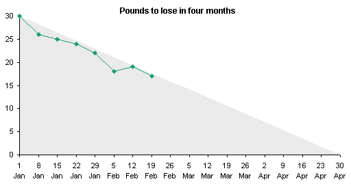
But there is a certain charm in, say, a pizza pie chart, which shows the current progress by eating away at the pizza. To compare two values, I pie chart is not totally terrible, so I’ve put together a simple protocol here.
The data is simple. Cell B1 contains the weight loss goal, cell B2 holds the current weight lost, and cell B3 has a formula that shows the difference, =B1-B2.

Select A2:B3 and create a pie chart. It looks like this. For illustration purposes I’ve shaded the plot area of this chart light yellow, and the chart area light gray. We will use a special fill for the plot area in a moment.
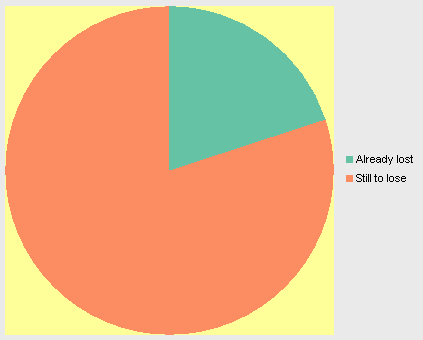
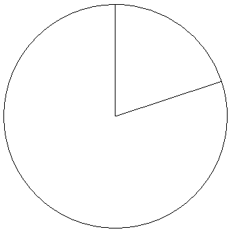
First, remove the colored fills from the chart. The two wedges should have no fill at all. I’ve left black borders on the chart, or it would vanish completely.
Now find a nice picture of a pizza pie (or a chocolate cake or lemon meringue pie). This picture came via Google Images from Taste Test: Pizza Slimdown in Chicago Magazine, who judged this beauty from Spacca Napoli to be the best Margherita pizza in Chicago.
Right click on the plot area (not the chart area or either of the pie sections), choose Format, and where appropriate for your version of Excel, use the picture as the fill pattern for the plot area. In Excel 2003 and earlier, go to the Patterns tab of the Format Plot Area dialog, click the Fill Effects button at the bottom of the Area section, select the Picture tab, click on the Select Picture button, and browse to your image.
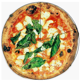
The pie fills up the whole image. Add labels to the center of the pie wedges, using a white background instead of transparent, so it shows up among the pizza toppings, and change the fill of the Already Loat segment to a solid color (white in this case).
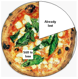
You may even want to remove the black borders.
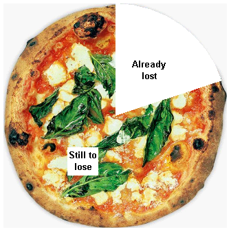
As you lose more weight and change the value in cell B2, the “eaten” portion of the pie increases in size.
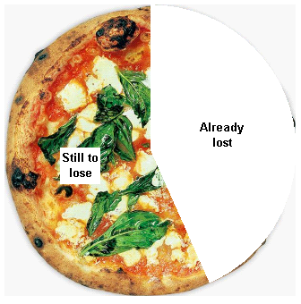
You could probably use an image editing program to get rid of the very light gray packground in the original picture. For this demonstration I left it unchanged.


Glen Turpin says
I used this kind of pie chart in a presentation about restaurant loyalty marketing. I wanted to show what percentage of the market has loyalty programs, and free desserts are often used as rewards in such programs, so a literal pie chart seemed appropriate. (Mine was apple.)
I can only think of limited uses for this, but it can be a lighthearted way to show a simple relationship between two values. A playful chart can be a welcome break in a chart-heavy presentation, as long as it’s done tastefully (sorry for the pun) and doesn’t obscure the meaning of the data.
Andy Pope says
So the more pizza you eat the thinner you get, cool :)
This diet sounds even better than JW’s patented eHAM® diet.
Jon Peltier says
Andy –
It’s virtual pizza. Eat all you want, guilt-free.
Angie says
Wow, you rock!! I’d share my pizza with you any day. Thank you so much. A.
teylyn says
@Andy: It’s more like: you can eat this much pizza if you want to maintain your current weight. So, the thinner you get, the less pizza you’re allowed. ;-)
JP says
Wouldn’t you want a legend next to the pie, showing the totals for each section? My first thought when I looked at it was that the pie was 100%, and someone was trying to starve to death :)
Gabriela Cerra says
I would do a salad pie, the more you eat the more thinner you get.
For a pizza, the slice of pizza will get bigger the more weight you lose, so it is the slice you are allowed to eat. If the target is met, you can go and eat a whole pizza.
Angie says
Hi all – it’s me, pizza girl again. I’ve got the basic concept down, but am having some problems with the final step. A couple of questions:
1. Is it possible to resize the chart to fit the picture, rather than the other way round? When I try resizing in by dragging, and then re-fill with the picture, it does everything proportionally, so I still get the same amount of deadspace within the borders of my pie chart (pizza pic a little too small – am having problems finding large enough pictures). Is there an easy way to do this or do I have to resize the pizza image, say in photoshop?
2. When I copied the chart plus pizza filling and pasted into photoshop, to get rid of the unwanted bits as you suggested above, the pizza did not travel well – I just got the pie chart with a greyscale filling. Any ideas?
Thanks guys,
Angie
Jon Peltier says
Angie –
I’ve never used PhotoShop, so I can’t help with #2.
To make the chart fit the pie, you have to crop the pie. This is easy enough in a program like IrfanView, which is a great free image editor. When you apply the picture as the fill, it will then fill the whole object (the whole plot area).
Hui... says
I like Donut Charts
The hole offsets the calories of the donut – I think!