This isn’t the usual “Pie Charts Suck” entry that we see so many of. I do have one (or more) of those rants posts in me somewhere, but this isn’t one. This is a specific illustration of a strange and wonderful phenomenon in Excel pie charts.
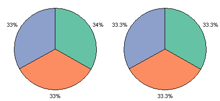
The phenomenon is that Excel will place incorrect percentage labels onto the wedges of a pie chart, simply to ensure that the displayed percentages add to 100. This only occurs if the precision of the labels is unit percentages (number format of 0%), not if more precision is allowed (number format of 0.0%). Both charts below use the same data range, three cells each containing the value 1. Each pie wedge is 1/3 of the total, 33.333333…%, rounded to 33%. However, the first chart reports percentages of 34%, 33%, and 33%. The second chart, with one added decimal digit of precision, correctly displays 33.3% for all three wedges.

I suspect this obviously intentional misstatement of percentage was implemented to mollify the high level pointy-haired managers, who deal with transactions worth billions of dollars, but worry that the percentages in their pie charts add to 100.
My colleague John Mansfield has noticed in meetings with these same pointy-haired administrators that they compare the percentages on these pie charts with the percentages calculated in the worksheet, and they get just as exercised when these percentages don’t match as they do when the total percentage adds to 99 or 101 due to rounding error. There are two ways I would have dealt with this issue: (1) using a number format of 0.0%, as in the right chart above, coincidentally also the right-hand chart above, and (2) using custom data labels from the worksheet that show the correctly rounded percentages. There are two very good, free Excel utilities that can be used to apply custom labels in a worksheet to a chart: Rob Bovey’s Chart Labeler and John Walkenbach’s Chart Tools. A third approach that occurs to me is to use VBA to extract the percentage values from the data labels and insert them into the worksheet.
John Mansfield has followed the path of greatest resistance, and has proposed a formula to recreate the percentages reported in the Excel pie charts. Follow the link to see John’s formula, which I will not discuss other than to say it works for simple pie chart percentages, but I don’t think even Richard Feynman could have predicted how Excel would deal with more complicated Excel pie chart percentages.
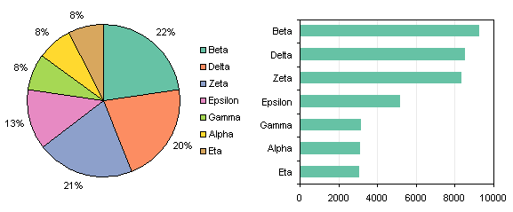
I’m talking about John’s second example, recreated below in Excel 2003. Labels are shown in column B, values in column C, percentages rounded to whole numbers in column D, and John’s clever formula in column E. John’s formula knocks two percentage points off the greatest percentage in the list to make them add to 100. Of course, Excel only deducts 1 percentage point from this percentage and 1 percentage point from one of the 21% percentages. My version of the pie chart is shown below the table, alongside a column chart. I’ve included the column chart merely to show how superior is is in showing relative differences in values. Beta is obviously much larger than Delta, which is larger than Zeta: I defy anyone to tell me this based on a pie chart without labels.
| A | B | C | D | E | |
| 1 | |||||
| 2 | |||||
| 3 | Values | ROUND | Array | ||
| 4 | Alpha | 3060 | 8% | 8% | |
| 5 | Beta | 9208 | 23% | 21% | |
| 6 | Gamma | 3119 | 8% | 8% | |
| 7 | Delta | 8466 | 21% | 21% | |
| 8 | Epsilon | 5135 | 13% | 13% | |
| 9 | Zeta | 8322 | 21% | 21% | |
| 10 | Eta | 3046 | 8% | 8% |

In fact, the funny Excel percentage feature means you can’t even tell me the order of Beta, Delta, and Zeta if you consider the percentage labels. I discovered this when I sorted the data to check whether John’s formula or Excel changed their displayed percentages. The sorted data and the updated charts are shown below. Note that John’s formula and Excel’s chart show the same percentages for each wedge as with unsorted data. In the sorted bar chart, you not only can clearly see the differences between Beta, Delta, and Zeta, but you can also see a pixel or so difference between Gamma, Alpha, and Eta. In the pie chart? Forget it.
| A | B | C | D | E | |
| 1 | |||||
| 2 | |||||
| 3 | Sorted | ROUND | Array | ||
| 4 | Beta | 9208 | 23% | 21% | |
| 5 | Delta | 8466 | 21% | 21% | |
| 6 | Zeta | 8322 | 21% | 21% | |
| 7 | Epsilon | 5135 | 13% | 13% | |
| 8 | Gamma | 3119 | 8% | 8% | |
| 9 | Alpha | 3060 | 8% | 8% | |
| 10 | Eta | 3046 | 8% | 8% |

The interesting thing about the Excel percentage display feature is that in the sorted pie chart, the percentage labels are out of sequence (22%, 20%, 21%, etc.). Even though Delta’s value is greater than Zeta’s value, Delta’s reported percentage is smaller, 20% vs. 21%. John had no chance of developing a formula to mimic Excel’s misreporting of percentages, if he foolishly assumed that these percentages would remain in the same order as the underlying data.
John will have to make some changes to his formula for use in Excel 2007. The percentages are still restated in 2007. My original sample chart at the top would show percentages of 34%, 33%, and 33%. In the more complex example, Excel doesn’t deduct from the largest wedges, but from the smallest. The percentages are in the correct order as shown in the chart below, and the two smallest wedges have been changed from 8% to 7%. Presumably the internal mechanism Excel uses minimizes the error in the percentages in a similar manner to the way a least squares minimizes the error between a data set and the regression line that describes it. I leave it as an exercise for the student to verify this error minimization.


Lucci says
You mean to tell me that Microsoft knows about this craziness??!! In my job I quite often have to create presentations which include all types of charts. Recently I have been asked to incorporate the pie chart to present some information. I was left baffled as to why the pie chart would not calculate a total value of 100% when I came across this article! Thank Goodness I’m not crazy!! As for the algebric calculations, are you kidding me! Does Microsoft intend on fixing this mess!!! Whats the point of having it as an option if it will never do what you need it to do??!!!
Lucci:(
Jon Peltier says
Lucci –
It seems to me that this incorrect labeling was done on purpose. It’s too detailed to have been done by accident.
There are better ways to show pie chart data. One article you couls check out is Save the Pies for Dessert by Stephen Few. In the article he tells you what is wrong with pie charts, and he suggests alternatives.
I know the directive to use pie charts probably came from your boss, but perhaps you could argue for a better display element.
Mike says
@ jon: For a long time I’ve found the output of all graphs in Excel to be a bit naff looking – my boss is asking on how to make them look more ‘professional’. I just came here through your comments over at the Excel blog and thought I’d ask.
Jon Peltier says
If by “more professional” you boss means shiny and glittery and all 3D, then this is not the place to find advice, because these visual effects make charts less effective at conveying information.
If you want cleaner and more effective charts, a good place to start is 9 Steps to Simpler Chart Formatting. For specific details beyond this, you could try searching using the search box at the top of the right sidebar.
Ben Miller says
Try setting the label formatting to #%
Jon Peltier says
Ben – That seems to have solved the problem. Now we just have to teach all those middle managers how to apply an Excel number format.
Phil Dubuc says
Found this page in Google while looking for online pie charts. Now that Microsoft has announced that they will be releasing an online version in the next release, i wonder if we’ll be able to create all these charts online?
For the time being, those in my situation looking for online charts, try the National Center for Education website or chartgo graph They’re both very pretty useful.