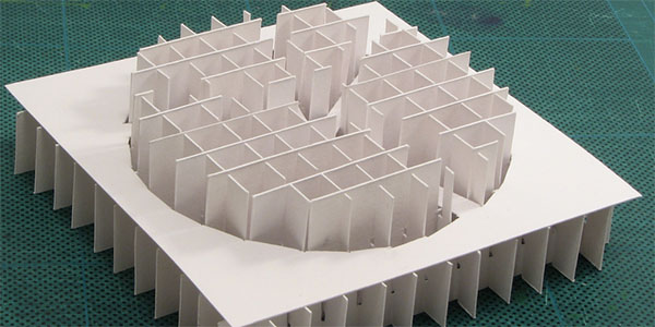
In Paper-Based Pie Chart Graphs, the information aesthetics blog shows a pie chart that isn’t printed on paper, but is actually fabricated out of paper. It came from Paper Graphs, on Nicholas O’Leary‘s knolleary blog. This seems to be more a work of art than a chart, so maybe it’s okay.

But I get the idea that information aesthetics is taking this rather seriously as a useful way to display data. A 2D chart is ineffective enough for conveying informtion, and a pseudo 3D chart on a flat display (or a printed page) exaggerates the ineffectiveness. This sculpture can only be worse.
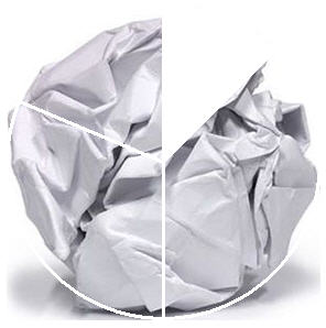
So information aesthetics is hosting a contest to find the best information display based on, but not printed on, paper. They chose this picture the headline the post announcing the contest.

My thoughts exactly. Or maybe…


Glen Turpin says
Jon, I respectfully disagree that the contest is about “useful” ways to display data at all. The criteria are beauty and originality versus readability and usability.
The Information Aesthetics blog focuses on visualizations that present data or information in original, intriguing or artistic ways. I don’t think it’s about the most effective ways to understand data. It’s always seemed more like a romp through beautiful and unexpected visualizations, using data as the raw material of the design or artistic process.
Take this, for example: http://infosthetics.com/archives/2009/01/tidal_data_as_a_table_data_furniture.html. As an informational chart, it’s useless. (As furniture, it doesn’t look very practical either.) But it’s a thing of beauty nonetheless.
I don’t know Andrew, but I’ve been an Information Aesthetics reader for quite some time. He’s not looking for useful analytical tools. He’s encouraging people to have fun and be creative.
I can’t wait to see the results, even if they are useless.
Jon Peltier says
Glen – I agree that Information Aesthetics has some artistic content. Somehow the word Information seems misplaced.
Chandoo says
Haha.. Jon, when I saw the post in information aesthetics.. I was like.. paper pie charts, really!!?!. Then I saw their contest post. I guess as Glen pointed they wanted to make it more of art and creativity contest than focus on information.
Also, to be frank, I dont think the original paper pie is effective, it provides poor contrast, although you can touch and grope (in authors words) to find exact values.
Jon Peltier says
“…you can touch and grope to find exact values.”
Not a very accurate instrument, the human hand. I was talking with my next door neighbor, whose wife is 39-1/2 weeks pregnant. She went into labor last week, a bit premature, and the contractions weren’t that close or that regular yet, but I gather she was not too comfortable. Anyway, the doctors kept her there for a while, then sent her home. My neighbor says it was frustrating, because they’d hear three OBs in a row, 3 cm dilated, 8 cm, 5 cm; 80% effaced, 25%, 50%. I mean, these are not precision machined calipers, these are fingers.
So I doubt feeling around on the corrugated surfaces will give you any better “feel” for the numbers than a quick glance would.
comptonator says
Your post is very timely. I just finished Edward Tufte’s chapter on chartjunk and moire effects yesterday. This is a great illustration of an emphasis on gridlines instead of data. They still get points for an interesting perspective.