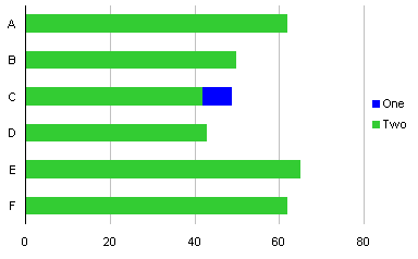
Robert Kosara of EagerEyes.org compares popular vote to electoral college vote in The Electoral College and Second Terms. He came up with a very clever and rather effective bar chart to display his data. I’ve included a mere excerpt of Robert’s chart below, enough to show the visual appearance of the chart. The two series he compares overlap, such that the shorter bar is in front and the longer bar extends further along the axis scale.

Robert liked the way the chart displayed the data, but noted that he had to use a stacked type of chart with numerous additional columns of data to support the required series. I thought about it for a moment, and realized he could use a clustered chart type with full overlap, and only one additional worksheet column and one extra chart series.
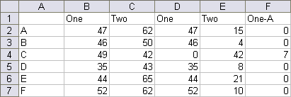
I’ll demonstrate the technique on the following dummy data. There are two sets of numbers (“One” and “Two”) for a half dozen categories.

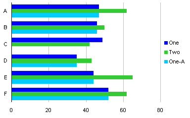
A simple clustered bar chart shows all of the data, but there’s too much back and forth of the two series to allow clear analysis.

When the two series are overlapped, we only see series “One” where it is greater than series “Two”, in category C.

We can address this by adding another column to the data, called “One-A” in the table below. This column has a data value matching that of series “One” if that value is less than the corresponding value of series “Two”; otherwise the value is zero. This results in a second set of series “One” values that will plot in front of series “Two” when overlapped.
The formula in cell D2 (which is copied into D3:D7) is:
=IF(B2<C2,B2,0)

A clustered bar chart now has three series.

The extra series “One-A” is formatted to match series “One”.

When the series are overlapped 100%, we get the effect Robert worked so hard to achieve, but with a minimum of fuss.

Incidentally, I didn’t care for the gray background below 50% in Robert’s chart. I found that the darker background selectively lightened the foreground bar colors, making it difficult to assess values close to 50%. For Robert’s chart, showing election results, I’d limit my vertical gridlines to 50% and 100%.
Update: October 13, 2008
Robert Kosara has followed up his original post with Popular vs. Electoral Votes Using Stacked Bar Charts, in which he describes the mechanics of his stacked bar approach. The data range looks like this:

Cells D2, E2 and F2 have the following formulas, which are copied into the rows below.
D2:   =IF(B2<C2,B2,0)
E2:   =C2-D2
F2:   =MAX(0,B2-C2)
Select A1:A7, then hold Ctrl while selecting D1:F7, and create a stacked column chart. Format series One and One-A the same, then remove the One-A legend entry by clicking once to select the legend, then again to select the One-A legend label, then press Delete. The result is visually indistinguishable from the chart just above this update.
Update: October 10, 2008
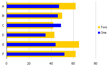
Reader Stag Lee commented that Robert’s chart type was not intuitive, and suggested a slight modification, as shown here:

The protocol to create this chart is presented in Overlapped Bar Chart – Thinner Bars in Front.


Robert Kosara says
Interesting! I agree about the gray being to dark, I’ll change that. I did think about keeping only the 50% and 100% lines, but I wanted to make it easier to read the numbers.
StackLee says
I like the re-design that includes the One-A bars. If you added a One-A bar for “C” you end up with a bullet type format that makes comparison/comprehension much easier.
Jon Peltier says
Stack Lee – I don’t think I understand your point. There is no One-A bar for C, because series One is greater than series Two for category C.
Chandoo says
This is very clever Jon, excellent way to achieve something that looks almost impossible at first take.
TV says
I find the color inversion confusing.
As it’s shown here, the end mark is all that matters in indicating the raw value, and the color scheme gives the One series an impression of being very small in category C (according to a standard reading of stacked bars).
I would prefer the bullet style where series A would have a no background color (or be a different width) and I can compare the series B relative to that benchmark with no confusion of reading the individual values…
Jon Peltier says
TV –
If we know that the bars are overlapping and not stacked, this chart type makes it very easy to see which categories have a “One” value greater than its “Two” value (i.e., “C”).
In your favored alternative, would you have both A and B in the same bullet graph? I have tried numerous ways to compare two column series. In some cases the chart is too cluttered, while in other cases, one series is emphasized at the expense of another.
I discussed this in my Tornado Charts and Dot Plots article. Here is a cluttered chart:
Here are a couple which are less cluttered but emphasize the filled series:
These two show less bias toward the shaded series, but not much less:
This chart is least biased of all:
Stacklee says
I think the step “One-A is formatted…” is the best version. Visualize one large width blue bar (but really 2 bars) overlayed with one small or medium width green bar. When series “two” is less than “one”, it is simple and clear, IMO, – but you need to add a “one A” for “c”.
Robert Kosara says
TV, you’re right, but the point of this chart was also to see the “amplification” from the electoral college system, so the part that both bars have in common is really not all that interesting. What is interesting though, is where the electoral vote was less than the popular, so these things were meant to stand out (and that’s why I spent so much effort on this, to make that point).
If you want to look at it as a stacked chart, it’s simply stacking the gain on top of the popular vote – so that works too.
TV says
Jon:
I see your concern about bias. My comment assumed the series are not independent… if the two series are, say, time 1 and time 2 of the same data, then I think the emphasis of time 2 would be acceptable. If they are independent, then yes, the shaded series pulls a bias that should not be there.
I agree the last chart is unbiased, and for a side by side comparison that is effective.
Jon Peltier says
Stack Lee –
The chart you describe is discussed in Overlapped Bar Chart – Thinner Bars in Front.
giedrius says
Hi,
Is there a way to make column One stacked? I.e. I want to show yearly budget figure and the budget for the quarter in the same column. Then column Two would show actual achievement figure for the quarter.
Thanks.
Jon Peltier says
Giedrius –
Technically anything is feasible. The question is whether it’s desirable.
Which chart would have the quarterly and annual budgets combined? If you mean the one which is the topic of this post, I think it would be more cluttered and confusing than it is worth. If you mean one of the charts from the comments, well, you would run into the same problem of confusion over mixed annual and quarterly numbers.
giedrius says
Hi again,
I mean chart that is just above my initial question (your post of October 10, 2008, 8:14 pm). I want the dark blue column (called One) to come in two colors – one representing the quarterly figure, the other – the rest of the total figure for the year (so that the total blue+other color column height represents total budget for the year).
Why you say the numbers will be mixed? They will not, to my understanding. In some organisations you might need to have a feeling both how you are proceeding during the quarter and year in total. Especially when budgeting is not very precise and/or achievements during quarters vary severely. Of course, one can make two separate graphs, but I thought it would be excellent to have everything in one.
Jon Peltier says
Well, it can be done. Just make a stacked chart, with four series on the primary axis and four on the secondary axis. Something like this:
Beware the optical illusion.
giedrius says
Well, that is not what I imagined, but I got your point. Thanks a lot.
James says
Hi Jon,
another excellent post!
I’m having a couple of difficulties with having a 3 series chart. Just using overlap tends to favour the largest one. Basically I want the 3rd series as a “background” to the other 2. Does this approach depend on the secondary axis only? Is there a z-index facility to use with overlap?
Also, on an unrelated note, one of columns is very small, but still a positive integer, and appears below the y-axis. Is this an unresolved bug with the system?
Cheers,
James
Jon Peltier says
James –
There is a particular Z-order to the series. Primary axis series are behind secondary group series of the same chart type. Within an axis group, the earlier plot order series are below the later plot order series.
Think of the series as being laid down in order. Primary series are laid down first, in the order 1, 2, 3, then secondary.
savithri.v says
Hi Sir,
Is it possible to overlap columns in a clustered stacked column chart?
Suppose one of the clustered columns depicts investments categorised in 3 sections -operational assets, non operational assets & sunk costs stacked on top of each other & the 2nd column shows equity injections into the project & retained earnings from the project due to shareholders stacked one on the above.
In a situation where the retained earnings is negative from a couple of projects, is it possible to show this negative figure as overlapping on the equity portion (instead of stacking it below zero) to illustrate how much of the equity injections have been eaten away by losses from those projects?
savithri
Jon Peltier says
Savithri – I’m not sure I visualize your intended graphic. How would overlapping successfully depict negative numbers?
savithri.v says
Dear Sir,
Sorry – as the internet link was down, saw this just now
I felt that if the overlapping is made with a thinner column in the front, it would portray the portion of the funding that is eaten away by the losses.
I had to get a presentation done this morning as part of a Balance Sheet structure. As I couldn’t figure out how to get the message across, I added another series for ABS value of losses, changed it to scatter type, used a minus Y error bar (100%) & formatted it with the maximum possible weight but still couldn’t get the desired width.
And as always…I can no other answer make but thanks, and thanks, and ever thanks (I’m learning Shakespeare from my son!)
savithri
Ken Stern says
As usual, very illuminating and great suggestions. I have one further variation I can’t seem to get to work. I have three sets of yearly estimates – low, medium, high. I’d like to show each year as a trio of columns with partial overlap. I want the lowest to be both on the left and in front (so each set of 3 increases to the right and towards the back, in effect).
I can’t seem to get both orders correct at once. In short, the right-most bar (i.e. the one with the highest series number) is always in front. Is there a way to play with front/back bar overlap without changing the order of the series? (I’d post a picture if there were an easy way but hopefully I’m explaining it clearly.)
(If I only had two series, I could get it working by playing with primary/secondary axes, but as it is these need to all be on the same axis anyway.)
Jon Peltier says
Ken –
You can’t interweave two series in that manner. A series can be either completely in front of or completely behind another series.
Jon Peltier says
Karan asked how to get the taller-bar-behind-shorter bar effect if there are more than two series. Essentially it’s the same, but you need several extra series. Here is one way to approach it.
Add some columns to the data:
The formulas in E2 through H2 are
=IF(OR(B2<C2,B2<D2),B2,0)
=IF(C2<D2,C2,0)
=IF(AND(D2<B2,D2<C2),D2,0)
=IF(AND(B2<C2,B2<D2),B2,0)
Here is the chart, not fully overlapped:
And here is the chart, with fully overlapped bars:
Luis Gonzalez says
I need a line chart to represent 3 different series, the problem is that the values of the series are very close and they overlap making it impossible to appreciate the differences even if the range is widen.
Any suggestion?
I really appreciate your help.
Thank you,
Luis G
Jon Peltier says
Luis –
Does it make sense to treat one of the series as the baseline, subtract its value from the other two series, and plot the deviation?
Luis Gonzalez says
Jon,
Thanks for the quick reply.
I’m not sure I understand what you are proposing. Would I still be able to see the right series values on axis Y?
Thanks again
Jon Peltier says
Your description indicated that conferences were important. What I suggested was not to plot Y1, Y2, and Y3, but rather (Y2-Y1) and (Y3-Y1). This accentuates the differences, but obscures the actual values.
Eliadann says
Hola Jon,
Mi problema es el siguiente, necesito mostra una columna apilada en primer plano (he puesto varios parámetros en eje primario) y en segundo plano una columna con el target. Quiero mostra los valores en eje primario como columna apilada, pero excluir el valor “target” que tengo en eje secundario de esta columna apilada.
¿Puedes ayudarme?
Gracias
Jon Peltier says
Not sure of the exact nature of your problem (Google Translate is only so effective), but I think you need to move the target series to the secondary axes.
Alan Stachowicz says
How would you go about the taller above shorter bar effect with four series of data?
Jon Peltier says
Alan –
My comment of 26 Oct 2009 (above) shows what would be needed for three series. Four series would be even more convoluted.
Alan Stachowicz says
Yeah I looked at your example of three series and got very close with many different formulas but couldn’t get it right to work in every situation. That’s why I was curious to see if you could come up with a solution that I hadn’t thought of. I can send you my spreadsheet if you want to take a look. Thanks!
Jon Peltier says
Alan –
I think the question is whether it’s worth trying to do this for so many series. It’s confusing enough to decipher it when there are two series. Put the bars side by side, or perhaps use a line chart.
Gary says
This is great. I am surprised that it is not yet a standard part of Excel 2016 (not that I can find anyway). I am trying to get my head round how to make it work for 6 series. I know, mental, but I have a device that monitors my solar power system and produces a web-based version of this for Generated electricity, imported, exported, diverted to immersion heater 1, diverted to heater 2 and overall house consumption.
I export the data to excel and have a chart that displays all 6 series but as 70% overlapping cluster chart, not a 100% overlapping chart. The trouble is, most (though not all) series can be higher or lower than the others, so this is exactly what I need. My guess though is that the number of additional series increases exponentially – am I correct?
Gary
Jon Peltier says
Gary –
With more series, this kind of chart becomes more complicated to create and maintain, and it becomes more confusing for people to interpret. Non-overlapping bar (column) charts are probably best, with the series in the same order at each category, no bar obscuring any other bars.
Gary says
Jon –
You are probably correct in the commercial world but as this is only for me and to replicate a chart I can see on the web-based Solar PV monitoring system I thought it might be worth the effort. Indeed, since penning my comment above I think I have a solution using the RANK.EQ function. It could possibly be refined but in simple terms adopts your approach to re-plot each of the series as many times as you have series – in my case 6 x 6 = 36 plotted series.
I have 6 series and whatever is the maximum value will always be visible. I then use the RANK.EQ function to see, for each of the 6 series, which value is ranked second from top and set the others values to zero – this is pretty much what your formula is doing I think. This group of 6 “series-1s” is then plotted in front of the max values. I then look at rank 3 and plot them as “series-2s”, then rank 4, 5 and 6. I end up plotting 6 x 6 series but get the result I am after.
I had already plotted my 6 series as a 70% overlapping cluster but wanted to replicate the web visual. Having now done that I am wondering, for the reasons you state, which is actually better. I would post some pictures of the charts and the formula but I can’t see how to do that…
Thanks for your thoughts
Jon Peltier says
Gary –
Upload the image files to one of the sharing sites, and write your comment with the links. I’ll incorporate the images.
If I had to go to this trouble, I’d make the chart with the series being Rank1, Rank2, etc., minimizing the number of series, then use VBA to color each according to the item that is at that rank for that category. But as I stated, when the colored items change positions in the chart, the chart becomes harder to interpret.
Gary says
Jon –
Here is a link to my original chart – https://dl.dropboxusercontent.com/u/14870257/Performance%20chart.JPG
And one to my attempt to overlap the series – https://dl.dropboxusercontent.com/u/14870257/Performance%20chart%202.JPG
And finally to a curtailed example spread sheet – https://dl.dropboxusercontent.com/u/14870257/Sheet.JPG
The formulae are for the second set or series:
H2: =IF(RANK.EQ(B2,$B2:$G2)=2,B2,0)
to
M2: =IF(RANK.EQ(G2,$B2:$G2)=2,G2,0)
Then for the third set:
N2: =IF(RANK.EQ(B2,$B2:$G2)=3,B2,0)
to
S2: =IF(RANK.EQ(G2,$B2:$G2)=3,G2,0)
and so on for the 4th to 6th sets of series.
Enjoy…
amanda says
Hi. Love it. Now trying to use to compare two like datasets over time. Series of two overlay bars.
One / Two / One A Three / Four / Three A
Row
Row
Row
No luck so far. Been done? Ideas
So same concept with grouping???
amanda says
Just thought to have more rows, less columns, then alternate color of rows….. A lot of work but will display comparative change in two data points for target within and across years….
Data1 / Data2 / Data 1A
RowA1
RowA2
RowB1
RowB2
RowC1
Row C2
Reshmi Kariat says
Hello Jon,
I created a stacked bar chart where I plotted the differences rather than the actual values like you suggested to Luis Gonzalez. Is there a way I can still have the actual values as the data labels?
I am using VBA scripting to generate the plot and I have the actual values in the form of arrays. How can I assign those arrays as the data labels
Jon Peltier says
Reshmi –
Add the data labels to the points. Then loop through each data label, and set the text of label i to array element i.