Candlestick Charts
Microsoft Excel has some built-in chart types for displaying how stock prices vary during a trading period. This is usually a day, but it could also show weeks, months, or years, or even intervals of minutes or hours during a trading day. These are the prices at open and close of the market as well as the high and low while the market is open. For example, the Open-High-Low-Close (OHLC) candlestick chart below was designed to show the high and low for a trading period as the top and bottom of the vertical line for each period, and the change from open to close as a rectangle, filled white for an increasing value or black for a decreasing value.
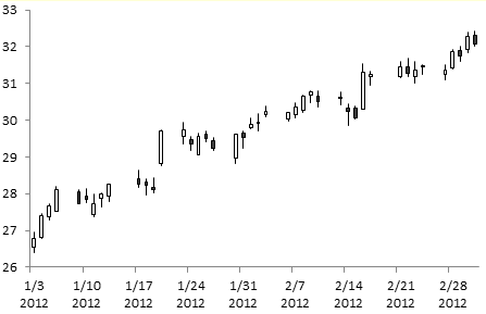
To make this chart type, you need five columns of data, in order Date (or other label of the trading period), Open, High, Low, and Close. If you omit the dates or labels, Excel will build the chart and label the periods 1, 2, 3, etc. Select the data, then go to the Insert tab > Other Charts, and pick the second stock chart type.
I guess I’m too dumb to remember such a straightforward convention, but I always have to check whether the white or black bars refer to increasing or decreasing values. So I like to color the bars red and green, like so:
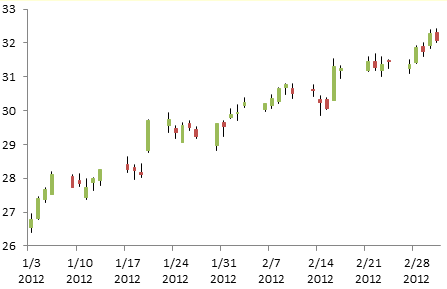
The problem is that the colored bars do not photocopy well in black and white. Also, while the red and green colors in Excel’s default theme are distinguishable by most people with color vision deficiencies, I can’t imagine the colors they see are as easy to distinguish as red and green, or as black and white, for that matter.
Stock Charts with Open and Close Tickmarks
The best approach then is to use the OHLC chart style found in newspapers. These have a vertical line to indicate the spread from low to high during a trading period, with a small tickmark to the left indicating the opening price and a small tickmark to the right at the closing price. Excel has a High-Low-Close stock chart with the vertical line and a single tickmark, to the right, to signify closing price. But no leftward tickmark.
So we must resort to some smoke and mirrors. Actually, some short horizontal error bars will serve as our tickmarks.
Start with the data arranged in the same way, but create a line chart instead of a stock chart.
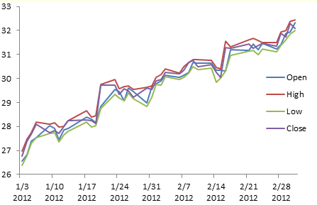
Select any series in the chart, go to the Chart Tools > Layout tab, click on Lines, and choose High-Low Lines.
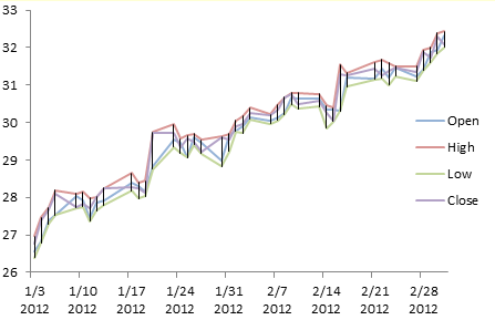
Format the High and Low series to remove the line color.

Change the Open and Close series to XY: right click on each series in turn, select Change Chart Type, and choose an XY type.
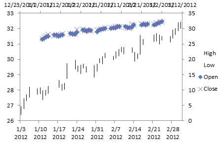
These XY points don’t line up and there are misaligned secondary axes, but this is simple to fix. Format both XY series to assign them to the primary axis.

Format the Open and Close series to hide the markers.
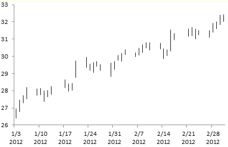
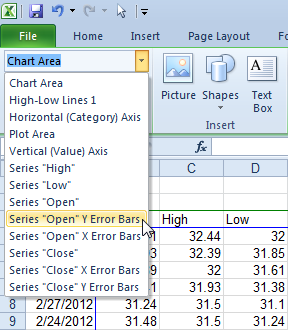
Select the Open and Close series in turn, and add error bars. There are no markers to click on, but if you select the chart you can find the Chart Element selector on the Chart Tools > Layout and Format tabs. The Chart Element selector and the pop-up tool tip are highlighted with a red border in this screen shot. This is a handy tool to add to your arsenal.
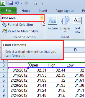
Use the Chart Element selector to select the Open and Close series, one at a time. (You could also select a visible series or another visible chart element, and use the up or down arrows to cycle through the chart’s elements until the desired series is selected.)
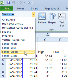
With the series selected, go to the Chart Tools > Layout tab, select Error Bars, and choose one of the options. I simply used the Standard Error option, since it was easier to add everything and adjust or remove the parts as needed. Repeat for both Open and Close.
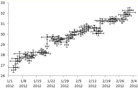
Reminds me of a swarm of starfighters from Star Wars.
Select the vertical (Y) error bars for each series. You may want to use the Chart Element selector for this.
Select the vertical (Y) error bars, and remove them by pressing the Delete key.
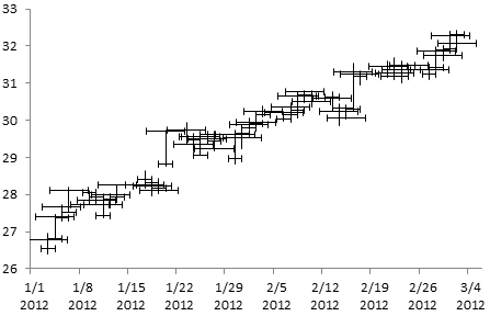
Select the “Open” X Error Bars, and press Ctrl+1 to open the Format dialog. Select the Minus direction and the No Cap end style, and enter a fixed value of 0.4.
Select the “Close” X Error Bars, and press Ctrl+1 to open the Format dialog. Select the Plus direction and the No Cap end style, and enter a fixed value of 0.4.
The vertical lines are one unit (one trading period) apart, so 0.4 reaches almost halfway to the next vertical line on either side.

This style of OHLC chart works well in black and white, and after the first time you go through the protocol, it doesn’t take too long to set up.


Calvin Graham says
I’ve always found it bizarre that they go for black and white as a default when red and green are the standard almost everywhere. Hadn’t thought about the print aspect of it though, even if they don’t apply that idea to other chart defaults
I suppose a useful followup to this would be the best approach to pulling in data. Currently I have tabs with stock symbols (eg “CNR” or “RLD”) and a fairly messy bit of VB to query Google finance and format the data. Not looking forward to the day they change their URL protocol.
More generally, you’d think that by now Microsoft would have a link from Excel to some sort of Bing finance thing to help you get prices/news/links. Or maybe that would end up in court like when they bundled IE with Windows…
Rick Henderson says
This is a great example. I was trying to figure out ways to format the stock charts in Excel to look more like the ones seen on finance websites, and this is a good take on it. It has always bugged me that the data you download from some sites like Yahoo finance isn’t formatted in a way that Excel likes. I think it’s too picky about it’s stock charts :)
Bob says
Hi – In your instructions you demonstrate how stacked data can be displayed in a clustered manner.
However, what about a greater mix of displayed items? Where, on a single chart:
1) some data is a single bar of data (the number of problem tickets for 2011 and 2012)
2) some data is a line with markers (password resets for 2011 & 2012)
3) some data is best displayed as stacked bar (calls received between internal and external callers).
Y = the totals; X = equals months (Jan – Dec). Best Regards, Bob
Val says
Jon, this is an amazingly useful site. Thank you!
One trick I haven’t seen is; changing Category axis text orientation in an XY Scatter chart. Can it be done in VBA code? If so, could you publish an example? Thanks in advance.
Matt Kelly says
Hi,
Thanks for the article – really useful. Just one question, is there a way to remove weekend dates from the x axis? Otherwise there are gaps in the chart. I’ve tried formatting the axis as text, but this just jumbles the data.
Jon Peltier says
Using text dates changes the axis scale. Your X values for the XY points are no longer dates, but instead are just indices (i.e., row numbers) of the dates.
Nick says
Thank you, it works here !
Ken says
I too am having the issue that Matt has and cant for the life of me figure it out. I love the chart but for my needs its unusable unless i can remove the weekend dead space. Has anyone a fix for it??
Jon Peltier says
When the X axis is plotting dates, it has a spot for every day in the span from min to max, including weekends. Since there are not data points for these days, you get a gap. Personally I prefer this gap, because it allows me to visually distinguish weeks and get a better sense for passage of time. But that’s me.
Change the X axis so that it is a Text axis not a Date axis. Since the chart is no longer plotting dates, you will also have to change the X values for the XY series that is used for the short horizontal error bars that look like tick marks. The first X value is 1, the second is 2, etc.
Ken says
I understand the first part of changing the x axis to text but i don’t quite understand how or what I need with the second part- the x values of the XY series. Do i need to add an additional row of data? What?
Thanks for the help- your site is great!
Jon Peltier says
Probably you need to insert a column, assuming the data are already aligned in columns. The first X value is 1 (to align with the first category), the second is 2 (to align with the second), etc.
Ken says
As it stands currently the data is in this format. Date, Open, High, Low, Close. Where would i insert this new column? Between date and Open?
Jon Peltier says
Actually, it can be even simpler. Change the axis type to Text. Then edit the series formulas of the XY series. For example, if the dates are in column A and Open in column B, select the Open series, and look at the formula in the formula bar:
=SERIES(Sheet1!$B$1,Sheet1!$A$2:$A$11,Sheet1!$B$2:$B$11,1)
Edit this to read:
=SERIES(Sheet1!$B$1,,Sheet1!$B$2:$B$11,1)
Repeat for the Close series formula.
Since no X values are indicated in the series formula, Excel will plot the series using {1, 2, 3,…}, so you don’t even need to insert these values anywhere.
Ken says
YEP!!!! That did it! Thanks for helping!
John Diggory says
Why do we add error bars? What does it indicate?
Jon Peltier says
The short horizontal error bars, without end caps, indicate the opening (left) and closing (right) values. These replace the vertical bars in Excel’s candlestick-style stock charts.
John Diggory says
Is there a more elaborate explanation possible? As in, do the error bars which are standard errors have any significance or is it just acting like a substitute or replacement?
Jon Peltier says
In this context, error bars with standard errors, or any calculated length, mean nothing. The length of the error bars we’re making here simply provide little tick marks to show us the opening and closing prices. That’s why we give them an arbitrary length of 0.4, a reasonable length for a tick mark.