The following chart illustrates a nice configuration for horizontal bar chart labels. These labels take the place of category labels and value data labels, and they are nicely aligned above the corresponding bars.
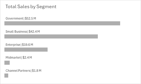
These labels are not hard to do in Excel, and I’ll show you how.
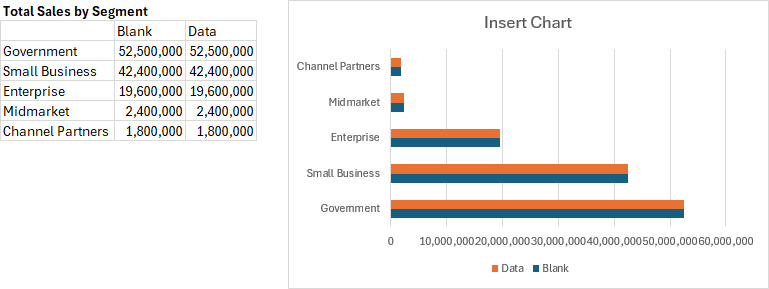
Start with the following data. Note that the data is repeated in duplicate columns, labeled Blank and Data. Ultimately the Blank series will have hidden bars and data labels. Create a bar chart, shown next to the data.
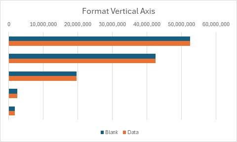
First, format the vertical axis. Select the axis and press Ctrl+1. Under the Axis Option icon, check the box for Categories in Reverse Order; under Labels, select No Labels. Under the paint can (Fill & Line) icon, select No Line.
Now hide some unneeded chart elements. Select the horizontal axis, press Ctrl+1. Under Axis Options, for Labels select No Labels. Select and delete the horizontal gridlines, then select and delete the legend.
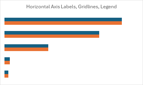
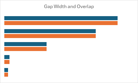
Next, adjust the spacing of the bars. Select either series and press Ctrl+1. Under Series Options, enter a Gap Width of 100% and a Series Overlap of -20%. You may later adjust these settings to fine-tune your label configuration.
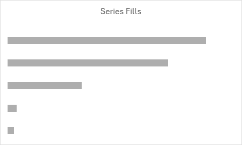
Apply series fill colors. For the Data series, apply the desired fill color (I’ve used a medium gray). For the Blank series, select No Fill.
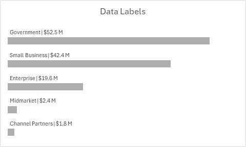
Now apply and format your data labels. Select the blank series (you should be able to click on it even if it’s blank, but if not select the visible series and press Ctrl and the down arrow key). Click the Chart Elements skittle (the plus icon next to the chart), select Data Labels > More Options.
Under Label Options, check Value and Category Name. Enter the pipe character | for your separator, and choose the Inside Base position. Enter an appropriate number format for your data labels. To show the values in millions of dollars, I used this format:
$0.0,, \MUnder Text Options > Textbox, uncheck Wrap Text in Shape, and enter zero for the Left Margin.
Finally enter your desired chart title, and drag the chart title to the left of the chart (hold Shift while dragging so the title moves horizontally).
Now your bar chart has nicely arranged labels, and it only took a minute or two.
A VBA Procedure and Add-In to Add Nice Bar Chart Data Labels
Bill commented that it would be informative to have a VBA procedure to label a bar chart using this protocol. Great idea, so I wrote a follow-up post to describe the code and present an add-in that can be downloaded. See Nice Bar Chart Data Labels Using VBA.


Winston Snyder says
Thanks Jon,
Looks good alignment between data labels and left edge of the bar is off a bit. Same with Power bi. I sent a comment via LinkedIn to Miguel Myers regarding the alignment earlier today.
Bill McNair says
I like this a lot. Very nice. I can see adding if/then commentary drawing attention to a specific (in this case business segment) in a similar fashion. Possibly asking too much here but, for this specific graph layout and data, could you encapsulate all the steps in this technique into a quick VBA routine? Nothing fancy. Just some VBA to build on this idea.
Jon Peltier says
Winston –
The textbox of a data label that is inside a bar never aligns precisely with the ends of the bar, but is aligned slightly inside the bar. Reducing the margin within the textbox is about how close you can get with the Inside End label position. If I were using VBA, I could align the left edge of the data labels to the inside left edge of the plot area.
Jon Peltier says
Bill –
Great idea. I just drafted a procedure that starts with a bar chart, adds a series, adds data labels, and does all the other formatting. I think I’ll write a follow-up post in a couple days that describes the code. Maybe I’ll include an add-in people can download.
Jon Peltier says
Bill –
I’ve written a follow-up article that describes a VBA procedure that adds these data labels to a bar chart. It includes an add-in that can be downloaded. See Nice Bar Chart Data Labels Using VBA.