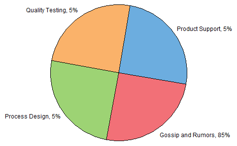
All this discussion about pie charts lately reminded me of one of my favorite pie charts.
This comes from back in the day, when I was still working in Corporate America. Actually it was fairly early in my career, when I was just getting used to the concept of reductions in force and downsizing. We had regular meetings during which we described how we had been spending our time, and what great things we had done to avoid the upcoming layoff. During one particularly stressful week, my colleague Mike put together a pie chart which I have roughly reproduced below. Of course, the pie itself didn’t tell the whole story, you had to pay attention to the labels. The percentages did all add to 100%, but they weren’t as equal as the pie appeared.

Pie charts get a lot of grief, well-earned because of the way people misuse them. But when used in a thoughtful manner, they can be effective. This pie was effective because it relieved some of the anxiety about the upcoming staffing changes.


SteveT says
Nice one!
paresh says
Well after all that discussion – Jon finally finds something useful about a pie chart !! He will find more effective uses with the passage of time.
If you want to see another effective pie chart refer to the one here on my web site – Simple but so eloquent
Jon Peltier says
Paresh –
What was good about this pie chart is that my colleague intentionally (a) exaggerated the time spent with rumors and gossip, and (b) didn’t plot the same values as he put in the data labels. Nothing to do with how well it would have presented the actual data, just how well it helped relieve a little tension. And by tension, I mean psychological stress brought on my conditions in the workplace, not by anything related to Gestalt.
Your pie chart example, about the effects of gay marriage, is effective because it ridicules the right-wingers who oppose gay marriage. All those bad things? Not happening.
When a pie chart is used as a vehicle for humor, it can be very effective. When used as a vehicle for accurate transmission of information, not so much.
Paresh says
Jon, unfortunately, I do not agree with you the part about “accurate transmission of information..” Yes pie charts / doughnut charts have been used sloppily – but they can be used effectively too as was done in the example I had picked up where the change was drastic.
I believe it would be useful in another context too. Rather than to show “part of the whole” relationship, the pie chart can be useful to show a change in one of the segments and a compensating change in another [ approximate ]. The focus of the chart would be on the compensating change and not on the individual segments. Coming up soon!!
Jon Peltier says
Actually, I disagree with your last assertion. Where a pie might be adequate is in showing parts of a whole. Where it is grossly inadequate is when used to try to show changing proportions. Since all of the wedges may be changing, and since as a result most of the wedges change their starting and ending angles (i.e., their baselines), it is very hard to detect all but the greatest changes. The NYT example you used had such enormous changes, that one could tell the dark gray was increasing at the expense of the light gray. But the line and area charts I suggested showed these changes much more vividly, and they would have clearly shown much smaller differences of a percent or so of the total.
Gregory says
I’ve never used a pie chart for anything in my life, but you’ve inspired me with this example.
Ed Ferrero says
Another good pie chart :)
http://xkcd.com/688/