I read a post entitled Calling All Graph Wizards – Overlapping/Stacking Graphs w/o secondary axis on the Mr Excel forum today, and decided the question was broad enough and the answer quick and elegant enough that it was worth sharing.
The problem was that the user wanted to show projected and actual values of one variable as columns on the primary axis and of another variable as lines on the secondary axis.
If you only have the one variable, you can plot projected on the primary axis and actual on the secondary axis, then use a smaller gap width (wider bars) on the primary axis and a larger gap width (thinner bars) on the secondary.
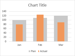
But you can’t use two gap width settings if the columns must be plotted on the same axis. When you plot them, the taller bars in the front obscure the shorter bars in the back, so you can’t compare the values.
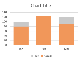
But you can still make Excel do what you want. (In fact, you can almost always make Excel do what you want, if you know how.) I’ll describe two ways to accomplish this.
Option 1: Fill Bars with Rectangular Shapes
This approach was the original topic of this tutorial.
Draw two rectangles, pretty tall. The taller the better for visual quality of the chart. Make the thinner rectangle the color you want, and make the thicker one transparent. Make the widths of the two rectangles in the same proportion as the widths you want for the bars in the chart. Center the two rectangles horizontally.

Select both rectangles, and copy (Ctrl+C). Select the series in the chart, and paste (Ctrl+V). The chart now uses the copied shapes as the fill for the selected series.

Pretty easy, once you know how.
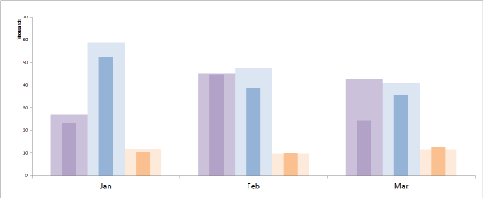
This comes in handy too if you need more than two widths. Without this trick, you couldn’t make the following chart even if you could use the primary and secondary axes:
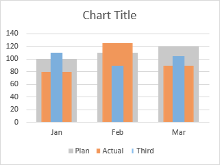
This requires two pairs of rectangles, a clear one and a relatively wide filled one for the second series, and a clear one and a relatively narrow filled one for the third. These are shown below:
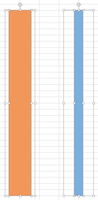
The advantage of this approach over the next is that the narrower bars keep their relative width, which is fixed by the ratio of filled rectangle to transparent rectangle used to fill the bars. The disadvantage is that if you want to adjust the width of the narrower bars, you need to adjust the width of the rectangles, then copy and paste onto the chart series.
Option 2: Error Bars with Multiple Widths
My colleague Andy Pope has pointed out in the comments that another approach for this effect is to use error bars for the narrower bars. In Excel 2003 and earlier, you had few options for line width, but since Excel 2007, you can make lines of seemingly any arbitrary thickness.
I’ll show Andy’s technique for three sets of bars. It’s even easier for two sets of bars.
I’ll start with the original column chart, setting overlap temporarily to zero so the different sets of error bars don’t obscure each other. The first thing to do is hide the bars you want to display narrower, that is, use no fill color for them. I’ve kept a colored outline to show what’s going on.
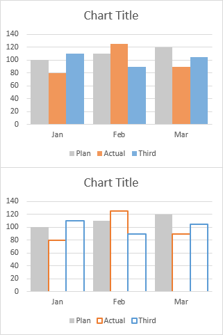
Add error bars to the series you want to show as narrower bars.
Customize the error bars using the Minus Only, No Caps, and 100% Percentage value options.
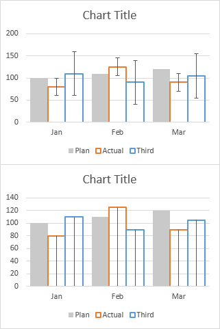
Now comes the magic. Apply the desired line colors to the error bars, and make the error bar lines thicker. Here I’ve used 11.25 pt for the orange bars and 5.75 pt for the blue bars.
Then I’ve hidden the outlines of the original bars.
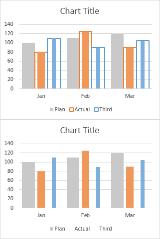
Change the overlap back to 100 so the bars are all centered on the categories (the month labels).
This has made the unchanged bars for Plan much wider, so we need to adjust the line widths of our error bars. I’ve settled on 30 pt for the orange and 12 pt for the blue.
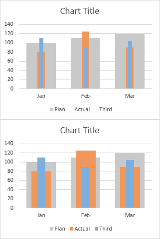
I used a little trick to reapply the bar colors to the legend. When I made the bars transparent, I started with the entire series formatted with the desired color. Then I selected one bar at a time instead of the entire series, and used no fill for the bar. Working point-by-point in this way leads Excel to believe that the series as a whole has not been changed, so it leaves the legend entries alone.
The disadvantage of the error bar approach is that any reformatting that changes the widths of the original bars (changing overlap, adding points to each series, stretching the chart) will distort the relative widths of the error bars and the original bars.
The advantage is that these widths can be adjusted very easily by formatting the error bar lines, without having to fiddle with the widths of the rectangles which must then be copied and pasted onto the series bars.


tamoghna says
Cool trick!!
GMF says
This post is very useful, but after seeing “You can almost always make Excel do what you want.” I had to ask…
I saw this graphic
http://www.economist.com/news/united-states/21591190-united-states-amoeba
before reading your post and idly wondered if one could make it in Excel. With your comment I felt I had to bring it to your attention. I would assume Excel could handle it, though don’t know if it would be worth the effort on a large dataset.
Jon Peltier says
GMF –
About that Amoeba graphic…
Sure, you could use Excel for this, but the data handling must be overwhelming. Each of 100 points can connect with any of the remaining 99, and the position of each point is based on which other points it is connected to. Excedrin headache.
Andy Pope says
Another approach would be to use Custom Error Bars, so limited to xl2007 onwards.
lockdalf says
Well, there is a simpler trick that can do the job if you need to have two overlapping columns and that is stroke and fill. I use full color 2 point stroke with no fill for forecast and no stroke 40-60 % color fill with about 50% transparency settings. So if your actual data is lower than FC it seems that the bar is only partially filled. It actual is higher, thanks to transparency you can still see what the FC was…
Jean-Paul Roche says
Jon, Excellent as usual.
For the column bar chart with 2 bars : no problem.
I try to build the column chart with 3 bars, I could not get the expected result by drawing three large rectangles.
Can you complete the process of constructing the chart ?
Thanks
Bryan says
Goodness, Jon, that’s genius.
You also finally solved a problem I’ve had with displaying two points of data. I was working with error bars to show the “goal”, but I think this version will look a lot better for what I want.
Jon Peltier says
Jean-Paul –

You need two pairs of rectangles, a clear one and a relatively wide filled one for the second series, and a clear one and a relatively narrow filled one for the third. These are shown below:
Jon Peltier says
Lockdalf –
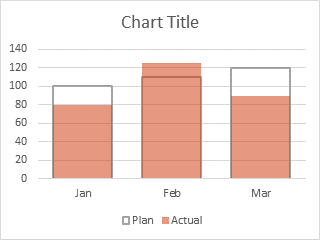
By “stroke”, I assume you mean the border of the bars. I’ve actually written about this technique in the past, somewhere on this blog. The result is something like this, no?
I typically plot the target series second, so it appears in front of the actual series, and I don’t need to use transparency.
lockdalf says
Jon,
precisely like that… who knows, I might have gotten it from you some time ago after all… ;o]]] I just use thicker border to make it more prominent… and good idea with changing the plotting order would make it look a bit less ‘dull’. Will have to implement it…;o]]]
Jon Peltier says
Andy –
Thanks for the suggestion. I’ve added it as a second approach.
Jean-Paul Roche says
Jon,
Done perfectly
Thanks a lot
Michael Slattery says
Thanks Jon:
I am attempting to do something similar, but sufficiently differently that you approach does not address my issue. I simply want to graph, 3 bar charts so they appear to be directly in front of each other. I change the transparency of the top two in order to always be able to view all of the data. Each bar chart is always on the same axis with a scale of 0 to 10. I don’t want a stacked chart, i.e., all three data points in one bar.
My current solution is to make three separate charts and make both backgrounds transparent.
Can you point me to a solution for this?
Thanks Michael
Jon Peltier says
Michael –
99% or more of the time, when someone is stacking up charts and making the top ones transparent, all the data can be shown in one chart.
In your case, you have three clustered column series, three area series, and two line series. They can all be plotted on the same chart. Start with a clustered column chart with all of them, then one-by-one select a series and change its type.
The three clustered column series have the primary color fills and 100% overlap.
The three area series have thick primary color borders and primary color fills with 50% or so transparency.
The two dashed lines actually require two lines, to get the two-colored dash effect. Plot each twice, color the first one (underneath) solid white and the second one (on top) with the primary color.
Of course, it may be possible to redo the chart to make it more visually appealing and more cognitively effective. Light or white background, less saturated colors, thinner lines. Are the series all directly comparable, or can they be partitioned into separate panels of a new chart, or even into separate charts?
Kris says
Hi Jon,
Thank you for sharing these tricks!
I have only one comment: I think there is no need to draw pretty tall rectangles, because Excel stretches it. The drawing is a rectangle, so there will not be any visual quality problem in case of vertical stretching.
Cheers,
Kris
Jon Peltier says
Kris –
Back in Excel 2000 what you say is true. In Excel 2002 or 2003 Microsoft started on a big antialiasing kick, where the edges of any feature in an image would be smeared out when it was stretched or shrunk. If you tried to fill a chart bar with a copied rectangle, the edges would not be sharp, and there would seem to be a border even if the rectangle had no border or a border with the same color as the fill. The only way around this was to use very large rectangles, so the pseudo border would be at most one pixel wide.
I haven’t checked 2013 carefully. The edge problem in stretched images isn’t as bad as in 2003, but to be sure my chart appears as nice as possible, I’ll keep using large images and shrink them.
Kris says
Thank you Jon for the answer.
I see now, you are right, in 2007 the top and bottom of the bar has some border, while in 2010 and 2013 it seems correct, so not border. But it is true better to use a method which works in all versions.
Bill McNair says
I am a big fan of using the x-y plot with error bars methodology. Thank you for including it in your solution. The x-y plot with error bars solution also works well for adding “programmed” rectangles (think quadrants) of any dimension anywhere on the plot. The error bars approach could be an alternative solution to the great article you wrote a while back – Shaded Quadrant Background for Excel XY Scatter Chart. Thanks!
Rohit says
Thanks a lot for this post. Is it possible to go one step further and show 3 sets of 3 overlapping bars for each month ?
That is, the above example would then have a total of 9 sets of 3 overlapping bars, 3 sets for each month
Jon Peltier says
Rohit –
If I knew exactly what you wanted I could answer more intelligently. Do you want three clusters of three overlapping bars for each month? If so, her you go:
Starting with this typical data, create a clustered column chart.
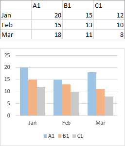
Arrange the additional data as shown below. The values in the first column are for the X values of these points, and will line up with a column chart that has 0% overlap and 100% gap width.
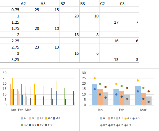
Copy and paste this additional data into the chart as new series (bottom left).
Convert these added series to XY type (bottom right).
Add error bars to all of the XY series (below left).
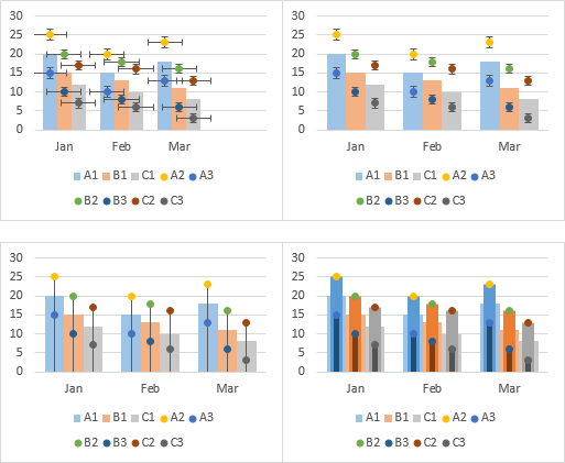
Delete the horizontal error bars (below right).
Change the vertical error bars to show only minus bars with a percentage of 100%, and with no end caps (bottom left).
Choose appropriate colors and line widths for the error bars (in this chart, for example, I used 8pt and 4pt) (bottom right).
Format the XY series to show no markers (they already showed no lines). Then adjust the colors if necessary to find a combination that doesn’t obscure itself.
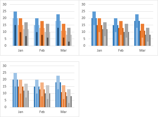
If you can arrange the series in order of height, it may help with readability. Or not.
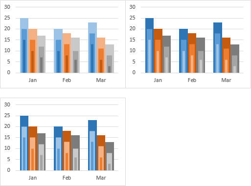
Rohit says
That is exactly what I was looking for Jon. Thanks! I later realised that I could do with two over lapping bars and set the color fill for the third bar to “None”
I am amazed to see how you and other folks on the internet manage to find workarounds to get the data visualization needed in Excel. For example, in the overlapping bar charts, the concept of pasting data from the second table directly onto the chart. I had never thought of that.
Jon Peltier says
Rohit –
Paste Special isn’t a workaround, but I guess people aren’t so familiar with it. Much easier than adding data series by series in that awful dialog.
Richard says
Jon,
Thanks for these tips, they’re really awesome. I wanted to write a note cause im having trouble. I’m using the error bar method, and am having trouble putting it in a presentation everytime i copy the graph into powerpoint it screws up the overlapping bars. it doesn’t matter if i use paste special or not. do you know what’s going on here?
Here’s the link to the pictures:
https://drive.google.com/file/d/0Bz8i1aVNCT1HSTFMNElycGt0dTg/edit?usp=sharing
I put the screenshots in a word file so you can see the appearance in excel and then in powerpoint
Jon Peltier says
Richard –
Looks like PowerPoint is tampering with the stacking order of the error bars. If you change the series order (before or after pasting into PowerPoint), does that have any effect.
I suspect if you copy the chart as a bitmap, it will be pasted with everything in the right order. You need to make the chart the same size in Excel as it has to be in PowerPoint.
Ambarish says
My data is –
Budget Actual Joiners
Jan 2000 1000 10
Feb 3000 3300 20
Mar 2500 1500 30
I created overlapped graph for Budget and Actual column by moving Budget column to secondary axis. Now since values of Joiners column are so small, I am not able to create line graph using secondary axis. Please help.
Jon Peltier says
Ambarish –
Neither Option 1 and Option 2 in my tutorial require the use of the secondary axis, so it should be available for the Joiners data.
Sifora says
The error line method worked perfectly! Thanks!!
Nick says
Any advice on a magical reordeing of the error bars? I format my triple series overlapping bars using the error bar technique – it looks great. But after i save my workbook, close it, open it back up – the order of the bars has now changed… what was on level 2 is now in front of everything… :( Any advice on reordering error bars? I’ve tried reordering my source data, doing it fresh in a new workbook, all with the same result.
Jon Peltier says
Hi Nick –
Column chart series are ordered with series 1 in back, series 2 in between, and series 3 in front. These are unchanged for me if I close and reopen the workbook. This is more obvious if the bars are partially overlapped.
If I do the error bar trick with the above chart, with a visible border on the orange and blue bars to match the orange and blue error bars, you can see that the error bars keep the same order. But note that all error bars are drawn in front of all column borders (the orange error bars obscure the blue borders.
However, I don’t need those borders. So when I show just the gray columns and the orange and blue error bars, the colors are in the same stacking order or gray – orange – blue.
I made the above charts in a brand new workbook. Saving, closing, and reopening the workbook does not change this.