The Problem: Your Y data is in more than a single row or column.
If you try to populate a chart series with 2D data where it isn’t allowed, you’ll encounter this error:
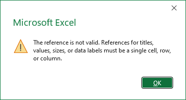
The reference is not valid. References for titles, values, sizes, or data labels must be a single cell, row, or column.
This isn’t strictly true. Not one of the objects listed is restricted to a single cell. Any text element in a chart (chart or axis titles, data labels, or shapes) can link to multiple cells, but the linked range must be contiguous and in a single row or column; the same is true for the name of a series. The X values of a chart series can be multiple rows or columns, which produce tiered axis labels such as those shown in LAMBDA Function to Build Three-Tier Year-Quarter-Month Category Axis Labels. The Y values of a chart series must link to data in a single row or column.
The Setup: Y data is in multiple rows or columns.
Here is the problem. The data contains more than one row (below left) or column (below right) but want it to be plotted in a single series. If you select the data and insert a chart, Excel parses the data into two chart series. The series formulas are shown below the charts, with font colors matching the series colors.
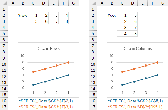
Let’s try to fix this. First, delete the second series of the chart.
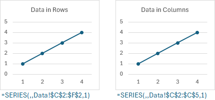
Now try to enter the larger range into the series formula.
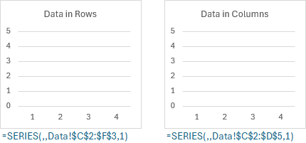
Excel rejects the changed formula, with the error message described earlier.

There is an exception to the single row or column rule for Y values. You can specify compound (multiple-area) ranges for Y values, as shown below for our multiple row and multiple column data ranges. The multiple areas in a compound range don’t even all need to be all by row or by column.
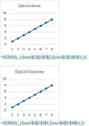
This works pretty well, but I think it’s pretty difficult to understand and maintain.
TOROW and TOCOL to the rescue!
Microsoft has released a plethora of new Dynamic Array functions. Among these are TOROW and TOCOL, which are used to arrange values in a 2D range into a new 1D range, shown below under the data ranges. TOROW and TOCOL produce ranges with the values in the same order, so whether we use one or the other is a matter of preference. There are two series formulas below each chart, showing the ranges produced by TOROW and TOCOL.
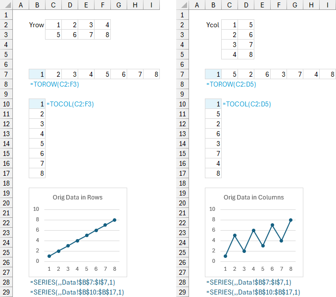
There is a problem, however. The charts don’t look the same for original data in rows vs in columns. This is because both TOROW and TOCOL take all the cells in the first row of the original data and append all cells in each successive row. This causes the data to be out of order when performing TOROW or TOCOL on columnar data. We can fix this by transposing the data first.
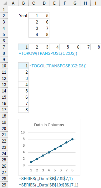
And now all of our charts are consistent.
You could also construct more complicated formulas with other Dynamic Array functions. For example, if I wanted to turn a multiple row range into a single row, I would use:
=LAMBDA(x,
  LET(
    rx,ROWS(x),
    cx,COLUMNS(x),
    MAKEARRAY(
      1,rx*cx,
      LAMBDA(r,c,
        INDEX(x,INT((c-1)/cx)+1,MOD(c-1,cx)+1)
      )
    )
  )
)(multi-row range)
To convert a multiple-column range into a single column, I would use:
=LAMBDA(x,
  LET(
    rx,ROWS(x),
    cx,COLUMNS(x),
    MAKEARRAY(
      rx*cx,1,
      LAMBDA(r,c,
        INDEX(x,MOD(r-1,rx)+1,INT((r-1)/rx)+1)
      )
    )
  )
)(multi-column range)
I’m sure people can write more efficient formulas than this, but the TOROW and TOCOL formulas are very concise.
Use Names to keep the worksheet clean
We can implement TOROW and TOCOL in Names rather than in the worksheet, and the Names work just fine in the chart SERIES formulas. Go to Formulas > Define Name; for Name type YrowTOROW; for Scope select the current sheet (Data); and for Refers to enter =TOROW(), put the cursor between the parentheses, and select C2:F3; then press Enter.
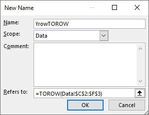
The four relevant names are:
Name: YrowTOROW
Refers To: =TOROW(Data!$C$2:$F$3)
Name: YrowTOCOL
Refers To: =TOCOL(Data!$C$2:$F$3)
Name: YcolTOROWT
Refers To: =TOROW(TRANSPOSE(Data!$C$2:$D$5))
Name: YcolTOCOLT
Refers To: =TOCOL(TRANSPOSE(Data!$C$2:$D$5))
These all produce the same values in the same order in either horizontal or vertical arrays. The chart SERIES formulas do not care. Notice that we applied the lesson from before, of transposing the columnar data before using TOROW or TOCOL; I’ve appended a T on these Names.
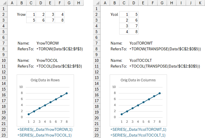
Same result as before. Using Names keeps the worksheet cleaner, but I don’t mind seeing the actual data I’m plotting in my worksheet.
Neat Trick: Double Unary Minus
Last week I learned a new trick. Well, it was new to me, but apparently it has been around for a long time, predating Dynamic Arrays by decades. My colleague Roberto Mensa was showing me some of his recent charting exercises (check them out at E90E50Charts – Excel Charts Gallery) and he showed me this trick.
You can use a double unary minus, that is, a double minus sign, to force an Excel chart to treat a multiple row or column range as a single array. The double minus is used to convert TRUE and FALSE to 0 and 1, to convert text into numeric values, and in this case to convert a range into an array. When a 2D array is passed to a chart series, it combines all rows of the array into a 1D array.
The double minus must be used in a Name in order to work with chart data. You can define the following names for row-based or column-based data:
Name: YrowMINUS
Refers To: =--Data!$C$2:$F$3
Name: YcolMINUST
Refers To: =--TRANSPOSE(Data!$C$2:$D$5)
Define them in the scope of the workbook Data, and as before, transpose the columnar data first. Then you can edit the SERIES formulas to use these Names.
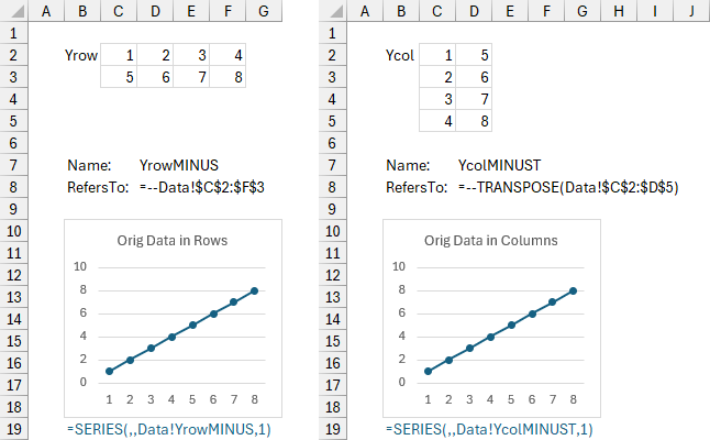
This double minus approach doesn’t take precedence over the Names that use TOROW or TOCOL, of course, it’s just another tool for your toolbox.


Leave a Reply