What’s a “Technical” Dot Plot?
This chart is crisp and well suited for publication in a technical journal, hence the name I’ve given it, “Technical” Dot Plot. The chart below show results of a hypothetical clinical trial, where the X values (categories) are three different cleansing approaches, and the Y values are the individual responses, where a lower value indicates fewer incidences of infection.
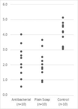
This “technical” dot plot chart shows each individual response, to give you an idea of the distribution of results. This is more detailed than a simple average, or even a box plot, which simplifies the data distribution into its min, max, median, and quartiles. If desired, each category could have different marker (dot) shapes, sizes, or colors. However, that isn’t necessary.
Other Kinds of Dot Plot
If you Google “Dot Plot”, or search Wikipedia or any other resource, you’ll learn that the phrase “dot plot” can mean many different things. In addition to what I call the “Technical” Dot Plot shown above, there are also “Cleveland” Dot Plots, “Kindergarten” Dot Plots, and Scatter Plots. Technical Dot Plots, Cleveland Dot Plots, and Scatter Plots are all effective means of displaying data. Unfortunately people who display data effectively do not always come up with effective and unique names for their charts.
“Cleveland” Dot Plot
This type of graphic is named for William Cleveland who described them in a 1984 paper with coauthor Robert McGill. They were presented nicely by Naomi Robbins in Dot Plots: A Useful Alternative to Bar Charts.
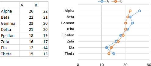
Peltier Tech Charts for Excel can create this type of chart as easily as any built-in Excel chart.
These are often a better alternative to horizontally-oriented line charts, especially since the category labels can be reasonably long and still remain horizontal for improved readability.

“Kindergarten” Dot Plot
I call this the “Kindergarten” Dot Plot, because it feels more like a fingerpainted art project than a serious means of visualizing data. It is built by adding a dot to the chart every time you encounter the given value in a set of numbers. See another value, dip your finger in paint and put another blot on the paper.
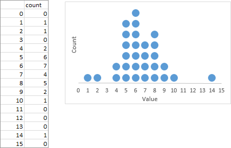
To me, the histogram below is a better representation of the distribution above. The simple bars show the values without distracting me into counting all those stupid little dots.

Peltier Tech Charts for Excel can create histograms easily in Excel. Excel’s old Analysis Toolpak used to make column charts that were passed off as histograms, and Excel 2016 for Windows has finally introduced native histograms.
You can represent a histogram as a line chart, below left, often called a “Probability Polygon”. It’s not a terrible representation, though I prefer the histogram.
Often you’ll see a probability polygon shown with markers and without line segments, and it’s also called a dot plot, below right. I find this inferior, because the dots are unconnected and seem to be strewn across the chart.

Scatter Plot
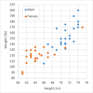
A Scatter Plot (a/k/a XY Chart, Scatter Chart, etc.) is often called a Dot Plot because dots (markers) are used to indicate individual data points.
Make a Technical Dot Plot
I’ll describe a few different ways to create Technical Dot Plots. The end result is the same, but the protocol differs because you may have different data layouts available for use.
Regardless of data layout, we will make a combination chart, using a column chart type to get the nice horizontal axis labels and XY Scatter types to get the dots.
Data Layout A – Multiple X and Y Series
The first data layout has separate X and Y values for each category in the chart. The X and Y ranges for each set of dots may be next to each other:
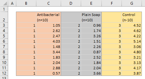
or the X and Y ranges for each set of dots may be separated from each other:
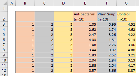
You also need a small table with the category names and zero values. Select this small table, and insert a column chart. The chart appears to contain no data, because the zero values produce bars with zero height. Format this chart now (or later) as appropriate.

Copy and select the orange shaded data range, either B2:C12 in the example with the X and Y ranges together or B2:B12 and E2:E12 in the example with the separated X and Y ranges. To select multiple areas, select the first area, then hold Ctrl while selecting additional areas.
Select the chart, then go to Home tab > Paste dropdown > Paste Special, and choose the options shown in the dialog below, to add the data as new series, values in columns, series name in first row, categories in first column.
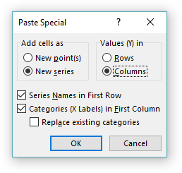
This results in the data being added as a new column series (below left). The categories are temporarily messed up: the three original categories are forced to the left because the new series has more points.
Right click on the added series, and choose Change Series Chart Type from the pop-up menu. Choose the XY Scatter type with markers and no lines. The result is a set of orange dots, plus secondary X and Y axes added to the chart (below right).
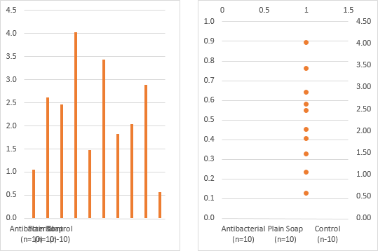
Select the series of dots and press Ctrl+1 (numeral one), the shortcut to open the Format Selected Object in Excel. Change the series from secondary to primary axis. Without an explicit X axis for the series, the X values of 1 align the points above the first category along the horizontal axis (below left).
Excel 2013 introduced a new Change Chart Type dialog which allows you to change chart types and axis of multiple series at once; this greatly reduces steps needed for this in a combination chart like this.
Copy and select the gray shaded data range, either D2:E12 in the example with X and Y ranges together or C2:C12 and F2:F12 in the example with separated X and Y ranges. Select the chart, and use Paste Special to add the data as new series, values in columns, series name in first row, categories in first column. The result is a set of gray dots added to the chart (below right). Excel remembers that the previous added series was changed to an XY type with markers and no lines on the primary axis, so it uses these settings for the new series. The X values of 2 position the gray dots above the second category along the X axis.
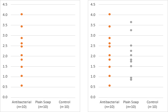
Copy and select the gold shaded data range, either F2:G12 in the example with X and Y ranges together or D2:D12 and G2:G12 in the example with separated X and Y ranges. Select the chart, and use Paste Special to add the data as before. The result is a set of gold dots added to the chart (below left). Excel again applies an XY chart type with markers and no lines and assigns the series to the primary axis. The X values of 3 position the gold dots above the third category along the X axis.
If you don’t need different colors for the different sets of dots, format them all the same (below right).
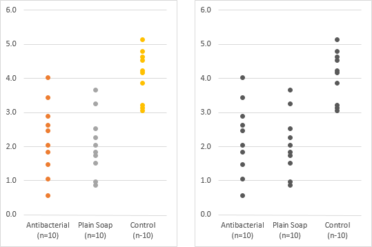
The technical dot plot is ready for publication.
Data Layout B – Single X with Multiple Y Series
The second data layout has a single set of X values with three sets of Y values, as shown below. This is easier than the previous data layout, because it requires only one Copy-Paste-Special cycle. Don’t worry about the blank cells; Excel will ignore them in the chart.
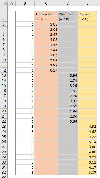
You also need a small table with the category names and zero values. From this small table, you insert a column chart. The chart appears to contain no data, because the zero values produce bars with zero height. Format this chart now (or later) as appropriate.

Select and copy the data range (B2:E32 in the example above). Select the chart, then go to Home tab > Paste dropdown > Paste Special, and choose the options shown in the dialog below, to add the data as new series, values in columns, series name in first row, categories in first column.

This results in the data being added as three new column series (below left). The categories are temporarily messed up: the new series have many more points, forcing the three original categories to the left.
Right click on the first added series, and choose Change Series Chart Type from the pop-up menu. Choose the XY Scatter type with markers and no lines. The result is a set of orange dots, plus secondary X and Y axes added to the chart (below right).

Change the chart type of the second and third added series from column to XY Scatter, so that there are three sets of colored dots on the secondary axes (below left).
Select the first series of dots and press Ctrl+1 (numeral one), the shortcut to open the Format Selected Object in Excel. Change the series from secondary to primary axis. Without an explicit X axis for the series, the X values of 1 align the points above the first category along the horizontal axis (below right).

Format the second and third set of dots so they are also plotted on the primary axis (below left). The X values of 2 and 3 position the dots above the second and third categories on the X axis.
Excel 2013 introduced a new Change Chart Type dialog which allows you to change chart types and axis of multiple series at once; this greatly streamlines the process to build a combination chart like this.
If you don’t need different colors for the different sets of dots, format them all the same (below right).

The technical dot plot is ready to go.
Data Layout C – Single X and Y Series
The third data layout has a single set of X values and a single set of Y values, as shown below. This is the easiest of all, because it requires only one Copy-Paste-Special cycle, and there is only one series to be modified once it’s been added to the chart.

You also need a small table with the category names and zero values. From this small table, you insert a column chart. The chart appears to contain no data, because the zero values produce bars with zero height. Format this chart now (or later) as appropriate.

Select and copy the data range (B2:E32 in the example above). Select the chart, then go to Home tab > Paste dropdown > Paste Special, and choose the options shown in the dialog below, to add the data as new series, values in columns, series name in first row, categories in first column.

This results in the data being added as a new column series (below left). The categories are temporarily messed up: the three original categories are forced to the left because the new series has way more points.
Right click on the added series, and choose Change Series Chart Type from the pop-up menu. Choose the XY Scatter type with markers and no lines. The result is a set of orange dots, plus secondary X and Y axes added to the chart (below right).

Select the series of orange dots and press Ctrl+1 (numeral one), the shortcut to open the Format Selected Object in Excel. Change the series from secondary to primary axis. Without an explicit X axis for the series, the X values of 1, 2, and 3 align the points above the first, second, and third category along the horizontal axis (below right).
Excel 2013 introduced a new Change Chart Type dialog which allows you to change chart types and axis of multiple series at once; this greatly simplifies formatting of a combination chart like this.
If you don’t need different colors for the different sets of dots, format them all the same (below right).
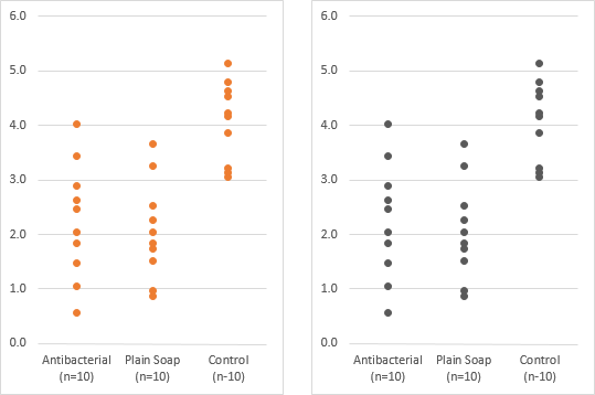
Your new technical dot plot is good to go.


Daniel says
If I may add to this, one problem with technical dot plots is that dots may overlap, hiding the true distribution of the data.
I come from the life sciences where Excel is often used to produce these kinds of plots. In one lab where I worked, people adjusted the values in the ‘category’ column by small increments (e.g., 1.0 -> 1.1), in order to spread out the dots.
This was too cumbersome for me, so I remembered my VBA skills and produced a helper function: http://www.xltoolbox.net/spreadscatter.html (I call it ‘spread scatter’, but it’s the same as the technical dot plot.)
Sorry about the self-advertisement, but it’s open source software and it may be useful to some readers of your blog.
Xan Gregg says
There’s one feature of the “Wilkinson” dot plot that is often overlooked and which sets it apart from the “Kindergarten” dot plot: the horizontal spacing is not necessarily regular. When the values are not dense, dots will appear at their exact locations rather than in binned locations. Besides that, another advantage they have over histograms is the ability to show individual selection or even color.
I’m not trying to make the case for such dot plots, just getting the facts straight. The big disadvantage is scaling, which is problem for all dot plots but worse for those that rely on dodging.
Jon Peltier says
Xan –
Do you have an example?
Xan Gregg says
Here’s the paper where Wilkinson tries to formalize the construction of statistical dot plots. Some examples are included.
https://www.cs.uic.edu/~wilkinson/Publications/dots.pdf
The abstract:
Dot plots represent individual observations in a batch of data with symbols, usually circular
dots. They have been used for more than a hundred years to depict distributions in detail. Hand-drawn
examples show their authors’ efforts to arrange symbols so that they are as near as possible
to their proper locations on a scale without overlapping enough to obscure each other. Recent
computer programs that attempt to reproduce these historical plots have unfortunately resorted to
simple histogram binning instead of using methods that follow the rules for the hand-drawn examples.
This paper introduces an algorithm that more accurately represents the dot plots cited in the
literature.
Jon Peltier says
Xan –
Thanks, this is rather interesting. I found the data and am following the protocol, but can’t exactly get the plot in Wilkinson’s paper. But it’s close, and I don’t have the original version of the data set.
This will be tricky to write Excel formulas for, but I’ll work on it. I think it will be worthwhile.
Xan Gregg says
Cool. We made an add-in for JMP a couple years ago (http://blogs.sas.com/content/jmp/2013/08/21/jmp-add-in-for-statistical-dot-plots/) based on that paper. However, I do remember some of the rules not working out as expected. Figured it was most likely my stupidity and just we tried to capture the intent, but maybe something is missing or out of context in the math.
Jon Peltier says
I don’t think it’s stupidity. I think it still could be rounding or truncation differences in different editions of the data, and perhaps small deviations in how different algorithms handle the distributions. I was going to blame the “twiddle value” as well, but that seems to be just a way to standardize the horizontal positioning of dots in a stack.
Years ago I wanted to use “JMP Software” for my company name (“M” is my middle initial), but a quick Google search turned up JMP on the SAS website. But now I like “Peltier Tech” better.
Jon Peltier says
I’ve worked out how to use Excel formulas to condition the data for “Wilkinson” dot plots. The same routines will be helpful to show overlapping points in the “Technical” dot plots in my example above. The original plot is shown below at left, the plot with points jittered horizontally according to kernel density at right.
So I guess I’m working on a rewrite…
Andy says
This is pretty great work. Are you able to make available the technique used to horizontally jitter the overlapping points?
Jon Peltier says
Hi Andy –
What I have isn’t quite ready yet. I realize there is a moving average component that I’d left out. But the gist of it is in the Wilkinson paper cited in Xan Gregg’s second comment.
Andy says
Thanks for such a prompt response. I looked at the paper and realized I’d rather pay $99 than figure it out myself :).
Jon Peltier says
Andy –
It’s not in the product yet!
Barbara says
Hi,
thank you for the information.
Is there a way to include a bar with the mean and the STDEV into the “technical” dot plot?
Jon Peltier says
Barbara –
This is like a box plot (see my tutorial on Box and Whisker Charts). Instead of using zeros for the dummy series that uses the categories for its X values (the first series in the chart), you would start with three series, plotted as stacked columns, then the dots are plotted on top as above.
Here’s the data. The average and standard deviation data are used to calculate the blank (average minus std dev), lower (std dev), and upper data (std dev again).
Make a stacked column chart of the summary data (below left). Format series Blank as No Fill, and give series Lower and Upper a lighter fill (below right)
Copy and paste-special the individual data (below left, then convert from another stacked column to XY Scatter series type (below right)
Assign the dot series to the primary axis (below left), then format it as desired (below right).
Claudia says
Hello!
I am having a little trouble creating a technical dot plot. In fact, after this very step:
” Right click on the first added series, and choose Change Series Chart Type from the pop-up menu. Choose the XY Scatter type with markers and no lines. The result is a set of orange dots, plus secondary X and Y axes added to the chart (below right). ”
the X axis is changed to a value axis, when I want a category axis.
What can I do to solve my problem?
Thanks!
richard edmonds says
In excel 2013 every series is changed to xy scatter when you select one series and change it resulting in loss of the catagory lables. To solve this you need to select the chart, switch to the the design tab, select change chart type, and seperately choose xy scatter for the data and clustered columns for the lables. Hopefully this will save the next person the 10 minutes it cost me to figure that out.
Claire H says
I used the “Data Layout B – Single X with Multiple Y Series” to create a technical dot plot – incredibly useful, thank you!
I need to go one step further and show the relationship between columns – connecting the dots, if you like. For example, how an individual performed at time point 1 compared to time point 2.
Can anyone offer assistance with this please?
Jon Peltier says
Claire –
To trace data across the chart, you will need to go about this differently. In my examples, it is assumed that the three sets (columns) of data are independent, and there may not be the same number of points in each column. Since you’re tracing individuals, you will have a row of related data for each individual, and the same number of points in each column as you have individuals providing data for each.
So you just need a simple table, categories across the top, individual names down the first column, and values in the grid. Create a simple line chart with data in rows, and label the last point of each series with the series name, which is the individual’s name.
This type of chart is often called a slope graph.
Edouard says
Are you able to make available the technique used to horizontally jitter the overlapping points?
Jon Peltier says
Hi Edouard –
I’d really love to share it. Unfortunately I can’t find the workbook I used to generate the lateral coordinates for those plots. It’s not really jittering (which I find overly random), it’s a kernel density thing, which I only vaguely understand. I have a number of projects I’d like to use it in.
name says
There’s a new paste special that’s super weird looking and it looks nothing like the old. Can you update this to the latest office 365 or 2019?
Jess says
Hi there,
Is there a way to stack points with one y-axis group of values (survival ranging from 0 to 100%) and three grouping categories, where there is a primary (year) and secondary x-axis (species) as well as a grouping variable signaled in the legend (treatment)? Where Jon Peltier replies to Claire on June 4 2018, this is the similar idea, with the addition of an x-axis and multiple points to display 4 points (rep) for each categorical combination year (4 points [rep] to display vertically for a particular year – species – treatment). Operating office 2016. I was unable to paste a graph of the data I am working with, but I’ll try a table:
Species Year Treatment Rep Survival
CORNSTO 1 0cm PMM 1 100
CORNSTO 1 0cm PMM 2 100
CORNSTO 1 0cm PMM 3 33.33333333
CORNSTO 1 0cm PMM 4 100
CORNSTO 2 0cm PMM 1 33.33333333
CORNSTO 2 0cm PMM 2 100
CORNSTO 2 0cm PMM 3 33.33333333
CORNSTO 2 0cm PMM 4 100
CORNSTO 3 0cm PMM 1 0
CORNSTO 3 0cm PMM 2 0
CORNSTO 3 0cm PMM 3 33.33333333
CORNSTO 3 0cm PMM 4 100
ELYMTRC 1 0cm PMM 1 100
ELYMTRC 1 0cm PMM 2 100
ELYMTRC 1 0cm PMM 3 100
ELYMTRC 1 0cm PMM 4 100
ELYMTRC 2 0cm PMM 1 100
ELYMTRC 2 0cm PMM 2 100
ELYMTRC 2 0cm PMM 3 100
ELYMTRC 2 0cm PMM 4 100
ELYMTRC 3 0cm PMM 1 100
ELYMTRC 3 0cm PMM 2 100
ELYMTRC 3 0cm PMM 3 100
ELYMTRC 3 0cm PMM 4 100
PINUBAN 1 0cm PMM 1 100
PINUBAN 1 0cm PMM 2 100
PINUBAN 1 0cm PMM 3 0
PINUBAN 1 0cm PMM 4 100
PINUBAN 2 0cm PMM 1 0
PINUBAN 2 0cm PMM 2 33.33333333
PINUBAN 2 0cm PMM 3 0
PINUBAN 2 0cm PMM 4 33.33333333
PINUBAN 3 0cm PMM 1 0
PINUBAN 3 0cm PMM 2 33.33333333
PINUBAN 3 0cm PMM 3 0
PINUBAN 3 0cm PMM 4 33.33333333
POPUTRE 1 0cm PMM 1 66.66666667
POPUTRE 1 0cm PMM 2 66.66666667
POPUTRE 1 0cm PMM 3 33.33333333
POPUTRE 1 0cm PMM 4 100
POPUTRE 2 0cm PMM 1 33.33333333
POPUTRE 2 0cm PMM 2 66.66666667
POPUTRE 2 0cm PMM 3 33.33333333
POPUTRE 2 0cm PMM 4 100
POPUTRE 3 0cm PMM 1 33.33333333
POPUTRE 3 0cm PMM 2 66.66666667
POPUTRE 3 0cm PMM 3 33.33333333
POPUTRE 3 0cm PMM 4 100
CORNSTO 1 10cm PMM 1 66.66666667
CORNSTO 1 10cm PMM 2 100
CORNSTO 1 10cm PMM 3 100
CORNSTO 1 10cm PMM 4 100
CORNSTO 2 10cm PMM 1 66.66666667
CORNSTO 2 10cm PMM 2 100
CORNSTO 2 10cm PMM 3 100
CORNSTO 2 10cm PMM 4 100
CORNSTO 3 10cm PMM 1 66.66666667
CORNSTO 3 10cm PMM 2 100
CORNSTO 3 10cm PMM 3 100
CORNSTO 3 10cm PMM 4 100
ELYMTRC 1 10cm PMM 1 100
ELYMTRC 1 10cm PMM 2 100
ELYMTRC 1 10cm PMM 3 100
ELYMTRC 1 10cm PMM 4 100
ELYMTRC 2 10cm PMM 1 100
ELYMTRC 2 10cm PMM 2 100
ELYMTRC 2 10cm PMM 3 100
ELYMTRC 2 10cm PMM 4 100
ELYMTRC 3 10cm PMM 1 100
ELYMTRC 3 10cm PMM 2 100
ELYMTRC 3 10cm PMM 3 100
ELYMTRC 3 10cm PMM 4 100
PINUBAN 1 10cm PMM 1 100
PINUBAN 1 10cm PMM 2 100
PINUBAN 1 10cm PMM 3 100
PINUBAN 1 10cm PMM 4 100
PINUBAN 2 10cm PMM 1 100
PINUBAN 2 10cm PMM 2 100
PINUBAN 2 10cm PMM 3 100
PINUBAN 2 10cm PMM 4 100
PINUBAN 3 10cm PMM 1 100
PINUBAN 3 10cm PMM 2 100
PINUBAN 3 10cm PMM 3 100
PINUBAN 3 10cm PMM 4 100
POPUTRE 1 10cm PMM 1 100
POPUTRE 1 10cm PMM 2 100
POPUTRE 1 10cm PMM 3 100
POPUTRE 1 10cm PMM 4 100
POPUTRE 2 10cm PMM 1 100
POPUTRE 2 10cm PMM 2 100
POPUTRE 2 10cm PMM 3 100
POPUTRE 2 10cm PMM 4 100
POPUTRE 3 10cm PMM 1 100
POPUTRE 3 10cm PMM 2 100
POPUTRE 3 10cm PMM 3 100
POPUTRE 3 10cm PMM 4 100
CORNSTO 1 30cm PMM 1 100
CORNSTO 1 30cm PMM 2 100
CORNSTO 1 30cm PMM 3 100
CORNSTO 1 30cm PMM 4 100
CORNSTO 2 30cm PMM 1 100
CORNSTO 2 30cm PMM 2 100
CORNSTO 2 30cm PMM 3 100
CORNSTO 2 30cm PMM 4 100
CORNSTO 3 30cm PMM 1 100
CORNSTO 3 30cm PMM 2 100
CORNSTO 3 30cm PMM 3 100
CORNSTO 3 30cm PMM 4 100
ELYMTRC 1 30cm PMM 1 100
ELYMTRC 1 30cm PMM 2 100
ELYMTRC 1 30cm PMM 3 100
ELYMTRC 1 30cm PMM 4 100
ELYMTRC 2 30cm PMM 1 100
ELYMTRC 2 30cm PMM 2 100
ELYMTRC 2 30cm PMM 3 100
ELYMTRC 2 30cm PMM 4 100
ELYMTRC 3 30cm PMM 1 100
ELYMTRC 3 30cm PMM 2 100
ELYMTRC 3 30cm PMM 3 100
ELYMTRC 3 30cm PMM 4 100
PINUBAN 1 30cm PMM 1 100
PINUBAN 1 30cm PMM 2 100
PINUBAN 1 30cm PMM 3 100
PINUBAN 1 30cm PMM 4 100
PINUBAN 2 30cm PMM 1 100
PINUBAN 2 30cm PMM 2 100
PINUBAN 2 30cm PMM 3 100
PINUBAN 2 30cm PMM 4 100
PINUBAN 3 30cm PMM 1 100
PINUBAN 3 30cm PMM 2 100
PINUBAN 3 30cm PMM 3 100
PINUBAN 3 30cm PMM 4 100
POPUTRE 1 30cm PMM 1 100
POPUTRE 1 30cm PMM 2 100
POPUTRE 1 30cm PMM 3 100
POPUTRE 1 30cm PMM 4 100
POPUTRE 2 30cm PMM 1 100
POPUTRE 2 30cm PMM 2 100
POPUTRE 2 30cm PMM 3 100
POPUTRE 2 30cm PMM 4 100
POPUTRE 3 30cm PMM 1 100
POPUTRE 3 30cm PMM 2 100
POPUTRE 3 30cm PMM 3 100
POPUTRE 3 30cm PMM 4 100
Jon Peltier says
Jess –
That’s a tough data set to visualize. I thought about it, and played a bit with your data, then decided it would be a much longer answer than would fit in the comments of a blog post.
I modified the data a bit, then wrote a new article which posted this morning. See Combination Chart for Multi-Factor Test Results. Here is what I came up with: