Low-Medium-High Charts
When comparing values, it is often desirable to compare ranges of values. You would use some kind of chart to plot Low-Medium-High values. Low and High typically refer to minimum and maximum values, and Medium might be an average or medium value.
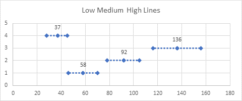
You could use a line to denote the range between Low and High…
… or you might prefer a thicker bar…
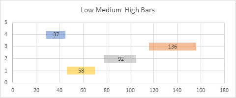
This article shows an easy way to set up such a chart, using error bars to construct the lines or bars.
This article uses techniques in two of my previous tutorials, Custom Error Bars in Excel Charts and Floating Bars in Excel Charts. It also shows ideas I shared when answering Making horizontal max-min-average chart in Excel in Stack Overflow.
You can download the companion workbook, Error Bars for Horizontal Lines and Bars.xlsx.
Low-Medium-High Chart with Horizontal Lines
The simple Low-Medium-High chart with lines is an XY Scatter chart with horizontal error bars. The data is simple: two columns with X (Medium) and Y values, two columns with Low and High values, and two columns with error bar lengths (from Low to Medium and from Medium to High). The error bar columns contain subtraction formulas to compute the values, but if you know the error bar lengths, you don’t need Low and High in the data range.

Selecting the X and Y columns of data, and insert an XY Scatter chart.
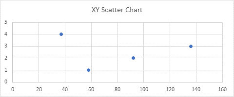
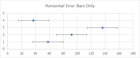
Click the plus icon next to the chart, and add error bars. Excel adds X and Y error bars with default values.
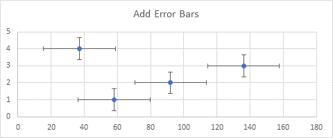
Select the vertical error bars, and click Delete.
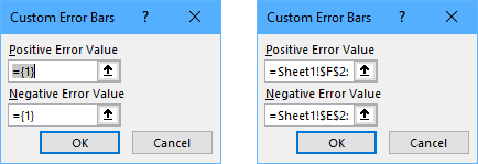
Select the horizontal error bars, use the Ctrl+1 shortcut to open the Format Error Bars task pane, and under Error Amount, choose Custom, and click Specify Value. The dialog shown below left appears (yes, the range boxes are really that narrow!), with default ={1} for the custom values. Select the ={1} in the first box, delete it, and select the range with the positive error bar values. If you don’t delete the default value before selecting the range, Excel may try to add the range to the {1} already in the box, and give you an error:
={1}+Sheet1!$F$2:$F$5
Repeat for the second box and the range with the negative error bar values (below right).
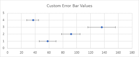
Here is the chart with our custom error bar values.
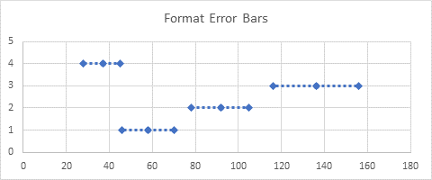
Format the error bars. Here I selected No Cap for the error bar’s end style, gave the line the same color as the XY markers, chose a dash style, and used the diamond-shaped option for begin and end arrow types.
Finally, click the plus icon next to the chart, and check the box to add data labels. Format the data labels so they are above the points, and so they show the X values, not the default Y values.
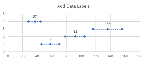
Low-Medium-High Chart with One-Colored Horizontal Bars
For a simple Low-Medium-High chart with one color bars, follow the same protocol as above, up to where you have applied custom error bar values. Select the markers, press the Ctrl+1 shortcut to open the Format Series task pane. Under the paint can icon, choose Marker > Marker Options > None.
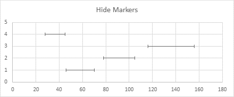
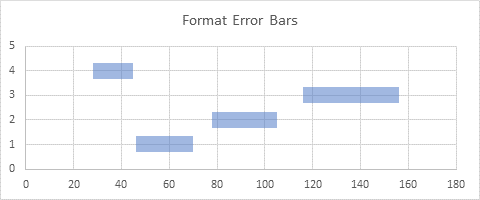
Format the error bars. Here I selected No Cap for the error bar’s end style, gave the line the first accent color in Excel’s default color scheme, gave it a transparency of 50% so the gridlines show through, and set the line width to 12 points.
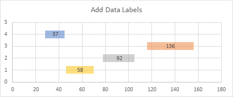
Finally, click the plus icon next to the chart, and check the box to add data labels. Format the data labels so they are centered on the points, and so they show the X values instead of the default Y values.
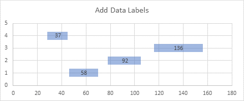
Unfortunately, all of the error bars have to be formatted the same, so you can’t do it so simply if you want different color bars. Read on for the procedure to create multi-colored bars.
Low-Medium-High Chart with Multi-Colored Horizontal Bars
In order to get multi-colored bars in the chart, you need multiple sets of error bars, which means multiple series in the chart. The data range is like that used above, but there are separate columns for Y values for each individual color of error bars. The other columns can be shared amonf the different series.

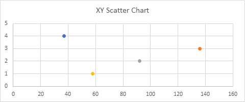
Select the columns with X and all Y values and insert an XY Scatter chart. Make sure Excel plots the data in columns. Each point in the sample chart below is a separate series, so each has its own color.
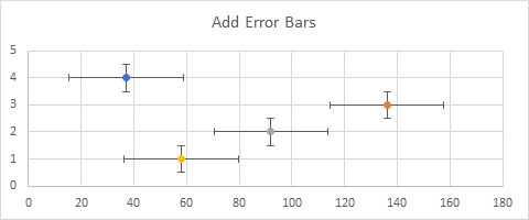
Click the plus icon next to the chart, and add error bars. Excel adds X and Y error bars with default values. The default Y error bar values are very small, so they are hidden by the markers; I’ve temporarily assigned a value of 0.5 you you can see them.
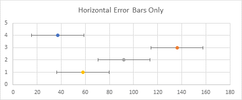
Select one set of vertical error bars, and click Delete; repeat for all other vertical error bars. Remember, each series has its own set.
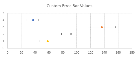
Select one set of horizontal error bars, use the Ctrl+1 shortcut to open the Format Error Bars task pane, and under Error Amount, choose Custom, and click Specify Value. Select the ={1} in the first box, delete it, and select the range with the positive error bar values (use the whole range, even though the series has fewer points). Repeat for the second box and the range with the negative error bar values.
Repeat for each additional set of horizontal error bars, using the same positive and negative range for each.
Select one of the markers, press the Ctrl+1 shortcut to open the Format Series task pane. Under the paint can icon, choose Marker > Marker Options > None. Repeat for the other series.

Format the error bars. Use No Cap for the error bar’s end style, give the line its own unique color with a transparency of 50% so the gridlines show through, and set the line width to 12 points.

Finally, click the plus icon next to the chart, and check the box to add data labels. Format the data labels so they are centered on the points, and so they show the X values instead of the default Y values.


Doug Gabbard says
The opening paragraph is clear enough to tell me that I should expect something like a simplified version of a boxplot or histogram–some visualization of a distribution. Then, I look at the chart and am utterly baffled by what it purports to tell me.
Jon Peltier says
This post is actually a reply to a reader who wanted to know how to plot low-medium-high values like this (he had included something he mocked up on a PowerPoint slide). I was focused on the mechanics of making an Excel chart look like this, rather than what it meant. The reader wanted to compare different populations, or different experimental sets, or other groups, such as Alpha, Beta, etc., in the charts below. For example, Alpha had a middle value of 37, a low of 28, and a high of 45.
I assumed it was a common enough request, since I’ve answered it before. I guess I was too short in the introduction, and too lazy to add vertical labels to clarify the chart. When I have a chance I’ll come back and try to improve the article.