I’ve written a tutorial about making Step Charts in Excel. Given a timeline of points where a value is set and where that value is constant until the next time it is changed, I showed how to build a line chart that showed the periods between changes as horizontal lines, and the changes as vertical lines. I will show how to use VBA to convert a line chart to a step chart.
Review: Build a Step Chart by Hand
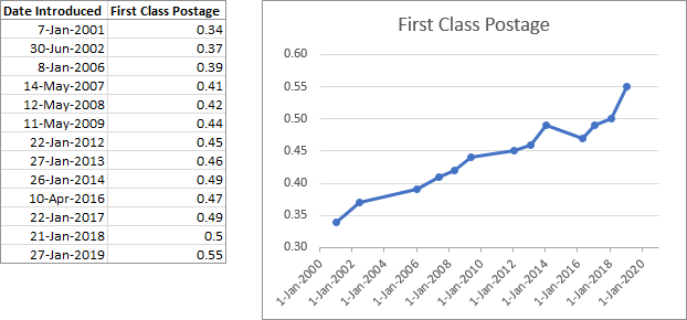
For example, here is a table and chart of first class postage rates in the US. Obviously, connecting the data points with diagonal lines does not reflect the price between points.
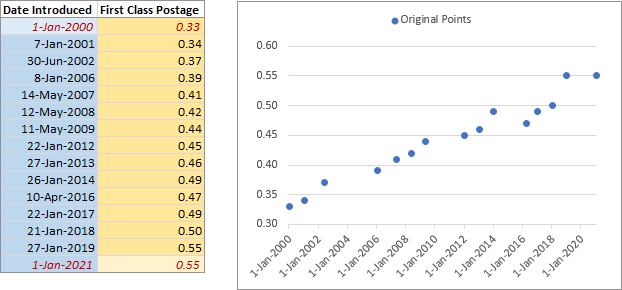
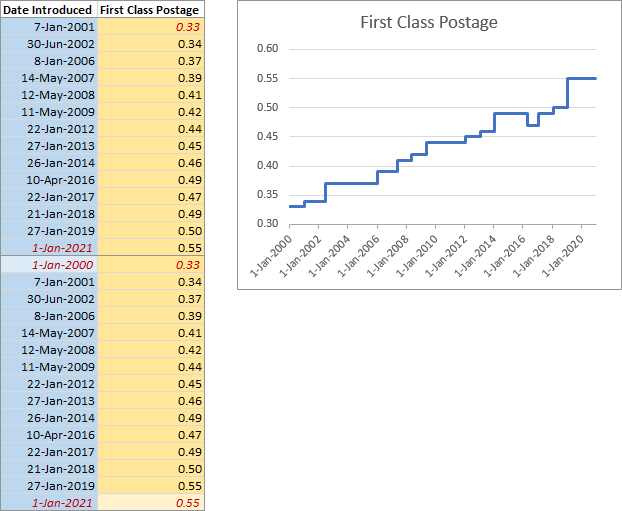
Here is the original data again, and I’ve added dummy points at the beginning and end of the arbitrary time period I’m watching.
I’ll start my chart data range using all but the first X values (dates) and all but the last X values. These points stagger the values to one date later.
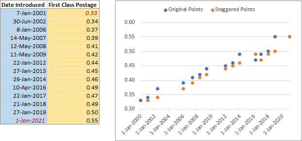
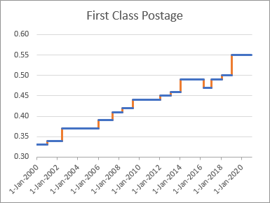
We need to connect the two sets of points: a horizontal line from each blue (original) point to the next orange (staggered point), and a vertical line from each orange point to the next blue point.
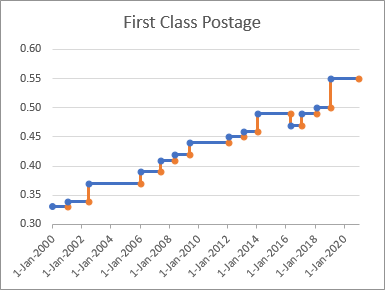
And we don’t need those markers.
If we append the intact original data range below the staggered data, and make the chart using this new extended range, Excel internally sorts the dates, and produces the steps we want.
Using VBA with the SERIES Formula
This isn’t the most difficult chart protocol I’ve ever described, but it requires an extended data range and a bit of work. Wouldn’t it be nice to run a simple macro and make it happen?
We’re going to do just that, with a short VBA procedure which will hack the chart SERIES formula to mimic generating the extended data range above. I’ve written about the SERIES formula in The Excel Chart SERIES Formula, and I wrote a tutorial about using VBA to hack the SERIES formula in Switch X and Y Values in a Scatter Chart.
If I select the chart series, I can see the series formula in Excel’s Formula Bar. (The artificial endpoints are colored red.)
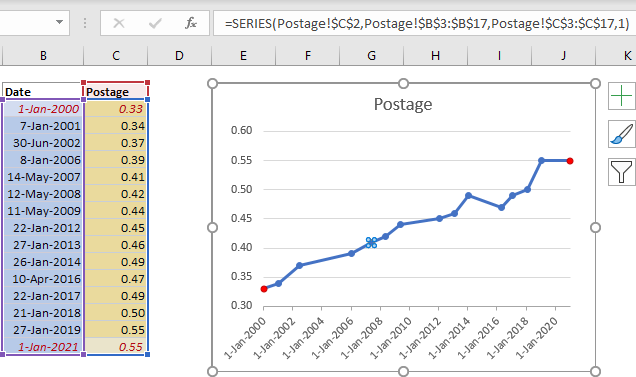
The formula looks like this:
=SERIES(Postage!$C$2,Postage!$B$3:$B$17,Postage!$C$3:$C$17,1)
The four arguments are:
=SERIES(SeriesName,XValues,YValues,Index)
As shown in the manual approach above, I need to combine all but the first X value with all of the X values, and all but the last Y value with all of the Y values. In the series above, our X values will become
Postage!$B$4:$B$17 and Postage!$B$3:$B$17
and our Y values will become
Postage!$C$3:$C$16 and Postage!$C$3:$C$17
You can use multiple-area ranges if you separate each area’s address with commas, and surround them with parentheses:
(Postage!$B$4:$B$17,Postage!$B$3:$B$17)
(Postage!$C$3:$C$16,Postage!$C$3:$C$17)
Our final SERIES formula will look like this:
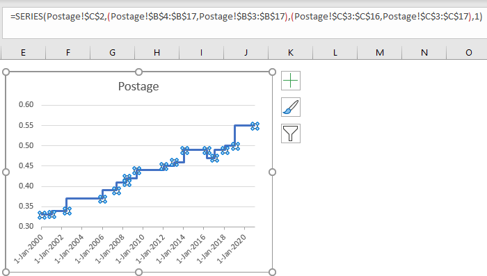
=SERIES(Postage!$C$2,(Postage!$B$4:$B$17,Postage!$B$3:$B$17),(Postage!$C$3:$C$16,Postage!$C$3:$C$17),1)
Outline the VBA Procedure
- Start with the active chart (and abort if there is none).
- Get the SERIES formula for each series.
=SERIES(SeriesName,XValues,YValues,Index) - Split this formula at the commas to create an array.
{"=SERIES(SeriesName","XValues","YValues","Index)"} - Find the range of X values, then find the range from the second cell to the last, get the address, and append the address of the original complete range.
- Find the range of Y values, then find the range from the first cell to the next-to-last, get the address, and append the address of the original complete range.
- Finally, put the new X and Y references into the array, and join them into a new SERIES formula, and put that into the chart.
The VBA Procedure
Here is the procedure, which took me about 15 minutes to write.
Sub LineToStepChart()
  If Not ActiveChart Is Nothing Then
    Dim iSrs As Long
    For iSrs = 1 To ActiveChart.SeriesCollection.Count
      Dim srs As Series
      Set srs = ActiveChart.SeriesCollection(iSrs)
      Dim nPts As Long
      nPts = srs.Points.Count

      Dim SrsFmla As String
      SrsFmla = srs.Formula
      '' =SERIES(name,xvalues,yvalues,number)

      Dim vFmla As Variant
      vFmla = Split(SrsFmla, ",")
      '' array {"=SERIES(name","xvalues","yvalues","number)"}

      If iSrs = 1 Then
        ' only needed on first series since all series use the same X values
        ' fix X values: all but first point then all points
        Dim sXVals As String
        sXVals = vFmla(LBound(vFmla) + 1)
        Dim sXSheet As String
        sXSheet = Left(sXVals, InStr(sXVals, "!"))

        Dim rXVals As Range
        Set rXVals = Range(sXVals)
        Set rXVals = Range(rXVals.Cells(2), rXVals.Cells(nPts))
        Dim sNewXVals As String
        sNewXVals = "(" & sXSheet & rXVals.Address & "," & sXVals & ")"
      End If

      ' fix Y values: all but last point then all points
      Dim sYVals As String
      sYVals = vFmla(LBound(vFmla) + 2)
      Dim sYSheet As String
      sYSheet = Left(sYVals, InStr(sYVals, "!"))

      Dim rYVals As Range
      Set rYVals = Range(sYVals)
      Set rYVals = Range(rYVals.Cells(1), rYVals.Cells(nPts - 1))
      Dim sNewYVals As String
      sNewYVals = "(" & sYSheet & rYVals.Address & "," & sYVals & ")"

      '' array {"=SERIES(name","new xvalues","new yvalues","number)"}
      vFmla(LBound(vFmla) + 1) = sNewXVals
      vFmla(LBound(vFmla) + 2) = sNewYVals

      SrsFmla = Join(vFmla, ",")
      '' =SERIES(name,new yvalues,new xvalues,number)

      srs.Formula = SrsFmla
    Next
  End If
End Sub
After selecting the last chart above (with markers removed) and running this procedure, here is the resulting chart and series formula:
Note that this only works for Line or Area charts, for X values which are dates or at least treated numerically. Line charts sort numerical X values before plotting them, which makes this macro approach so easy. If the X values are text (non-numeric labels), the following chart results:
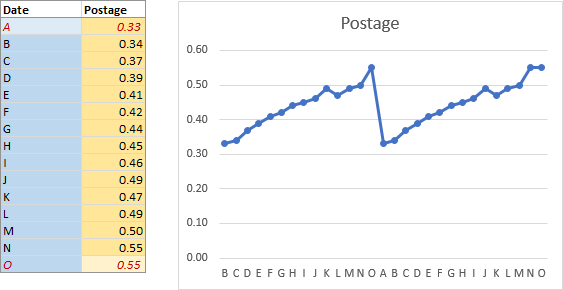
It did what I specified, but with a text axis, it failed to produce steps. We could test for the right kind of axis, and the right kind of data, but that’s a lot of work for a quick and dirty program.
Step Charts in Peltier Tech Charts for Excel
Step Charts are included in the many custom chart types available in Peltier Tech Charts for Excel 4.0.

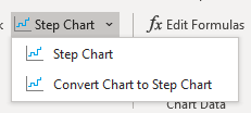
Click the button to open the Step Chart dialog, or click the dropdown arrow. The first menu item also opens the dialog, while the second will convert your existing chart to a step chart using an approach like the one above, but with more error checking and flexibility built into it. Actually, it converts a copy of your chart, in case you change your mind.
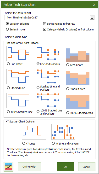
The Step Chart dialog lets you select your data range and specify its characteristics, then select a chart type.
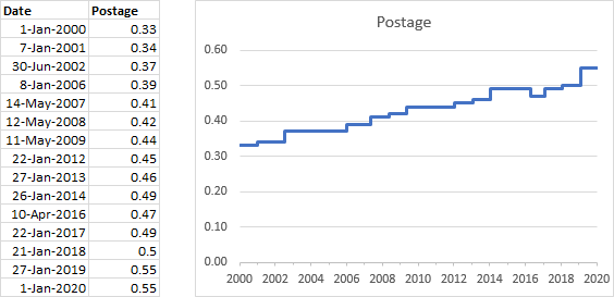
The result looks great, but it’s much easier than the manual approach. The chart is built on a new worksheet because of the data manipulation required; below I’ve simply pasted the chart next to the original data.
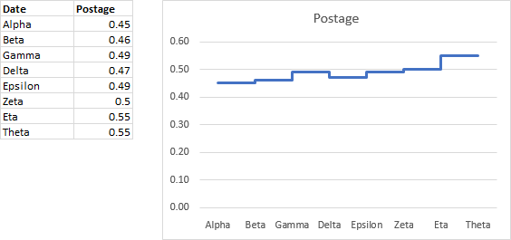
Even if your X values are non-numeric text, the program will give you a step chart.
Visit Peltier Tech Charts for Excel 4.0 to purchase a license to this powerful Excel add-in.


Leave a Reply