Some time ago, I showed how a column or bar chart could display a table of data more effectively than four pie charts (or a donut chart) in Column Chart to Replace Multiple Pie Charts. I showed how to build a panel chart to plot the same data in How to Build a 2×2 Panel Chart. In this post I’ll demonstrate why donut charts are such an awful way to try to present data.
Donut Charts

This is the data used to make the donut chart above, and it’s served us for several other exercises. Rows add up to 100%.

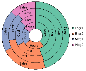
Here again is the donut chart. You can compare values by comparing the included angles, except that only Engr1 and Mktg2 have a common baseline for all points in those categories. If you consider consider the Mktg1 (blue) sections. Three of the four have values between 19.7% and 20.0%. Without consulting the table above, it’s mighty hard to tell which doesn’t fall within that range.

Of course, we could apply data labels that display the values, but to make them fit, some have to be rotated. In this chart I was lucky, because I could stick to horizontal or vertical orientations, and not any of the pixel-squashing inclinations in between.

It’s still hard to remember which concentric arc refers to which series. Let’s change the labels to show series names. Okay, that’s better, but now I can’t remember the percentages.
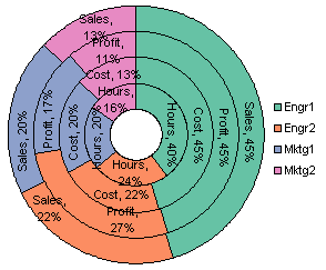
The dialog lets us add both to our label, in fact, we could also add the categories from the legend. But the labels are already overcrowded. I suppose if we wanted to, we could find a package that lets us wrap the labels around an arc, but I’m glad Excel doesn’t offer that option. But at least we have all the data visible in the chart that was in the original table of data, only not as easy to read.
Donuts, an Exploded View
I’ve pivoted the data so all values are in one column. I’ve also calculated the area of each segment, with a scaling factor that conveniently equals 100 for the hole in the center. The innermost arc has a total area of 300 (that is, three times the area of the central hole), the second 500, the third 700, and the outermost 900. If you’ve been listening to me for a while (I mean months, not just this post), you can guess where this is going.
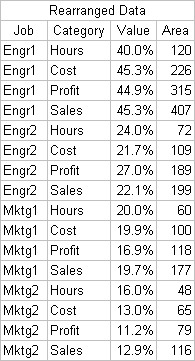
To start this analysis I had to explode the donut chart. Quick, call Dundas, a new chart type! This was easier than I had expected: I copied the donut as a picture in Excel, pasted onto a PowerPoint slide, and ungrouped twice. Then I dragged the pieces into position.

Then I arranged the segments in order of ascending value from top to bottom. As you can see by eyeballing the pieces, or by looking at the Area column or dot plot in the accompanying sorted table, the area jumps around a lot as the value monotonically increases. If a measure such as area is to be a reliable indicator of value, both measure and value should increase monotonically and proportionally.


Here is the same set of building blocks, this time sorted by area. We can tell from the table, but not from the arcs themselves, that value jumps up and down a lot as area increases.


Bar Charts
Let’s compare the donut’s area-value lack of correlation above with the area-value characteristics of a bar chart. This is the data and chart from Column Chart to Replace Multiple Pie Charts.


Here I’ve removed the gaps between clusters and inserted a narrow white strip between adjacent bars. I’ve put labels in the bars so the legend isn’t necessary to identify anything.
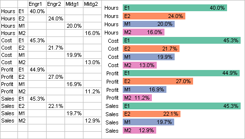
Then I sorted the values and rearranged the bars accordingly. The bars are sorted by value and by length. Since each bar has the same thickness, they are also sorted by area.
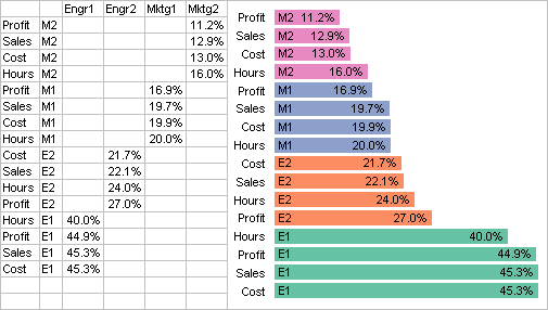
Comparison
Which shows the better correlation between value and measure of that value?


Jorge Camoes says
Jon, I agree with you, “donut charts are such an awful way to try to present data” if, and only if, you use it to display completely different series (hours / cost). Although this is standard practice (unfortunately), the only (barely) acceptable use of donut charts is to detail the previous series. This avoids some of the perceptual issues because it keeps the arcs aligned across series.
I’ve tried to exemplify how to create better pie charts, and that basically means using donuts charts this way.
Sandi Mays says
That was a pretty Captain Obvious question :) I’ll take the chart on the right. Ha!
Jon Peltier says
Jorge –
I remember your chart now. I see what you were trying to do with the outer concentric arcs, but I have to say I think it is still harder to digest the data in this form than in a table. Maybe it’s a lack of familiarity with the thought process that went into it, but it takes too long to move one’s eyes back and forth, and try to internalize what the arcs are trying to communicate.
We shouldn’t stop trying to repurpose old tricks, even poorly performing ones, if we can make them perform new tricks.
I’ve come across a couple of other pie/donut variants lately that may merit full posts at some point, but now you’re making me comment about them :-)
The first pie/donut variant is a new way to display poll results, the visual output of a new computer package that allows users to change categories in their data easily. This is the brainchild of two researchers at the University of Utah, Geoff Draper and Richard Riesenfeld. I don’t have many details, just a press release, but it seems like it has all the functionality of pivot tables, without the “nice graphics” of pivot charts.
The second pie/donut variant is a sequentially broken down pie chart that becomes, in effect, a radial treemap. Jeff Clark of Neoformix has posted some of these, and I have inserted a couple below.
After doing this work, Jeff discovered that there is nothing new under the sun, or rather, under the SunBurst. The following is an illustration of hard drive usage generated by a program called Sunburst.
Jorge Camoes says
I already wrote about your first pie chart example, and I find it a very, very, stupid idea. Something that breaks the law of a circle meaning 100% is stupid by definition.
Jon Peltier says
Jorge –
Ha, and I even commented on it. I knew I’d gotten the link from somewhere.
As I said, I don’t think it does anything that a simple pivot chart cannot handle, and a pivot chart doesn’t distort the display by forcing it into a circle.
While we’re on the subject of pies not adding to 100%, how about this chart which compares recidivism rates based on the original crime:
I don’t recall where I found this gem. If anyone recognizes it, please let me know.
derek says
Jorge, I tried quite hard to persuade Excel to let me put a thin donut on top of a pie, but it was no use. Pies go on top of donuts always, covering them up. Of course, the pie and the donut ought to be just options in a single chart type: a pie is just a donut with a hole of 0%, a donut is just a multilevel pie with a white or no-color central level.
Jon, many people say what they need is a graph type that makes the 100% nature of the summed segments clear. 100% stacked bars do that, but suffer from some of the same problems as donuts. Your Excel panel graphs, as demoed elsewhere, are the ideal compromise: they stack the whole, but they also align the bases of all the parts.
Or, you could be silly like me and stack them back to back :-)
Jorge Camoes says
“I don’t recall where I found this gem. If anyone recognizes it, please let me know.”
http://people.howstuffworks.com/prison4.htm.
Tim Mayes says
Jon, a little detective work turned up that lovely pie chart at:
http://people.howstuffworks.com/prison4.htm
Perhaps they need a feature on “How Math Works.” :-)
BTW, there’s a really nice column chart on the same page.
Jon Peltier says
Derek – This might be a good compromise, at least for comparing bars in the same category (color in this case).
Jorge & Tim – Thanks for the link, I want to make sure I give credit where credit is due.
Dan Predovich CFA says
Jon, We spnd a huge amount of time working with non-technical decision makers. The single worse metaphor to convey any degree of complexity is the donut chart. I comment on this only because (a) I used to beat my head against terminal trying to make donut charts work; (b) I have huge respect for the work done at THE ECONOMIST (magazine) RESEARCH UNIT, but for the life of me I can not understand their ADDICTION to donut charts. Another analyst I respect but for their over use of Donut Charts is the Bank of America CFO quarterly roundtable report. Honestly I don’t get it… why take FINE research and analysis and ruin it with poorly executed charting?!
An Exception: Before finance and econometrics, I did a lot of public health work. The kinds of charts shown by Jeff Clark — which remnd me of radial heat maps (pardon the pun) and others ARE intuitive and useful, but only in my view to time-constrained technical, scientific, or field practioners such as physicians. It would be poorly applied in a business setting. I found they were best done with call-outs to the underlying text. Done this way they convey a lot of information quickly, and better, help guide the user to accompanying text without forcing them to digest the entire text. That newsletter, later taken over by the CDC, received considerable praise from practizing clinicians with little time to wade through text.