Often your data is stacked, that is, multiple sets of X and Y values are stacked into two columns and identified by a label in another column (below left). When charted, the data is shown as one series (below center). In order to plot it as separate series in a chart (below right), you first need to unstack the data. In a moment I’ll get to a Lambda formula that unstacks data like this.
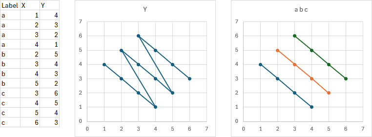
Stacked Data
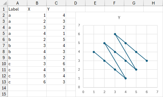
The following data set is stacked. Column A has labels identifying which subset each data point (row) belongs in, while columns B and C contain the X and Y values for each point. Plotting the X and Y values results in a single chart series, though sometimes you can tell that the data should be subdivided.
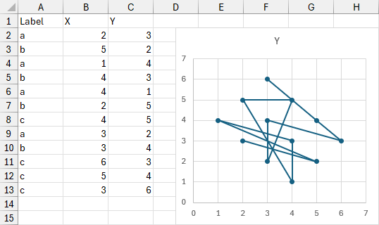
If the data is randomly sorted (or is that an oxymoron?), you may not even be able to see that the data can be unstacked.
Unstacking Data
This is similar to the problem described in Conditional Formatting of Excel Charts and Conditional XY Charts Without VBA. The splitting of data ranges into multiple series is covered in these articles and also in Split Data Range into Multiple Chart Series without VBA and VBA to Split Data Range into Multiple Chart Series.
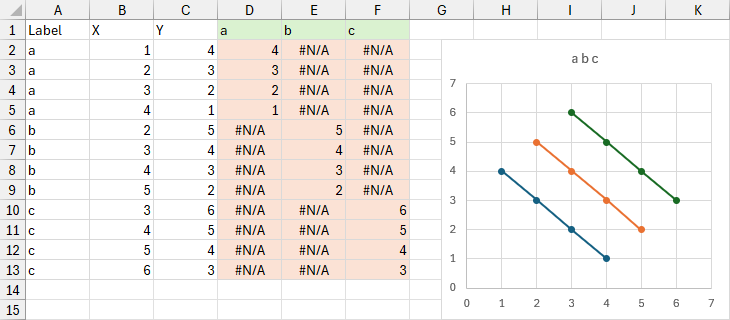
For an Excel XY Scatter chart, you need one X column for all chart series and one Y column for each chart series; the X data remains stacked while only the Y data is unstacked. The simple protocol is illustrated below.
New columns (shaded below) are added for each separate series (each set of Y values). The top row (shaded green) has the unique items in the Label column. The rest of the region (shaded orange) uses a formula to put the Y value into the column if the column header matches the value in that row of the Label column; it inserts NA() if the labels do not match, which appears as #N/A in the cell and is not plotted in the chart. The formula in cell D2 and filled down and across to F13 is:
=IF($A2=D$1,$C2,NA())
In modern Dynamic Array Excel, you can fill the new column headers easily with this formula:
=TRANSPOSE(UNIQUE(A2:A13))You can then enter a single formula in cell D2 to fill the shaded region:
=IF(A2:A13=D1:F1,C2:C13,NA())Selecting B1:B13 and D1:F13 (use the Ctrl key to select multiple areas) and inserting an XY chart results in the following.
You can take this simple Dynamic Array approach a bit further and write a single Lambda formula that will populate the entire chart source data range. This means that the chart will dynamically reflect the data range if changing the data results in more labels. The first version of the Lambda I wrote is:
=LAMBDA(input,
  LET(
    headers,TAKE(input,1),
    data,SORT(SORT(DROP(input,1),2),1),
    label,CHOOSECOLS(data,1),
    X,CHOOSECOLS(data,2),
    Y,CHOOSECOLS(data,3),
    labels,TRANSPOSE(UNIQUE(label)),
    split,IF(label=labels,Y,NA()),
    VSTACK(HSTACK(INDEX(headers,2),labels),HSTACK(X,split))
  )
)(A1:C13)
Broken down, the Lambda starts with A1:C13 as its input. The first row of this input is taken as headers, and the first row is dropped, then sorted twice, by column 2 (X) and by column 1 (Labels) to give us the data. The first, second, and third columns of data are chosen to be variables labels, X, and Y. A variable called labels is defined as the unique list of items in the label column. A variable called split generates an array of either Y values or #N/A. Finally, the requisite pieces are stacked together and output into the worksheet.
Diarmuid Early, a colleague on LinkedIn, told me I could use a single SORT command with an array of sort columns, which leads to this streamlined Lambda:
=LAMBDA(input,
  LET(
    headers,TAKE(input,1),
    data,SORT(DROP(input,1),{1,2}),
    label,CHOOSECOLS(data,1),
    X,CHOOSECOLS(data,2),
    Y,CHOOSECOLS(data,3),
    labels,TRANSPOSE(UNIQUE(label)),
    split,IF(label=labels,Y,NA()),
    VSTACK(HSTACK(INDEX(headers,2),labels),HSTACK(X,split))
  )
)(A1:C13)
The screenshot below shows this Lambda formula in cell J1 and the chart that plots the entire spill range J1# (or J1:M13).
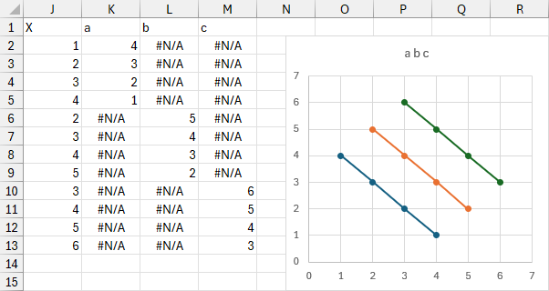
You can paste the Lambda formula (excluding the A1:C13 argument and its brackets) into a new Name definition, shown below.
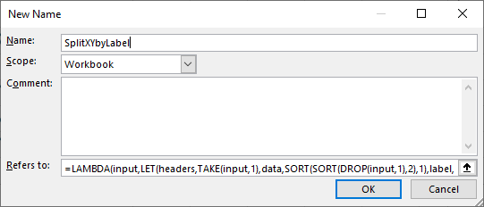
Now the formula can be called anywhere in the workbook as a regular Excel function called SplitXYbyLabel().
Peltier Tech Articles About Conditional Formatting of Excel Charts
- Conditional Formatting of Excel Charts
- Conditional XY Charts Without VBA
- Invert if Negative Formatting in Excel Charts
- Conditional Donut Chart
- Highlight Min and Max Data Points in an Excel Chart
- Split Data Range into Multiple Chart Series without VBA
- Conditional Formatting of Lines in an Excel Line Chart Using VBA
- VBA Conditional Formatting of Charts by Value and Label
- VBA Conditional Formatting of Charts by Series Name
- VBA Conditional Formatting of Charts by Value
- VBA Conditional Formatting of Charts by Category Label


Leave a Reply