A common question is “How can I label the total stack values in a stacked column chart?” When you add data labels to the chart, you can’t get any labels showing the totals.
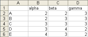
Let’s use some simple data to illustrate.
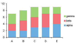
Here is a standard stacked column chart.
When we apply data labels to the chart, we get a label for each column segment in the stack, but no labels for the total of each stack.

We only need to add a series to the chart that encodes the totals. Column E has the totals for each stack.

Construct the chart as a stacked column chart, with the Totals column stacked on top.

Change the Totals column series to a line chart type series.
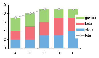
Add data labels to the Totals series.
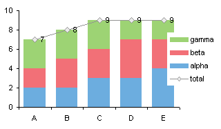
Move the labels to the Above position (right click on the labels and choose “Format” to open the format dialog).
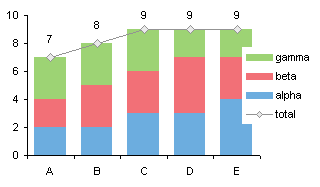
Hide the Totals series by formatting it to show no lines and no markers. And don’t forget to delete the unwanted legend entry: click once to select the legend, click again on ‘totals’, then click the Delete key.

Nicely done, without being too sneaky: just one hidden series.


Robert says
Helpful post thanks. Is it possible to achieve this on a horizontal stacked bar chart too?
Jon Peltier says
Robert –
I’ts possible to get this effect in a stacked bar chart, but it’s not as easy. You can’t use a line chart series for the labels. You could use an XY series, and you’d have to mess around with the primary and secondary axis scales (see Bar-Line Combination Chart). Or you could add another bar series onto the stack, with values of zero and custom labels. Good topic for a follow up.
chip says
Jon, I do these slightly differently and it works for bar charts (per Robert’s request) the same as for column charts and has I think fewer steps.
Same methodology up through where the totals are added. Instead of converting to a line chart:
1. Open the formatting for that series, change it to Secondary Axis. Now it’s sitting in front of the stacked bars I really want to see.
2. Add data labels to that series. (They go in the right spot at the top of the bar).
3. Format the area pattern as None and the border as None.
The bar disappears, leaving the data labels and the underlying stacked bars or columns.
This is another one of the things that Harvard Graphics for DOS used to do automatically! Silly that you have to trick the program to add these.
Jon Peltier says
Thanks, Chip. I was going to write this up as a follow-up, but you’ve done it for me. I suppose I could make a illustrated version….
Tony says
I like that you have the x-axis as being a category versus time because we all know that a stacked column chart is bad for showing data series’ over time, right? Good tip!
Robert F says
You can also use the right menu to change the total part of the stack to area and border= none. Then select total data labels adn change the alignment label position = inside base.
Anna says
This information was most helpful. Thanks.
Doug Keith says
Thanks for the great tips! Worked like a charm.
Kirvin K says
Thanks Jon, very useful tips. Can you think of way to show Pivot Chart Totals or should I just give up and create a regular chart? I would really like to have the pivot filter capability while displaying the totals over my stacked bars.
Jon Peltier says
A regular chart will do this easily. You probably can’t do it with a pivot chart unless you have created a custom field to capture the totals.
Neil Jimack says
I’ve been asked to produce something very similar, but I also need to apply labels to each series showing their percentage of the total.
I tried creating several dummy series’ which calculate the percentage, using a secondary axis, but can’t get the labels to line up with the values.
Jon Peltier says
Neil –
Calculate the percentages in the worksheet, and use Rob Bovey’s Chart Labeler to apply these custom labels to the stacked column series.
Neil Jimack says
Thanks Jon. Unfortunately I can’t download that onto my work computer, so I’ve had to resort to manually linking each label to a cell.
Ishtar says
Almost embarassed to ask …..
How do you change a singel column (“total” in this case) without changing them all.
Everything else worked GREAT!!
THANKS!!!
Jon Peltier says
Ishtar –
You mean, how do you change the Totals series from column to line? Right click on the series, choose Change Chart Type (Chart Type in 2003 and earlier), and select a line style.
Ishtar says
Thanks Jon – yes, that is what I meant to say.
I’m in 2007 and it wanted to change the entire chart even tho I selected only the Total series. So, I refomatted the series with no fill/no line and followed your advice on the data labels. Next, I adjusted the value axis and I’m cooking with gas!
BTW … Lots of GREAT stuff here. Thanks again!
evsap says
This is exactly, what I needed.
Thank you.
hmatlock says
I am soooo glad I found this. Thanks for posting it!
Jordania says
Wonderful! Thank you so much!
graham says
Jon, Thanks for all the help. I have a similar question as Neil…
I have a stacked column showing 4 series from 1 set of values to another. I want to show the % change from 1 to another.
Using several dummy series I have the labels but they never fit where they should. I’m not able to use the add-in here at work – and although it sounds like it would work it’s not viable for us.
I cannot seem to find any other instructions online documenting how to do this. Any thoughts on writing the instructions?
Jon Peltier says
Graham –
If you can’t use the tool, then add any type of data labels to the points (I usually pick the series name). Select each label in turn (to select a lable you have to single click twice, first to select the series of labels, then to select the specific label), click in the formula bar, type =, then click in the cell with the label you want to apply.
graham says
Jon, Thanks for the tip – I can use that as a shortcut in some other charts I do. Unfortunately I don’t think that will update or adjust the positioning of the data labels to match the appropriate series. I have a picture of the graph to share…
Jon Peltier says
Graham –
The position of the labeled points, and the label values, are set by the formula that calculates the sum of the particular stacked column. Why would this not update?
Fanny says
THANK YOU! I knew there had to be a better way to do this than mess with stupid text boxes all day. Whohoo!
Sinclair says
Spot on. Updates automatically as YTD figures change. Thanks, Jon.
Guillermo Alzuru says
Hi Jon, I’m not an expert and need help. I followed the procedure and all looks fine, but get stuck when I get to the step: “Change the Totals column series to a line chart type series”
How do you do that? This may be basic but I just could not figure it out.
Thanks,
Guillermo Alzuru says
Nevr mind, I figure it out. Thanks, though.
Guillermo
Jeff says
Very helpful! Thanks Jon! …I had almost given up. :)
Keith says
Totally saved me today. Thanks.
Chris says
You made my day! Thanks a lot!
Ananth says
This tip has been simple and very useful. Thanks a lot !!
Ben says
Saced me from asking Bossman another ‘simple’ question. Thanks!
Dayan says
Thanks for this… such a practical solution for a problem!!!!
Aleesha says
I feel like a moron but I’m not able to convert the total series to a line chart in Excel 2010… it converts everything to line.. any help is greatly appreciated.
Jon Peltier says
Aleesha – Make sure you select just the one series, then change the chart type.
Aleesha says
Thank you so much for your time.. I select only re total series but it still changes everything to line :(
Does it make a difference if I have office 2010 professional?
Jon Peltier says
All versions of Excel from ’97 through 2013 do this the same way, regardless of adjectives like “Professional”, “Ultimate”, “Pro Plus”, “Student”, or whatever. All I can suggest is try again with a fresh chart, and select the Totals series carefully.
Damian says
Jon, I can’t tell you how awesome your site is! This is yet another clear and to-the-point how-to that is a perfect example of how your site is hands down better than any other Excel site! Thank you!
amber says
How do I do this in a stacked cylinder column chart?
Jon Peltier says
The stacked cylinder chart is a 3D chart. Among their cognitive deficiencies, 3D charts also cannot combine one chart type with another. This means you can’t add a line chart series to apply the labels.
So convert the chart to a flat 2D column chart, add the line series with the totals, and apply labels to this series.
Brandon says
To add totals to a horizontal stacked bar chart with a pivot table you need to use the above process (Thanks Jon), after using Jon’s process to convert a pivot table to a regular chart. But instead of converting your “total” series to a line chart you need to leave it as a stacked bar. You then just change the color of the bars in that series to match your chart background (usually white) or make transparency 100%. Also do the same thing with the border. Go to format data labels for that series and adjust label position to inside base. You will also need to adjust your x axis label maximum value down to an appropriate size to fit your graph. Thanks again Jon.
Steven says
This would be useful if you actually took the time to explain how to HIDE the total series. FAIL
Jon Peltier says
Steven –
It says “Hide the Totals series by formatting it to show no lines and no markers.” So right click on the series, choose Format Series, choose No Line for the line and No Markers for the marker type.
sahar says
Thanks alot!
very useful :)
Danielle says
Hi Jon,
So glad I found this tutorial, I’ve been trying to figure out a workaround for this for ages! I saw plenty of guides that had different ways to do this, but you had to overlay two charts on top of each other which is way more work (and a pain in the butt to edit). I’m working on a big excel dashboard to help us report website analytics to our clients and this will help it be WAY more user friendly.
Thanks!
Julie says
THANK YOU! Worked like a charm.
Marc says
Thank you Jon, it was helpful… Saved my day
Lynlyn says
thanks for this post. really helpful. will try this one in my pivot chart. :)
Jim says
Hi Jon,
If you’re still monitoring this…. is there a way to add labels to the LAST column in the series only? ie if I have a series of stacked columns representing data over time, and I want to specifically show only the latest set of values…?
Thanks
Jim
Neil Young says
Thanks, clear instructions
Drew says
Awesome – thanks! Nice clean work around, really slick.
Bryan Reid says
Very helpful, seven years later. Thanks for the blog post!