Jon’s Toolbox Ribbon Commands
This is a quick look at the custom ribbon tab of Jon’s Toolbox. Click on the image to see it full size in a new browser tab.
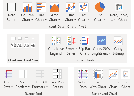
The ribbon includes groups of controls, such as Insert Data – Chart – Pivot, Chart and Font Size, Chart Tools, Range Tools, Range and Chart, plus a teaser at the end, From the Blog.
Insert Data – Chart – Pivot
Insert Data – Chart – Pivot has controls to quickly insert data, charts, or a whole data-pivot table-pivot chart ensemble. This is nice when I’m running a demo of my other software, preparing for a class, writing documentation or a blog post. It’s especially nice if I’m running a class and I want to demo a feature of Excel and I want some data for a chart quickly, and I don’t want to make everyone watch me mistype a bunch of numbers.

Data Range
Insert Data Range inserts a handy dummy data set, ready for me to demonstrate Excel’s features, or the features of some software I’ve written. If the active sheet is blank, it puts the data there, otherwise it inserts the data onto a clean worksheet.
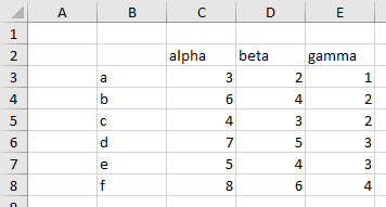
Nothing fancy, but it’s a good simple data range for demonstration purposes.
Column Chart, Bar Chart, etc.
There are chart buttons for all of the chart types I routinely use. Yes, it includes pie charts, get over it.
Each of the buttons is a split button. I’ll illustrate the functionality with the Column Chart button.
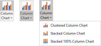
If you click on the icon (left), the program creates the chart type shown. If you click on the dropdown (middle), you get a dropdown list with the options for that chart type (right).
When you use one of the options from the dropdown, the split button icon changes to that chart type, which is created next time you click on the icon.

The way a chart is inserted varies, depending on what is selected.
- If no data is selected, the program inserts a new worksheet, it inserts the dummy data range (see Data Range above), and it inserts a chart one row below the data range using this data.
- If a data range is selected, or if a cell in a block of data is selected, a new chart of the selected type is inserted, one row below the data range.
- If a chart is selected, the program inserts a new chart of the selected type, offset slightly from the original chart, using the same data as the previously active chart.
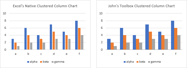
The charts created here are essentially the same as those from Excel’s own Insert tab, the same size and same series formatting, but they follow my own preferences for that chart type.
For example. Excel’s column charts have too much space between clusters, and unneeded space between columns in a cluster. Jon’s Toolbox fixes this.
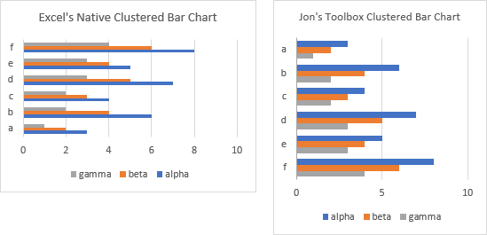
Excel’s bar charts draw the axis in the opposite order of how the data appears in the worksheet. Jon’s Toolbox fixes this, while also changing to an aspect ratio that better accommodates the chart.
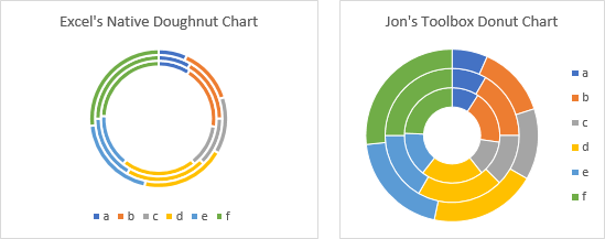
In addition to being spelled with too many silent letters, Excel’s doughnut charts have too fat a white line surrounding the individual points, the default hole size of 75% is ridiculously large, and the legend is placed below the chart, shrinking the doughnut’s height and leaving wide swaths of white space on either side of the doughnut. Jon’s Toolbox creates a donut chart spelled with no excessive letters; with a thin white outline around the points; with a default hole size of 66% for one ring (one series), 50% for two rings, and 33% for three or more rings; and with its legend on the right side of the chart, allowing the donut to fill more of the space occupied by the chart. In addition, Jon’s chart is closer to square, which means the chart takes up less space.
Data, Table, and Chart
Data, Table, and Chart inserts a new worksheet. The worksheet contains a Table of data, a Pivot Table constructed using the data in this Table, and a Pivot Chart based on this Pivot Table. Click on the screenshot to view in a new window.
This is a great way to quickly show someone about Tables and Pivot Tables and Charts.
Chart and Font Size
Are the default charts in Excel the right size for your purposes? In the US, the defaults are 5 inches wide and 3 inches tall, and frankly, that’s way larger than most of my charts need to be. Also, that 14-point chart title is much too large.

The Chart and Font Size group of controls provides the following predefined set of alternative sizes for charts and their fonts.

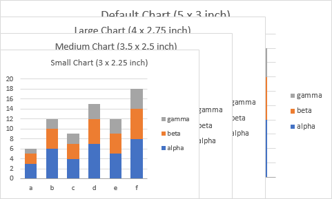
The different chart and font sizes look something like this. Note that they are independently applied to each chart. For my blog posts, I can easily fit two of the small charts, usually with medium font, side by side within a column of text.
Like many of the features of Jon’s Toolbox, if you select multiple charts before clicking the button, the formatting is applied to all selected charts.
Jon’s Toolbox now allows you to customize your chart sizes with a comprehensive dialog.
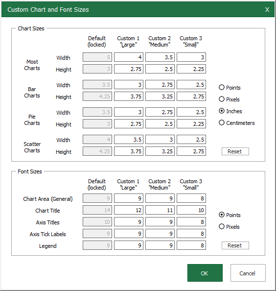
Chart Tools
Jon’s Toolbox has a handful of useful chart tools.

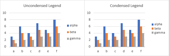
The default legend in an Excel chart is pretty widely spaced out (below left). Condense Legend closes it up (below right).
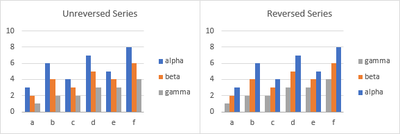
You can easily Reverse Series (and then unreverse them) in a chart, for example in a clustered column chart…
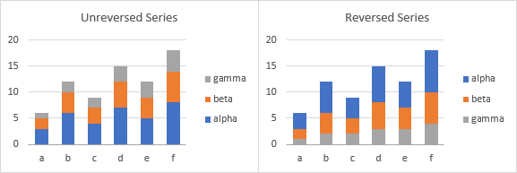
…or in a stacked column chart.
By default, Excel plots a bar chart with the vertical axis in exactly the opposite order as the data appears in the worksheet. This makes sense on some level, but not from the standpoint of usability. Click Flip Bar Chart and fix your bar charts instantly. (Click it again to get the upside-down version back.)
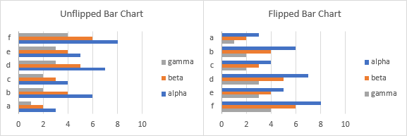
Note that if you use Jon’s Toolbox to insert a bar chart, it is automatically plotted the right way.
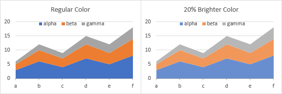
The default Excel color palette is not too bad, but if large areas of your chart are filled with the colors, the chart may seem oversaturated (below left). In Excel’s color pickers, the next lighter shade is 40% brighter, which may make the charts washed out. Apply 20% Brightness applies an intermediate shade to the selected series (below right). Note that you have to select and format each series separately.
Finally, the Copy Bitmap button copies the active chart or selected range to the clipboard in bitmap format, saving you several clicks (Home tab > Copy dropdown > Copy as Picture > select Appearance and Format). Simply switch to PowerPoint or your image editing software and Paste.
Range Tools
Jon’s Toolbox contains a set of range formatting tools.

(Format as) Chart Data
When you select a chart or a series in a chart, Excel highlights the associated data in the worksheet.
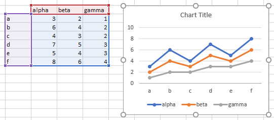
Chart Data applies this formatting more permanently to the worksheet. The colors are the same, it only lacks the small square handles on the corners of the shaded regions. Great for tutorials and illustrations, though.
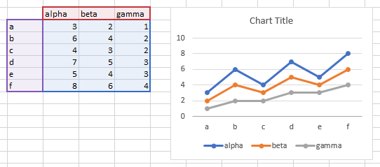
Click the Chart Data icon, and different things happen according to what is selected.
- If a chart is selected, the data range for the whole chart is formatted.
- If a series in a chart is selected, the data range for that series is formatted.
- If a range is selected, the range is formatted as if it were used in a chart. If more columns that rows are selected, the range is formatted as if series are plotted by row, otherwise it is formatted as if series are plotted by column.
If you need more control over the formatting, click the Chart Data dropdown.
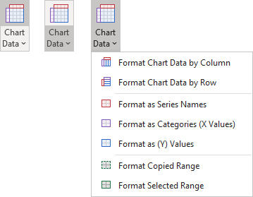
You can format a range including X and Y values and series names as if plotted by row or by column. You can format a range as if it contains only series names, X values, or Y values.
In addition, you can format a range so it looks like a selected range (below left), as a copied range (below center), or by clicking the two buttons in succession, as a selected range that’s been copied (below right).

I have found these very useful when writing blog posts, class notes, or documentation for my software.
Borders
Excel has an extensive built-in Borders menu.
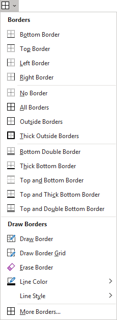
And the borders it creates are stark, in-your-face dark black. Sometimes I even want to pluck out my own eyeballs. (My daughter once determined that any statement is funnier if you say “eyeballs” than if you just say “eyes”, and I agree. She’s a scientist working on visual perception using primates.)
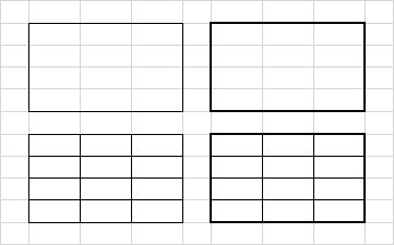
Below are Outside Borders, Thick Outside Borders, All Borders, and a combination of All Borders and Thick Outside Borders. Pretty harsh.
Nice Borders applies more visually appealing borders to a selected range. Medium is a medium gray, darker than the default cell boundaries, but not as irritating as black, while light is a light gray similar to the default cell boundary color. “Nice” borders means a medium gray outline with light gray internal boundaries, and the other options format internal borders and outlines, or just outlines, with medium or light gray borders.
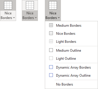
These are illustrated below with cell gridlines (Gridlines on the View tab) displayed on the left and turned off on the right.
Medium Borders applies medium gray borders to each cell in the selection.

Medium Outline applies a medium gray border around the outer cell boundaries of the selection.

Light Borders applies light gray borders to each cell in the selection. The light gray is indistinguishable from the default cell gridlines. I use this to put gridlines only on a certain range, while turning off gridlines elsewhere.

Light Outline applies the light gray border around the outer cell boundaries of the selection.

Nice Borders applies a medium gray outline around the selection and light gray borders to cell boundaries within the selection.

Dynamic Array Borders applies a blue outline that matches the outline of a dynamic array formula range when a cell in that range is active, and adds lighter blue internal borders.

Dynamic Array Outline applies only the blue outline matching the dynamic array border.

No Borders simply removes all borders from the selection.
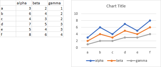
If I am making screenshots for documentation, I will often either hide the default gridlines and use Light Borders (first screenshot below), or I will show the gridlines and use Nice Borders (second screenshot below).
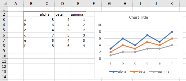
When you select one of these Border options, it becomes the new icon and default action for the command.

Clear Formats
Clear All Formats will clear all formats, except for number formatting, from a selected range. This is nice, because sometimes you need to get rid of some ugly border and fill colors, but recreating number formats is a chore.
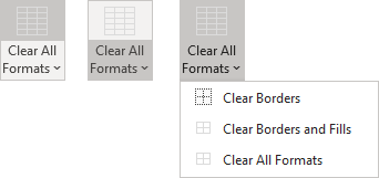
In the Clear All Formats dropdown, the options are to
- Clear border formatting,
- Clear border and fill formatting,
- Clear all formatting except for number formatting.
Page Breaks
Hide Page Breaks simply removes those unsightly page break dashed lines that make me crazy.
Range and Chart
The Range and Chart group has controls that help you control how the chart interacts with the worksheet.

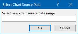
Select Data allows you to quickly select a new source data range for the active chart (or for each selected chart).
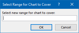
Cover with Chart lets you select a range for the active chart to cover. The chart is repositioned and resized to cover the selected range.
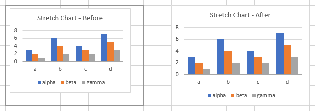
Stretch Chart resizes the active chart or shape (or each selected chart or shape) to fill the cells it partially covers.
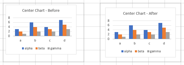
Center Chart moves the active chart or shape (or each selected chart or shape) so it is centered within the range of cells it covers.
From the Blog
Finally, Jon’s Toolbox includes some nice little programs that were previously presented in the Peltier Tech Blog.
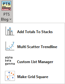
These programs were featured in the following blog posts:
- Add Totals to Stacked Column Chart (but it works on stacked bar, stacked area, and stacked line charts, too)
- Trendline Calculator for Multiple Series
- Built In and Custom Lists in Excel
- Make Excel Chart Gridlines Square


