An interactive dashboard by definition includes mechanisms for users to control aspects of the display. There are many ways to accomplish this. In Interactive Charting by Combo Box or Checkbox I wrote about using checkboxes to do this. That used a very simple example, which I will explore further in this article.
There are a couple of ways to achieve this interactive control. There is an easy method that relies on worksheet formulas to alter the contents of the source data range of each series, and there is a more involved technique that uses VBA to programmatically adjust the chart’s source data. This post will describe the approach that uses worksheet formulas.
Checkboxes and Worksheet Formulas
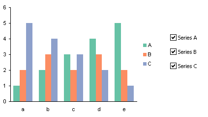
Start with a column chart that includes all of the series you will allow the user to select from (A, B, and C in this example). Add a checkbox from the Forms toolbar for each series.
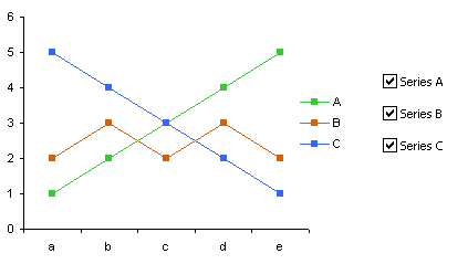
This works as well for a line chart, though the formulas have to be different for line and column charts.
The data range is shown below. The original source data is in J3:M8, and the three checkboxes link to the three cells in K1:M1.
There are two calculated ranges below the original data range. The category labels have simply been copied from the original range, but the other data is linked using worksheet formulas.
For the first calculated range, select K10:M15 so K10 is the active cell, enter
=IF(K$1,K3,"")
then hold CTRL while pressing ENTER to fill the formula into the entire selected range.
For the second calculated range, select K17:M17 so K17 is the active cell, enter
=IF(K$1,K3,"")
then hold CTRL while pressing ENTER to fill the formula into the entire selected range. Then select K18:M22 so K18 is the active cell, enter
=IF(K$1,K4,NA())
and again hold CTRL while pressing ENTER to fill the formula into the entire selected range.
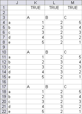
If the Series B checkbox is unchecked, L1 is FALSE, so L10:L15 appear blank, L17 also appears blank, and L18:L22 contain #N/A.
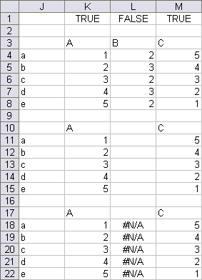
The source data range for the column chart has been changed from J3:M8 to J10:M15. The data for Series B appears blank due to the “” in the formulas, which Excel treats as zero. The bars for Series B have a height of zero, so they don’t appear, and the legend entry for Series B is “”, so it doesn’t appear.
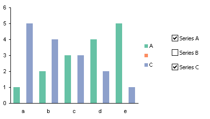
There is still a gap between the bars for Series A and Series C where Series B fits. There also is still a legend key for Series B, which is the unlabeled orange square between the green and blue squares. The legend can be hidden, but then another means is needed to identify the series in the chart.
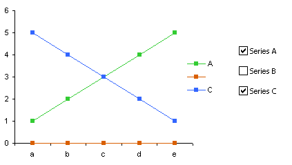
We don’t want to use “blanks” in the source data for the line chart. Since the “” are interpreted as zero values, the line and markers for Series B lies along the horizontal axis, where Y=0. The legend entry for Series B displays no label, but the legend key still appears (the red bos and line).
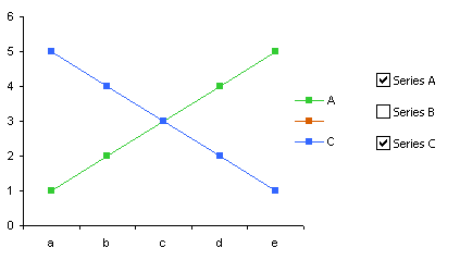
For a line chart, use the range J17:J22 as the source data range. This uses #N/A instead of “” to indicate undisplayed values, so the line and markers for Series B don’t even appear in the chart. We still have that pesky unlabeled legend key, though.
It would be nice to use the same data range for both line and column charts, but the #N/A error does not preclude plotting a point in a column chart. The value is zero as in a line chart, but if you put value labels on the points, the result is a label that says “#N/A”. There is no fancy trick using number formats to hide the error.
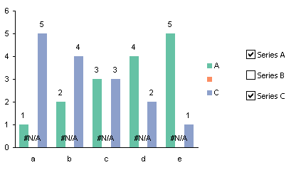
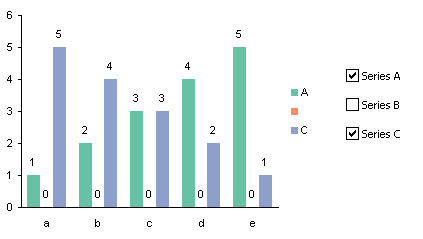
Using the range with apparent blanks results in labels of “0” at points corresponding to apparent blanks.
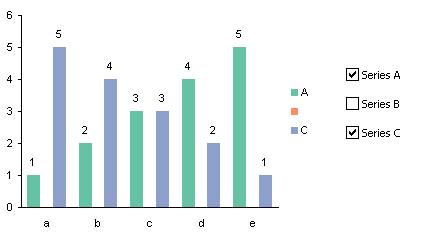
Using a custom number format of “0;;;”, we can suppress the display of any label except positive numbers (and errors).
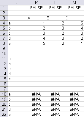
What happens if the user gets excited and unchecks all of the boxes? The data ranges respond as expected:
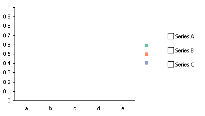
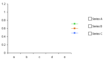
And the column chart and line chart both show no data, with unlabeled legends.
CheckboxAndFormula.zip is a zipped workbook which you can download to illustrate this technique.
Checkboxes and VBA
In the next article, I will show how to use VBA in conjunction with the checkboxes to control a column or line chart with a single worksheet range and no formulas, while avoiding gaps for missing columns in the column chart and also avoiding unlabeled legend entries.


Bernard Lebelle says
Another brilliant way of tweeking Excel. Look forward for a practical implementation on a real dashboard
Tim Mayes says
Jon, I’ve been playing around with something very similar to this for awhile now. I’ve been using defined names for the ranges, where the name is either the range that contains the data, or a blank column. The choice is made depending on the value of the cell link from the checkbox. Works great, except, as you mention, the legend entry remains.
For this project, I’m trying very hard to avoid using VBA so I’d rather not use your clever technique from the next post. Is there any non-VBA method of making the legend entry appear or disappear? I can’t think of anything short of just not showing a legend, or deleting the entry for the one series that I want to toggle on or off. That will work for me, but it isn’t ideal and I may just give up and use VBA.
Jon Peltier says
Tim –
To change the legend, other than the text shown in the legend entry), you need more than worksheet formulas. You either have to do it manually or using VBA.
You could apply a data label to each series, and when the series isn’t visible, neither is the label. This approach eliminates the need for a legend.
Tim Mayes says
Thanks Jon, the data label is the perfect solution. I should have thought of that.
Jon Peltier says
Tim: Next time you will.
Leonardo says
Hi Jon,
Dynamic Charts are great. I however have a problem currently where the Data Series doesn’t allow me to enter a named range in Excel 2007. I even tried to put it in with VBA but still no joy as well as in the SERIES function. The named ranges are correct, it just seems like Excel 2007 doesn’t support it any more? Does it possibly have something to do with SP’s that I need to install?
Jon Peltier says
Leonardo –
This is still supported. Two hints:
Make sure you qualify the name with the worksheet name. I find the easiest way to get this right is to create my chart with regular data, so the values range is represented by something like =’Data Sheet’!$B$2:$B$100, and replace everything after the exclamation point with the name.
In Excel 2007, there are problems if the name of the named range begins with “Chart”. For example, you can’t name a range ChartData, but you can name it ChtData.
Leonardo says
Jon,
Thanks a lot. The inclusion of the Sheet Name did the trick when defining the Data Series on the chart.
I will keep the second hint in mind as well for future. Thanks, you’re a legend!
Malcolm says
I have been able to have the legend names appear/disappear if based on the state of the checkboxes; is there a way to also have the legend colors do the same? For example, where you state, “Using a custom number format of “0;;;”, we can suppress the display of any label except positive numbers (and errors).”, can the Series B orange box also disappear?
Jon Peltier says
Malcolm – This can be done using VBA, but not through formulas and worksheet tricks. If you set the sheet up so that you can hide a row using an autofilter, then by default data in the hidden cells will be hidden from the chart, but this means that the chart series after the hidden one will assume the formatting of the hidden series.
Mike says
What a great idea! Thanks so much for this. This was a big help to me. I’m an Excel user of moderate skill, but thanks to you my skillset is increasing.
THANKS!
Malcolm Sokol says
I have an animation plot, pehaps not very differnent than your gasoline gap application but I have an issue with screen updating. I have a large number of data points (X and Y values for an XY scatter plot) taken at successive time intervals. I want to plot a trajectory curve of the XY values as the time increases and show the evolution of the trajectory from starting point till the final point is plotted. I have a chart sheet that does this very well but the screen updating of the underlying data processing is slowing down the display. If I turn off screen updating the chart is not updated until finished and updating is turned back on. Is there any way to turn off screen updating but have the chart sheet update each time interval which adds a new point to the end of the curve.
Jon Peltier says
Malcolm –
Screen updating is what lets the screen update as things change (like the data behind a chart). Screen updating shouldn’t affect what’s happening with another sheet, though.
Malcolm Sokol says
Using Excel 2007. Not what I observe but it could be the way events on a worksheet cause the chart sheet object to be updated or refreshed (or not.) The plotted data refers to two columns in my worksheet which I clear and the chart line disappears. There is no data within the range which is now referenced to a large number of blank rows. My macro loop adds one data point at a time to the plot data range increasing the length of the data vector. The plotted line grows like a snake as new data is added. But if I use Application.ScreenUpdating = false, then the ever-increasing data trend is not displayed until I turn it back on after the loop is complete. Can this be some event not occuring to tell the chart to update?
Jon Peltier says
Malcolm –
I should have been more detailed.
ScreenUpdating = Falsetells Excel not to update anything that can be seen on screen. This used to be 99.9% reliable and predictable in Excel 2003 & earlier, but in 2007 & later that percentage has dropped to 90 or 95%. Some things update that aren’t supposed to, and some things used to change (in memory) with ScreenUpdating turned OFF now need it turned ON. But…To animate the chart, ScreenUpdating has to be True. If you encounter issues, it might be solved if you can simplify the worksheet, so that the updating is limited to (say) changing an index, where the index is the row beyond which a formula changes calculated values to NA() to hide those calculations in the sheet.
You can see this simple approach in Rolling Wheel Animation and Ballistics Animation.
Malcolm Morris says
I know I’m late to the party but ;)
For anyone else looking for next article where John shows “how to use VBA in conjunction with the checkboxes to control a column or line chart with a single worksheet range and no formulas” – it’s here:
https://peltiertech.com/interactive-charts-with-checkboxes-and-vba/
samreen says
How to make visible a line in chart when I click on a command button?
Jon Peltier says
Samreen –
One of the series in the chart should be a line or XY chart type. The data is either the value of the line, or #N/A-filled cells, based on the checkbox and its linked cell.