In Chart with a Dual Category Axis I showed how to make a chart with dual category labels (two rows of labels). In Individually Formatted Category Axis Labels I showed how to format axis labels individually by ignoring the built in labels and using an invisible series with individually formatted data labels. An attentive reader asked how to format the individual labels in a dual axis category axis, and the answer is: combine these two methods.
We’ll use the same data as in the original post.
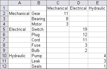
Make a column chart using the data in columns C:E, ignoring the axis labels for now.

Format the axis to hide the default axis tick labels (but remember the sequence: 1, 2, 3, etc.).

Here is the data for the dummy (hidden) series that will provide our labels. The first block is for the puter labels: the X values are in column G, corresponding to the slots in the category axis which were numbered for us in the first chart above; the Y values (zeros) are in column H; and the labels are in column I. I’ve kept all of the rows in this first block just so the labels were aligned and I could use simple formulas.
The numbers 2, 6, and 10 in column G refer to the slots that these labels will be centered under; if any of the groups had an even number of points, we would have had to center the outer labels between two axis slots, by using an X value of (for example) 9.5. Since we’ll be making XY series of these sets of data, we could use non-integer X values if necessary.
The labels use a simple formula to insert a line feed before the text of the original label; the line feed positions these outer labels below the inner labels. The formula in cell I2 is
=CHAR(10)&A2
and this is copied down as needed. It can be used in all cells, since a line feed plus an empty string will not look like anything in the chart.
The second block, for the inner labels, is configured in the same way as the first.

Add the first dummy series by copying G1:H12, selecting the chart, and using Paste Special to add the data as a new series. The new series is not visible in the chart, because it is added as another stacked column with values (heights) of zero.
Select a visible series in the chart, and use the up arrow until the added series (“Outer Labels”) is selected. Right click on one of the selection indicators, and if the context menu has an item called Format Data Series, choose Chart Type, and select the XY type with markers but no lines. The series is indicated below as large red squares.
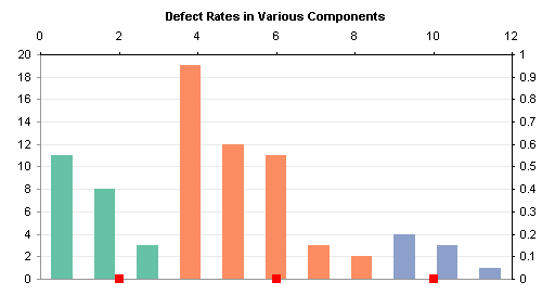
Excel helpfully placed the XY series onto the secondary axis. Select the XY series, press CTRL+1 (numeral one) to open the Format Series dialog, and change its axis to Primary. See how well it is aligned.

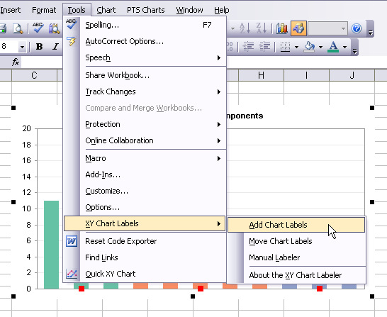
Now add data labels to this series. The easiest way is to download and install Rob Bovey’s Chart Labeler. The Chart Labeler is free and easy to use. It installs a submenu to the Tools menu, as shown below (in Excel 2007 it adds an item to the Add-Ins ribbon tab).
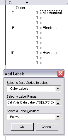
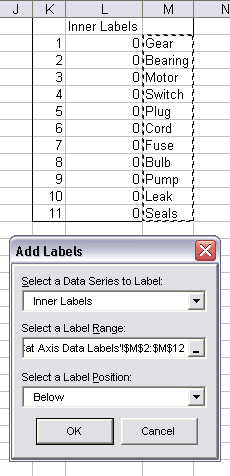
In the dialog, select the series, select the range containing the labels, and select the position of the labels.
Here is the chart with the outer labels.

Add the second series. Copy K1:L12, select the chart, and use Paste Special to add this data as a new series. Since the previously added series was converted to an XY series and moved to the primary axis, this chart is conveniently pasted as an XY series on the primary axis, indicated by green diamonds below.

As above, use the Chart Labeler to label the Inner Labels series.
Here is the chart with all category labels showing.

Hide the XY series by formatting them to show no lines and no markers.

Select an individual label (the first click selects the series of labels, the second selects the label itself), and format it as desired. When one label is selected, you can use the left and right arrow keys to move to adjacent labels. In Excel 2003 and earlier, the F4 key will assign the last applied format to the selected label.

Here is the chart with its category labels formatted to match the plotted data. The color used for the font is a darker variation of the fill color used for the columns; it looks like these could be even a bit darker.


Liu 's chart blog says
maybe you dont need to use the xy chart and the labelers changer?
use a col of 0 to draw a line , set the line serial’s data label = the category ,it’s the same
Jon Peltier says
Liu –
Good point, this is a simpler way to handle the inner labels. The added series has to be a line chart type, and it has to use only the inner label column for its category labels. You then need to add another series for the outer labels.
Lois Huang says
I don’t understand your way to add chart label, but I find another way, I name the chart title “mechanic”, X-axis “electrical” and Y-axis “hydraulic”, then move them down in a line under the X-axis, so the titles turn to be labels,you can format them easily.
The question is that you need to be very careful to place them on the same line. Is there any better way for this question?
Jon Peltier says
The better way is the way I showed in the chart. Try again and follow all of the steps carefully. What do you get which is different than what I get?
mark says
Take your chart- I want to change the appearance of the data labels on y axis to read:2-3 days; 3-5days; 6-10 days, etc instead of values you have. the underlying dats does not change, just the scale point names change –
I’d rather not get into VBA coding –
and I am under a tight deadline.
Jon Peltier says
Mark –
Change the text in the cells that the added data labels reference.
So,pm says
Just what I was looking for.
Thanks!
Daniel says
Jon, You’re the man!
Is there a way to apply this to pivot charts?
Jon Peltier says
Daniel –
Pivot charts do not allow you to add data to a chart unless the data came from the pivot table. So you can’t add the dummy series needed to supply the formatted labels.
Caroline says
Hi Jon
thanks so much for sharing! this is exactly what I’m looking for.
Caroline says
Hi Jon
I’m back for a question. in your example, there’s only one series and one column bar. is there any way to apply it to the chart with two series and put both of them in one column bar?
Jon Peltier says
Carolyn –
I’m not sure what you mean. Are the two series stacked in the same bar?
Caroline says
Hi Jon
Yes. like in each month there’re some partners use our program while some not. we monitor the # who use and the # who don’t use the program. they’re stacked in one bar.
thanks and have a nice day!
Alison says
Is it possible to change the colour of SOME of the font used as titles in a bar chart. I have some survey results that for the questions that have a 40% or greater negative response, we want the colour of the question displayed on the chart to show up red as opposed to black. Is this possible?
Jon Peltier says
Hi Alison –
The individual labels are separate data labels, not the usual monolithic block of axis labels, so you can format each one individually. You can see in the next to last picture in this article that only two of the three “Mechanical” labels have been changed to green.