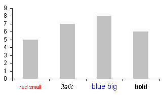
A reader named Roland asks, “How can I individually format the labels on my category axis?”

Excel axis tick labels cannot be individually formatted. But you can make a chart like the one above in Excel. You simply need to use a little trick involving a second hidden series and its data labels.
First, add a column to the data range that contains all zeros.
| Data | Labels | |
| red small | 5 | 0 |
| italic | 7 | 0 |
| blue big | 8 | 0 |
| bold | 6 | 0 |
Select this entire range and create the column chart.

Format the category axis to hide its default category labels.

Convert the “Labels” series to a line type. To select this series, select the “Data” series and click the up arrow key. To change the type, right click on it and select Chart Type or Change Chart Type, or go to the Chart menu or Chart Tools Design tab and select Chart Type or Change Chart Type.

Format the “Labels” series so it has no line and no markers. Also apply data labels to the “Labels” series using the Category option.

Format the data labels so they are in the Below position.

Format the data labels individually. To select a single data label: click once to select the series of labels, then click again on the specific label.


fulvioo says
Nice trick.
Your blog rocks, thank you for constantly update it with useful information.
Audrey says
Wow, ingenious!
Syed Altaf says
Thanks for your Quick Reply. . .This what I was looking for .. .:-) But I am stuck in middle could u please guide me how to “Format the category axis to hide its default category labels”. I am using Excel 2007.
Thank you so much. . and yes the Blog is Outstanding!!
Jon Peltier says
Syed –
Right click on the axis, choose Format Axis from the pop up menu, and on the main screen of the dialog, find the option for where to show the labels. Options are High (top of chart), Low (bottom of chart), Next to Axis, and None. Choose None to hide the labels.
Syed Altaf says
Wow. .Thank you So much Jon . . .It helped me a lot. . I will try it for multiple axis chart. .with huge data. . .Thanks a ton .. .
Ralph says
Hi – I can’t seem to be able to follow this instruction. Would you mind elaborating a little? Thank you!
“Convert the “Labels” series to a line type. To select this series, select the “Data” series and click the up arrow key.”
Nice tip!
Jon Peltier says
Ralph –
You need to select the series first. When I can’t see the series I want to format, or it’s behind another series, I usually select a different series and use the up or down arrows until the one I want is selected. You could also select it using the dropdown on the Chart toolbar (2003) or on the ChartTools > Layout or Format tabs (2007).
Then on the Chart menu > Chart Type (2003) or Chart Tools > Design tab (2007), select a Line style for the selected series.
Make A Blog says
When I originally left a comment I appear to have
clicked the -Notify me when new comments are added- checkbox and now each
time a comment is added I get four emails with the same comment.
Perhaps there is an easy method you can remove me from that
service? Thanks!
Jon Peltier says
Halley –
Go to the bottom of the page that you get notifications for. Below the comment form is the line:
You are subscribed to this entry. Manage your subscriptions.
The phrase “Manage your subscriptions” is a link to the subscription manager, which you can use to unsubscribe from these notifications. You must have found this already, though, because I looked in the subscription manager and didn’t find your email.
Manik says
Very nice and easy trick. Thank you so much. If any one can explain step by step? I am using excel 2007.
Jon Peltier says
Which steps were omitted?
Rebecca says
This is great!
Do you have any suggestions on how to do something VERY similar but to a bar graph rather than a column graph?
I’d like the formatted category labels to be to the left rather then under the graph. (Obviously I can drag them there, but I am looking for as little VBA coding as possible).
Thanks!
Jon Peltier says
Rebecca –
Pretend this is your chart with its data.
Add another bar chart series, that uses small negative values values.
Move the new series to the secondary axis, and make sure it’s a clustered bar type, not a stacked bar.
Delete the secondary value axis (horizontal axis at top of chart).
Format the primary category axis (vertical axis) to have no labels.
Add date labels to the secondary axis series (the dummy series you just added). Use the Inside End and Categories options.
Format the horizontal axis so its minimum is locked in at zero.
To select an individual label, you need to single click once to select the set of labels, then single click again to select the specific label. Once selected, format away.
Rebecca says
Thanks you so much John! I had to switch a few things since I am creating a tornado diagram, but your example was a great starting point. You saved me hours. Now to create the graph through VB.