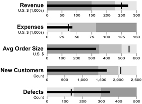
Stephen Few of Perceptual Edge introduced the concept of Bullet Graphs a few years ago, and their use as a replacement for various gauge charts is slowly expanding. Bullet graphs are easier to read than the many gauges that adorn poorly designed business dashboards, while taking up less space and breaking the ineffective metaphor of a business dashboard as the cockpit of a 747.

Charley Kyd of Excel User shows How to Create Bullet Graphs To Replace Gauges in Excel.

Dealer Diagnostics shows how to Create Bullet Graphs with Google Charts.
![]()
![]()
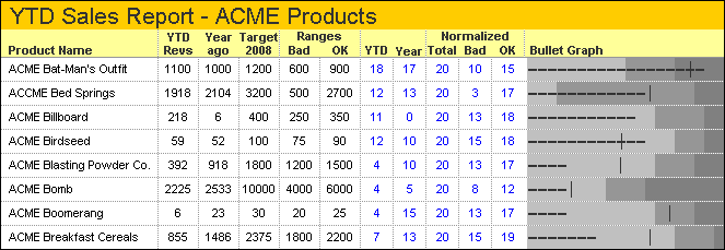
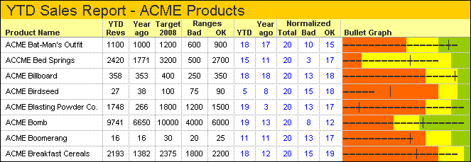
And now Chandoo of Pointy Haired Dilbert wants to help you Become a Dashboard Ninja with Bullet Graphs. Chandoo has done some interesting things with conditional formatting (visit his blog for examples), which he uses for the background colors of his bullets, shown below. The bars and the ticks used to indicate last year’s performance are controlled by worksheet formulas.


This is a clever way to get bullet charts into an Excel report.


Jon Peltier says
Sure, it’s a cool technique. Wish I’d thought of it.
Chandoo says
Hi Jon…
Thanks for blogging this :)
kalin says
Kalin from Dealer Diagnostics here. I thought you might also be interested to know that we have released a gadget that can make the bullet graphs we had created using the google charts API using live data from a Google spreadsheet.
http://dealerdiagnostics.com/blog/2008/09/the-ddr-bullet-graph-gadget/
Liu 's chart blog says
Here is a simple method to create a bullet chart in excel via error bar of a scatt plot:
http://excelpro.blog.sohu.com/131084696.html
Andrew says
I’m trying to show a bullet chart with four performance bands (instead of three). I’ve followed the charley kidd tutorial but it messes up when I try to add a fourth data series. Any ideas on how to do this?
Thanks!
Jon Peltier says
Andrew – Don’t add the series after the chart is built with the original three. Start with all series and follow the procedure.
Andrew says
Thanks Jon – I’ll give this a try
savithri.v says
Sir,
I’m not sure whether it is appropriate to remark here about the post “How to Create Bullet Graphs to Replace Gauges in Excel” referred by you above
But knowing for sure that you would cut me down to size and not allow anything inapt…
Explanation therein, for the formula in cell G3 mentions:-
“If the OK amount is greater than the unsatisfactory amount, cells G3 and G5 contain that positive difference; otherwise, they contain zero”
Let us say cell B2 contains a -ve amount (Tolerance level can be ‘-ve’. Can’t it?)
If negative, the formula in cell G3 given as “MAX(B3-F3,0)”, I feel, may not give the desired effect.
Instead, something like “MAX(B3-IF(B2>0,F3,0),0)” may work
Again in cell H3 which carries the explanation,
“Cells H3 and H5 contain values that are at least as large as the Target value, but not less than zero.”
the formula I feel, instead of “MAX(B5-SUM(F3:G3),0)”
could be “MAX(B5-(IF(F3>0,F3,0)+IF(G3>0,G3,0)),0)”
savithri
Jon Peltier says
Savithri –
At the end of that article, there is a link for emailing comments to the author and website owner.
The whole positive-negative aspect of bar charts led to my web pages Stacked Column Charts that Cross the X Axis and Waterfall Charts that Cross the X Axis.
With bullet graphs there is an issue with scales that extend both above and below zero. Since bars convey values by their lengths, you would have to start at least the thin black indicator somewhere in the middle of the graph, or lose the length-value correlation.
savithri.v says
Dear Sir,
The file sent to you offline was after testing again (and again) with a few more data (I was conscious of the recipient…)
In the one off instance where the graph was used, it was felt that the grey bands looked apt to show achievable, ideal, targets etc – hence the bullet graph.
As mentioned by you, I did care that the scales for Revenues in various categories (all the graphs) were kept the same as also the scaling for the cost graphs were compatible
Till I learn a better word to express…THANK YOU!
savithri