Kaiser wrote about a chart in The Economist in Dealing with skew. Kaiser’s discussion centered around how unclear the Economist’s chart was in even describing what it was showing. Even the title of thee chart, “Income distribution by decile in selected OECD countries”, was deceptive. We won’t get into the junky background.
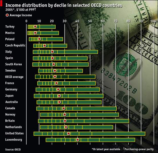
The bars seem to show decile ranges, until you count the segments and realize there are only nine per bar. It turns out that each bar connects ten values, the average incomes within each decile. This strikes me as a little odd: I think if you had to leave off the extremes, perhaps taking the 5th, 15th, 25th, . . . and 95th percentile values might be a bit more natural. But maybe it’s a matter of taste.
The data originated with the folks who bring us the OECD Factblog, by the way. The data is available in an Excel workbook at Growing Unequal? Income Distribution and Poverty in OECD Countries.
Data in hand, I decided to slice it and dice it. My first impression was to look at cumulative distributions. I assumed that the value for each decile was the value for the middle of that decile, so I used 5% for the first decile, 15% for the second, etc. There were a lot of lines cluttered together, so I made myself an Interactive Multiple Line Chart with a listbox to highlight one country at a time. I have highlighted the US in each of these charts.
I did not include the protocol for creating this interactive chart, but if I get more than two comments asking for it, I’ll be glad to oblige.
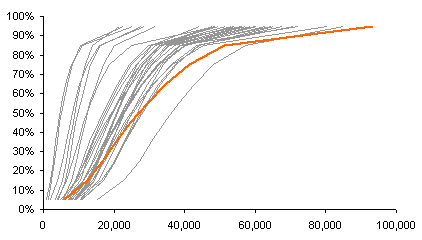
Using linear values on the horizontal scale tends to compress the lower values together. I plotted the log of the income data to spread out the data. On a log scale, an equal distance on the chart relates to an equal percentage difference of the values.
The rightmost gray line is Luxembourg. It is steeper than the line for the US, meaning there is less disparity between the lowest earners and the highest. Most of the other curves have a similar slope (similar percentage disparity between low and high). The US and a few others are less steep, meaning they have a greater difference between the poorest and richest earners.
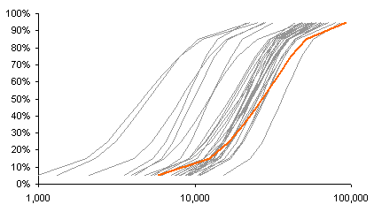
I converted the percentile values on the vertical axis to their Z-scores. This straightens out most of the curvature at the ends of these S-shaped curves.
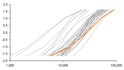
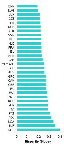
I took this one step further, and computed linear regression coefficients for each country’s distribution using Z-scores as the independent variable and log income as the independent variable. The computed intercept provides a rough approximation of the median income, while the computed slope is related to the disparity between highest and lowest income.
The median income is shown below left and the income disparity below right. If you believe that higher income and less income disparity is good, then it’s better to be located toward the top of each of these charts. Luxembourg is close to the top of both charts; Mexico, Turkey, and Poland are near the bottom of both; and thee US is mixed, near the top of median income and near the bottom of income disparity.

I like XY charts, so I plotted Income Disparity against Median Income. The data shows a negative trend in the bottom right corner is Luxembourg, while in the top right are Mexico, Turkey, and Poland. The US is the furthest above a diagonal, meaning its combination of high median income and high income disparity is unmatched. To reduce clutter, I removed the labels from the data points in the middle of the chart.

While this analysis is interesting, none of these charts gives a really good overview of all of the data at once. The cumulative distributions give a sense of the data, but it is not realistic to try to label all countries on a single chart. Ironically I drifted back to the stacked bar representation that The Economist showed. With less distracting background, of course.
In Kaiser’s post, Chris Jackson mentioned his paper in The American Statistician, Displaying Uncertainty With Shading, which essentially applies a gradient to a bar that relates to thee density of data at each point along the bar. I decided to apply this approach, but without a gradient that fades too severely at its ends (too reminiscent of the conditional formatting data bars in Excel 2007). I applied his approach by applying lighter shades to the outer deciles and darker shades to the central ones. This worked reasonably well, considering that I made no effort to develop a color palette for this purpose.
Here is my own rendition of The Economist’s chart.
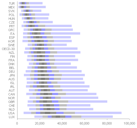
This has the same problem with the lower deciles being compressed. But having just plotted log income in my cumulative distribution plots, I decided it would be worthwhile to apply logs to this stacked bar chart.
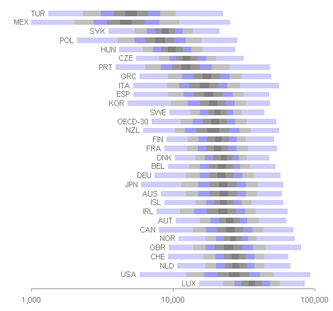
This is a more effective display of income disparity than the linear version put forth by The Economist, but it assumes that the audience understands Logarithmic Axis Scales. The median income is clearly identified by the lateral position of the bars, and the disparity of income is directly related to the total width of the bars.


fabrice says
Boxplots could work, loosing some granularity…
Ran Barton says
“I did not include the protocol for creating this interactive chart, but if I get more than two comments asking for it, I’ll be glad to oblige.”
Count me in as one vote for a write up, please and thank you.
Jon Peltier says
Fabrice – I did in fact think of that, but decided to leave it for another day.
Ran – That’s 1….
Fabrice says
Here is the boxplot chart :
Jon Peltier says
Fabrice –
Nice. The boxplots lose resolution more in the way the stacked bars against a linear income scale lose resolution: everything at the lower end is compressed. You could apply a log scale, and the disparity in income would be easy to compare.
Jon Peltier says
Fabrice has shared his box plot above and a second one that uses a log scale in How to use BoxPlot charts.
DaleW says
Jon,
Very cool, especially the use of a normalized semilog slope to quantify income disparity, and your final gradient chart on a log scale. That Excel decile gradient chart is a nice alternative to the boxplot (even Fabrice’s variant) when higher resolution is desired, and much easier to interpret than the Economist graphic.
Possibly the advantage of tracking mean income by decile is that it preserves the ability to exactly calculate an overall mean simply from the 10 decile points? If we used purely robust methods and tracked the median of each decile as you suggested, such data wouldn’t let us exactly reconstruct the overall mean — or even median. For practical purposes, either of those approaches allows a pretty decent reconstruction of the distribution, except for the ~ 5% tails.
Jason says
I would greatly appreciate a description of how you recreated the economist chart.
Jon Peltier says
Dwight –
It’s a stacked horizontal bar chart. The first column of the data is the country number. The second column is the average within the first decile (0th to 10th percentile). The third column is the average of the second decile minus the average of the first decile. And so on for averages of each decile minus the average of the previous. Create a stacked bar chart, format the first bar with no border and no fill to hide it, and format the others with appropriate shades of gray, darkest in the middle to lightest at either end. Choose either a linear or logarithmic scale for the horizontal (value) axis.