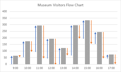
My colleague Frédéric LeGuen, an Excel MVP from France who runs the ExcelTutorial website and the ExcelExercise YouTube channel, asked me a tricky question last week. He wanted a way to visually track visitors to a museum, knowing how many arrived and left during a given hour. He tried a candlestick chart first, which is great for monitoring stock data, and a waterfall chart, which is great for tracking a quantity subject to up and down changes. The problem is that both charts show only up or down values in a given time period, while we want to show up and down for each time period.
Museum Visitor Data
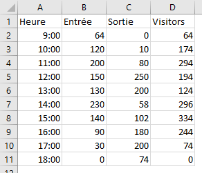
We have the following data that lists the number of visitors entering (Entrée) and leaving (Sortie) during the hour, and the net visitors. The formula in cell D2, filled down the list, is
=SUM(B$2:B2)-SUM(C$2:C2)
So let’s plot the data in a clustered column chart to see what we have.
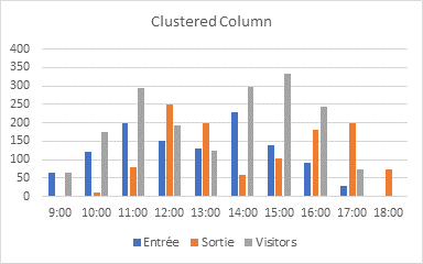
No, that doesn’t show us anything. How about a stacked column chart?

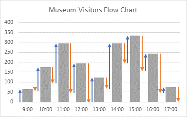
What we want will look like this, but have blue arrows before each column showing visitors who have arrived and orange arrows after each column showing visitors who have left.

There is an easy way to do this, using all columns and the sometimes tricky custom error bars. And there is a hard way, using XY series and tricky custom error bars. There’s another hard way, which uses easier error bars but more complicated stacked columns that require a complicated data layout, so I think I’ll avoid that one.
The Easy Way
Starting with the same initial data as above, I made a clustered column chart using time (Heure) as X values and Visitors as Y values. I’ve changed the series overlap from the default of -27% to 0% and the gap width from the default of 219% to 100%. I don’t know who thought up those defaults.
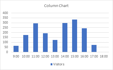
I copied the Visitors data, selected the chart, and pasted. Two series with the same values and name, that’s what I wanted. Really.

Then I repeated the copy and paste so I have the same data in the chart three times. This will give me the total visitors as the middle column, with a column before and after this where I can draw my arrows.
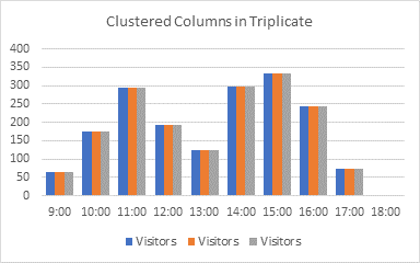
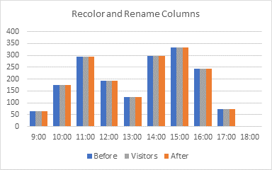
I changed the colors of the bars, because I want the totals to be gray, and I want blue and orange to represent increases and decreases. And I’ve renamed the outer bars Before and After.
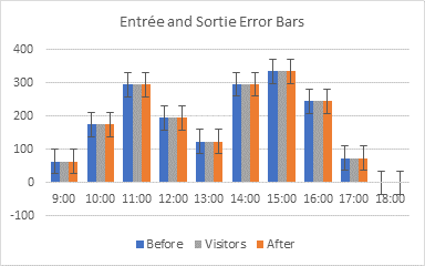
I added error bars to the Before and After series, using the little plus-sign icon floating beside the chart.
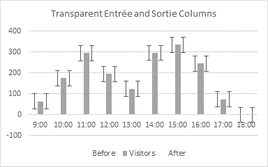
I don’t need to display the blue and orange columns anymore, so I’ve formatted them with no fill, to be transparent.
Time to format the error bars. Be sure to choose the No End Caps option, and then under Error Amount, select Custom, and then click the Specify Value button.
I used the data in the Entrée and Sortie columns as custom values. When you click the Specify Value button, you get this tiny little dialog, with even tinier little edit boxes for selecting the range. The values are initially ={1} for both: change the positive value to ={0} and select the Entrée values for the negative.
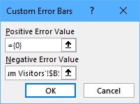
I’ve been complaining about the tiny Custom Error Bars dialog for a long time. Here’s what a more reasonably sized dialog would look like. See that, Microsoft? I did it in 5 minutes in MS Paint.

Note, for the Sortie error bar values, they are off by one row, so you need to select the range starting in the second cell, so use $C$3:$C$11. Here’s how the custom error bars look.
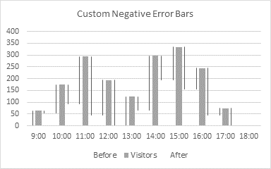
Format the error bars with the blue and orange colors. Make the lines a bit thicker; I’ve used 1.5 pt which is 2 pixels. Give the blue error bars a starting arrowhead, and the orange error bars an ending arrowhead.
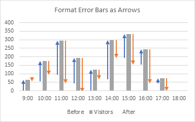
A little clean up. I deleted the legend, and adjusted the chart data range to leave out the meaningless blank at 18:00.
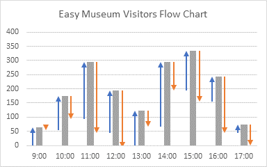
You have some leeway in the spacing of the columns, by adjusting the gap width. In the chart above, the gap width is 100, meaning the space between the clusters is 100% as wide as a single column. The hidden columns that the arrows occupy are 100% of this width as well, so there is a reasonably wide space between arrows.
If you want to decrease the spacing, you can decrease the gap. The chart below has the minimum gap width of 0%.
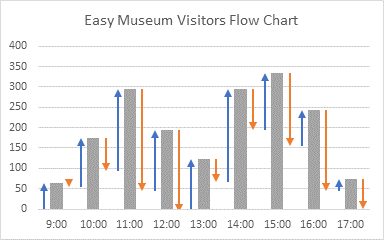
If you had kept the default gap width of 219%, the columns and arrows would be rather far apart.

You can set the gap width as high as 500%, which looks so ridiculous that I’m not showing it..
The Hard Way
The easy approach used two column chart series to hang the error bars on. The hard approach uses two XY scatter chart series. I’ve inserted a column of X values before the Y values (Visitors) in my data.
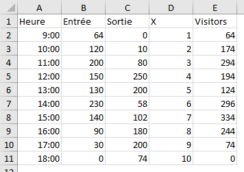
I selected the time (Heure) and Visitors, and created a column chart. I’ve recolored it gray, and applied overlap of 0% and gap width of 150%.

I copied the X and Visitors data in columns D and E, selected the chart, and used Paste Special (Ribbon > Home tab > Paste dropdown > Paste Special) to add the data to the chart as a new series in columns, series name in first row, categories in first column.

The result is a second set of columns with the same values as the first. I’ve recolored the columns blue and renamed them Entrée.

I right-clicked on the new series and chose Change Series Chart Type from the pop-up menu. I changed the chart type for Entrée to Scatter (arrow 1), and I unchecked the Secondary Axis box beside it (arrow 2).
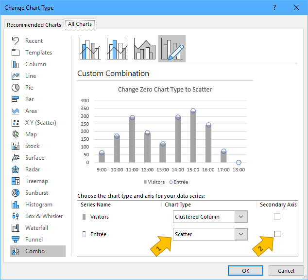
The result is a combination chart with a set of gray columns and a set of blue markers, which I have reformatted into a large blue circle with no fill color.
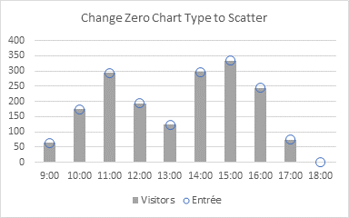
The X values I’ve used, 1, 2, 3, etc., align with the bars at the first, second, third, etc. categories. What I need is to subtract a little bit from these X values to move the blue circles to the left of the columns, and add the same amount to these X values so another set of circles will sit to the right of the columns.
So I’ve added two more columns to my data, X-Before and X-After. I put a small value into cell D13. The formulas in the added columns are:
Cell E2: =D2+$D$13
Cell F2: =D2-$D$13
Keeping my original X values in their own column and using a cell to hold my small amount to add and subtract make it easier to make adjustments later, to cells I can see, rather than to formulas where the amounts are hidden.
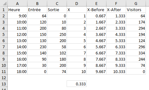
I changed the X values of my Entrée series to X-Before.
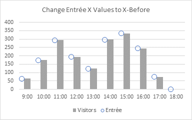
Looking good. So I copied my X-After and Visitors data, and used Paste Special as before to add a third series to the chart. Since I’ve already changed the previous series to a scatter type on the primary axis, Excel made my new series also a scatter type on the primary axis. I’ve renamed the new series Sortie, and made it a large orange circle with no fill.
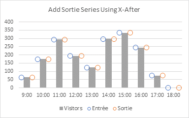
So far so good, as long as Disney doesn’t come after my for trademark infringement.
So let’s bring this puppy home. Add error bars to the Entrée and Sortie series, using the plus icon floating beside the chart.
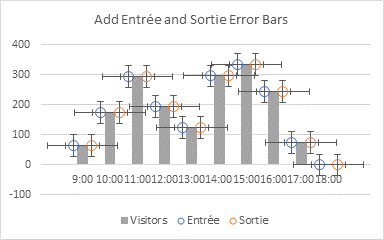
Select and delete the horizontal error bars.
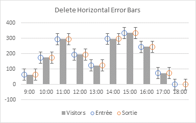
Let’s format the error bars. Choose the No End Caps option, and under Error Amount, select Custom, and then click the Specify Value button.
Use the data in the Entrée and Sortie columns as custom values for the error bars. You get this tiny little dialog I showed before, with microscopic edit boxes for selecting the range. The error bar values are initially ={1} for both: change the positive value to ={0} and for negative select the Entrée values.

Isn’t this Custom Error Bars dialog difficult to use? Here’s a better sized dialog. See that, Microsoft? I fixed it in 5 minutes using MS Paint.

Note that the Sortie error bar values are off by one row, so you need to select the range starting in the second cell, so use $C$3:$C$11. Here’s how the custom error bars look.
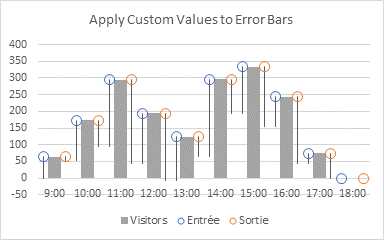
Format the error bars with the blue and orange colors and the lines thicker; I’ve used 1.5 pt (2 pixels). Give the blue error bars a starting arrowhead, and the orange error bars an ending arrowhead.
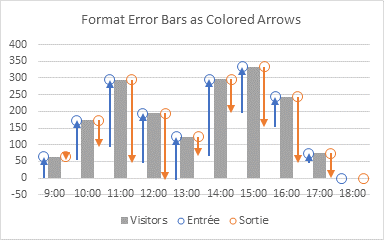
Format the Entrée and Sortie series to use no markers.

Finally a little clean-up. Delete the legend. Make all of the chart series one point shorter to remove the meaningless 18:00 category (stop at row 10 instead of row 11). Set the Y axis minimum to zero (the arrows between 12:00 and 13:00 actually drop slightly into negative territory, but that’s not crucial to the story).
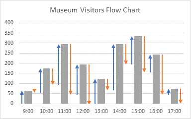
The chart above used a gap width of 125% and a value of 0.333 to add or subtract from X to position the Entrée and Sortie arrows. You can adjust these together to change the chart’s appearance. Below, for example, I’ve applied a gap width of 75% and used an X increment of 0.41.
Related Posts
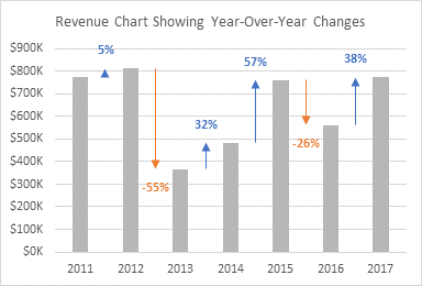
The hourly flow chart in this tutorial uses a similar approach to that in Revenue Chart Showing Year-Over-Year Variances.
There is a somewhat dated but still relevant tutorial on this blog that tells you all about Custom Error Bars in Excel Charts. Here is the cramped Custom Error Bars dialog in Excel 2007 and Windows 7, even narrower than Excel 365’s.

Here is a complete list of error bar related articles on the Peltier Tech blog.
- Error Bars in Excel 2007 Charts
- Custom Error Bars in Excel Charts
- Floating Bars in Excel Charts
- Error Bar Gantt Chart
- Callout Labels with Error Bars
- Step Charts in Excel
- Swimmer Plots in Excel
- High-Low Line Alternatives in Excel Charts
- Custom Axis Labels and Gridlines in an Excel Chart
- Add a Horizontal Line to a Column or Line Chart: Error Bar Method
- Add a Vertical Line to a Column or Line Chart: Error Bar Method



Niklas says
I think the problem is more easily solved by a simple combo chart
Bob says
Hi Jon,
Way cool.
Jon Peltier says
Niklas –
That’s a quick way to do it. The bars don’t contribute as clearly to the total.
Josh says
Hi Jon,
I always appreciate your creative use of error bars. ^_^
I think that if Frédéric expands the business goal of the chart it would inform the design.
For instance, if the museum wanted to…:
…staff ticket booths efficiently, we’d want to see incoming patrons clearly (Niklas’ chart wins).
…staff the gift shop efficiently, we’d want to see exiting patrons clearly (Niklas’ chart wins).
…staff security guards efficiently, we’d want to see current number of patrons (both charts win).
…understand the effectiveness of the “half price after 14:00” promotion (Jon’s chart wins).
…understand how drastically the late morning glare through the windows was driving out patrons (Jon’s chart wins).
Josh says
Apologies for the double post.
I didn’t mean to miss the forest for its trees. I’ve definitely had need for a waterfall-ish chart that shows ups AND downs, and this is a great solution. Thank you!