I wrote a tutorial about Histograms long ago, and haven’t used any of that for my own histograms in years. I don’t use regular column charts, unless I need something really quick and dirty. Instead, I use XY charts for various reasons, and I follow the protocol in this post.
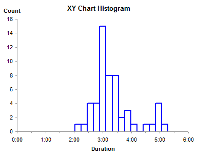
A histogram is basically a column chart with value ranges (bins) laid out in numerical order along the horizontal axis, and the height of the columns encodes the number of observations within that value range.
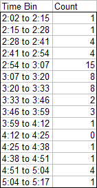
Data for a histogram typically looks like this, with the bin label in the first column and the count (frequency) within each bin in the second column.
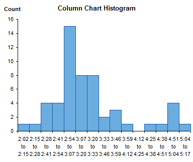
The typical Excel histogram is a column chart from this data. It shows the data well enough, although having more than a dozen bins squashes the labels together making them hard to read.
Rotating the labels 90° unsquashes them, but they are equally hard to read unless you awkwardly swivel your neck.
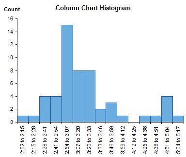
Another problem with a plain old column chart is that the bins look numerical, but the axis is categorical, and does not represent the numerical values of the bin boundaries. Unless you can do math in your head, and can force your mathematical brain to ignore what your visual brain sees, you don’t know that the bins are of equal width. In this case they are equal, but I’ve seen histograms which have unequal bin widths represented by equal width bars. This is just another way of distorting the data.
To correct this problem, let’s modify the data, so we place the bin start values in the first column, and the count for the bin starting at each of these values in the second column.
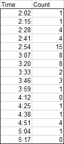
Now the fun begins. This is a similar exercise to that used to generate step charts, but we need not just a vertical line segment connecting adjacent horizontal steps, we need vertical line segments connecting these steps to the horizontal axis at the bottom of the chart. So we need to modify the simple table above.
In the first block below I have stacked up three copies of the data. These are color coded so we can trace the data through the next steps.
In the second block I have indicated two cells that need to be deleted, with cells shifting up to fill the gap. The third block shows the data after deleting these two cells.
Finally I sorted the data by the first column, resulting in the striped last block below.
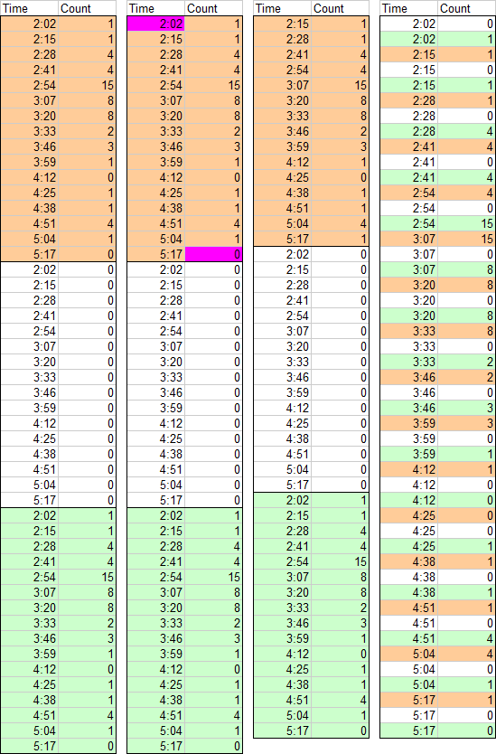
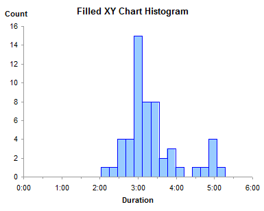
The rest is easy. Make an XY chart, using the lines-without-markers option, from this last block of data, and format it to look nice. The lines connecting the XY points trace the sides and tops of each histogram bar.

The advantage of this type of histogram is that the X axis is truly numerical. The axis can be formatted with the minimum, maximum, and spacing that you want. The min, max, and spacing can be natural “human-friendly” values, not values defined by statistical calculations to excessive significant figures. And you can see by inspection that the bins are of equal width.
The disadvantage of the XY chart histogram is that the bars are only present in outline: they are not filled with your favorite colors. In the next article I will show a technique to fill these bars. If you want a head start, you can refer back to the tutorial that shows how to Fill Below an XY Chart Series with an XY-Area Combination Chart.


derek says
My favourite method for histograms uses the time-scale property to draw a line chart; so like yours it builds on previous experience with step charts. The advantage is that filled areas are as simple as changing the chart type from Line to Area. The disadvantage is that the bins must be in integers, unless you transform them into integers and add a dummy label range.
You have to arrange three columns in series, not side-by-side, so expanding the data set requires making or leaving space for new rows. Fortunately there’s no need to interleave the data points, as the time-scale axis does that automatically. In fact I think you can play games with named ranges to avoid the need for multiple columns altogether.
Steven Frazier says
Jon, I recently started converting my histograms to CDF (continuous distribution functions) based on readings from the book Data Analysis with Open Source Tools by Phillip K. Janert, pages 23-27. You simply rank the actual data and determine the percentage of data below each value. The XY plot of data can be used for seeing if the data is normal and making inferences is much easier than with a histogram.
Jon Peltier says
Derek –
Stay tuned for the next article, which discusses area chart series to fill the histogram outlines produced here. Since I need an XY series for the axis labels anyway, I keep using it for the histogram outlines. This requires sorted data, but that’s not too much of an impediment. Besides, for the humans tasked with maintaining these histograms, sorted data is much easier to comprehend. You can in fact use names to define the source data for the histograms if you’re using line or area charts (see Approach 2 in https://peltiertech.com/Excel/ChartsHowTo/StepChart.html ), but these are also tough to comprehend.
derek says
Jon, I’m sometimes lucky enough not to need an XY series for the axis labels, because my bins are bounded by integers anyway. After writing that comment, I checked that, yes, I could write a name that would refer to three ranges, the original, a blank range, and the original offset by one.
But like you say, how do you hand that off to a random colleague and expect that they’ll ever understand what to do if it breaks? :-)
Jon Peltier says
Steven –
Making a CDF of a data set allows more rigorous analysis of the data, and I probably will write a post about this technique. I did write a tutorial about using a dummy series to create a probablility axis scale, in https://peltiertech.com/Excel/Charts/ProbabilityChart.html.
I’ve found that these charts often need a lot of explanation. People have trouble with a simple pseudo-CDF like a pareto chart (https://peltiertech.com/pareto-charts/), and a CDF is even a bit more complicated. This doesn’t mean we shouldn’t use them, it just means we may need to explain the chart itself, before explaining the data in the chart.
Lawrence Heltzer says
Jon,
This was VERY helpful…and timely! Thanks.
I’m trying to solve another chart issue (not sure where to post this one on your site, sorry.) I have a dynamic line chart that tracks monthly revenues. The user can scroll through time and see how revenues change month to month (or quarter to quarter). But what I need to add is a cumulative year-to-date line and the problem is I don’t know how to break that line after the end of a fiscal year when the cum is reset to the value of the first period.
The problem is easily solved using columns for the YTD cumulative data, but the request is for a line and I’m not sure whether that is more effort than it’s worth. What do you think?
Lawrence
Jon Peltier says
Lawrence –
I’m assuming you are not asking how to reset the YTD total when starting a new year. To get a gap, you need either a gap in the data (a truly blank cell, not “” or #N/A or related tricks), or you need to use two different series, one worksheet column for last year and the next column for this year.
DaleW says
Jon,
Very useful tutorial. Count me as convinced: this XY method is the best way to draw a histogram in Excel when one wants to add other data to the chart.
As a visual check of whether a dataset follows a distribution, most commonly a normal one, a histogram is a great place to start. Add a bell curve having the same average and scatter and area as the dataset, and we’ve got a very good graphic.
To provide more insight into the data, what is usually needed is statistical hypothesis testing rather than a better visual, such as your NPP plot (a transformed CDF plot) would be for some. Why not just report the results (p-value) of your favorite statistical hypothesis test(s) for normality as a caption or footnote on the more familiar plot showing the histogram with its bell curve hypothesis? (Pity that native Excel doesn’t have any such tests readily available…)
remarq says
A quick and dirty shortcut could be using a negative error bar on a xy scatter plot. The height of the error bar is equal to the value. Make the error bar as thick as possible and use an appropriate marker (or no marker at all) for the data point itself so that it looks a bit like a bar.