Most histograms made in Excel don’t look very good, because the category labels describing the bins are centered below the bars.
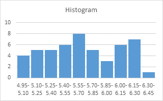
In Histogram with Actual Bin Labels Between Bars I showed technique that centered bin edge values between the bars of a histogram.
Much nicer.
In this tutorial I will go one further and show how to plot your histogram on a value-type horizontal axis.
Data for Histogram and Labels
Fifty random values between 4.95 and 6.45 are summarized in the table below. The gold shaded range is the list of bin values, corresponding to the value at the top of each bin. The blue shaded range is the result of the FREQUENCY function, which tells us the number of values below the first bin value, the number of values between each successive pair of bin values, and the number of values above the top bin.
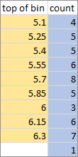
We can expand the column of bin values so we know the overall upper and lower limit of the data.

By inspection of these upper and lower limits, coupled with decades of experience in labeling chart axes, I will use the following values for my histogram chart axis labels. The first column are the values, the second column is a bunch of zeros, because I will plot these points along the bottom of the chart, and hang the axis labels on them.

Constructing the Histogram
Start by selecting the blue range in the data range above. Ignore any of the other data.
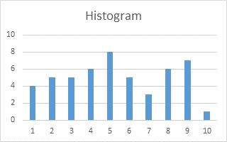
Those are pretty spindly bars for a histogram. Change the gap width to a small number (10-15% works well). Purists will make their gap widths zero, but then you need a border around the bars. We’ll let the thin white gap serve as our border.
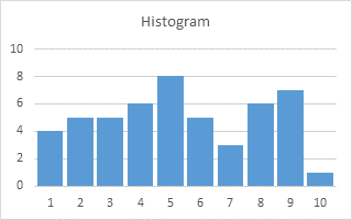
Copy the labels data (the last data range above), select the chart, go to the Home tab of the Ribbon, click the down arrow on the Paste button (the Copy button in older Excel ribbons), and choose Paste Special. Add the data as a new series with rows in columns and with category (X) labels in the first column.
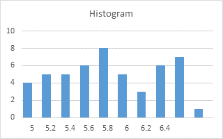
Doesn’t look like much, but the values were zero, so the bars have no height. They did push the histogram bars aside to make room, though.
Select the added series (select the histogram bars and press the up arrow key), click the menu button (between the Alt and Ctrl buttons to the right of the space bar) to pop up the context menu, and choose Change Series Chart Type. Select XY Scatter with markers and no lines.
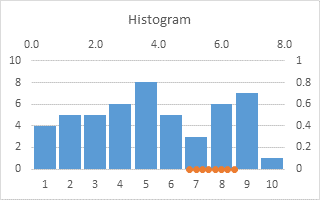
Excel automatically puts this XY series onto the secondary axes, and draws the axes for us. Select the secondary (right) vertical axis, and choose Horizontal Axis Crosses at Automatic Position (zero).

Select the primary (left) vertical axis, and choose Horizontal Axis Crosses at Maximum Axis Value.
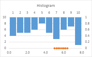
Select the primary (left) vertical axis and press the Delete key, to turn those histogram stalactites into stalagmites.
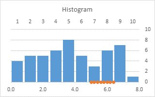
Format the secondary (bottom) horizontal axis, and choose Vertical Axis Crosses at Automatic Position (zero).

Format the primary (upper) horizontal axis so it uses no labels, no tickmarks, and no line.

Format the secondary (horizontal) axis scale so its minimum and maximum are the same as the outermost bin limits, that is, 4.95 and 6.45. If the axis has visible tickmarks, change the tickmark settings to None.
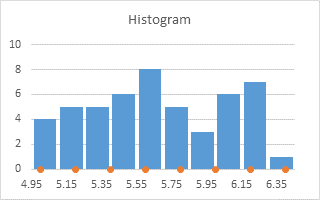
If you hide the secondary (horizontal) axis tick labels but choosing None for labels, Excel will remove the space below the chart for these labels. Instead, change the number format of the secondary (horizontal) axis to ” ” (three spaces within double quotes) to preserve this spacing.
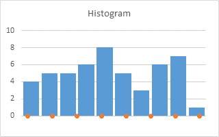
Add data labels to the XY series. Use the Below option for position and X Value option for what the label contains.

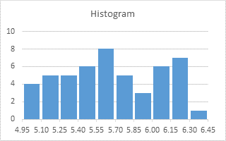
Finally, change the marker of this XY series to small plus symbols, and use a gray color that matches the axis line. These plus symbols now mimic axis tickmarks. Unfortunately there is no easy way to add tickmarks outside the plot area, which is my preference and should be yours, but we’ll put up with tickmarks that cross the axis just this once.

And our new histogram is finished.


EK Esawi says
Hi Jon,
i have seen, in multiple places, a histogram with class boundaries listed on the edges of each bar and in some the mid point is listed in the middle of the bar. Instead of having the x-axis labels centered in the middle of the bar.
I read the info here but it was, if i am not mistaken, published in 2013, i am wondering if there is an easier and less laborious way to create a histogram with class boundaries on edges and midpoint in the middle,
The only possibility, which i did not try, i can think of is to draw the histogram one bar a time and by connecting coordinates.
Thanks
EK Esawi