Excel highlights the data range of a chart under many conditions. The source data range must be relatively simple, based on a rectangular data range. The chart must be embedded in the worksheet that also contains the data. If the data meets these conditions (elaborated upon later), selecting the chart area or the plot area of the chart will cause Excel to highlight the source data.

Highlighting is used in Excel versions 97 (or earlier) through 2007; Excel 2003 was used for the illustrations in this post.
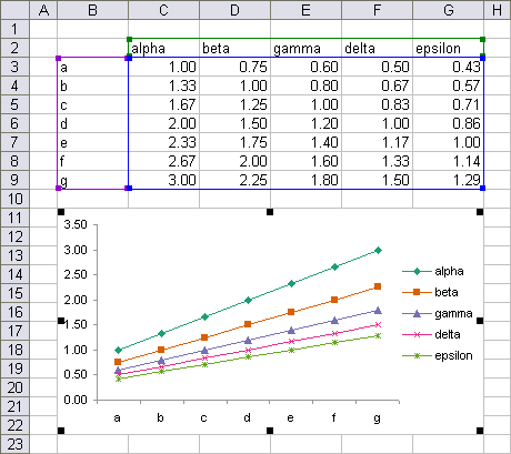
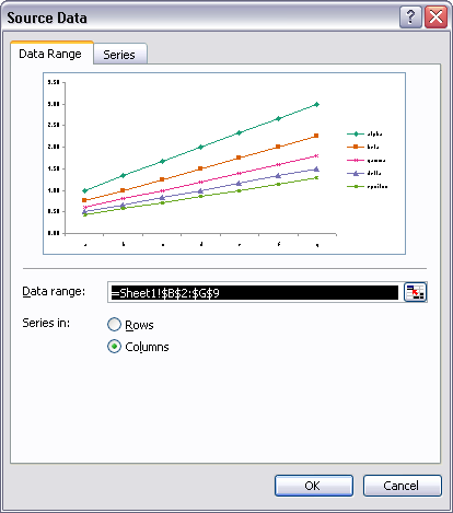
The Y value data is highlighted by the blue outline, the X value data by the purple outline, and the series names by the green outline. If the data range is defined in such a way that no series names are derived from the worksheet, there is no green highlighted range. If the X values are not drawn from the worksheet, there is no purple highlighted range. This data range corresponds to the Source Data – Data Range dialog below. Note that the rectangular range in the dialog includes four rectangular ranges in the worksheet: Y values in C3:G9, X values in B3:B9, series names in C2:G2, and the blank cell B2.

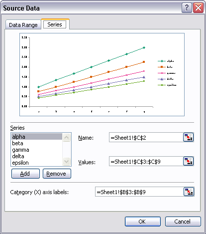
If a single series is selected, the corresponding data ranges for that series are highlighted (even if the source data for the entire chart was not highlighted).

This corresponds to the Source Data – Series dialog below.

In the following chart, the source data has been switched from series in columns to series in rows. The blue highlighted region below is the same as in the first figure above, but the purple and green regions have been switched.

The small squares (“handles”) on the corners of the highlighted ranges allow the user to adjust the sizes of the ranges by clicking on a corner and dragging. The ranges can be moved without resizing by clicking on the edge of a highlight rectangle and dragging. If the highlights show the source data range for the entire chart, moving and resizing one range will automatically move and resize the other ranges to maintain the “integrity” of the overall source data range.
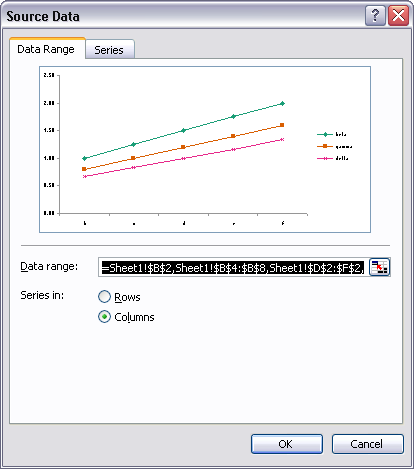
In the following illustration, the data range has been adjusted so that columns C and G and rows 3 and 9 are no longer included. (If the source data has been defined such that rows or columns subdivide the Y data range, the data range is considered “too complex”, and the highlights vanish.)

The corresponding dialog is shown below.

The entire data range address isn’t visible in the screen shot, but I’ve reproduced it here:
=Sheet1!$B$2,Sheet1!$B$4:$B$8,Sheet1!$D$2:$F$2,Sheet1!$D$4:$F$8
Note that the range includes the top left blank cell (cell B2) as a separate range, along with the X and Y ranges and the series names.
Experimenting with the highlighting behavior leads us to develop requirements that must be met for highlighting to occur.
Requirements for highlighting of whole chart source data
- Data range must be based on a rectangular range.
- Chart must be embedded in same worksheet that contains all data.
- X values and series names are optional.
- If X values are included, all series must use the same X value range.
- If series names are included, all series names must come from the appropriate cell in the range.
- If series names are not included, no series name may come from a worksheet cell.
- Related ranges must have identical numbers of rows or columns (as applicable).
- Related ranges must be aligned (start and end in same rows or columns).
- If X values are included, they must be parallel to Y values (i.e., same row or column orientation).
- Overall range may be divided by rows or columns between X and Y values or between Y values and series names.
- Y values range may not be subdivided by rows or columns.
- Series must be plotted in same order as data in data range.
- If any range does not meet requirements, all highlighting is lost.
Requirements for highlighting of chart series source data
- Data ranges must each be a contiguous rectangular range.
- Only data in same worksheet as embedded chart will be highlighted.
- Related ranges need not have identical numbers of rows or columns (as applicable).
- Related ranges need not be aligned (start and end in same rows or columns).
- If X values are included, they need not be parallel to Y values.
- If one range does not meet requirements, others may still be highlighted.
- If the data range for one series does not meet requirements, data ranges for another series may still be highlighted.
- If the chart’s entire data range does not meet requirements, data ranges for an individual series may still be highlighted.
The following screen shot illustrates the greater flexibility allowed for series data range highlighting, compared to whole chart highlighting.


Diane Smith says
My problem is when I click on the chart for some reason the data is not highlighted. In other words I don’t see the colored borders on the data that I can click and drag. One time it works and then the next time it does not, I click on the chart and no highlighting? Do you know a reason for that?
Jon Peltier says
Diane –
Is the source data highlighted for some charts and not for others? If the chart’s data is not easily grouped into the rectangles which would be highlighted, then the highlights will not appear. This means all series use the same X values, and each series uses the next column (or row) fir its Y values.
If the series are out of order, no highlight. If the series use different X values, no highlight. If the series use sequential ranges in order for Y values, but on series uses a different number of cells (e.g., one fewer point), no highlight.
Selecting an individual series will still highlight the data for that series.
Jamel says
My problem is when I click the chart, the data highlights for a second and then disappears. I looked all over and can’t find a solution to this. It doesn’t matter how the data is grouped.
Ray says
I appear to have “fixed” the not seeing the chart source data highlighted when clicking in the chart plot area by re-selecting the data range (Context Menu (right-click)>Select Data…>Chart Data Range). After that the chart data highlights when I click in the plot area.
Jon Peltier says
Ray –
Reselecting the chart data in the dialog ensures that the data is nicely arranged. All series the same number of cells, series in the order of rows or columns (changing the series order breaks the highlighting), etc.