I was asked recently whether it was possible to change the font color of a data label in an Excel chart to highlight the maximum value.
Well, sure, anything is possible. And there are at least two ways to accomplish this task. Because I’ve been doing a lot of coding lately, my first thought was an approach using VBA. Then of course I came to my senses, and worked out a non-programmatic approach. If possible, it’s usually advantageous not to rely on VBA for such tasks.
The VBA Approach
Because I thought of it first, I’ll show the VBA method of formatting the label for the maximum value first.
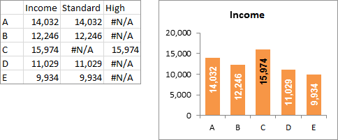
Here is the simple data and chart, with all labels formatted with white text.

For this simple example, I want the tallest bar to have a black label, like this:

Here is the simple VBA routine I worked out to accomplish my task.
Sub HighlightMaxDataLabel()
  Dim srs As Series
  Dim vY As Variant
  Dim iPt As Long, nPts As Long
  Dim dMax As Double
  Dim iHighlightColor As Long

  ' do nothing if user hasn't selected a chart
  If Not ActiveChart Is Nothing Then
    Set srs = ActiveChart.SeriesCollection(1)

    ' highlight color: change to suit
    iHighlightColor = RGB(0, 0, 0)

    ' reset all labels to original font color
    With srs.DataLabels.Font
      .Color = .Color
    End With

    vY = srs.Values
    nPts = srs.Points.Count

    ' find maximum value
    dMax = vY(1)
    For iPt = 2 To nPts
      If dMax < vY(iPt) Then
        dMax = vY(iPt)
      End If
    Next

    For iPt = 1 To nPts
      ' highlight all labels at maximum value
      If vY(iPt) = dMax Then
        srs.Points(iPt).DataLabel.Font.Color = iHighlightColor
      End If
    Next

  End If

End Sub
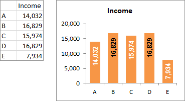
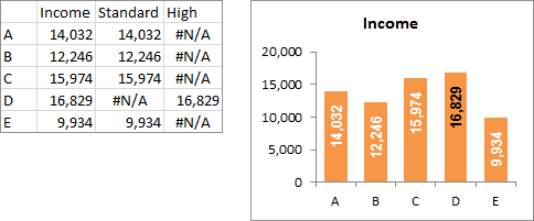
When the data changes, the labels don’t immediately change.
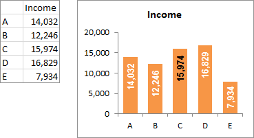
Run the code again, and the labels are now properly highlighted.

Of course you could modify the code and stick it into a Worksheet_Change event procedure to make the labels change when the data changes.
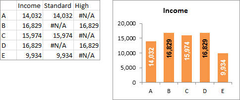
I made sure that the code checked all values, without stopping at the first maximum. This way, both labels are highlighted if there’s a tie for first.
The Non-Programmatic Approach
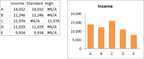
Here is the same data with a couple extra columns, and the column chart without data labels. The added columns provide data for hidden line chart series which will contain the differently formatted data labels.
Assuming the data is in A1:D6, the formulas are:
Cell C2: =IF(B2<MAX(B$2:B$6),B2,NA())
Cell D2: =IF(B2=MAX(B$2:B$6),B2,NA())
These formulas result in only one of the two line chart series having a marker for each column of the column chart.
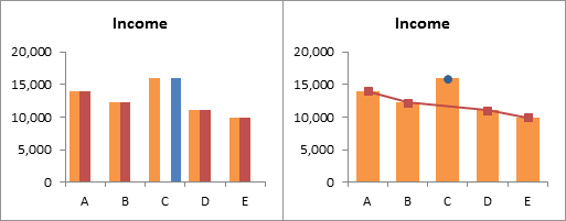
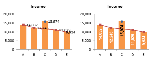
Start by making the chart using all of the data (left), or if you’ve already got the chart, add the extra series. Then change the chart type of the additional series* to line chart (right).
* right click on the series, choose Change Series Chart Type from the pop up menu, and select the desired chart type.
Add data labels to each line chart* (left), then format them as desired (right).
* right click on the series, choose Add Data Labels from the pop up menu.
Finally format the two line chart series so they use no line and no marker.
When the data change, the chart labels change just as quickly as Excel can calculate the new values in columns C and D. No need to hassle with VBA event procedures.
If more than one value matches the maximum, each will be highlighted as the maximum.


arindam says
Hi,
I am using xl 2007, and unable to get the changed font of max data. plz help
Jon Peltier says
Arindam –
Using which technique? If VBA, did you select the chart first?
Jon Acampora says
I really like the formula based technique. You have got me thinking about a lot of uses for it besides max. I think it could be very useful trends where you have a time period on the x-axis and you want to highlight a significant date like last day of the month, highest/lowest volume, first vs last day of the quarter, etc. Thanks for sharing!
Dave says
Jon – excellent stuff, really like both approaches, especially the non VBA version.
One more finesse for either solution could be check that the values of the chart labels will potentially fit on the graphic – in your example the values are sufficiently high enough across the board for this to be the case. But in other scenarios you might want to ignore values approaching zero or less than a specified amount – although this may make the graphic look odd with a mix of with/without data labels.
However, doing this could ensure you don’t get labels “outside” of the bars on the chart. In other words, bars smaller than the typing of the data label. In VBA this would be easy enough I think and doing this non VBA would entail using some additional formula, maybe run an IF statement on the values, before allowing the data label to be populated, again not necessarily too hard given the great basis already presented.
Great post Jon, can really see some uses for these in automating dashboard work, thanks!
Jon Peltier says
Jon –
I give examples like this a lot, with simple formulas, and try to remind people that what they can do is limited by their imagination. You aren’t limited to pointing your formula at the value being plotted. And you’ve mentioned a couple possibilities.
Jon Peltier says
Dave –
Yeah, make the labels fit… If you look carefully you may notice that the last value in the non-VBA example is greater than in the VBA example. This is because the line chart labels are further from the points than bar chart labels are from the ends of the bars. I changed the value so the label looked better, but I’d already done the VBA example and didn’t feel like redoing those pictures.
VBA is very powerful, and some of my utilities rely heavily on VBA to create unique charts that Excel can’t do by itself and the manual approach takes a long time. But i want the results to be independent of VBA. In some of my output charts, things like axis scales and data labels are driven by formulas. In my Marimekko and Cascade charts, the user can check boxes to select what is contained in the labels, insert custom number formats in cells to format their labels, and enter a minimum value for labels so that labels don’t obscure tiny bars. I use these inputs to formulas to output “” to the cells that link to the labels or NA() to the points that support the labels. Very powerful.
Dave says
Yes Jon that’s exactly along the lines of what I was thinking. I hadn’t spotted the difference in VBA to manual chart value, I’m glad my thoughts regarding the look are similar to yours. I’d never thought of having labels and scales driven by formula or macros before visiting your site and have seen so many great ideas for solutions to issues I hadn’t even thought of before! thanks again for the site!
derek says
My instinct would have been to leave the original data out, make the chart out of the two derived series, (each a stacked bar series) and not have any lines. But on seeing your version, I see it’s got advantages, like not always having to format the bar colours twice, when you want you change the colour.
arindam says
I got it Jon, thanx for a nice n easy steps