Here is a simple data set and an XY Scatter chart. We want to highlight the minimum and maximum points in the chart.
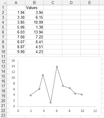
We could manually select the high data point and format it, then select the low point and format it. No big deal for a one-off chart. But if the data changes, we may have to manually change formatting again.
Instead we’ll add a couple columns to the data range, and use them to determine where to plot the minimum and maximum values.
The formula in cell C2 (copied and pasted in C3:C10) is
=IF(B2=MAX(B$2:B$10),B2,NA())which puts the value of column B into the same row of column C only if it’s the maximum value in column B. Otherwise column C contains the #N/A error value, which is not plotted with a marker in an Excel scatter or line chart.
Likewise, the formula in cell D2 (copied and pasted in D3:D10) is
=IF(B2=MIN(B$2:B$10),B2,NA())which puts the value of column B into the same row of column D only if it’s the minimum value in column B. Otherwise column D contains #N/A.
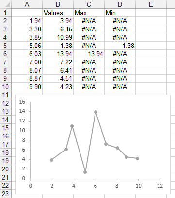
When we select the chart, we can see the chart data highlighted in the worksheet.
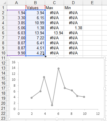
We can drag to extend the blue range to include columns C and D.

And now columns C and D are plotted in the chart. Column C (minimum) is plotted as a blue marker, and column D (maximum) as an orange marker).
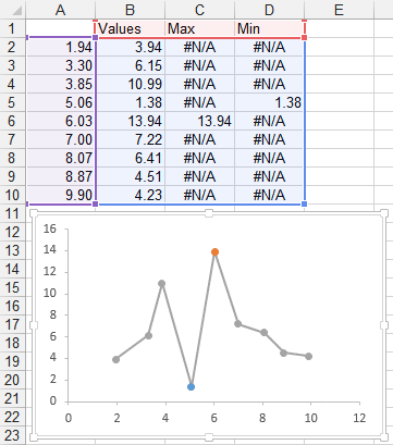
Let’s do a little formatting. Right click on the Max point, and choose Data Labels. Select the label and choose the Series Name option, so it shows “Max”, and choose the bright blue text color. Format the marker so it’s an 8-point circle with a 1.5-pt matching blue border and no fill.
Right click on the Min point, and choose Data Labels. Select the label and choose the Series Name option, so it shows “Min”, and choose the gold text color. Format the marker so it’s an 8-point circle with a 1.5-pt gold border and no fill.
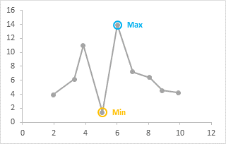
The nice thing about using this formula-based approach, instead of manually formatting everything, is that if the data changes, the new Min and Max are highlighted. In fact, if multiple points have the same min and max values, all will be highlighted.
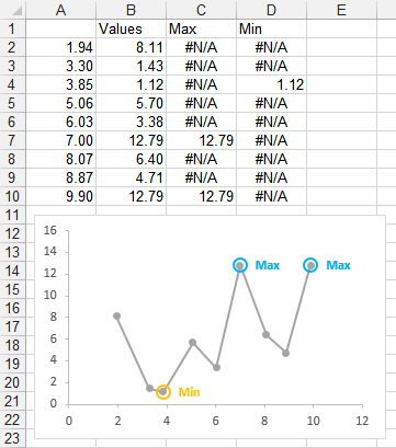
This approach, of adding a series for any data you want to highlight, is very flexible. You don’t need to only highlight minimum or maximum values, you can highlight anything that you can write a formula for.
My colleague and fellow Excel MVP Leila Gharani has recorded a video on YouTube at Highlight Max & Min Values in an Excel Line Chart, which illustrates this technique. Leila has recorded many dozens of videos, which are well made and which clearly show a wide variety of Excel features and techniques.
Peltier Tech Articles About Conditional Formatting of Excel Charts
This is one example of conditional formatting in Excel charts; below are several other approaches.
- Conditional Formatting of Excel Charts
- Conditional XY Charts Without VBA
- Invert if Negative Formatting in Excel Charts
- Conditional Donut Chart
- Split Data Range into Multiple Chart Series without VBA
- Conditional Formatting of Lines in an Excel Line Chart Using VBA
- VBA Conditional Formatting of Charts by Value and Label
- VBA Conditional Formatting of Charts by Series Name
- VBA Conditional Formatting of Charts by Value
- VBA Conditional Formatting of Charts by Category Label


Bob says
Hi Jon,
How would you go about doing this same sort of thing in a dynamic range of data? For example, if I wanted to show the last 12 months of data in a dashboard type situation but let the user select the time frame?
Thanks,
Bob
Mitja says
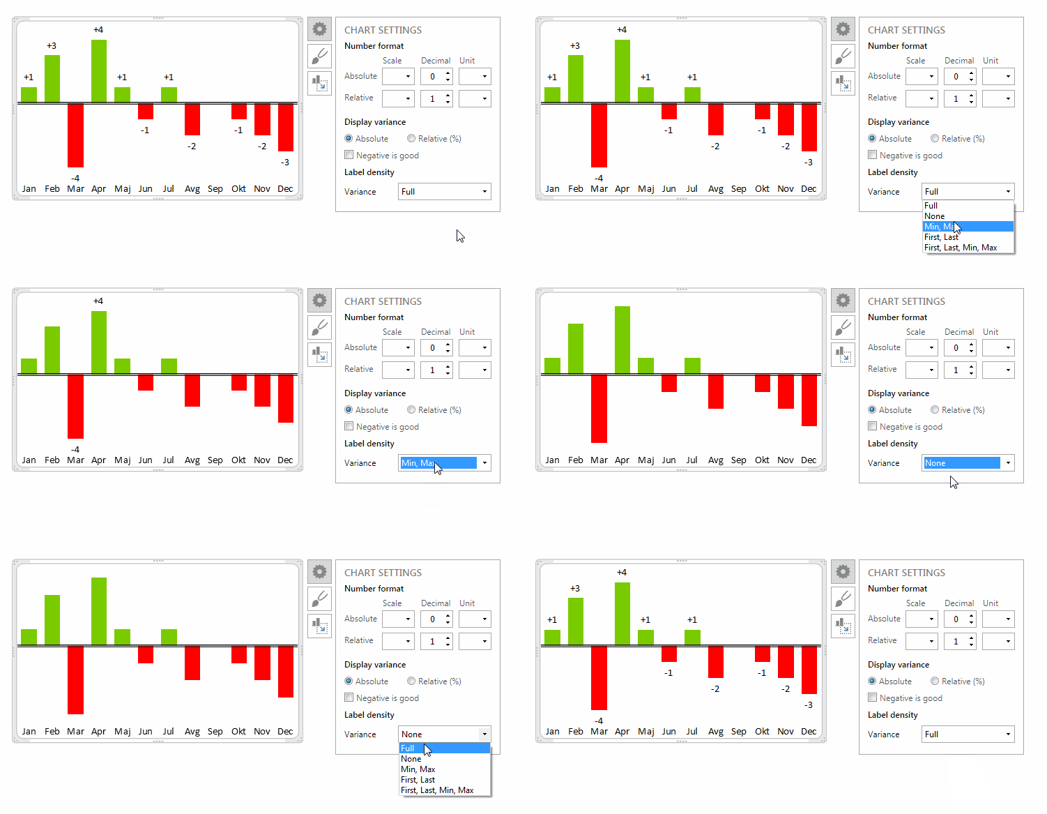
We are using almost the same logic for our labels. This is very useful especially when the charts are small and the labels start to get crowded.
Jon Peltier says
Bob –
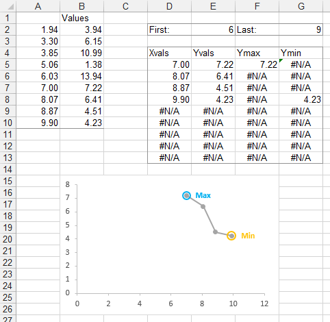
Here’s the data, as above, in sheet named “Names”. I have defined the following names:
Names!First
=Names!$E$2
Names!Last
=Names!$G$2
Names!Xvals
=INDEX(Names!$A$2:$A$10,Names!First):INDEX(Names!$A$2:$A$10,Names!Last)
Names!Yvals
=OFFSET(Names!Xvals,0,1)
Names!Ymax
=IF(Names!YVals=MAX(Names!YVals),Names!YVals,NA())
Names!Ymin
=IF(Names!YVals=MIN(Names!YVals),Names!YVals,NA())
Initially First and Last contain the valuse 1 and 9, so the names include the entire starting range.
To create my little data table, which serves only to show me what the values are at any time, I selected D5:D13, typed =Xvals, and held Ctrl+Shift while typing Enter, which entered the formula as an array formula, so I can see what the array Xvals consists of at any time, based on First and Last. Similarly I array-entered YVals in E5:E13, Ymax in F5:F13, and Ymin in G5:G13.
The chart is below the data. My three series have the following series formulas:
=SERIES(Names!$B$1,Names!Xvals,Names!YVals,1)
=SERIES(“Max”,Names!Xvals,Names!Ymax,2)
=SERIES(“Min”,Names!Xvals,Names!Ymin,3)
When I change Last to 4, you see from the table and the chart how all of the Names now include just four points, and a different Max is indicated, as the original Max is no longer among the points in these Names.
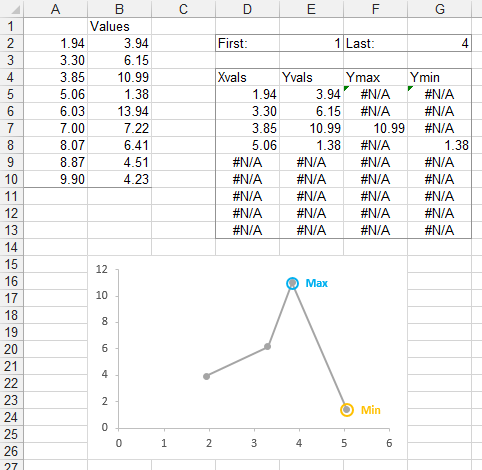
When I change First to 6 Last back to 9, the table and the chart update to show a different four points, and different Max and Min are indicated.
Bob says
You are like a Jedi Master and I a lowly learner. Super.
Thank you very much.
Bob
Tony says
Hi,
I extract some input dynamic data (numbers) from a web during 12 hours and i i want to be stored to the end of interval time the minimal value.For example during day the temperature in Celsius various from 20. 22, 26,24,18,29,26 ect.. and i want to be stored to the end of interval the minimal value 18 grade celsius.
I will appreciate you help
Best Regards
Tony
Jon Peltier says
Tony –
Go to MrExcel.com and ask your question there. Many more people will see it, and you’ll probably get several answers before I even have a chance to think about it.
william deleo says
Hello Jon –
I am trying to apply this to a column chart, but I find that all the #N/A labels come through as well. Is there a way to only show the non #N/A labels for a column chart? I could overlay a scatter plot for just the label, but I am hoping there is a cleaner approach.
Thanks!
Jon Peltier says
William –
Series with lines and markers (XY and Line) treat data differently than series with bars or columns.
For XY and Line charts, use #N/A for missing data, and no marker will be drawn. Without a marker, there is no place to hang a data label, so the #N/A value does not appear. But you need the #N/A so a dummy marker isn’t drawn at zero.
For column and bar charts, no bar is really drawn where there is a #N/A, but there is a place to attach a label (a legacy from pre-2007, I belie), so the #N/A errors appear in the chart. However, if you use “” for the missing values, the bar that is drawn has a length of zero, so it doesn’t appear, and the value that is placed in the label is “”, so it also doesn’t appear.
william deleo says
As always, spot on. Thanks much Jon.
william deleo says
Jon – I have tried using #N/A, zero, a set of double quotes (as suggested above), and a dash (“-“) … but in all cases there is either a zero or a #N/A in the label. The bar doesn’t appear, but I can’t get the labels to not post as zero. Am I not understanding your instructions correctly?
Thank you again.
Jon Peltier says
William –
If the labels are for hidden series, format your visible data as columns, but plot the hidden data as lines. That way the #N/A will not show any markers (or labels).
abbelito says
Hi!
How do i get it to give me a min value when there is a value in the column that contains a zero value? Have tried to add >0 but int only shows me N/A on the two values that are above 0.
Jon Peltier says
Abbelito –
Could you describe your problem in a bit more detail?
Janez says
Dear Jon,
your method is a great and pretty obvious tip. My situation is a bit more specific.
Let’s say you have a 10000 data points – e.g. some values measured with a sensor during a certain time (e.g. Jan-Dec). You can draw an XY chart and easily mark min and max with the above described method. But then you want to only focus to a specific region of the plot in the chart, e.g. limiting the x-axis min value to only show data points starting with 2000 and ending with 6000 (e.g. Feb-Sep) – because you can just use exactly the same series plot, limiting x-axis is much easier than drawing a new chart by selecting a limited part of the dataset.
Then you would potentially need to draw 3 additional charts, to compare the plot of the data point in the regions 2000-2500 (Feb), 4300-4800 (May) and 5500-6000 (Sept) (as far as I know Excel does not allow to “break” the x-axis to only show intermittent range of data point, hence the 3 charts). So, in each of the described charts you would need to have a label of min and max value…
Of course you could find the corresponding part of the dataset for each of the required plots and use the method you have described for each part of the dataset. However, if you can only see which parts of the dataset you would need to compare, once you have the plot of the data in front of you, it’s pretty time consuming to go looking back to the numerical data, to find the corresponding datasets and applying the method to each one of them and then drawing charts from each one of them (and doing this for several sets of data).
So, in a way, I am asking, if there is a way to label min and max values of only that part of the data points, which is shown in a plot?
Thanks,
Janez
Jon Peltier says
Janez –
I showed one way to do this in my comment of Thursday, July 9, 2015 at 12:51 pm, where I used a helper range to limit the plot between arbitrary first and last points within the overall range.
Another way is shown below. Let’s say there are two regions of different behavior in the chart. I can write smart formulas to help identify the min and max of each range.
I’ve decided to split my data into those with X<7 and X>=7. (I could have used Y<8 and Y>=8, or whatever criteria I am creative enough to imagine). I put some calculated values above the data, to use as reference in the formulas in the data range.
Cell B2 has the desired X value cutoff. Here are the other formulas. These are array formulas: don’t type the curly braces, instead hold Ctrl+Shift while you press Enter.
For the formula in D2, the IF statement within the MAX returns either the value in C5:C13, if B5:B13 is less than the cutoff in B2, otherwise it returns the overall MIN of C5:C13 (which I promise is lower than the MAX of any subset of the range) if B5:B13 is not less than the cutoff. So this formula finds MAX(2.38, 3.94, 4.23, 4.51, 5.15, 2.38, 2.38, 2.38, 2.38), where the red values are for Y less than the cutoff and the blue for Y >= the cutoff.
Then I select D5:G13 with D5 as the active cell. I enter the following formula and hold Ctrl (NOT Ctrl+Shift!) while I press Enter:
Now I plot the data and add labels.
Amiolemen Alfred says
Thanks!
This is very helpful