Sometimes it helps a time series chart if you can highlight certain periods with a different color background. You may want to show financial performance over time, for example, and point out the periods when the economy was in a recession. In this example, I will use a simpler example, plotting the readership of this blog over the past couple months, and highlight weekends.
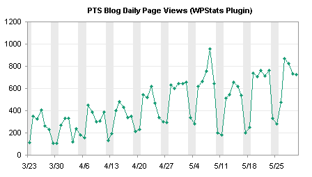
This is accommplished using a combination of a line series to show traffic with a column series to highlight weekends.
The following line chart is a time series of pageviews for the PTS Blog between mid-March and May. There is an obvious cyclical pattern, with weekends having about 40% as much traffic as weekdays.

Creation of the column chart series that highlights weekends begins with a column of data added to the worksheet. Next to the already plotted data, enter a 1 where you want the background to be shaded, and zero otherwise. In many cases, this is done manually, but I can use a formula based on the date in column A to calculate 0 or 1:
=1*(MOD(A2,7)<=1)
Copy the column of data, select the chart, and use Paste Special to add the data as a new series.
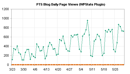
The added series is aligned with the bottom of the chart. To make the second series useful, assign it to the secondary axis.

Change the secondary Y axis scale so it has min and max of 0 and 1. In fact, if you use 1, the top edge of the chart will be obscured by the top edge of the column series (when you convert the second line series to a column), so use something slightly larger, for example, 1.005.

Format the secondary Y axis to hide it: choose no line, no major or minor tick marks, and no tick labels.

Change the second series to a column type. Right click on the series, choose Chart Type or Change Chart Type (depending on Excel version), and choose the first column type, clustered column.
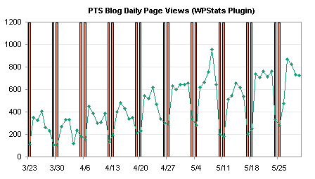
Format the column series to make a nicer background. Remove the border, change the gap width to zero, and use a light color. I’ve changed my Excel 2003 color palette so the light gray is a couple of clicks lighter than the default gray.

With the weekends highlighted, it’s easy to see that weekends have lower traffic than weekdays, and it allows us to identify a couple of low traffic weekdays. In this chart, we see that on April 3 (the day I switched hosting companies and the blog was down for several hours) and on May 26 (Memorial Day holiday in the US), the PTS Blog had lower traffic than expected for a weekday.
I noticed that Professor Tim Mayes of the Excel Blog wrote a similar post last month, showing how to indicate recession periods on a time series of an economic indicator, in Charting Economic Time Series with Shaded Recessions. This is a nice blog, with good how-to exercises, mostly geared toward Excel 2007, taking examples from the field of finance.


Mike Alexander says
Very useful Jon. I have a customer who wants to show progress on a project, but he hates gannt charts. I think I’ll use this technique to show a timeline view instead of a gannt view.
Marty says
Jon,
THANK YOU. I will work on it tonight and I learned more about the other chart from some of the posts.
Marty :):)
Marty says
Jon
On this chart could you have ended with the last look but with the numbers on the right side?
Marty
Jon Peltier says
Marty –
Double click the bottom axis, check the box for “Value (Y) Axis Crosses at Maximum”.
Plus a little stray formatting.
derek says
I sometimes keep the secondary axis, but format it to look identical to the primary axis, so the graph has labels on both sides. Showy, and strictly unecessary (Tufte would frown) but it impresses the management, and is sometimes handy for graphs that are long thin strips.
Jon Peltier says
“Tufte would frown but it impresses the management”
I’ll bet Tufte never had to deal with management.
Brian Johnson says
How do you keep the X-axes aligned?
I am attempting to follow the directions here – but the X-axis for the column series is not aligned with the X-axis for the XY series.
Jon Peltier says
Brian – I made my chart using a combination of column and line series (not XY series). Line charts and column charts use the same type of X axis, so there is no problem with the combination.
Ryan K says
Would this work if the time series was both above and below zero? And what if you wanted to color code time periods, e.g., blue when a Dem is president and red when a Republican?
Jon Peltier says
Ryan –
Somebody always has to try to stump the expert. But I’m equal to these tasks. (Fill in your best evil/maniacal laughter.)
1. The columns are plotted on the secondary axis, which goes 0 to 1 regardless of the primary axis scale.
2. For a more complicated condition, you need a column that holds the variable (say it’s column C). Then you need two columns of data for the color. The formulas in columns D and E look like:
Cell D2:
=IF(UPPER(LEFT(C2,1))=”D”,1,0)
Cell E2:
=IF(UPPER(LEFT(C2,1))=”R”,1,0)
Use these two columns to populate new series in the chart, like the gray columns in the example above. Make them stacked column charts, with a gap width of 0, and color them blue or red for Dems or Reps.
Vimal says
Hi
I have chart
Which contains 5 Persons productivity as per Products like A,B,C,D and E from this total I want to show every persons productivity with a bench mark line at 480
I don’t know how to create a bench mark line please advise me
It’s very urgent.
Jon Peltier says
Hi Vimal –
I have covered this topic on my web site, in Add a Line to a Column or Line Chart.
Mark says
Hi,
Regarding the shading, is there a way to graph the primary data as a bar chart instead of a line chart and also have the shading? When i try to do this, the shading overshadows the original data and thus it is not visible.
Thank you,
mark
Jon Peltier says
Mark –
It’s pretty much the same protocol, with a few differences. Start with two column series, and move the actual data to the secondary axis, so it is drawn in front of the shaded weekends on the primary axis.
It might be less cluttered to simply use a different fill color for the foreground data rather than to shade the background. I have two series in this chart, one for weekdays, one for weekends:
Time series are generally more effective as line series.
kcin says
For some reason the columns on my secondary axis have several unwanted gaps even after adjusting the gap width to zero. I have tried changing the chart option on my secondary axis from automatic to category or time-series but it has no affect.
My chart consists of daily share price data for the past two years.
Any help would be appreciated, thanks.
Jon Peltier says
kcin –
Is there any pattern to the gaps? Weekends vs. weekdays, holidays, or other gaps in the record?
kcin says
Hi Jon,
I’ve noticed that the gaps are actually because I have no x-axis labels or data for weekends (since there is no trading on weekends obviously).
Is there a way for excel to ignore the 2 day gap over weekends and fill in the spaces?
My x-axis base units are in days and my major units are in months.
Thanks
Jon Peltier says
In a date scale axis with a base unit of days, every day will be plotted, data or not. If the base unit is months, every month will be plotted, data or no.
You need to use the category (“text” in 2007) option for the X axis. You will not get the nice date tick and label spacing with the default axis, but that’s why Bill Gates invented XY series.
The technique is described on Custom Axis Scales using Dummy Series, and if you use this technique for your labels, you don’t need the dummy column series. For simpler labels the column series is easier to explain, easier for people to understand, and easier to knock out. For complicated labels, the column approach may be impossible.
Justin says
Cracker tutorial mate!
Client is most impressed at my (cough cough) Excel skills.
Thanks!
Jon Peltier says
He he. It’s not what you know, it’s what you can learn fast!
Marcel says
John,
Any ideas on how to add timed highlights to your beautifull Gantt chart (https://peltiertech.com/Excel/Charts/GanttChart.html )?
I would like to differ the time our business is open from time it is closed, so some hours on a given day a grey background, and some a white background.
Is that a clear question ;o) ??
Regards Marcel
Amir says
thank you for this post. I used the knowledge to create a nice looking chart with varied width columns to indicate certain time periods. However I can’t get the fill color of the new column series to be semi-transparent (this is important because I have to show the grid). any idea why ?
Thank you
Amir
Jon Peltier says
Amir –
Transparency didn’t become an actual option in charts until 2007, despite the appearance of the grayed out checkbox. John Walkenbach shows a clever workaround in Spreadsheet Page Excel Tips: Creating A Transparent Chart Series.
David says
To follow up your response to having shading for weekends where the primary data is a column chart…what if the primary data is in stacked columns? I have 3 series that make up each of my columns. I have successfully created 6 series (3 of which are for weekends and 3 for weekdays), but it gets really ugly when I try to use different colors for the weekend stacked columns. Do you have any suggestions for creating a good workaround? I thought about just using a different color for the weekend x-axis labels but I can’t figure out how to do this. Thanks!
Imran says
Hi Jon,
The problem what i’m facing is that when I use the “Highlight certain time period in a chart” graph with data tables, i’m getting all the legends including the legends of the highlighted weekends.(where i am using a series with secondary axis for highlighting weekends in timeline)
I need something where we can remove the specific Series in the data table.
Any idea on this?
Juan A. Fdez says
excellent post, many thanks,
jaf
Jim says
Hi,
The problem with this approach is that the columns don’t line up with the line data points. If you’re showing incremental progress over time (say two weeks) and want to show weekends as columns, then because the line points are centred above the tick marks, and so are the columns, the overall effect is of progress continuing into the weekend, and of the flat line continuing into the following week.
What’s really needed is a way to make Excel columns left-align with the X axis tick marks, or to simulate this somehow.
Jon Peltier says
If you are using a date scale axis, each day has the same width. The weekend bars will be centered on Saturday and Sunday, while the daily points will occur on Monday through Friday. Plot both on the primary X axis.
Jim says
Hi Jon,
Yes, that’s my point. The columns will be centered on the Saturday and Sunday tick marks, and the line points will also be centered above tick marks. So what happens in the resultant graph is that the progress line levels off directly above the tick mark, but because the column has a width and is also centered above a tick mark, the point at which the progress line levels off is not aligned with the left hand side of the column. Similarly, “half way” through Sunday (as far as the columns shows), progress starts to increase again to hit the tick mark on Monday.
I’m at work so I can’t upload an image anywhere , but if you plot this data with “Complete” as a line chart and “Weekend” as a column with zero gap on X Axis 2, you’ll see what I mean. I want the progress line to level off at the point it meets the “Weekend” column, but it actually levels off half an “interval” beforehand.
Date Complete Weekend
11/06/2013 0
12/06/2013 3
13/06/2013 5
14/06/2013 8
15/06/2013 8 1
16/06/2013 8 1
17/06/2013 12
18/06/2013 15
19/06/2013 18
20/06/2013 20
21/06/2013
22/06/2013 1
23/06/2013 1
24/06/2013
25/06/2013
Cheers
Jim
Jon Peltier says
I see. Well, there are two approaches. The simpler involves simply changing the line chart values for weekend days to blanks, so the lines start on Mondays, extend to Fridays, and don’t pass through the weekends.
A little trickier is to use both horizontal axes. In the following, I’ve added the secondary horizontal axis. I switched the top and bottom horizontal axes (format the crosses at setting for each corresponding vertical axis), Then adjusted the primary axis (top) so it starts a day earlier than the secondary one. This shifts the data point to the end of the day, and the horizontal stretch of the line so it completely corresponds with the bars. Take the next step (which I haven’t) and format the upper axis so the tick marks and labels are not displayed.
Jon Peltier says
Actually, there are many more approaches. You could insert a single blank, and not show the markers, and the line ends at left of the gray bar, then picks up right where it was at the right of the gray bar.
Or you could make it into a step chart.
Probably there are a dozen more options.
Jim says
Jon,
That’s perfect! The second option “A little trickier…” has done exactly what I need. I’d tried this but been unsuccessful. It hadn’t occurred to me to swap the axes, and I’d also assumed that by setting one axis scale a day earlier than another, it would offset by a whole day and the tick marks would still effectively be aligned (still don’t understand why this isn’t the case actually, but it works!)
Thanks for your help
Jim
Jon Peltier says
Jim –
If I had labeled all tick marks it would be more clear. The lower axis starts on 9 June and ends on 22 June, but the ends of the axis are really 1/2 day earlier and later than this in order to fit the whole category on the chart (i.e., the entire bar width for weekend days). The upper axis starts on 8 June and ends on 22 June, a day longer than the lower axis, but it doesn’t have the extra 1/2 day buffers on either side, so the axis lengths are the same. The offset of the data is 1/2 day, not 1 day, because the buffers are 1/2 day each.
It’s hard to remember this, and I’d expected to need to do more manipulation. But as soon as I changed the starting date, the chart fixed itself, and I realized not for the first time how it works.
Janet says
I’m in way over my head; am using Excel 2013. What I need to graph and basically DID graph using your comments on 6-12-13 to Jim is a line graph that shows weight changes in a disabled man when passed from one caregiver to another. I used recession bars to show his time spent with Caregiver 2 and colored the plot area to show time with Caregiver 1. The legend wouldn’t work, so inserted colored text boxes to correspond to the 2 caretakers, which is the least of my problems. As Jim pointed out, the columns don’t line up with the line data points. Your second “a little trickier” option worked well. I somehow managed to insert a second horizontal axis (date) with the top one starting a day earlier than the bottom one (also date)—think the top one ended up as primary. So far, so good—chart was great! But then I created tables and screwed up my chart/2nd horizontal axis and can’t replicate the chart, after many tries. I was VERY lucky to have created it in the first place. I need to replicate it and do a number of other ones for which I have similar data. Could you provide a little more detail on how to add the secondary horizontal axis and how to switch the top and bottom horizontal axes? Or any other way to achieve my goal? I will be eternally grateful! P.S. Only chart not screwed up now is marked up–will attempt to post a scanned copy on a website and send info to you in a little bit.
Jon Peltier says
Janet –
I couldn’t get to the chart, because ShutterFly requires me to have an account to see it.
Do you mean you added a data table within the chart? Bad move, though you had no way to know it. These data tables can be a disaster; they are inflexible and provide few formatting options.
Janet says
Hi, Jon
Am not having much luck figuring out how to post my chart on a website for you to access. Any suggestions? Could I possibly just email you a jpeg or pdf file of it?
No, I didn’t put a data table within the chart. I created a separate table to supplement the chart, showing pounds gained or lost, % of body weight gained/lost, a date column, and a column showing which caregiver he was with and the hand-off day. But I was using the same worksheet (which actually has 14 months of info in it) to generate both the chart and the table. I probably should have saved things separately. I think the 2 sets of dates, needed for the two horizontal axes, did something to the chart and apparently took out the top horizontal axis. You are sure right that these data tables can be rough; I haven’t done a table in Excel before and making it look interesting has been a challenge.
Janet says
Hi again, John. Here’s the website–just scroll down and there’s the good version of my chart, which no longer looks like that! I should add that I created 2 vertical axes and used dummy data like you suggested to get the vertical bars, which worked just fine.
Jim says
Hi there again Jon,
I’m now trying to re-implement this in Excel 2010 and running into problems. I’m fine up until the point when I add the second horizontal axis, at which point the chart changes from this:
http://i211.photobucket.com/albums/bb172/wanstronian/Image1.png
to this:
http://i211.photobucket.com/albums/bb172/wanstronian/Image2.png
No matter what I try I can’t make this work. Moving forward with the hope of solving this later, I also ran into problems when I tried to swap the two horizontal axes.
Hoping you can help!
Thanks
Jim
Jim says
Follow up: I managed to overcome the problem now. However, I’m now faced with another problem that I suspect is insurmountable: As well as a line I also want to display data in columns. Primary X axis is tick-mark aligned, secondary axis is centered between tick marks. I want the column data to be centered between tick marks, but this means displaying it on the secondary axis, which means adopting the Overlap and Separation properties of the “weekend” columns. Also, the scale of the secondary axis is different and fixed, so I can’t use it for “real” data:
http://i211.photobucket.com/albums/bb172/wanstronian/Image3.png
Declan Fay says
Hello Jon,
I found this great help. What I am trying to do is shade for different times that represent different locations where I have been taking measurements. Firstly I was wondering if there is a way to have multiple of these shaded zones with different fill colours to represent my different locations? Or better, if there was a quick way of labelling the fill regions – I have about 13 which represent different things. Also on my graph, I do not want the series three legend to appear but I do the others. Is there a way of hiding this? I figured to hide the secodary axis label by making the text colour white but the same does not apply to the legend.
Cheers,
Declan
Jon Peltier says
Declan –
You can have as many shaded zones as you can successfully juggle.
To remove a single legend entry from the legend, click once to select the legend, then click again on the unwanted legend entry, then click Delete.
Michael says
Thanks Jon, you answered one of my Stack Exchange questions with this excellent example!
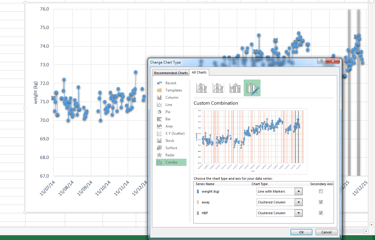
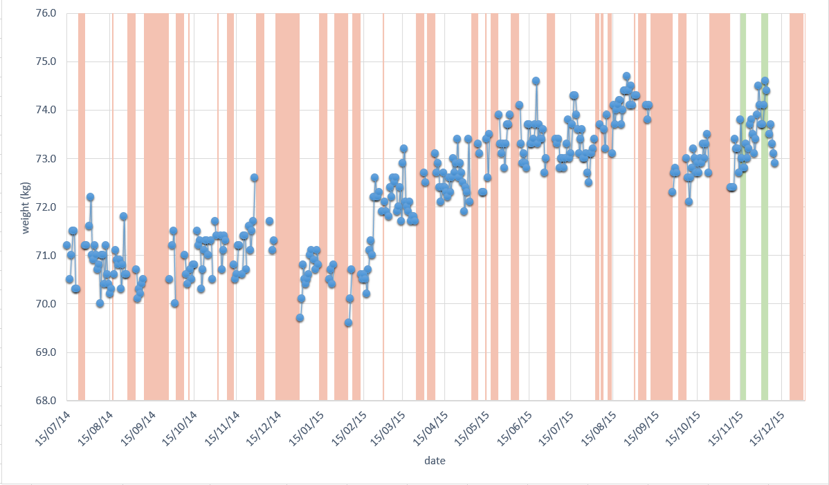
I used it to monitor my daily weight against times at which I was away. Now I’m trying to add a second set of columns (to indicate when I’m working night shifts), in a different colour. I added a new dataset, and tried to format it exactly the same way. I am also plotting it on the secondary axis – so my first series is a line plot, then 2 and 3 are clustered column plots.
Unfortunately this doesn’t seem to work. It looks OK in the preview but in practice I just can’t get all three sets to display at once. See screenshot below.
Any ideas? Thanks in advance for all your help.
Jon Peltier says
Michael –
Try using stacked columns instead of clustered columns for these series. They might be too narrow to render properly.
Michael says
Thanks Jon. In the end I managed to get it all looking the way I wanted, the reason they weren’t showing up turned out to be Excelʻs “soft edges” option, which made the thin columns disappear!
Jon Peltier says
Those are the kind of effects that should be avoided. You’ve just seen how they misrepresent the data.
Mark says
Is it possible in SSRS 2014 using Striplines to create a.highlighted area based on category values? So, if I have 12 months of data then show this area for June only? Currently striplines go across the whole plot area.
Jon Peltier says
Mark –
Sorry, I am totally unfamiliar with SSRS.
eileen says
Hi John,
Is it possible in excel to try to find data trends by date and day of the week? For instance, compiling the data for each date and then trying to spot a trend regarding something like is it busier on Mondays? Perhaps highlight each date by what day of the week it is?
Jon Peltier says
Eileen –
This usually requires a bit of work. If I have this kind of data, I usually insert a column that has the day of the week. Then I can filter the data, or build a pivot table, or perform calculations, any of which help show daily averages, or timelines by day (to see how a specific event affects other days, such as how a Monday holiday affects the preceding weekend or the following Tuesday). I’ve done quite a few of these analyses, and they’re never very pretty.