A reader named Martin suggested that I take a look at The Slate Bailout Guide, which sported a concentric set of rings purporting to be a chart. It was interactive and all, very slick. The graphic contained data regarding the economic bailout efforts by the US government over the past year. But it tried to do too much, and ended up being confusing.

The chart had a timeline along the bottom, but it was unlinked from the values in the rings. It almost was linked like a legend, but colors in the chart were repeated for multiple items. When you mouse over a ring, or a box along the timeline, or entries in a legend below the chart, a box pops up to provide additional information. Nice, I guess, but you can’t easily compare information between different rings.

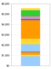
I did a quick check using a stacked bar chart to show that the rings protrayed data according to thickness, not by area. The authors of the article compared their chart to an onion, so volume may even have been a better analogue for value, except that would have been even more difficult to interpret. The stacked column chart is probably a better way to show the cumulative total of the bailout. My stacked column chart could be made more compact, but it still is much smaller (and therefore information-dense) than the onion chart above.

In all of my charts, the dollar axis labels show Billions of dollars. Wow, it would only take a few million to bail me out!
I’ve extended the stacked column chart to display both committed and spent funds in a single view, while the interactive chart required the user to interactively hide one view and show the other. It’s still a difficult chart type to interpret.

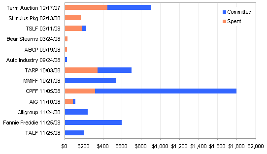
I used a bar chart to show the bailout items in chronological order. The bars are not stacked, but instead the Spent columns are drawn in front of the Committed columns, giving a thermometer-like %-complete effect.

The items are listed chronologically in the chart above, but it is impractical to show bars or columns along a proportional time axis. This causes the chart’s message to be choppy. I’d like to see the items ranked according to their dollar values, so I can ignore the small values that are (relatively) insignificant.

It would be nice to see a timeline of the bailout events, though, so I built a step chart. This gives a more complete picture: there was a bump a year ago, and some small additions, but not much from mid-Spring to mid-Fall, when activity took off, leading to the hockey stick behavior at the end of the year.

The Slate chart tries to put too much into a single view. This causes the reader to miss information, by the mere fact of not being able to see more than a bite at a time. All of the information in the interactive pop-up windows should be placed in a table adjacent to the chart, so the reader can read from multiple fields at a time, comparing items without having to play a game of Concentration to remember which pop-up corresponds to which ring. And the rings have to go. It’s impossible to compare values between rings, and it’s impossible to compare spent funds vs. committed funds. The ring charts take up much more space than their scant data justifies.


db says
nice work, Jon
Tim Mayes says
Agreed, nice job Jon. I really like that step chart at the end. Very informative to see both the magnitudes and timing in the chart.
Zhirui says
Looks good, Jon. I like the step chart, but I’m not sure how you’d indicate what has already been spent. You could add a second step, but it wouldn’t tell you which pot o’ money it came from. Maybe “% spent” labels after each bailout?
One question… Are you sure the axis is in trillions? It looks like billions because you have the “,000” on each number.
Jon Peltier says
Hi Zhiriu –
Good catch, I did mean Billions on the axes. When numbers get that high, I guess I’m no smarter than Congress.
I thought about a second step chart to show spending, or adding a second series to the first step chart. It would be very messy, though. For the allotments, there is a vertical step because the allocation is made in one moment, while the actual payments are spread out over time. I doubt anyone even knows what this looks like.