Heat Map Donut Charts
My colleague Debra Dalgleish steered me toward an article about a ‘Hot doughnut’ chart in Excel.
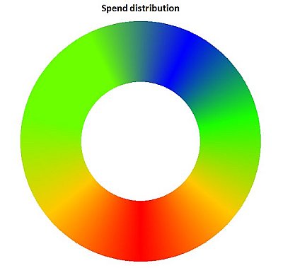
Hmm, very interesting. Eye-catching.
You can take the above and combine it with target values in another concentric ring, add a few labels, and make it really pretty. This is from a companion article, How to create a heatmap doughnut chart.
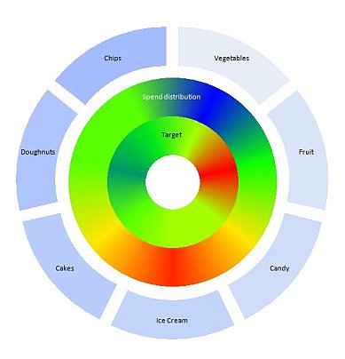
Despite its attractiveness, at first glance I didn’t think it was very effective. You know, donut charts being even less effective than pie charts. But I sat down and went through at least the preliminary steps of recreating the chart.
Note: I apologize for the use of jpeg images. On one of my monitors they look absolutely horrendous, with terrible artifacts everywhere, but on the new monitor they’re okay. I normally use png images for my charts, but some of the images in this article were only available as jpegs.
How to Make a Heat Map Donut Chart
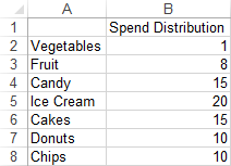
Here is the data. It looks unsorted, but I’ll describe the unusual sorting order shortly.
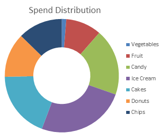
Make a nice donut chart (as if there ever were such a thing).
Recolor the wedges based on value (red at the large end of the values, through orange, yellow, and green, to blue at the small end).
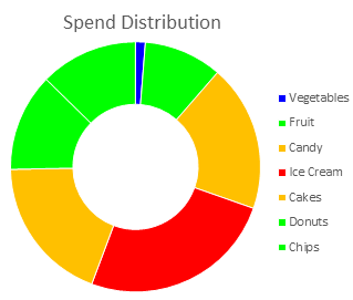
Perhaps we need another legend to clarify the sequence of the color codes?

Remove any size data for the slices, using 1 for each data point’s value. Let’s assume we don’t need sizes, since the colors are encoding the values.
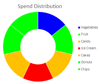
In the previous recolored charts I kept a thin white border on the wedges, so adjacent wedges of the same color don’t just look like one larger wedge. In this chart, such adjacent wedges merge into a single wedge.

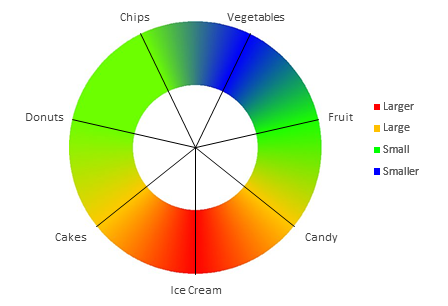
Now smudge the colors between the centers of adjacent wedges. I didn’t actually do this; below is a screen shot from the original article. The approach I’d take is to divide the wedge into a number of smaller wedges, and gradually change each mini-wedge’s color to simulate a gradient from the center of one wedge to the center of the next. Start with all blue, change to mostly blue plus a little green, then to still mostly blue plus more green, to mixed blue-green, to green with some blue, to green with just a little blue, to all green.

This chart still needs labels for the wedges, and probably a data table so you can see the values which are obscured by the artistic effects.
The last few charts illustrate the unique sorting. This actually took me a while before I noticed it. The smallest point (blue) is at the top and the largest (red) at the bottom. Some of the points go clockwise from the smallest to the largest, and the others go counter clockwise. If you start in one place, the values go from small to large and back to small, like a sine wave. This provides two “continuous” color paths, so that smearing of colors between one wedge and another doesn’t introduce an intermediate color from the scale.
What Makes the Heat Map Donut Chart Ineffective?
Before diving into this critique, I want to point out that it is important to experiment with visual techniques. We should display our data using a variety of existing approaches to tease insights from the data. We should also apply new methods that may make it easier to find certain patterns or make the data more approachable by a wider audience.
However, we also need to review our attempts honestly, so we can concentrate on approaches that work and shelve those that do not.
There are a number of features of the heat map donut chart that make it ineffective as a data display method.
Color Gradient
First, the value of each wedge is only encoded by the color in the very center of the wedge, that is, along the spoke that would connect it to the hub of the chart. Gradients in color generally indicate variations in data, but in this case the gradients are gratuitous artwork. Worse than that, the reader may be fooled into thinking there is real data in the spaces between spokes.
Effectiveness of Encoding Techniques
A more fundamental problem is illustrated by Figure 2 of Presentation Graphics by Leland Wilkinson. This figure shows William Cleveland’s ranking of different graphical features in terms of how effectively they are for encoding and decoding data.
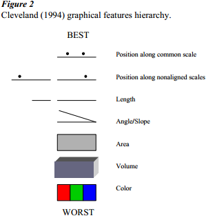
The heat map uses color to encode values. Cleveland’s hierarchy of graphical elements lists color as the least effective encoding means. Color can be effective to indicate different categories (for example, different lines in a chart), but it is not a good choice for displaying continuously variable numerical data.
Color Vision
Another reason color is a poor choice is that an estimated 8% of the male population (and only about 0.4% of the female population) find it difficult or impossible to distinguish between certain colors. A companion article, Color Vision Issues with Heat Map Donut Charts, uses these heat map donut charts to investigate how color vision deficiencies interfere with color-based data encoding.
Chart Busters: Fix the Heat Map Donut Chart
No critique of a graphical display is complete without a description of one or more improved ways to display the same data. My improvements are shown in Chart Busters: Fix the Heat Map Donut Chart.


Leave a Reply