My friend and colleague John Walkenbach pointed me to a post from National Geographic called The Cost of Care, which compared health care spending with life expectancy for a number of countries. John asked how I would display this data.
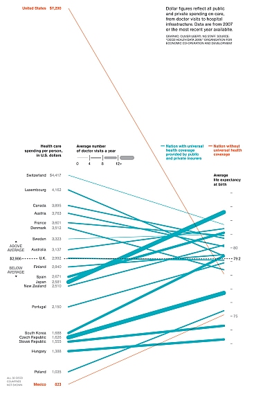
The article shows a line chart with a line connecting a country’s health care spending on the left axis with its life expectancy (at birth) on the right axis. The US and Mexico are colored differently because they do not have “Universal” health coverage. Thicker lines indicate more doctor visits per person per year. Click on the chart for a full sized version.
The Original Chart
This chart was mentioned in Not the best time for a parallel coordinate plot . . . but it’s not actually so bad here by Andrew Gelman, who thought the chart wasn’t terrible, but wondered why they selected these specific countries for the chart.
Evan Falchuk was more critical in Warning: Graphic Politics. Evan noted that there were no apparent correlations between life expectancy and spending, number of doctor visits, or whether there was universal coverage. Evan also asked whether spending was even relevant to the quality of health care.
None of the critiques of the chart mentioned the effect of malpractice insurance on health care costs, though one response to Falchuk’s post mentions defensive medicine. It’s more complicated than the US being ripped off, and anyway, that’s a political discussion for another place and time.
John asked me when he sent me the original link how else I might graph the data. We agreed that the purpose of the original chart was to show the huge spending in the US, compared to its life expectancy, in as dramatic fashion as possible. To take away some of the drama, I redrew the line chart with more equal spreads in the respective Y axes. You could tweak the scales even more to reduce the relative steepness of the lines, or make the chart wider and less tall.
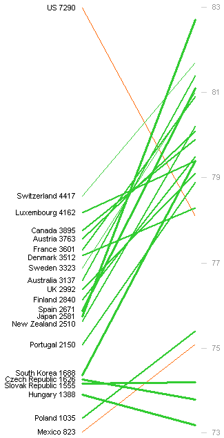
The chart is still a bit dramatic, but not as outrageous. The extreme slopes of most of the lines are just a distraction. As noted above by Evan Falchuk, this chart shows no correlation between the two main variables in the study. Not surprising, because the correlations are weak. Also not surprising, since it’s not a very effective way to show a correlation.
The New Chart
The best way to show correlation between two variables is in an XY chart. I got into Chart Busters mode, and plotted X=spending and Y=life expectancy in the following chart. The US and Mexico are colored differently to highlight their non-universal-coverage status, and data points are sized to reflect the number of doctor visits.
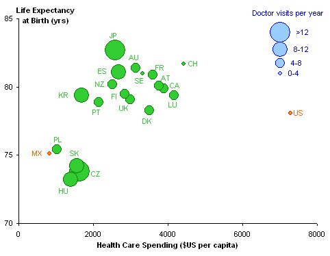
The US is an obvious far outlier. You can imagine an upward slope in the green markers, perhaps steeper than 45° in this plot. The correlation is not really strong, nor is it negligible. Excluding the US, the R² value is 0.52 including Mexico and 0.48 excluding Mexico.
A commenter to the National Geographic post listed a handful of other countries, which I’ve included in the XY chart below:
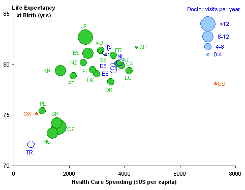
Inclusion of these countries increases R² to 0.56, probably since most of them fall within the dense upper range of the previously included countries, and one point, Turkey, falls below and left of the rest. In all of the regressions, the slope of the line is 1.9 years per $1000 of spending, and the Y-intercept implies that we’d live to 73.5 without spending a dime. At the level of spending of the US, the relationships predict a life expectancy of 87.5 years.
What’s the takeaway?
First, the XY chart shows the correlation between spending and life expectancy much better than does the line chart, without nearly as much drama. The US still shows a dramatic divergence from the other countries, spending more than twice as much for a slightly below average life expectancy. We’ll leave debate about the reasons for this divergence for the political blogs.


derek says
What a strange choice of chart: it’s the beginnings of an Inselberg-style profile plot, but those are meant for four or more dimensions, where plotting as a scatter graph or a multiple of scatter graphs isn’t feasible. I can’t imagine why anyone would choose it for only two dimensions, when we already have two dimensions available to us on the screen or paper.
Wellescent Health Blog says
When I first saw the plot in my copy of National Geographic I had to look at it for a bit to see what it was really telling me. I definitely did not like the format that much. I must say that I definitely prefer your X-Y chart far more because it also shows important clustering factors that might promote further investigation and discussion. It would be interesting to see if other clusters/divisions appear when the type of universal care was used in the coloring.
Infoholic says
The “after” version of the chart is a much clearer presentation of the data. Furthermore, it presents a more balanced view of the data.
If you don’t mind I would like to use this as a teaching example for my post grad students in the BI Applications unit.
PS: I like the position Australia has on the chart. It somewhat vindicates our governments’ balanced approach to funding health care.
Alex Kerin says
Your chart Jon, is much clearer – easier to identify if there are any correlations between the variables. I think the biggest problem with the original chart, and I know this wasn’t the point of your post, is that it’s just a poor choice of data to begin with.
Stepping back, you can’t compare life expectancy from country to country with the myriad of other factors that affect it outside of health care (genetic make-up, poverty, endemic health problems, attitude towards end-of-life care, etc.)
Just because a set of data exists, it doesn’t mean that you should attempt to make a story out of it. Far more telling would be intra-country comparisons of socio-economic controlled groups that have, and don’t have, access to healthcare. These data exist in scientific form (especially for Taiwan as they introduced universal health care a decade or so ago).
I wish that authors would not only design better charts (as I know you do as well), but also question the validity of the point they are trying to make with the data presented to them..
derek says
By the way, because the doctor visits data is so crudely binned, you don’t have to use a bubble chart, which you would if they were smooth variables. You can choose four scatter series and manually tweak your symbols for size, colour, and shape (I’d choose all same shape, size mostly proportional to square root of value, and colour mildly distinguishable in hue with some directed progression in luminance and saturation). Then you don’t have to hand-roll a legend: Excel provides one for free.
I might take advantage of the extra facilities scatter charts allow (bubble charts don’t play nice with any other Excel chart type) to hand-roll a life expectancy scale that floats apart from the spending scale to avoid the appearance of an origin (per Tufte).
It seems to me that the number of doctor visits is a multiplier of dollar spending: that is, many visits gets you more life years per dollar, or the same life years for fewer dollars. Does regression on a bin-by-bin basis back that impression up?
DaleW says
Yes, a bubble chart seems a better way to present this data (although the original choice of variables may itself reflect determination to make a political statement).
Visually, I would prefer that your legend were separated clearly from the data. The often superfluous box around the legend could have a purpose here.
I just saw a USA Today headline proclaiming “Plotters will be punished” with a picture of President Obama, and wondered if charting was becoming too politicized . . .
Jon Peltier says
Derek –
Your suggestion to use an XY chart with four series (one per visit bin) makes sense, and the ability to regress within a bin also seems to make sense. Of course, the bins are arbitrarily defined, so there’s a large error in X. And as Dale points out, the variables were obviously selected to further a political argument.
Dale –
I thought about adding a box after the post was published, but decided not to worry about it.
Evan Falchuk says
Jon,
Thanks for this terrific post.
You have done a more elegant job than I did at showing how interesting, and complicated, health care is. I guess data can be used to make whatever point one wishes to make….
Many thanks for reading my post, and especially for giving me the chance to learn about your fascinating work.
Evan Falchuk
Jerome Cukier says
just wanted to point out it’s OECD data out there (my employer). I’m always happy to see OECD data in use. Data source can be found here: http://www.oecdilibrary.org/oecd/content/book/health_glance-2009-en
In the original book, you have a scatterplot of life expectancy vs health expenditure which looks like your final chart, although the number of doctor visits are not represented.
Jon Peltier says
Jerome –
Thanks for that, and for pointing us to the original source of the data.
I think the dashed curve used to “describe” the data is misleading without an explanation for its derivation (it’s not given in the relevant chapter).
Oliver Montero says
Great analysis John. Could you please include the excel source files used in this post (or others in the future). They work great as future reference for other analysis.
Sjoerd Hoogwater says
Rather than showing a polynomial correlation, it looks like the data is segregated into two groups: low cost, low life expectancy, and higher cost, high life expectancy. Most western countries plus Korea and Japan spend $3000-4000, except for the US. Scatter within the group could be explained by a lot of factors, but the only firm conclusion that can be drawn is that the US pays way too much per capita on healthcare – and that is not a surprise, nor likely to change soon, even with the new reform.
Jerome Cukier says
here’s the data source for the chart: http://dx.doi.org/10.1787/717383404708 (there’s a link on the page of the book)
the curve is just a logarithmic regression line…
Wodun says
Part of the cost associated with American health insurance plans is the potential to visit a doctor. What is the maximum potential number of visits covered by the average health insurance plan? Compare that with how often people actually go to the doctor.
In the USA, we have a culture that tells you not to go to the doctor. It tells you to go to work even if you are sick. It tells you to work long hours so that you don’t have the extra time to exercise. We tough it out because we are Americans.
The point I am trying to make, is that the majority of Americans with health insurance don’t use all of the benefits they are paying for. If Americans went to the doctor as many times a year as they were allowed under their insurance plans, how would that look on the graph? Or even using some actuarial numbers on what liabilities insurance companies plan to cover because that would be less than the maximum usage and more than actual visits.
An interesting graph would be medical services paid for every year in comparison to what is actually used.
It is interesting to note that some people in congress have think the same thing and plan to tax some insurance plans because they provide more benefits than people are using.
Julie Whittard says
I am curious how this data would look broken down proportionally by age groups in each population…sorry, it’s been a while since stats class…because an argument I recall for health-related expenditures was that an aging population has begun to stress the health system in ‘developed’ countries. Life expectancy as a variable doesn’t appear to capture that effect? It seems probable this problem will accelerate in the next decade, so wouldn’t the gap demonstrated by the U.S above be reduced with increases in mortality due to age, birth rates, migration etc etc etc?
Glenn Hansen says
Now, how about a chart that compares spending by lobbyists (if that word translates to all other countries) who have prolonged the American system of overpaying for health care.
Joe Meyer says
I also took a shot at a redo of the NGM data graphic and have it posted on flickr here:
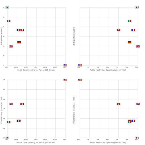
I’ve added the outcome of infant mortality and the independent variable percent public spending on health.
What I find fascinating is that for the G8 countries in the OECD higher health care costs correlate negatively with life expectancy and positively with infant mortality while percent public spending correlates in the opposite sense!
Is this an argument for more government control over health care? For single payer?
trish says
How did you get the bubble legend to appear. I can build it and then copy it onto the chart, but wonder if there is something in excel 2007 that will do it for us.
thx
Alex Warren says
Your chart Jon, is much clearer – easier to identify if there are any correlations between the variables. I think the biggest problem with the original chart, and I know this wasn’t the point of your post, is that it’s just a poor choice of data to begin with.
Medx4u says
The new chart is very much useful then the older one, any one can easily understand the chart, it shows the data accurately. Very important blog posting related to health care data.
Honor says
I don’t understand how you think the green line graph is less dramatic than the blue line graph. Less intelligible, yes. Less dramatic? Rather the opposite, I think.