In Calculating Easter (from Easter Formula), John Walkenbach posted a chart showing the frequencies of dates on which Easter falls. I wouldn’t go so far as to call this a “bad” chart, but I have two comments about it.
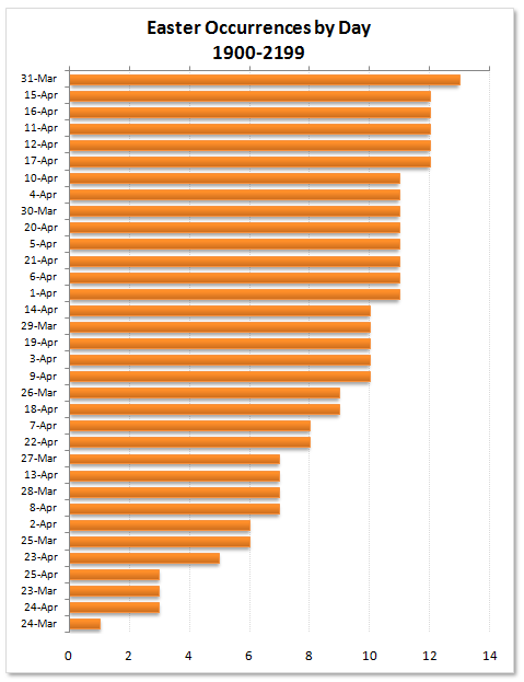
My first comment about the chart is that the combination of a gradient in the bar’s fill formatting, plus the shadows under the bars, makes me think either that there are multiple series in the chart, or that my eyeglasses need to be changed.
This issue is addressed simply by keeping the chart formatting as simple as possible. With all due respect to John, Excel 2007 makes it just too tempting to spoil a good chart.
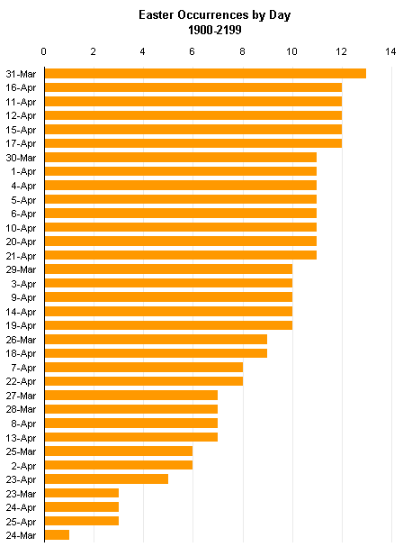
My second comment about the chart was that it might be more interesting to show the occurrences in date order rather than in occurrence order (a la Pareto), to try to understand why a given date may seem to be underrepresented.
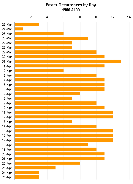
As expected, the dates in the middle of the date range are somewhat evenly distributed, while those at the edges (March 23 and 24, April 23-25) have lower representation.
I noted that John’s formula and one offered by Chip Pearson differed by one week in the prediction for 2079. Neither John nor Chip admit ownership of these respective calculations, so the error comes from the originators of one or the other relationship. I tried showing it in a bar chart, but that was even worse than the gradient and shadow in John’s chart that led me to write this post. Two series are evident, but it’s impossible to make sense of the chart.
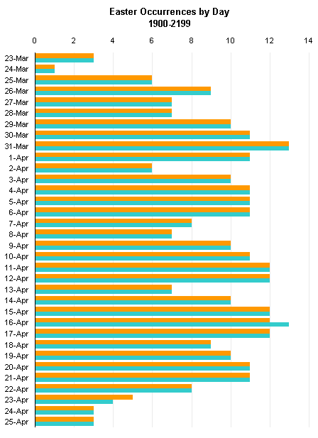
I converted this to a line chart with three series. One series shows all of John’s points, one shows all of Chip’s points, and one shows all the points where they agree. This last series is less distinctively formatted, and it appears in front of the other two series, so the chart highlights the points that differ while showing the general agreement.
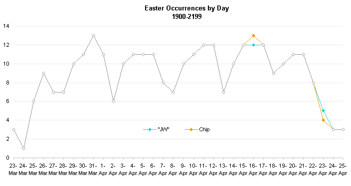
I’ve described the rationale behind my decision to sort the date axis categories by date in Choice of Category Axis Order. A future post will discuss various calculations of Easter.
John Walkenbach is the author of such popular, useful, well-written Excel books as Excel 2010 Bible, Excel 2010 Power Programming with VBA, Excel 2007 Charts, Excel 2010 Formulas, and Excel 2007 VBA for Dummies. Versions are probably still available for older editions of Excel, but for the most part, the content is applicable across the range of Excel editions.


Jon Spring says
Another easy way to show the discrepancy would be to add error bars to your basic date-order chart above. The important story is that only those two dates show any difference. The problem with the paired-bar chart is that the color clash makes you look through every date to find the story, not just the two meaningful dates.
Jon Peltier says
Jon – Despite the color scheme, the clustered bar chart is not very useful for showing the differences, especially if there are relatively feew differences. I wouldn’t use error bars, because you’d have to pick one series to apply them to, which would discount the importance of the other. I thought the line chart showed the differences best.
John Walkenbach says
OK, I concede the first point. It was a moment of insanity. Excel 2007 just made it too easy to spoil a good chart. I throw myself on the mercy of the court.
I see your point regarding data order vs. frequency order, but I prefer my method.
According to several web sites I visited, Easter 2079 is on April 23. Chip’s VBA function returns that date, but his formulas return April 16.
Jon Peltier says
John –
I’ve followed up a bit more, and an upcoming post will have a bit more detail. It would seem that Chip’s source for the calculation is not correct.
The order of categories makes sense either way, depending on what you’re interested in. I am interested in the distribution across the range of dates, and I describe it further in the upcoming post. A pareto like yours will give different results, at least a different order of categories, depending on whether you sample 200, or 300, or 500 years. The distribution in date order will look much the same independent of sample size.
Jon Peltier says
John –
I’ve described the rationale behind my decision to sort the date axis categories by date in Choice of Category Axis Order.
Alexa Class says
Is there a way to add diagonal lines to a section of bars or a bar through Excel 2007. I only find gradients/ color options and am trying to publish scientific info where they require diagonal black and white lines instead of gradients. Help very appreciated
Jon Peltier says
Alexa –
Microsoft removed that capability from the user interface (the ribbon and all that), but it’s still accessible to VBA. Andy Pope has written a free add-in for Excel 2007 that provides a dialog to apply these fill patterns to Excel 2007. Read about it in Chart Pattern Fills Add-In.