You can make Gantt charts in Excel using stacked horizontal bar charts. The bars have the appearance of floating, because the lower series in the stack is hidden via formatting (no border and no fill), leaving the upper series to show the duration of each task. I’ve written two tutorials about Gantt charts, Gantt Charts in Microsoft Excel and Advanced Gantt Charts in Microsoft Excel, and I’ve compiled a list of links to other tutorials, templates, and programs related to Excel Gantt charts in Gantt Chart Links.
A common question about Excel Gantt charts is how to display multiple floating bars for a single task. bar series can only have one bar per category, right? That’s true, but you aren’t stuck with using one series to represent repeating tasks. There’s a hidden series for all the time before the task started, and a series for the first occurrence of the task. Simply add another hidden series for each gap between occurrences of the task, and another visible bar, formatted like the first, to represent each repetition of the task.
The Data
Today’s example comes from a recent post in the MrExcel forum, Variation of a Gantt chart. The poster knew he needed a Gantt chart, but hadn’t thought of using multiple series.
The data represents the times that ambulances went out on call and returned. One ambulance went out three times, the other three once each.
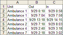
The data needs to be rearranged to put all data for each ambulance in a single row.

The formula in cell H10 is =B10 and this is filled down the column to row 13. The formula in cell I10 is =IF(C10>B10,C10-B10,0), and this is filled right to column M and down to row 13.
The Chart
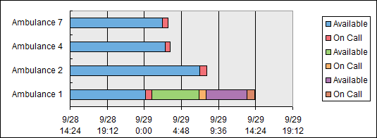
The chart source data is highlighted yellow in the figure above. Select one area, then hold CTRL while selecting the other. Then insert a stacked horizontal bar chart. You’ll have to change the orientation of the data to series in columns, since by default Excel will plot this with series in rows (more columns than rows, so Excel tries to make fewer series with more points). This is what the default chart looks like in Excel 2003. It’s less ugly but still needs work in 2007 (not shown). Note the three series called “Available” and the three called “On Call”.
Let’s clean up by removing the chart area border, the plot area border and fill, and the legend border. Let’s use a very light gray for the vertical gridlines and a medium gray for the axes. We don’t need the tickmarks on the vertical axis. For the horizontal axis, set the minimum to 9/29/2010 in Excel 2003 or 40450 in Excel 2007 (which has lost the ability to accept value axis scale parameters in date or time format). Set the major unit to 3:00 in 2003 or 0.125 in 2007, and the minor unit to 1:00 in 2003 or 0.046666666667 in 2007.
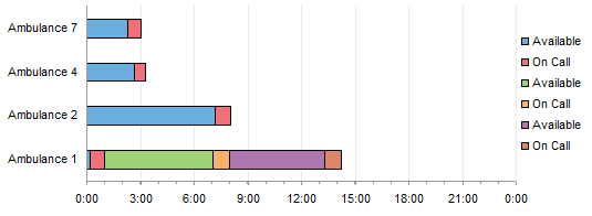
Hide the three Available series by formatting with no border and no fill.
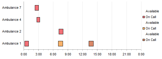
Format the three On Call series using the same border and fill.

To get the ambulances in the opposite order, format the vertical axis, and adjust the scale so categories are plotted in reverse order, and so the value axis crosses at the maximum category.
Hide the unneeded legend entries by clicking once to select the legend and again to select the unwanted legend entry, then pressing Delete. Lather, rinse, repeat.
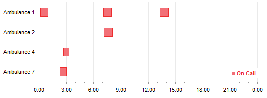
Ta-daaa!


Oli says
I just wanted to thank you for another great blog entry. I love reading what you have to say and learning in the process. You also have a style of whit in your writing that always brings a smile to my face :)
Thanks again.
Bob says
Hi Jon,
Glad to see you are posting again. Every time I visit your site, I learn a little more. Sometimes, a lot!
What about creating a solution using XY chart, error bars to represent the call time. and line charts to get the nice time scaling ?
You end up with fewer series to work with, but it would scale up better.
Just a thought.
Cheers,
Gregory says
I always like a good chart, but hate the process of making them. You make this Gantt chart transformation look easy. It’s inspiring.
derek says
Jon, that’s pretty good, but it means you have to have a new pair of series for every event. What happens when someone comes along and presents you with an ambulance that made *four* callouts?
You can have an indefinite number of callouts, driven by a database having a neat series of only three columns, if you number the ambulances, make the category axis (the vertical axis in the case of a horizontal bar chart) into a Time-scale axis, and record each new callout with a new data row (ambulance no., start time, duration).
Because it’s a Time-scale, each new bar will fall on the numbered row (a category axis would make a new row every time). If you want to name the ambulances, you can create a dummy XY series to attach labels in the required spots.
Jon Peltier says
First Bob, then Derek, with better ways to handle this. Well, that’s okay, thanks for the additional topics, stay tuned next week.
Derek’s approach is particularly clever, using some strange characteristics about Excel’s date-scale axis that I didn’t consider. Notably, multiple entries for the same date are plotted at the same position, essentially midnight on that date. The multiple items for ambulance 1 have the same date (same category number) and so line up without need for multiple series.
DV says
Hi Jon
I just love your site…Lately Your posts on Gantt Charts have been insightful..However I am a MS Project User and can not find many great MSP blogs unlike Excel Blogs…If you know any please Suggest…Once Again Jon Thanks a ton for all you do for us mere Mortals :P …
Gantt Chart Template Trainer says
This is a very good tutorial on an often covered subject. I’ve never seen a Gantt chart interpreted in this way.
ZZ says
Hi Jon
This is a great solution. But how do I automatically rearrange the original data, to put all data for each ambulance in a single row?
Thanks!
Jon Peltier says
A priori there’s no way to automatically arrange the data. You can copy and paste, or if you want it to be dynamic you can use formulas to get the appropriate value into the cell where you need it.