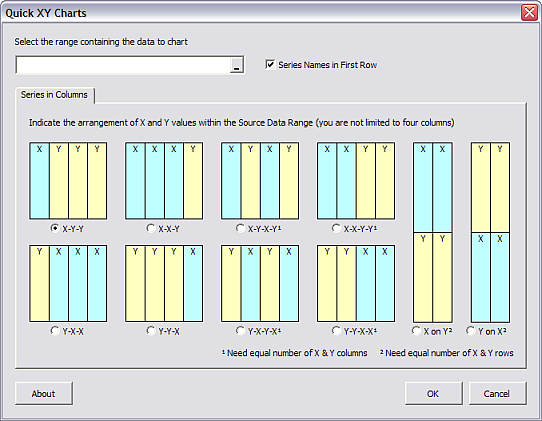
A quick post today to respond to a user of my Quick XY Chart Utility. This noncommercial utility generates XY charts using input data in a variety of layouts, beyond X in first column and Y in subsequent columns.
The utility does not apply any particular formatting to the output charts, using the defaults it finds. One user of the utility had charts with over 100 series, and he wanted them all to be formatted identically.

In Excel 2003 and earlier, this is easy to do manually. Format the first series as desired, select the next series (use the up arrow key), press the F4 key, repeat the up arrow/F4 cycle until all series look the same. However, in Excel 2007, the F4 (Repeat Last Action) functionality has been eviscerated, particularly in charts. This is one of the productivity-sapping changes I have discussed in the past.
I wrote a little VBA procedure to apply the same formatting to all series in the chart. I wrote the routine in Excel 2003, but it will work fine in Excel 2007. It does not make use of the more extensive formatting capabilities introduced in Excel 2007, and that is just as well, since they do nothing to enhance the effectiveness of a chart.
Sub FormatAllSeriesTheSame()
  Dim srs As Series

  For Each srs In ActiveChart.SeriesCollection
    srs.MarkerStyle = xlMarkerStyleNone
    With srs.Border
        .ColorIndex = 5 ' blue lines
        .Weight = xlThin
        .LineStyle = xlContinuous
    End With
  Next
End Sub
Select the chart and run the code.

We can improve on this routine, making it a better experience for the user. First, the following routine can check that there is an active chart. If not, the code exits gracefully with a reminder that the user should select a chart first. Second, to avoid the screen flashing and to speed up the reformatting, the routine deactivates ScreenUpdating while it is reformatting the chart.
Sub FormatAllSeriesTheSame()
  Dim srs As Series

  If ActiveChart Is Nothing Then
    MsgBox "Select a chart and try again.", _
        vbExclamation + vbOKOnly, "No Active Chart"
  Else
    Application.ScreenUpdating = False
    For Each srs In ActiveChart.SeriesCollection
      srs.MarkerStyle = xlMarkerStyleNone
      With srs.Border
        .ColorIndex = 5  ' blue
        .Weight = xlThin
        .LineStyle = xlContinuous
      End With
    Next
    Application.ScreenUpdating = True
  End If
End Sub
If you aren’t sure how to use this code, please read my tutorial about How To Use Someone Else’s Macro.


Bobby says
Hi Jon,
I have a question on how to label XY Scatter charts. I’m trying to create a graphical representation of how projects are prioritized items. In essence, the chart would represent a 4 quadrants; high – high, high – low, low – high, low – low. The idea that precedence is given to anything in the “high-high” section. Each item is based on two criteria. Each criterion is given a numerical value. I can get all the items to graph on the chart OK. My issue is that there are several items listed at a single X, Y coordinate. Here is an example:
ITEM X VALUE Y VALUE
1 -15 0
2 10 0
3 0 0
4 -25 -5
5 -25 0
6 -25 0
You’ll notice the last 2 items have identical coordinates. What I want to do is create a label that will display all the Item numbers at a single coordinate (i.e. 5, 6, etc.). Do you know a way to accomplish this using Excel 2007?
Thanks you.
meyer garber says
In Excel 2003, when you select a series (on an X-Y Scatter chart), and click on “Format Data Series” a Dialog Box appears with tabs labeled ‘Data Labels’, ‘Series Order’, ‘Options’, ‘Patterns’, ‘Axis’, ‘X Error Bars’, and ‘Y Error Bars’ – 7 tabs in all.
Is this built-in dialog box accessible via a VBA macro? Thank you very much for this and past help,
Jon Peltier says
Meyer –
This dialog is not accessible via VBA, but most of the settings in it are. That is, all settings can be defined via VBA, but a few things (such as the data ranges for custom error bar values) are hidden from VBA.
To see how to do things from this dialog in VBA, turn on the macro recorder, then format a series, and examine the code. (In Excel 2007, many of the formatting operations are not recorded, but Excel 2010 has brought back the recorder’s functionality.)
meyer garber says
Re Your reply of Tuesday, January 18, 2011, 11:51 am
A recording shows how the Format Data Series language works, but it is not interactive. This 3-line code shows the built-in dialog box for x-axis scale and number format. For doing many charts it helps! I guess I’ll have to go to a User Form to do the same for the Data Series scale (ugh).
ActiveChart.Axes(xlPrimary).Select
Application.Dialogs(xlDialogScale).Show
Application.Dialogs(xlDialogFormatNumber).Show
As always, many thanks, m.garber
Haley says
Hi – this is exactly what I’m looking for – thank you!
I’m rather new to VBA and I’d like to introduce a few more options into the code:
ie) I’d like a line to select certain series and then apply attributes to only that selection of series. Do you know where I can find a list for the VBA tags for different attributes? I’d like to change the marker shape/line/colour as well. Thank you very much.
Jon Peltier says
Haley –
You should familiarize yourself with the Object Browser, which describes every Excel object and its properties (and its subset objects), and if you have 2010, the Macro Recorder, to record little snippets of code to remind yourself of the syntax needed for a given task.
I don’t have any specific material on these, but Google does.
Mustafa says
Thank you so much for sharing this procedure.
I have huge amount of data to be visualized with excel 2003.
It helped me so much.
Thanks a lot.
Mustafa.