I reviewed a colorful yet ineffective graphic in Wow! Heat Map Donut Chart!. No critique of a graphical technique is complete without describing alternative techniques which would be more effective. Starting from the heat map donut chart, I’ll work backwards, removing features that negatively affect chart readability, then forwards, changing to features that improve readability.
Hierarchy of Visual Elements
To guide our redesign of the heat map donut chart, we will refer to Figure 2 of Presentation Graphics by Leland Wilkinson.
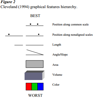
This figure shows William Cleveland’s ranking of different graphical features in terms of how effectively they are for encoding and decoding data.
Heat Map Donut Chart
Here is the heat map donut chart in all of its glory, including intense primary colors and gradients.
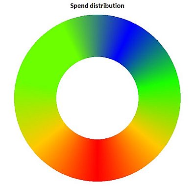
This graphic uses color to encode its data, which according to Wilkinson’s chart is the least effective graphical feature for this purpose. The gradients in color between data points only makes the use of colors more ineffective.
Unsmear Colors
Because of the gradients of color, the data for each category is encoded only along the spoke at the center of that category’s segment of the donut.
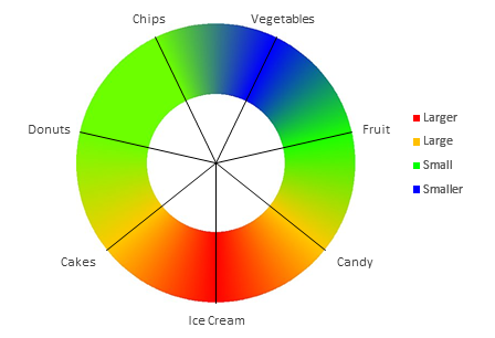
To use the entire segment to encode the data, to clearly delineate the segments, and to eliminate potentially misleading intermediate colors between spokes, let’s unsmear the colors.
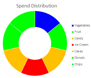
Size Wedges Proportionally
Now that we’re not using color to encode data, we can move up in Cleveland’s hierarchy. Let’s skip volume, since we already know (haven’t you been paying attention for all these years?) that 3D effects distort and mislead. Excel doesn’t even offer 3D donut charts, but there are blah blah professional state of the art yada yada business intelligence solutions that do. We’re using a donut chart anyway, so let’s make the area of the wedges proportional to the underlying data.
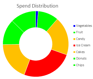
Use Color-Vision-Deficiency-Friendly Colors
Those primary colors are still glaring, and there are multiple points using the same colors. Let’s apply Excel’s dull but useful default color scheme.
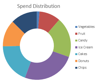
A companion article, Color Vision Issues with Heat Map Donut Charts, discusses how color vision deficiencies can hinder readability of certain color schemes, such as the scheme used in the heat map donut chart.
Sort by Size
Since we’re not very good at comparing areas, especially of rotated shapes, we can help our brains rank the data by sorting the points according to value.

Replace Legend with Data labels
The legend forces us to move our eyes back and forth from the donut to the legend, then remember which color corresponds to which category. This slows comprehension and overloads our feeble short term memory. Let’s remove the legend altogether and apply data labels to the wedges.
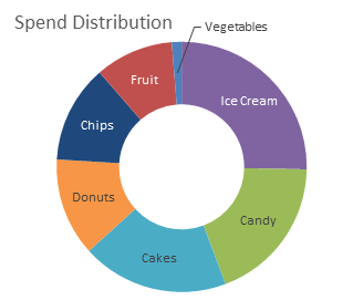
Put the Hole Back Into the Donut
The donut chart uses area to encode data. The figure above lists angle above area, hmmm. The donut also uses angle to an extent, but there is a big hole where the angles come together. Let’s put the hole back into the donut, and use a pie chart, which uses redundant approaches of area and angle.

Encode Using Length: Bar Chart
Another glance at the figure of hierarchical graphic elements shows that length is more effective than area or angle. How do we get length? In a sense the donut chart uses length, arc length, but the elements not straight, nor do they share a common starting point, so this length isn’t used effectively. Let’s totally scrap the circular chart paradigm, and draw bars proportional in length to the underlying values.
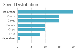
Notice an additional benefit that the bars don’t have to be different colors, and the labels are right there on the axis.
Encode Using Position Along Scale: Dot Plot
Again we check Cleveland’s list. In this context position along nonaligned scales doesn’t make sense. But position along a common scale? But position along a common scale? We have the common scale from the bar chart. Let’s put a symbol at the end of each bar, then hide the bars.

Like the bars in the previous chart, the dots in this plot need not be different colors. In fact, color can be used here in its most effective role, identifying different sets of dots. We could overlay target and actual values with little confusion, particularly if colors were chosen to minimize the problems of color blindness. Using different shapes for the symbols is a redundancy that helps identify the groups of data.
The bar chart and the dot plot are the two most effective ways to display this data quantitatively and clearly. Not only are these charts easy to read, they are easy to create and maintain.
What if We Work Backwards?
Suppose we were unfamiliar with Cleveland’s hierarchy of graphical effectiveness. How could we lead ourselves astray starting from such effective graphs as the bar chart and dot plot? To reinforce the lessons from Cleveland and Wilkinson, let’s explore.
We could color code the bars or dots. Not a terrible idea, but also unnecessary.
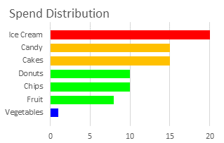
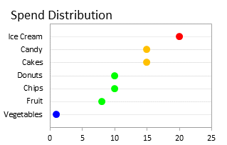
Now we’re free to lose sight of the effectiveness of the different encoding methods. We can decide color is all we need to show the data, so we remove the variation in lengths of the bars, or the horizontal positions of the dots. Do you notice the conversion from a quantitative display to a qualitative one?
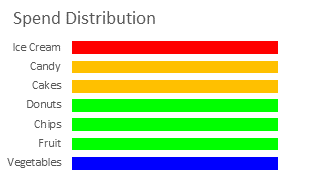

Let’s label the bars directly, or put the dots in front of the labels.


The last bulleted list could be made easier in the worksheet (or in PowerPoint or Word!) than in an Excel chart.
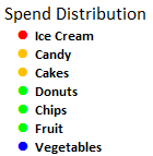
We can simplify the labeled bullets or labeled bars by simply coloring the text. Simple and totally qualitative, complete with potential red-green color vision issues, like so many color-coded but non-graphical tables of data we’ve endured.
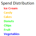
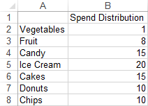
I’ll leave it to the reader, guided by Figure 2 from Wilkinson’s paper, to work backwards from this colored list to a useful quantitative display. Here is the data, if you’re interested:


Martin says
Yay!!!!! Your fist bar chart under “what if we move backwards?” is the same I did myself !!!!! So proud !!!
I really want to have the data for the other datasets, ie countries, to see how to tell the story. it is missing from the original post.
thanks to all your posts for leading me on the right direction!
Martin
Chris says
Hey Jon,
I you are in need of new blogpost topics: I’m curious what a chart busters view on this economist crowdcharting challence might be: http://www.economist.com/blogs/graphicdetail/2013/01/revisualising-kickstarter?page=1&fsrc=scn%2Ftw%2Fte%2Fbl%2Fcrowdchartinganyone#sort-comments
Hope to be reading from you soon.
Cheers,
Chris