Fill Below Standard Normal Distribution
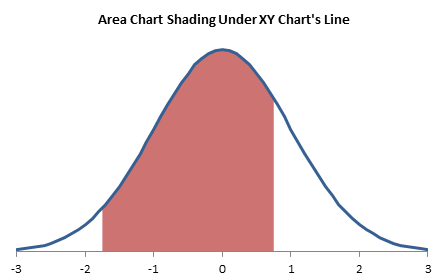
A common request I get is to show someone how to apply shading under part of a plotted curve. This can be done easily using a combination chart. Combination charts may sound difficult, but they are actually pretty easy. We could use a line and area chart combination, but that’s not smart enough, so we’ll use an XY and area chart combination.
Plotting the normal curve, in fact, plotting any function, is an easy task. Put the X values for the function into one column of a worksheet, then calculate the Y values in the next column, and plot this data. The data for the standard normal distribution is shown here (it extends down to row 65).
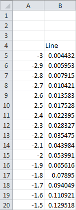
The X values in column A start at -3 in cell A5 and increment by 0.1 down to X=+3 in cell A65. This formula in cell B5 to calculate the standard normal distribution is copied into the range B5:B65.
=NORMDIST(A5,0,1,FALSE)The data for the area chart (at least for the first cut) is shown below:
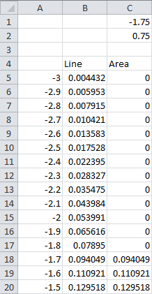
Cells C1 and C2 contain the minimum and maximum X values to fill below.
This formula in cell C5 is copied into C5:C65.
=IF(AND(A5>C$1,A5<C$2),B5,0)First Cut at Filling Below a Plotted Line
This first exercise will show that, for this particular example, a line and area chart combination isn’t sufficient. For other uses, such a combination may be perfect.
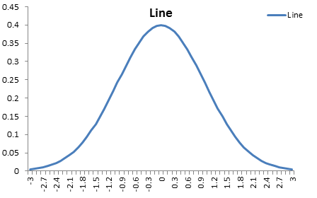
This is the data in A4:B65 plotted in an Excel line chart. Note that the labels along the X axis do not denote numerical values. A line chart treats anything in the X values range as nonnumeric labels and plots data at equally spaced intervals along X.
This is the data in A4:C65 plotted in an Excel line chart.
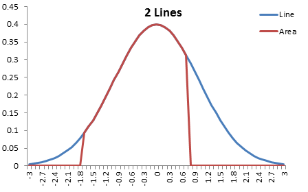
This is how it looks when the “partial” line chart series is converted to area chart type.
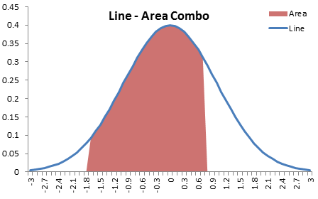
This doesn’t work quite right. The edges of the shaded region are not vertical. Since the default text-style axis of a line chart (also used by area charts and column charts) plots each point above a category label, the edge of the shaded area slopes from the value at one category to the value at the next.
Filling Below a Plotted Line, Done Right
We’ll need a more clever way to get our chart, so we’ll use an XY and area chart combination.
We can take advantage of the behavior of the date-style axis of a line chart. This treats numerical X values as dates starting at 1 for January 1, 1900, and incrementing up one unit for each day. In fact, it starts at zero for January 0, 1900. Values are plotted horizontally according to date, so they no longer need to be equally spaced, if the days between points are not equal. You can even plot multiple values for the same date, and the points will be plotted along a vertical line. This is what we want for our shaded region.
Since the date axis only recognizes whole days as whole numbers, and ignores any fractions, we can’t use the same scale as the -3 to +3 for the normal curve, That is also no-go because the date axis only recognizes non-negative dates. But we can normalize our X values so they run from 0 to 10,000 (which is the same as 5/18/1927). The data table is shown below.
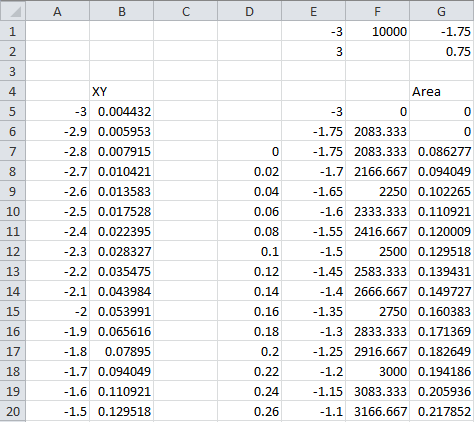
A few constants are included in the first two rows of the worksheet. E1, E2 contain min and max X values for the X axis of the normal curve. G1, G2 contain min and max X for highlighting under curve; change these numbers to change which region is shaded. F1 is the max for the area chart’s date axis (the minimum is zero).
The formula to calculate the standard normal curve is the same as in the previous example with the line chart. A5:A65 contains values of -3 to +3, incremented by 0.1, while cell B5 contains this formula, which is copied into B5:B65.
=NORMDIST(A5,0,1,FALSE)The first two and last two rows of the area chart data range contain dummy values for the unshaded ends of the chart. The formula in cell E5 is:
=E$1The formula in cells E6, E7 is:
=G$1The formula way down in E57, E58 is:
=G$2The formula in E59 is:
=E$2Cells G5, G6, G58, G59 contain the value zero.
The range D7:D57 have values from zero to one, incremented by 0.02. I judged that this spacing has more than sufficient resolution for a chart 400 or so pixels wide.The formula in E8:E56 computes the X values used to compute the normal curve for the area chart.
=G$1+(G$2-G$1)*D8The formula in F5:F58 converts these X values into “dates” for the area chart’s X axis.
=(E5-E$1)/(E$2-E$1)*F$1Finally, the formula in G7:G57 computes the standard normal values plotted by the area chart.
=NORMDIST(E5,0,1,FALSE)Let’s start by selecting F4:G59 and inserting an area chart. Doesn’t matter if you use stacked area or unstacked, since there’s only one area series in the final chart, but I used unstacked.
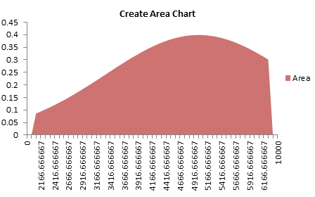
Convert the default text-style axis to a date-style axis. Make sure it is scaled from zero to 10,000.
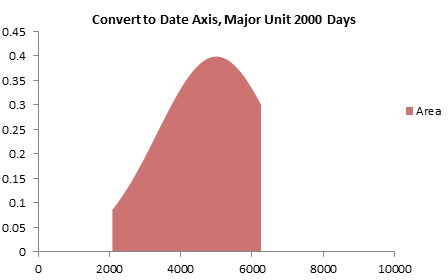
Copy the XY data in A4:B65, select the chart, and use Paste Special to add the data as a new series, with categories in first column and series names in first row. This data is added as another area series.
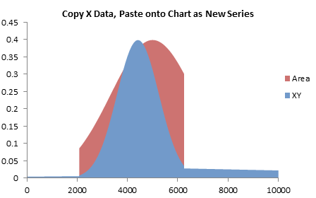
Convert the new series to an XY type. If it doesn’t automatically go onto the secondary axes (and you don’t see axes on all four sides of the plot area), format the new series, and choose Secondary Axis.
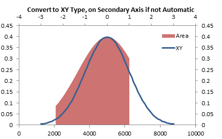
Align the curve and the area by setting the secondary X axis (top of chart) so it ranges from -3 to +3.
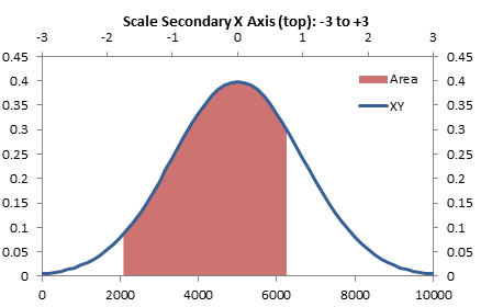
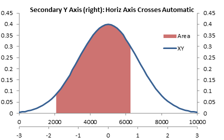
We want to use the top horizontal axis along the bottom of the chart, so we need to switch the horizontal axes. You have to format the corresponding vertical axis to set this. Format the secondary vertical axis (right of chart) so that the horizontal axis crosses at the automatic position, which means at zero.
Now format the primary vertical axis (left of chart) so the horizontal axis crosses at the maximum axis value.
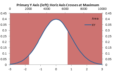
Oh noes! the axis is where we want it, but now we’ve shaded ABOVE the plotted curve. This is because area charts and column charts start at the horizontal axis and rise upward or hang downward to reach the plotted value. Unless the corresponding vertical axis is missing, so select the primary vertical axis (left of chart) and click Delete. All series in the chart use the secondary Y axis if it’s the only one available.
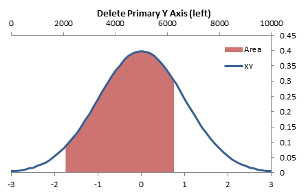
Now delete the primay X axis (top), or hide it by formatting it so it has no line, no tick marks, and no tick labels.
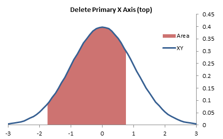
Finally, hide the secondary Y axis (right of chart) by formatting it so it has no line, no tick marks, and no tick labels.
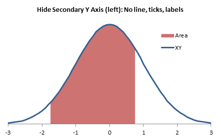
Remove the legend and write a descriptive chart title, and the chart is done.

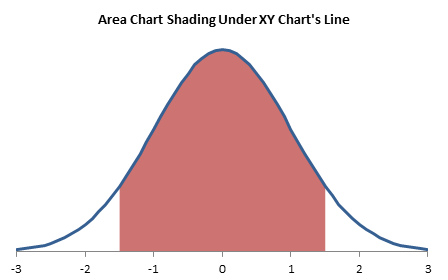
As promised, changing the values in G1:G2 change where the curve is shaded. Instead of -1.75 to 0.75, let’s change the values to ± 1.5.
Or let’s highlight the curve from 1 to 2.
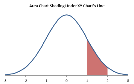
See how easy it is to use a combination chart to highlight some or all of the area under a curve.
More Combination Chart Articles on the Peltier Tech Blog
- Pareto Charts in Excel
- Clustered Column and Line Combination Chart
- Precision Positioning of XY Data Points
- Add a Horizontal Line to an Excel Chart
- Horizontal Line Behind Columns in an Excel Chart
- Bar-Line (XY) Combination Chart in Excel
- Salary Chart: Plot Markers on Floating Bars
- Fill Under or Between Series in an Excel XY Chart
- Excel Chart With Colored Quadrant Background


Leonid Koyfman says
Hi Jon,
Should we use an inclusive range like =IF(AND(A5>=C$1,A5=C$1,A5<=C$2),B5,NA()) and copy it down into C5:C65.
2. Plot data in A4:C65 as a line chart.
3. Change Area series chart type to Area chart.
4. Open Select Data dialog box ,select Area series and click Hidden and Empty Cells button.
5. Select Show Empty Cells as Gaps option.
6. Format category axis and remove value axis.
Cheers,
Leonid
Jon Peltier says
Leonid –
The problem is that the “Show Empty Cells as Gaps” option only works for EMPTY cells, not cells that contain #N/A or “” or anything that is not nothing. Whether you use “” or 0 or #N/A for the unshaded regions, you still get the inclined edge between shaded and unshaded.
Leonid Koyfman says
Jon,
Maybe it is infamous “it works on my machine”.
Yes, I had this problem with 0 and “”(empty string”), but with NA() it works fine.
I use Excel 2010.
I can email my file.
This message doesn’t need to be posted.
Leonid
Jon Peltier says
Well, I stand corrected. After reading Leonid’s comment I opened up the workbook with all of these charts in Excel 2013, and I stuck NA() in place of the zeros. Then I changed the behavior to gaps. And I got gaps with vertical lines. Mind blown, I opened up Excel 2003 and 2007, and discovered that this behavior changed in 2007. Summary:
In Excel 2007 & later, an area chart (not stacked area, just regular area) recognized the “treat blanks as gaps”, and it will even recognize #N/A as a blank cell.
Line charts still treat #N/A by interpolating across the missing point regardless of the selected blank cell option.
In this chart I inserted #N/A for Y at X = -2, -1, 0, 1, and 2, and I added vertical gridlines at these axis ticks. Note the gap in the area chart through which you can see the gridlines. Also note that while there is no marker at the gridlines, which is the expected behavior for #N/A, there is still a line spanning the gap.
Bob says
Hi,
I sure am glad I came back to try this solution. Learned somethign, and could hear the echo of a mind blowing up.
Cheers,
Bob
Best Excel Tutorial says
Very useful chart. Thanks for teaching me. Since now I could only do simple Gauss Chart as I showed here: http://best-excel-tutorial.com/88-gauss-chart
Mariam says
I am having difficulties aligning the line to the area for a smooth fit. Instead my area is outside the bell shaped curve. HELP!!
Mariam says
Further to my comment above – I can’t get the 2 peaks to align and form one smooth curve. My shaded area is a little outside the curve. Can anyone please provide an answer
Jon Peltier says
If the two peaks are misaligned, there is a mismatch between the X values and X axis limits of the XY curve and of the Area fill. If the shaded area is outside the curve, it may also be related to a mismatch of the Y axis scales.
I have a more general tutorial that I’ve just rewritten with Excel 2007-2013 in mind. Check out Fill Under or Between Series in an Excel XY Chart.
Mariam says
The mismatch is in the selection you have provided. You are asking to select f4:g59 while asking to select a4:b65 which does not extend to the values we have selected for the area portion which is only 59 values while the line portion is 59 values (not the full 65)
Jon Peltier says
Miriam –
The numbers of points in each series do not need to be the same. The data in A4:A65 is converted to an XY type in the chart on the secondary axis, while the data in f4:g59 is left as an area type on the primary axis. In my new tutorial, these are done the opposite way, starting with both series as XY, moving the series that will provide the fill to the secondary axis, .then converting this to an area chart type
Sarah says
Hello Jon. For a report I’m writing I need to do a t-test. I followed the instructions on this page http://www.excel-easy.com/examples/t-test.html to do a t-test in Excel by using the Analysis Toolpak add-in. I would like to visualize the result of my test with a critical region (area under curve) similar to your combination charts, but it’s too complicated for me. Do you know if there’s a tool in Excel that I can use?
Jon Peltier says
Sarah –
If there were a function to make this kind of chart for a t-distribution, there would also be one for the normal distribution, and I would not have had to write this post. So you’re going to have to build it yourself following the protocol in this article. You’ll have t ofigure out what formula and which parameters to put into column B, but that’s the only difference.
Daniel says
Thanks very much for taking the time to write up this tutorial, very, very helpful!
I thought I’d try and expand on it by adding two more data series, as I wanted to shade different parts of the , basically by copying D1:G59 and inserting it twice over. I picked 0-1.83 as the range for the first, 1.83-2 for the second and 2-3 for the third. However, all of the shading is being stacked inside the area of the first range, instead of after each other, and I can’t seem to figure out why. The data in the tables looks good, it just doesn’t seem to translate to the chart right?
Pic of my graph: http://lessonstolearn.net/images/graph.jpg
Jon Peltier says
Daniel –
What’s the data look like?
Daniel says
I uploaded the file here: http://www.lessonstolearn.net/bell_curve.xlsx
For some reason, any additional data series I add is displayed within the confines of the first one.
Jon Peltier says
Daniel –
All of the three area series need to use the same X values. Otherwise, all three will use the X values for the first. This is where your difficulty comes from.
You need to list all the values you will need in one column, then of course calculate what you need for the technique (because it;s scaled from 0 to 10,000 instead of -3 to 3). Then the next three columns are the values you need for the three colored areas. Only one of the three has a value for any row of X values.
To get the vertical edges, you need to duplicate the X values where the edges appear. For example, x=1.83 appears in two rows: in the first row Area 1 has a value and Area 2 has zero; in the second, Area 1 is zero and area 2 has the value. Same for x=2.00 with Areas 2 and 3.
I’ve inserted my area chart data in columns S through X of the amended workbook, which is posted here:
Fixed Bell Curve Workbook
Daniel says
That’s extremely helpful Jon, thanks so much! And sorry about not catching that myself!
Jensen Samuel says
Very useful. Thank you!