Shading between plotted lines with a light color can enhance some charts. The shading may help to indicate a target range for the data.
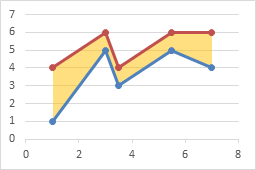
I’ve written earlier tutorials about this topic, but I have had to change sequences of steps in the protocol because more recent versions of Excel were not as flexible with order of operations as Excel 2003 (RIP).
XY-Area Combination Charts
Recently in Shaded Quadrant Background for Excel XY Scatter Chart I showed how to generate a background grid of colored rectangles.
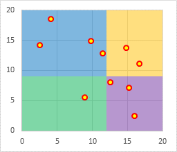
This technique plotted the XY chart data on the primary axes and the Area chart data on the secondary axes. It also took advantage of a trick using the category axis of an area (or line or column) chart: when used as a date axis, points that have the same date are plotted on the same vertical line, which allows adjacent colored areas to be separated by vertical as well as horizontal lines.
To fill under or between XY series, we’ll make use of this same approach: XY data on primary axes, Area data on secondary axes, with a secondary date axis.
Fill Under One XY Series
Let’s start with the simple case of filling color below an XY plot. Simple data, simple chart of type Scatter With Straight Lines and Markers.
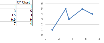
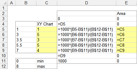
We need to do some calculations to produce data for the area chart series (see below). The min and max X for the XY chart’s X axis are entered in B11 and B12 (these are Excel’s automatic scale limits in the XY chart above). To provide reasonable resolution, we’ll scale the area chart’s X data from 0 to 1000. The formulas for the area chart’s X values in column D are simple interpolation formulas to properly rescale the data.
The X values are extended so that the first calculated X value in D5 is repeated in D4, and a zero is placed in D3; also the last calculated X value in D9 is repeated in D10, and the X max of 1000 is entered into D11. These duplicate X values will provide the vertical edges of the shaded region.
The formulas for the area chart’s Y values in column E provide the same Y values for both chart series. The Y values are extended by two cells above and below the calculations, which contain zeros.
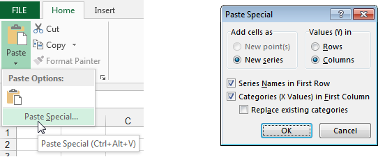
The chart already contained the XY data in the first two columns of the data range (B4:C9). Copy the next two columns (D2:E11) , select the chart, then click on the Paste dropdown on the Home tab and choose Paste Special (below left). The Paste Special dialog will appear; make sure the same settings are selected as shown below right.
Here is the computed data and the chart. The added series is an XY chart type, like the first. Don’t change it yet.

Select the newly added series, press Ctrl+1 (numeral one) to open the Format Series Task Pane (Excel 2013) or the Format Series Dialog (2010 or 2007), and under Series Options, select Secondary Axis (below left). Excel adds a secondary vertical axis along the right edge of the chart (below right).
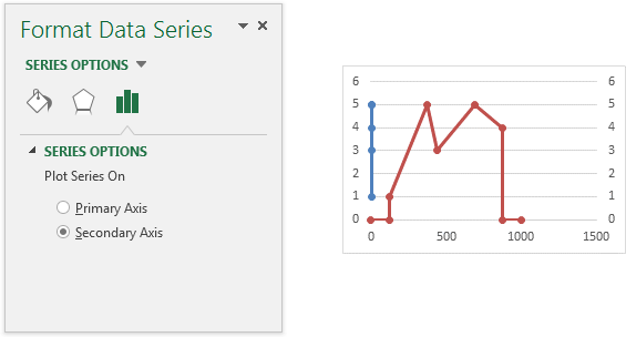
Excel adds a secondary vertical axis along the right edge of the chart.
In Excel 2013, click the plus icon beside the chart, click on the right-facing arrow beside Axes, and check the Secondary Horizontal box. In Excel 2010 or 2007, you’ll have to trudge up the the Chart Tools > Layout tab, click on the Axes dropdown, click Secondary Horizontal, and finally click Show Left to Right Axis.
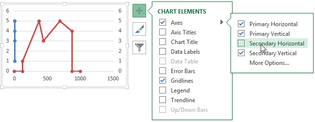
Now all axes are present and accounted for.

Right click on the “Area” series (which is still of type XY), and choose Change Series Chart Type. In Excel 2013, the Change Chart Type dialog appears. Click the Chart type dropdown in the Area series row, and select Area or Stacked Area (doesn’t matter which in this case, since there’s only one area series). You actually could have switched the area series to the secondary axis in this dialog (as long as you do it before changing the chart type), but I usually forget that it’s become this simple.
In Excel 2007 and 2010, select Area or Stacked Area from the pop-up window.

The series has now been converted to an area series.

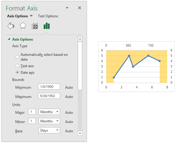
Select the secondary horizontal axis (top of chart) and press Ctrl+1 to open the Format Axis Task Pane or the Format Axis Dialog. Under Axis Type, select Date Axis (below left). You may also have to change the Base Unit of the axis to Days.
The area chart series is now perfectly aligned with the XY series. Since it’s plotted on the secondary axis, the area series fills the space between the secondary horizontal axis at the top of the chart and the data points. So it’s above the data, not below. But we’re clever enough not to panic.
Delete the secondary vertical axis (right edge of chart) and the secondary horizontal axis (top of chart). The fill moves into position below the XY plot.
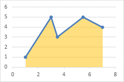
Fill Between Two XY Series
The protocol for filling between two plotted lines is pretty much the same as above. We start with two XY scatter chart series, one above and one below the filled area. We will also need two stacked area chart series, one for the clear region below the lower XY line, and one stacked on top to fill between the XY lines.
Here is the data and the initial chart for the two XY curves. It takes up space, but I’ll leave the legend there until the end to help us keep track of which series is which.

The formulas to calculate the area chart X and Y values are like those used in the simpler example above. Note that the Bottom Area data is the same as the Bottom Line data, while the Delta Fill data is the difference between the Top Line and Bottom Line data.

Copy the area chart data (E2:G11) , select the chart, then click on the Paste dropdown on the Home tab, choose Paste Special, then make sure the settings are correct. The new data is added as additional XY series, which is fine.

Select one of the Area data series (still plotted as XY), press Ctrl+1 to open the Format Series Task Pane or Dialog, and choose Secondary Axis. Excel gives us the secondary vertical axis along the right edge of the chart. Repeat for the other Area data series.
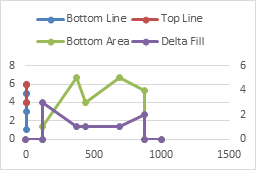
In Excel 2013, click the plus icon beside the chart, click on the right-facing arrow beside Axes, and check the Secondary Horizontal box. In Excel 2010 or 2007, you’ll have to trudge up the the Chart Tools > Layout tab, click on the Axes dropdown, click Secondary Horizontal, and finally click Draw Left to Right Axis.

Right click on the “Area” series (which is still of type XY), and choose Change Series Chart Type. In Excel 2013, the Change Chart Type dialog appears. Click the Chart type dropdown in each of the Area series rows, and select Stacked Area. You could have switched the area series to the secondary axis in this dialog (as long as you do it before changing the chart type).
In Excel 2007 and 2010, select Area or Stacked Area from the pop-up window. The chart probably looks like it’s broken right about now, but don’t panic. Right click on the other area series, choose Change Series Chart Type, and again select Stacked Area.

Select the secondary horizontal axis (top of chart) and press Ctrl+1 to open the Format Axis Task Pane or the Format Axis Dialog. Under Axis Type, select Date Axis. The area chart series are now perfectly aligned with the XY series. Since they’re plotted on the secondary axis, the Bottom Area series fills the space between the secondary horizontal axis at the top of the chart and the Bottom Line data points. So it’s above the data, not below. The Delta Fill area has filled the space between the XY lines.
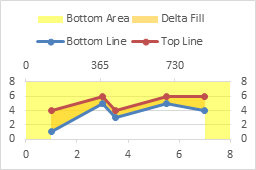
Delete the secondary horizontal and vertical axes. The Bottom Area now fills below the Bottom Line, while the Delta Fill fills between Bottom Line and Top Line.
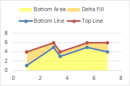
Format the Bottom Area series so it has no fill.
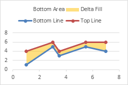
Finally, delete the legend.

Fill Between Overlapping Regions
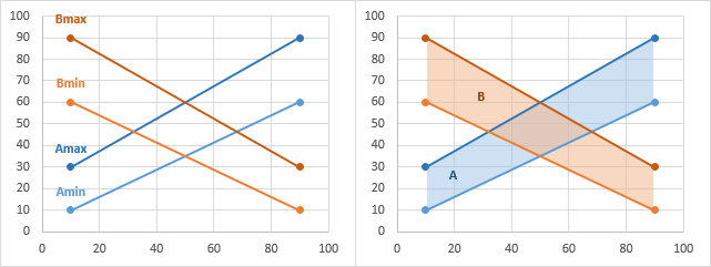
It is possible to extend this approach even further. Suppose we want to fill between two pairs of lines. The following simple data has four series, min and max for set A and min and max for set B. We want to fill between Amin and Amax, and between Bmin and Bmax. If these areas overlap, we’d like to see both.
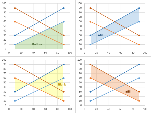
We can set up the area chart data below, where we have an area below Amin (“Bottom”), one between Amax and Amin (“Afill”), one between Bmin and Amax (“Blank”), and one between Bmax and Bmin (“Bfill”). The “Blank” area between Bmin and Amax extends from Bmin down to Amax, if Bmin is greater, or from Bmin UP to Amax, if Bmin is smaller.

I won’t go through the whole procedure, because it’s really the same as filling between two lines, above. The lines are shown on the left, A in blue, B in orange. The finished overlapping filled regions are shown on the right, again A in blue and B in orange. I’ve used a transparency setting of 50% so we can see gridlines and other data behind the area fills.
The four charts below show each area in turn with the others hidden. First, “Bottom” fills from the axis up to Amin, then “Afill” fills from Amin up to Amax, “Blank” fills from Amax up (or down) to Bmin, and finally “Bfill” fills from Bmin up to Bmax.
Fill Under a Plotted Line: The Standard Normal Curve
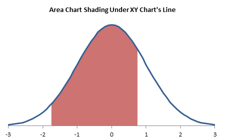
For an example of this technique, see another tutorial I’ve written, Fill Under a Plotted Line: The Standard Normal Curve.
More Combination Chart Articles on the Peltier Tech Blog
- Pareto Charts in Excel
- Clustered Column and Line Combination Chart
- Precision Positioning of XY Data Points
- Add a Horizontal Line to an Excel Chart
- Horizontal Line Behind Columns in an Excel Chart
- Bar-Line (XY) Combination Chart in Excel
- Salary Chart: Plot Markers on Floating Bars
- Fill Under a Plotted Line: The Standard Normal Curve
- Excel Chart With Colored Quadrant Background


Bob says
Hi Jon,
I have an immediate need for exactly this solution.
I was asked to chart statistics from our help desk to reflect the abandoned calls versus the total calls. I’ve been struggling with this for a bit to see if I could get it to work.
Thank you for a very timely post.
Cheers
Brian Berry says
Hi Jon
Thanks you so much for the informative posts, they have helped me countless times.
I do however, have a question that I’m struggling to find a straight answer to on the net. That is, I want to know how to improve the speed of VBA scripts which are creating and using many charts with many data series. Being an engineer, I like to push things to the limit so I went bananas with producing many charts from large data sets produced from batch studies. This code works perfectly, however, I find it to be a bit slow for my liking. I also find that it gets slower the longer it runs. Assuming that this was a memory leak issue, I decided to watch the performance monitor whilst running the script and saw that the memory usage of Excel steadily increases. I tried to clean this up a bit by setting unused objects to nothing but the problem is still there. Is the lack of speed perhaps due to the chart being activated when it is created, is there a way to deactivate it and add series and formatting without using the ActiveChart command?
I am using similar code to your previous examples:
Sub EmbeddedChartFromScratch()
Dim myChtObj As ChartObject
Dim rngChtData As Range
Dim rngChtXVal As Range
Dim iColumn As Long
‘ make sure a range is selected
If TypeName(Selection) “Range” Then Exit Sub
‘ define chart data
Set rngChtData = Selection
‘ define chart’s X values
With rngChtData
Set rngChtXVal = .Columns(1).Offset(1).Resize(.Rows.Count – 1)
End With
‘ add the chart
Set myChtObj = ActiveSheet.ChartObjects.Add _
(Left:=250, Width:=375, Top:=75, Height:=225)
With myChtObj.Chart
‘ make an XY chart
.ChartType = xlXYScatterLines
‘ remove extra series
Do Until .SeriesCollection.Count = 0
.SeriesCollection(1).Delete
Loop
‘ add series from selected range, column by column
For iColumn = 2 To rngChtData.Columns.Count
With .SeriesCollection.NewSeries
.Values = rngChtXVal.Offset(, iCOlumn – 1)
.XValues = rngChtXVal
.Name = rngChtData(1, iColumn)
End With
Next
End With
End Sub
Sorry this comment isn’t really related to this particular post but I couldn’t work out how else to ask you. If you do have an answer, a post on improving speed whilst working with charts in VBA would be much appreciated.
Thanks.
Kind regards
Brian
Jon Peltier says
Brian –
This particular code runs pretty fast. It may benefit from inserting
Application.ScreenUpdating = Falseright before you define the chart data, and
Application.ScreenUpdating = Trueright before you exit the sub.
You might like to read my piece on Fixing a Recorded Macro, which covers a number of other ways to improve recorded code.
samuel says
where do i click Draw Left to Right Axis?
Jon Peltier says
Samuel –
Excel 2007 and 2010: Chart Tools > Layout tab > Axes dropdown.
Excel 2013: Click the plus icon next to the chart and click on Axes.
Rekha says
Thanks Jon for the useful post. I could create a chart I was looking for with the method you provided above!!
Paul Murray says
Any idea how I can do this on xy-series which is on a log-log scale? I’ve managed to get to the point where I need to delete the secondary axis and ‘flip’ the area, but it doesn’t work…
Jon Peltier says
Paul –
Is it fine up to that point, or is it not really following the example?
Paul Murray says
I got the example to work and I’m trying to apply it to new data on a log-log scale (y = 1E-05 to 1E-01 and x = 1 to 1000).
I managed to get so far by basing the area chart on the log of the xy base data. However when get to the step where I delete the secondary x and y axis it can’t seem to cope. I ended up getting something by colouring the secondary axes white, setting the chart background blue and setting the 1st series area (above the xy line) white. Not elegant but just about gave me what I needed! Would be interesting if there is a better way to do this as I’m often plotting log-log charts.
Tim Hoy says
I am trying to do something similar to the “Blank” Example above. I have two sets of data; receipts per month and completions per month, and would like to highlight the areas between each. I’m not sure if the overlap in the data (see below) plays a factor, but would appreciate any assistance.
Month Receipts Completions
Apr ’13 689 669
May ’13 857 796
Jun ’13 780 740
Jul ’13 655 738
Aug ’13 726 507
Sept ’13 943 534
Here’s a link to a quick graph to show the overlaps. http://i.imgur.com/fLb5wbl.png
Thanks in advance for your help.
Tim Hoy says
I kept going through your tutorial and have gotten everything to plot, but for some reason it won’t align correctly. I’m not sure if it has something to do with the formula used in column E of your tutorial or not. Here is a link of what is happening.
http://i.imgur.com/SEzHhS9.png
Jon Peltier says
Tim –
I’ve recreated the chart, using my protocol and your data, and I found the problem.
Fix the last three X values. The last one should be 1000, and the two before should be 857.1 (that is, 6/7 of 1000).
Jon Peltier says
Tim –
Also, get rid of the 0 and 7 at the bottom of the first column, to avoid confusion.
Fachri says
Hi
I managed to copy tutorial you made for filling between chart.
Anyway, is there anyway to control the order of the chart animation when we use it on excel, because on the example made, the order comes where the fill between chart come in first before the chart it self.
The aim is to animate the low and down chart first, and then the fill comes next.
Any help would be appreciated
Jon Peltier says
I think PowerPoint just animates in stacking order of the chart series. If so, the fill appears first, then the lines.
Roland Rivera says
Hello,
I’d first like to thank you for the helpful advice you’ve provided thus far. I have a question regarding how to plot the area under the curve for a normal-log chart (so say, a y-axis going from 0 to 100, and an x-axis going form 1 to 100,000). I’ve tried the method you’ve described here, and it doesn’t seem to line up with the log scale very well. I’ve also tried integrating the functions for the values described and plotting that, but that didn’t work, either. Any advice or help on this matter would be appreciated.
Jon Peltier says
Roland –
You will need to use a two-step transformation of the X axis values. You start with 1 to 100,000. First you take the logs of these, so you have 0 to 5. Second you have to spread this out on a date axis with sufficient resolution, to get from 0 to 1000.
Basically, the formula in D5 of my example becomes
=1000*(log(B5)-log(B$11))/(log(B$12)-log(B$11))
The X axis that has the XY series should be converted to a log scale, but the date axis for the area series is a linear axis based on the logs of the values it is based on.
Roland Rivera says
Hi Jon,
Thanks for your prompt response. I did as you said, and the result is that I get an area chart that seems to be the right shape overall, but is offset on the X axis. Here’s a print screen of the problem:
http://i1213.photobucket.com/albums/cc480/rothgar13/OffsetIssuePrintScreen_zpse4e560bb.png
Thanks for any advice on this matter.
Jon Peltier says
Roland –
Looks like your formulas are using 10^5 instead of 10^6 for the maximum.
David says
Hi Jon,
Similar to one of the questions already asked, I don’t see “draw left to right” for the secondary horizontal axis in the dropdown in Excel 2010. Instead the dropdown includes: show axis in thousands, show axis in millions, etc. What do I need to do to see that drop down?
Thanks!
Jon Peltier says
David –
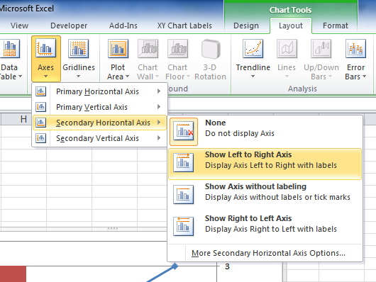
Select the chart, than go here on the ribbon:
Angel Morales says
Thank you, I have been looking for these for weeks now! But I’m having trouble following you cause my graphs never fully align
http://postimg.org/image/oijxvpj89/
I’m using excel 2013
Jon Peltier says
Angel –
Change the chart type of the blue line from line chart to XY scatter.
Paul Corcoran says
Hi Jon,
Great instructions. I have an Excel 2010 line chart with both year and quarter labelled on the X axis. I want to shade between the lines to the right of the green dashed line, i.e. between the purple and orange line and also between the purple and blue line.
http://s8.postimg.org/5wlqpu99x/Paul_Chart.png
Can it be done?
Thanks a million
Paul Corcoran
Jon Peltier says
Paul –
That can certainly be done, following exactly the protocol in this tutorial.
Angel Morales says
Is there a way to make the area fill color change when it passes a certain threshold. To make it turn red as it surpasses 5% and green when it goes below.
soco says
dear sir
i’m a civil engineer
in my excel sheet after i applied ur way to draw a filled moment diagram! with a execl chart ,but the excel keep “crash” when i click on it!
Jon Peltier says
soco –
What version of Excel? How complicated is the chart (how many series, etc.)?
Ernie B says
Hi Jon,
I have a simple graph showing Hours Variation from Target. The Target is always 0, so it’s a horizontal line in the middle of the plotting area. The Hours Variation points are plotted above target (positive numbers) and below target (negative numbers) to show late or early submission of reports.
Using Target as a reference/baseline, I’d like to shade the area between Target and any points above Target in red (they are late submitting), and the area between Target and any points below Target in green (they have submitted early).
An Area Chart looks like exactly what I need – I just need to be able to change colour based on position above or below the zero line.
I’m running Access 2007 btw.
Any advice would be most welcome!
Regards,
Ernie
Jon Peltier says
I don’t know about Access… But for an Excel area chart, try Area Chart – Invert if Negative.
Ernie B says
Hi Jon,
Thanks so much for your help! I’m onto it already.
(I actually meant Excel – not sure what happened to my fingers there – sorry.)
Regards,
Ernie
Adam Barnard says
Hi, thanks for the information above, however I am really struggling getting it to work for my purpose!
Basically I have a plot which has depth on the y axis and strength on the x axis. with depth the strength generally increases however we add a factor to the original data which gives us our 2 series. The example above is great for if you want the shading focussing in the x axis direction. how do I get it to focus ion the y direction?
I’m in a new job and really could do with impressing my boss so would be really grateful if someone could help. if you need anymore information please email me and I can send a screen shot to help explain.
Many thanks,
Adam
Jason says
About the ‘Fill Under One XY Series’, I am really struggeling to manage a range that contains negatvie values i.e. (min =-120 | max =120). Can one provide an example please?
Jon Peltier says
Jason –
The routine actually doesn’t “fill under” a series, it fills between the series and the horizontal axis. You would need to use the approach like that for filling between two series, and the lower filled area (the one that is made totally transaparent) would be a horizontal line across the bottom (most negative value) of the chart.
Jason says
thanks Jon. I am somewhat stucked with this. Could you help me with the right outer part please?
Jon Peltier says
Jason –
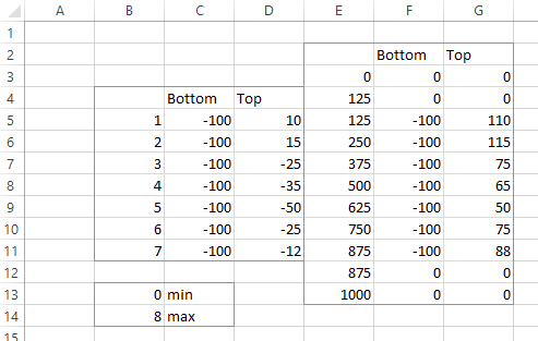
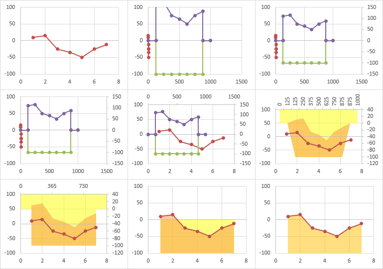
Here’s the data.
Here are the steps to building the chart (click to open a full-size view).
lutz says
Hi Jon,
I’m facing nearly the same problem : x-axis goes from -6 up to +6 under a standardized normal distribution.
Everything works fine until the point when the chart-type is changed to a stacked area.
My 2nd horizontal axis when changed to date-type starts with zero and it is impossible for me to align the curves properly.
If could give some advice I’d be grateful for that.
Thanks in advance for your kind assistance.
Best regards
Lutz
Jon Peltier says
Lutz –
Make sure the calculations of the scaling of the X axis has been done properly (column E in my example).
Jason says
Hi Jon, thanks a lot for helping me out in details. One last question, if I want to start the chart plotting at ‘0’; what would I need to do ?
Jon Peltier says
Jason –
You mean at X=0? Start the data at X=0 instead of X=1.
Jon Peltier says
Adam –
You have a data sample to help me see what you need?
Dave Tufte says
As near as I can figure, this doesn’t work if the initial series you want to shade under is constructed so that it is rectangular.
I did this by creating the vertical and horizontal faces of the rectangles, basically so that an XY looks like a bar chart. This is the primary series I want to shade under.
The thing is, there is no equivalent for the shaded series. The 2-d area chart you recommend does not literally “connect the dots”. Instead, the connections are interpolations that are all at angles. So, the shading does not match the line.
You can see what I’m trying to produce in the top post entitled “Correcting the Wall Street Journal” at this link http://suumacroblog.blogspot.com/
Jon Peltier says
Dave –
That original chart is pretty bogus. The year axis isn’t drawn proportionally, so it’s not as much of a timeline that it appears. The spacing between years is not proportional, so I don’t know what to make of the widths of the bars.
In any case, the shape of the XY series should have no bearing on this technique, as long as it doesn’t ever move backwards.
Could you post your data so I can look at it?
Jon Peltier says
I followed the link to the NBER trough/peak data. I must not be thinking clearly tonight, because I can’t visualize how they turned a table of months and years into a square timeline.
Dave Tufte says
Sorry Jon … Super Bowl … offline for many hours …
There are two figures. The top figure was published in The Wall Street Journal on Friday. Yes, it is bogus (but not for the reasons you cite). The width of the bars appears accurate. The widths between the bars are not accurate. The labels along the horizontal axis are “accurate”, but are for the left side of each bar.
The bottom one is my version. There’s includes only expansions. Mine includes both expansions and recessions/contractions. The widths, heights, and areas above or below the 0% axis are correct in my diagram. But I can’t figure out how to shade them.
There is some spreadsheet work involved in the background that I won’t bore you with. The data that is appropriate for my chart (the second one) is pasted below. Connect the dots, and you get my chart.
1953.375 0.000
1953.375 -0.024
1954.375 -0.024
1954.375 0.040
1957.625 0.040
1957.625 -0.039
1958.375 -0.039
1958.375 0.056
1960.125 0.056
1960.125 -0.004
1961.125 -0.004
1961.125 0.049
1969.875 0.049
1969.875 -0.001
1970.875 -0.001
1970.875 0.051
1973.875 0.051
1973.875 -0.025
1975.125 -0.025
1975.125 0.043
1980.125 0.043
1980.125 -0.043
1980.625 -0.043
1980.625 0.043
1981.625 0.043
1981.625 -0.010
1982.875 -0.010
1982.875 0.043
1990.625 0.043
1990.625 -0.026
1991.125 -0.026
1991.125 0.036
2001.125 0.036
2001.125 0.006
2001.875 0.006
2001.875 0.028
2007.875 0.028
2007.875 -0.029
2009.375 -0.029
2009.375 0.024
2013.875 0.024
Jon Peltier says
Convert the fractional years to dates (e.g., 1953.375 = 5/16/1953). Now you don’t have to fuss with converting axes, etc.
If you want to show up and down areas in different colors, use a formula to put MAX(value,zero) in one column and MIN(value,zero) in the next.
In the following screen shot, your data is in columns A and B. To compute the date, this formula is in D2 and filled down to the end of the data:
=DATE(INT(A2),1,(A2-INT(A2))*365.25)
To separate into positive and negative values, cells E2 and F2 contain these formulas, which are filled down to the end of the data:
=MAX(B2,0)
=MIN(B2,0)
At this point you just have to copy the data in D:F and insert an area chart. The date axis is used automatically, you just need to apply some formatting.
And I doubt you need the line, but if you do, it’s probably easier to make a line chart with column D as the X values and the original data in column B for the Y values.
Dave Tufte says
Thank you very much. I will digest this on Monday.
FWIW: The dates are in a format I prefer for the purposes of the chart (and the underlying raw data).
Dave Tufte says
Digested. Yes, this works. I will credit you, as is appropriate.
FWIW: I want the dates in that particular format generally … but I’ll make an exception for such a slick method. I didn’t realize that I wasn’t thinking outside the box when I chose an XY chart in the first place.
Paul says
Great post, thank you.
I was able to match your examples, but when I tried it with my data the location of the shaded area did not quite match up with the lines: http://www.flickr.com/photos/37472531@N03/12480046905/
Thank you for any help you can provide.
Jon Peltier says
It’s probably a mismatch between the primary and secondary horizontal axes.
The reason to use the complicated approach here is that area charts use a line chart’s axis, which by default does not show X values proportionally, doesn’t consider fractional numbers, and also doesn’t allow for an area with a vertical edge. We convert the axis to date scale so we can show points at irregular horizontal intervals and also show vertical area edges.
Since your data is equally spaced whole numbers, we can make the chart much more easily.
First, you can use a line chart for the original values. Convert the axis to a date-scale, to get the vertical edge. Use the year values as the X values for all four series. There is no need to use both primary and secondary axes.
Prepare the data by inserting a row before 1983, repeat 1983 in the first column, leave the next two cells blank, and put zero into the last two cells. Add a row at the end, repeat 2013, leave the next two cells blank, and make the last two cells zero.
Plot all four series as a line chart. Convert the last two series into area type, and format the lower series with No Fill (I just made it transparent below, so you can still see it).
Convert the axis to date scale, set the minimum to 1980 by entering 6/2/1905 in the box, and the maximum to 2015 by entering 7/7/2015 (just type the years into a cell, and format as a date). Use 5 for the major tick spacing.
Paul says
That fixed it. Thanks, Jon! I really appreciate the help.
Tom says
Thanks for your great posts!
First, I have used your earlier post – Histograms Using Excel XY Charts – to be able to make a dynamic histogram which excludes #N/A. The reason is because I want to be able to change the data inputs, which allows the histogram to automatically fit the lowest and highest x-values in the sample used. Second, I have now tried to fill the “bars” (below the XY-chart) using this post. If I let the primary x-axis’ MIN and MAX be set automatically, the Stacked Area chart (on the secondary x-axis, using the date format) will mismatch the XY-scatter perfectly. Using manually MIN and MAX on the primary x-axis (sat equal to MIN and MAX from the calculations in this post), I am able to match the two series, but then the histogram is not dynamic as i would like it to be. Do you know if there is a way to make the histogram dynamic?
Best Regards;
Tom
Jos says
How can the MIN and MAX functions in your example return 0 and 8 while they are obviously 1 and 7? Can you show the formulas you used there?
Jon Peltier says
Jos –
No formulas. Those are values I typed into the cells, based on how Excel plots the XY data. I’ve tried to clarify this in the text.
Christoffer says
Thank you for this very informative post.
I would like to create 2 shaded series, similar to this plot: http://jvoigts.scripts.mit.edu/blog/assets/plot_shaded_pretty.png
I simply create two sets of data, in the same order as above, but the result is not correct. It seems that excel chooses two different secondary axes for the two sets, which messes things up. When I remove all data from one of the series from the chart, it looks fine again. Is it possible to solve?
Christoffer
Kurt says
Looks great, but I messed it up. Is there a complete demo-file to download?
thanks
tereesa says
Hi,
Perhaps i’m missing the obvious, but how could I get it to work with dates on the X axis?
I have monthly data that I would like to use this idea for.
For example:
date low high
01/01/2013 35.12 69.28
01/02/2013 33.12 65.34
01/03/2013 31.34 61.83
01/04/2013 29.77 58.73
01/05/2013 28.39 56.00
01/06/2013 27.14 53.54
01/07/2013 26.01 51.31
tereesa says
ok, I WAS missing the obvious, I just had to change it to Stacked Area rather than just Area Chart!!
Thank you for this article!!
B.faye says
I need to highlight a range within a chart to show whether the data points fall within, above or below average.
I can’t seem to figure out how to make this work. PLEASE HELP!
Alicea says
Hi Jon,
I’m having the same issue as Adam Barnard on 1/22/14. I’m working with depth profiles and am having a hard time with the fill area in the horizontal direction. I’ve got depth from 0-60 meters and dissolved oxygen values from 0-10 ppm on the x-axis. Any suggestions?
Thanks,
Alicea
Jon Peltier says
Brittany –
Check out Excel Charts With Horizontal Bands.
Alicea says
Jon –
I’m not sure if the horizontal bands link was directed at me, but it doesn’t quite help me out. I’ve got the following graph and I want the area to the left of the blue bands shaded:
I think the photo will help describe what I’m needing help with.
Thanks,
Alicea
Jon Peltier says
Alicea –
Keep in mind how area charts fill in areas. They fill from a lower point to an upper point. If a second area intrudes between these two points of a first area, the first area can’t fill partway, stop when the second area intrudes, then continue above. This means that you’ll have to fill the areas piecemeal, which I have partly done below (it’s slow and tedious). Even if all you wanted was to fill between the two lines, you still need all of these areas, just many of them will be transparent.
Elmir Sedic says
Hello, i appreciate your work, it helped me a lot with presenting my data.
I am a PhD student in agriculture, and for my needs, have to combine a chart like those in this tutorial, i made it to present climate data and construct a Walter-Lieth climate diagram which is not possible with the base chart types in excel. after making it, i used your tutorial for a gnitt chart to make a feeding timetable for animals.
Is there any possibility to combine these two charts so that the major vertical grid lines overlap? The gnitt chart has to be attached at the bottom of the XY chart?
If further feedback on this is needed i can send a link with both of my charts.
Thank You in advance.
Kurt says
@Elmir Sedic
I am interesseted in visualizing climate-data too. how can I get in touch with you ?
Kurt (kurtwerbe-mailATyahoo.de)
Elmir Sedic says
@Kurt
You can mail me to [email protected] or [email protected] for further communication.
Jeff Phillips says
I ran into a problem using Excel:Mac 2011, where formatting the secondary horizontal axis as “Date” failed with an error. The fix is in Excel Preferences, Calculation, check (on) “Use the 1904 date system.”
That was an interesting problem to track down!
Joe says
Hi Jon,
What about shading in between two vertical lines?
i.e. two quartiles on a chart.
Thanks,
Joe
Anonymous says
@Joe
Its possible, just as shown by Alicea, its just important to set the limits of your background fill and the highlighted area.
Damian F says
Thanks Jon, great stuff….owe you a lobster dinner!!
Graham C says
Jon,
Thanks for the great post. I am running into the same problem as Tim Hoy did, I cannot get my two graphs to align.
Here is a link to the chart. Is my problem that my origin is zero?
any help would be greatly appreciated
http://imgur.com/3eXlYZp
Larry D says
Hi Jon,
What can be done to fix the vertical axis if most of the data is quite close together say between the range of 1500-2000. All my data is pushed to the top area of the chart with the first stacked area series (the transparent one) taking up most of the chart. When I try to reset the axis it reverts back to initiating the scale from 0 automatically.
Thanks
juan says
Hi Jon,
Do you know how to fill areas between 3 lines graph in excel.Let’s say we have 3 line graphs that do not intersect. Is there a way to fill the area between the top two with one color, and the area between the bottom two with another color. Look forward to hearing from you.Thanks,
Elmir says
@Juan
Its possible, the same way you paint one space between lines, you can do it with the second space. I did it for climate diagrams, even with intersecting lines, and with three colored spaces.
Enzo says
Jon, thank you for this post!!
But I want to follow up on the question that Jos wrote some time ago, about the Xmin and Xmax in your example being 1 and 7 and not 0 and 8.
You wrote: “The min and max X for the XY chart’s X axis are entered in B11 and B12, in this case manually based on the scale in Excel’s XY chart above.”
It’s the “based on” that looses me. I replicated your example and tried different values that seems just as valid as your 0 and 8, like 0.5 and 7.5 for instance. Well, for any other values than 0 and 8, the area misaligns.
I tried on my own XY scatter curve with 200 different values of x. There again I had to manually try and find an Xmax so that the area would align properly. After n attempts I got i t kinda ok, but I must say that this Xmax was not found “based on” the scale or anything else..
So, I’m sorry if I’m kind of redundant here, but how do you figure out Xmin and Xmax ??!
Thanks for your time, that would be super helpful!!
Enzo
Jon Peltier says
Enzo –
The Xmin and Xmax of my data were 1 and 7. The Xmin and Xmax of the axis that Excel drew for me were 0 and 8. I’ve rewritten the description to try and clarify what I meant.
Enzo says
Ohh I get it now!! and thanks to your (just as great) page about bound calculation (https://peltiertech.com/how-excel-calculates-automatic-chart-axis-limits/) I’m out of the woods!!! Thank you VERY much!!
:)
Enzo
Marcelo says
Hey mate…thanks for the tutorial….I’m trying to do something a lil bit different….I have multiple “top” and “bottom” series, and I wanted to fill the areas between those series….is it possible to have multiple series (for different values in the x-axis, series never cross each other)?
Thanks
Jon Peltier says
Marcelo –
Use a blank formatted series for the area below the lowest “Bottom” series. Use a filled formatted series for the area between this and the lowest “Top” series. So far it’s just like the example in this article. Then use a blank formatted series for the space between the first “Top” series and the second “Bottom”, and a filled series for the space between the second “Bottom” and the second “Top”. Keep using blank and filled pairs for each additional “Bottom” and “Top” pair of series.
Marcelo says
Thanks for the quick answer…i tried another thing instead…instead of using different series, i grouped everything in just two series (bottom and fill series)….It’s almost perfect…however, I’m trying to represent the y-axis in log-scale, and I’m having some problems. I changed the formulas from “=C5” to “=log(C5)” and “=D5-C5” to “=log(D5)-log(C5)” but the first point isn’t right…is there a way to fix this? Here’s the graph http://www39.zippyshare.com/v/57040962/file.html
Jon Peltier says
How are you getting a logarithmic axis? Are you checking the Logarithmic Axis checkbox in the Format Axis dialog? If so, you don’t need to then use =LOG(whatever) in the data you are plotting. Both primary and secondary series are using the primary Y axis, aren’t they?
I see that the first point is messed up, giving you a triangle instead of a rectangle. The vertex of the triangle is at log(1) on the log scale which is zero on a linear scale. What does the data look like?
Dan says
I’m doing similar to Marcelo, but my shaded areas need to overlap in both x and y. I can get the overlap in y, but the second blank and filled series adopt the x values for the first set. I can’t find a way to decouple the x values. (I’ve only been on Excel 2013 for a couple weeks, so it feels like I’m starting over on so many things…)
Dan says
So I got it…I had to create a single merged x (category) value column and repeat y values as needed to span the appropriate x ranges.
Jacob says
Hi Jon,
Thanks for your help!
I am having the same issue as Christoffer. I am trying to add multiple areas of shading. The first area of shading between the bottom curve and the x axis works great!
But when I try to add another shading between the bottom curve and the middle curve, something goes wrong when I try and add another area to the secondary axis. Can you help?
http://imgur.com/LuYQqnp
Thanks again!
anyonymous says
Jon,
This is great. I could make the chart so easily. However there is one more thing I would like to do. I am presenting sales data of two different regions with the lines. i want the area color to be different when one region is above and different when the other region is up. Is it possible?
Jon Peltier says
You could have both colors in different series in the chart. Formulas in the worksheet would evaluate some condition, and make the source data of one or the other zero if certain conditions are met, so only one color appears.
anyonymous says
Jon,
Thanks for the quick response. Do you mind explaining a little bit how do i set that up. I have been trying to create another “gap” chart and keeping the value inverse of the original gap chart. However i dont get it absolutely correct
Jon Peltier says
Set up your data something like this, with dummy values (1) for the blue and orange series:
Now enter a criterion (Blue) into a cell (A1), and enter formulas in the source data. In this case, I selected B4:C6 and typed this:
=IF($A$1=B$3,2,0)
then held Ctrl while pressing Enter so it was entered in all the selected cells.
Only the Blue series is visible, because the orange values are zero. Change the color in A1 to Orange, and the orange series appears instead:
anyonymous says
Jon,
Thanks again. I think I wasn’t clear in asking my question. can you look at the image below
I made this chart based off your instructions in the blog ( Thank you!!!!) if you see sometimes the orange line is above green and sometimes below. What I want is that the color of the shaded area changes depending which line is on the top. Is that possible?
Jon Peltier says
Ah, I answered the easy question. The harder answer may be found in another tutorial, a guest post actually by a reader named David Montgomery:
Two Color XY-Area Combo Chart
Sadia says
Hi Jon,
Can I please request you to email me the sample excel used to create this graph. I’ve tried everything but I can’t get axis to work the way shown here. When I paste my second graph, my horizontal axis doesn’t change. This is my data set:
2012 1 210
2013 2 215
2014 4 217
2015 6 222
2016 10 225
2017 14 230
2018 21 235
2019 34 240
2020 46 245
Any help will be appreciated :)
Jon Peltier says
Sadia –
Can you upload the workbook somewhere I can download it from? Or email it to me (jon at peltiertech dot com).
Brij says
Hi Jon Peltier,
I tried to follow the steps you have mentioned to fill between two XY series but the things didn’t go as you have explained/shown in your example. Can you please look at my data and point out where I made the mistake. I am using excel 2007. Please follow the below link to see what I did:
http://imgur.com/a/UDjyA
Thanks
Doris says
Dear Jon Peltier,
I’ve tried to copy your example “Fill Between Two XY Series”. I use the german version of excel but so far I was able to find all buttons. I only have one problem, which regards the point “draw left to right axes”. When I click on this button (I’ve seen that you produced a picture to show the way and I definitely use the same button”) I can’t find “draw left to right axes”. When I click on it it says something like “show none, show the standard axis, show axis in thousands, show axis in millions, show axis in billions….” Only AFTER I’ve turned the area series into a stacked area diagram I can find your described “draw left to right axes” when i click on the SAME button. But as you have described in your instruction, I have to click on this BEFORE.
Do you have a solution for that? Does it make a difference if I choose “XY scatter diagram” or “XY scatter with lines in between”?
Thank you very much.
Doris
Jon Peltier says
Doris –
Microsoft plays with labels in every version of Office, because users weren’t confused enough in the previous version. What you really want here is the standard axis.
XY Scatter means show markers for the data points. XY Scatter with Lines means show markers and connect them with lines. Except for the appearance, the chart will behave the same.
Delaine Adkins says
Hi Jon,
I’m so close but I just can’t figure out what I’m doing wrong, the shaded area doesn’t line up.
I’m trying to show progress versus target of test cases. By date I have the target number of test cases (100%) then 79%, 89% and 97%. I want to shade under 79% red, 80- 89% yellow, 90-97% green and 98-100% white. Then as I fill in the actual test cases it will show the color coding of where we are and the size of any gap.
Help is appreciated. -Delaine
rw says
Hi,
Great tutorial and I’ve enjoyed following the example but I cannot get the last step, i.e. deleting the second horizontal axis to flip the shading under the line in Excel 2003. You mention at the top having made previous versions of this tutorial, would these be more helpful to someone using Excel 2003? Can I find these anywhere?
Thanks.
rw says
Hi,
is this possible in Excel 2003? I’m struggling following the example at the very last step to shade beneath a line. When i delete the second horizontal axis the shaded area moves off the left and remains above the line.
Thanks.
Jon Peltier says
This technique is certainly possible in 2003, though it takes a bit different sequence of steps. Unfortunately I have not used that version in so long that I don’t remember the older sequence.
Mona says
Hi,
Thanks so much for a very awesome tutorial. I followed your instructions for creating the XY Scatter diagram and then shading above, below, between. My problem is that I need 3 axes. My two Primary axes are fine, but I can’t seem to get the Secondary Vertical axes that I need (in date format) without messing up the shading. Can you help?
I have attempted to give you an image website link to an image of what I have thus far…. What I need is another axes on the right, in date format.
Can you help me fix that, please. I am using Excel 2010.
Richard L. says
Hi Jon,
Thank you for this awesome tutorial. It has really helped me display the data I have in ways that people understand well. I have run into a tiny snag with the filled in range and I was hoping you could help me trouble shoot. The area chart seems to line up perfectly in the chart except for the beginning of the range where a sliver seems to descend nearly to zero.
Let me know if you need a visualization or my data set.
Thanks!
Delaine says
Hi Jon,
I’m so close but I just can’t figure out what I’m doing wrong, the shaded area doesn’t line up.
I’m trying to show progress versus target of test cases. By date I have the target number of test cases (100%) then 79%, 89% and 97%. I want to shade under 79% red, 80- 89% yellow, 90-97% green and 98-100% white. Then as I fill in the actual test cases it will show the color coding of where we are and the size of any gap.
Help is appreciated. -Delaine
Patrick says
Hi Jon. Thanks so much for the excellent work you do.
I think my problem is relatively simple, but I can’t quite work it out. Was wondering if you could help?
See attached excel sheet with 3 x graphs at the bottom. I am creating 3 x lines with shaded error bars (se). The issue is I can’t get the “WALKse.mmol LL” (lower limit of WALK se) area to display on the shaded graphs – it seems to get overlapped? I would love it to look like the graph on the right (but show the blue shading at the second nadir in curve)
https://www.dropbox.com/s/q5zrqv7avbhr5oj/reward.cgm.meanbytime%20PD.xlsx?dl=0
Really hoping you can help,
Thanks so much in advance, Patrick.
Marco says
Is it possible to use do x-Axis in date format?
Jon Peltier says
Marco –
If the X values are dates, this is much easier, since both line charts and area charts can use the same axis. Make a line chart with your first two series, calculate the area chart Y values teh same way as above, but plot them with the same dates as the line chart uses.
Alfred says
Awesome tutorial. Thank you!
Thank you says
Great tutorial and feedback on question! Sitting here now with nice shaded graphs :) Cheers!
Mark Peeters says
Hi Jon, great tuturials you have on this website.
Only for this tutorial I do not manage to get the intended area between my graphs (http://imgur.com/bb9DNQu)
I have to note, that when I try to set the secondary horizontal axis, I cannot mark ‘from left to right’ but there is only an option in that spot that says ‘show normal/ standard axis’. Not sure if this has to do something with it.
Thanks.
–Mark
Chidi Elendu says
Hi Jon,
I’m using Excel 2010 and I’ve being battling for hours looking for “finally click Draw Left to Right Axis”.
I’ll appreciate your assistance on this.
Chidi
Jon Peltier says
Actually, it’s Show Right to Left Axis, but I’m surprised you didn’t try it even if it didn’t say Draw.
Ken1986 says
Hi – I have replicated the chart with the shading between the lines but I need to get monthly labels along the horizontal axis is there a way to do this?
Thanks
-Ken
Nick says
I’ve posted a user suggestion for MS to add this functionality on the Excel UserVoice website:
https://excel.uservoice.com/forums/304921-excel-for-windows-desktop-application/suggestions/10948113-colour-between-lines-on-chart
Jens Hegg says
For those who are interested in vertical bands, say to highlight a given range that is dynamic, I just discovered this can be done with points connected by a line in an XY plot. I have several areas within time series data that are determined based on other statistics and I wanted to change the background color behind each section of the time-series. Set these values up as two X points with the same Y value on an XY plot (horizontal) then connect them with a line in the format dialog, remove the marker points, and make sure the ends are set to “square”. Then set the line width to some ridiculously huge number…and, the line between the points fills in the background of the chart.
Lisa says
Hi hopefully you can help,
I have been trying to do this programmatically with VBA in Excel 2010. Everything works fine until I try to change the secondary axies to be a Date Axis. It remains as a Text Axis. Some data is coming from the spreadsheet, but the areas to fill are coming from the code. Do you know of anyway to get this to work. I tried recording a macro and when I used that along with the data I have in the code, it did not work. But If I reference the areas to fill from a spreadsheet it works. Any help would be great
Jon Peltier says
Hi Lisa –
You didn’t say what “doesn’t work” means, exactly. Does the chart not plot the hard-coded data? Do you get errors and the code won’t continue? Is the data formatted exactly as if you manually entered the coded data?
My philosophy is that Excel charts were designed to plot worksheet data, so I almost always put data into the worksheet and plot it, rather than plotting arrays that I’ve built into the series formulas. It sounds like this has worked for you, so I suggest you keep doing it that way.
Lisa says
Jon,
The chart plots fine. What doesn’t work is setting the secondary axis to Date, When I set it to Date within the code, it actually keeps it as a text axis, and therefore doesn’t re-align the secondary axis, so when I delete the axis the fills are not correct. I don’t get any error the visual is just not correct.
I can’t have the info in the spreadsheet, because shaded areas will need to be one of ~6 options depending on part of the filename of the file the scatterplot points will coming from.
Thanks again
Jon Peltier says
After the code doesn’t change the axis type to date, format the axis: does it have the Date option selected? Can you edit the bounds and units?
I had a project that did this with a combination XY-Area chart, and only in Excel 2010 the “Date” axis sometimes did not treat the numbers as dates but as categories. My code would test for this and redraw the whole chart if necessary.
Lisa says
Jon,
It has the Date option selected but there are no bounds to be changed. I am working in Excel 2010. I have been trying to figure this out over the last 8 hours, and I keep redrawing it, but it has yet to ever draw correctly. It appear to only draw correctly if the values for the fill areas are in the spreadsheet and not an array.
Thank you
Jon Peltier says
Lisa –
That’s the symptom, it pretends to be a Date scale, but doesn’t allow you to adjust it, and doesn’t treat the values as dates. And it happens with non-worksheet data for the areas. Your code has to put the values into the series formulas anyway, why not put them into the worksheet? I don’t understand this constraint.
Lisa says
Jon,
Ideally the data for fill areas (a background in my case split by a slope), would not be in a spreadsheet. The scatter-plot data points that will be plotted on top, is dynamic and is being updated every minute from a peripheral device. So the values for the fill areas will also be dynamic and need to be updated as well. I have it currently set up that the slope and intercept are properties of a class where there are 6 possible instances based on the file being updated by the peripheral device.
I think if I absolutely have to I can make it work by placing the data in the spreadsheet..
Jon Peltier says
Isn’t the XY data updating process invoking VBA? That same VBA procedure can update the fill data.
Lisa says
Jon
the updating isn’t invoking the VBA, I am using a timer to repeat the commands to the peripheral device, once the response is received it is written to the file and then the graph will update based on calling the routine. I can update the fill data that way. That may be my only choice. I am just worried about the visual aspect, I don’t want the fill data visible/editable by the users.
Thanks for all help
Jon Peltier says
You can always hide the data, even in the cells behind the chart.
How does the device update the data? Some kind of DDE?
Lisa says
Jon,
I am using a Serial/USB port to communicate with the device. I think I will have to go that route to hide the cells, not my preferred method but if it is the only way.
Thanks for the assistance
Lisa
Jeff says
Thank you so much for this tutorial! I was looking for good free/cheap software to make highly customizable elevation profiles for hiking/biking trails, and this worked beautifully. I made a few tweaks to the method, the biggest being that I leave the fill above the chart line, and color it white. That leaves the plot area and grid lines showing under the curve, and gives a lot of options for colors/patterns under the chart line.
Thanks!
Jeff
tom says
Thank you for this. I have adapted it to suit an application I’m working on, it seemed to work perfectly at first but the graph is developing an error when certain values are give. I cannot understand why this is happening, can you please help me fix this?
Please see the screenshots below.
Working correctly
Table data: https://goo.gl/photos/JazDJL7YcqCN6mZ78
Graph: https://goo.gl/photos/fRgNTttvKpCXzLV86
Error
Table data: https://goo.gl/photos/QpzWiVRw6gHya9mj6
Graph:https://goo.gl/photos/iZUFy1H27gRQgJoR6
Thanks
Tom
Pieter HOLCIM says
Hello,
How does it work for graphs with:
– a logaritmic scale on the x-as
– for a double dataset on the same graph (example: comparing two ranges, between two different bottom and top lines)
I have tried to do twice what’s necessary to do in the example here above given by you but that’s something strange. I can’t post here screenshots. If necessary, I can/want to mail you my document.
Jon Peltier says
Pieter –
1. You can plot the XY data on a logarithmic X axis. The area chart dates must be linear, however, so your formulas in column D would have to have a LOG() transformation to take this into account.
2. Read through the ‘Fill Between Overlapping Regions’ section at the end of the post.
Pieter - HOLCIM says
Hello,
Thanks for the fast answer. I’ve tried something, and it’s better. But not yet what it has to be. I’ve a well shaped colored area but that area is not on the right scale & location.
Here some figures:
Basic, not logaritmic, perfect I think: https://s32.postimg.org/ttb645g29/Normal.png
Logaritmic as I understood your explination: https://s32.postimg.org/5bj2g9dht/Logaritmic.png
The adapted formula I used: https://s32.postimg.org/v6xr2c901/Formules.png
The graph with two or more ranges will I try tomorrow.
Jon Peltier says
Pieter –
Your picture links are not working.I fixed the links, but the pictures are shrunk so small that I can’t read them.remco says
This only works when your horizontal axis of both graphs is actually equal, otherwise excel just ignores your 2nd axis.
Jon Peltier says
Remco –
Excel won’t ignore something that’s there. When you moved some series to the secondary axis, Excel always adds the secondary Y axis, but sometimes it doesn’t add the secondary X axis. If you haven’t explicitly added it, Excel will just keep using the primary axis fire all series.
Leyton says
Hi Jon, I am trying to do something similar to your last example. I have six total lines on my graph and I need a shaded area between the first pair, second pair and third. When I only put two lines on the graph and use your method I can get the shaded area between the lines just fine. However, if I try to put them all on the same graph, one of the shaded areas stays between its respective lines, but the others are skewed. I think it has something to do with my secondary x axes, but I’m not completely sure. Any ideas?
Jon Peltier says
Leyton –
Say you want to shade between A and B, C and D, and E and F. You need six stacked areas: Value = A with no fill, Value = B – A with color fill 1, Value C – B with no fill, Value D – C with color fill 2, Value E – D with no fill, and Value F – E with color fill 3.
Even if there is overlapping, the areas will work correctly, since a negative area will “stack upon” a previous area, going downwards from the previous values.
Gambrose says
John,
This is great, but I can’t seem to get it to work with multiple shaded areas (I am trying 2 shaded areas). I assume I am not setting up all of the formulas correctly based on my interpretation of the instructions at the end of your post. There is some overlap between the two shaded areas, similar to your example at the end.
Right now I have:
Col B: X axis 1:16
Col C: Group 1 Low
Col D: Group 1 High
Col E: Group 2 Low
Col F: Group 3 High
Col H: 0 – 1000 appropriately scaled
Col I: Bottom formula (0, =E5, =E6, etc.)
Col J: Group 2 Fill formula (0, =F5-E5, =F6-E6, etc.)
Col K: Group 1 Fill formula (0, =D5-C5, =D6-C6, etc.)
Col L: Blank formula [I assume this is wrong] (0, =C5-F5, =C6-F6, etc.).
Here is a picture of the worksheet showing a sample of the formulas:
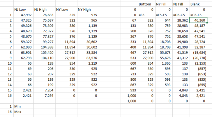
Any help would be most appreciated. I have been trying different options for 2 hours and can’t get it. It seems that my secondary Y axis is not scaling properly because it goes to a much larger # than my primary Y axis, which is different than the single shaded region example.
Thank you!
GAmbrose
Jon Peltier says
Put Blank between Group 2 Fill and Group 1 Fill. The order of area series should be Bottom (formatted with no fill), Group 1 Fill ( with one color) Blank (also no fill), and Group 2 Fill (another color). Also, delete the secondary Y axis, and all series will be plotted against the primary axis.
Rana says
Hi,
First i appreciate your efforts.
I am facing problem that i am following your step in post but unable to see secondary Axis under the Axes tab.
my example is just like your
Sebastian Lehmann says
Hello John, hello guys,
first, thanks for your guide John! Please take a look at this pic:
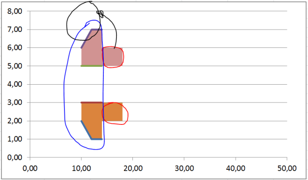
Blue marked is my first area which consits out of four single areas. Red marked is another analog area which i pasted via option: “new data point”. The result is the whole – for example orange – area act like one connected area but i would like to give different colours to the orange blue and red marked area parts. when i paste the red marked additional area data like i pasted the blue marked area – which means by chosing the option “new data row” – it doesnt gets a new orientation in relation to the x-axis. Instead of appearing again in the position like the red marked area it suddenly apears in the black marked position.
I hope my description isn’t too confusing.
Thanks for any help!
Greetz,
Sebastian
Jon Peltier says
Sebastian –
It would help to see the data. However, if you use paste special and add the data as new data points, Excel will try to add the new data to extend the existing series in the chart. This is what happened in your chart. If you use paste special and add the data as new series, it will not extend existing series, but it will add new series, in parallel with the existing series, which is what you want and which is what the tutorial directs you to do.
Brian says
Fantastic tutorial. This is exactly what I needed to do. Just one word of caution. When I switched the secondary axis to a “date axis”, I had some minor alignment problems. I eventually found that if I changed the Units Base to “Days” everything aligns perfectly. For some reason my graph was defaulting to “Months”. I hope this saves someone a little headache.
Jon Peltier says
Brian –
Good point. I make that adjustment automatically (when the characteristics of the data don’t do it by default), so I forgot to mention it.
Heba Elsalahy says
Dear Jon,
Thank you very much for this informative post.
It is really helpful and easy to apply.
I have a question regarding adding a new series of data to Fill Between 3 Overlapping Regions. In your post, you explained a case of Fill Between 2 Overlapping Regions. I have tried the same steps that you mention and add “Cfill and Blank2” columns to the previous calculations. But I am not sure if it is correct and if we really need another blank how it should be calculated.
I really need this help.
Thank you once again. I really appreciate your help.
Heba
Jon Peltier says
Heba –
I would suggest trying it yourself with the same data I used here, then when it feels familiar, try it with your own data. If you still have problems with your own data, upload it to a file-sharing website, and comment back with a link.
Kate says
Is it possible to do something similar with a radar graph instead of an XY plot?
Jon Peltier says
Actually, a radar chart can have both filled series (like an area chart) and line or line-and-marker series (like a line chart). Unfortunately a bug in Excel adds a false category in a mixed-type radar chart. Note the six-spoke line-and-marker radar chart gains an unlabeled seventh spoke between F and A when one series is converted to a filled type. In an interesting twist, moving one series (doesn’t matter which one) to the secondary axis restores the correct number of spokes, while shrinking the plot area (which can then be stretched).
I’m not a fan of radar charts anyway. I only discovered this bug when I created a radar chart to show that you can make a combination filled and line-and-marker version.
john says
Hi Jon,
I am so close… My X axis seems to be slightly misaligned. Any chance you can help me with this? Here are my data points:
Area Chart
X Value Y Value
Scatter Plot – 1,000.00 0.00
X Value Y Value -914.29 0.00
-32,000,000.00 0.00 -914.29 0.00
-14,000,000.00 -1.00 -400.00 -1.00
-4,000,000.00 -2.00 -114.29 -2.00
-2,000,000.00 -3.00 -57.14 -3.00
0.00 -3.00 0.00 -3.00
0.00 -3.00 0.00 -3.00
2,000,000.00 -3.00 57.14 -3.00
4,000,000.00 -2.00 114.29 -2.00
14,000,000.00 -1.00 400.00 -1.00
32,000,000.00 0.00 914.29 0.00
914.29 0.00
1,000.00 0.00
-3.50 Y min
0.00 Y max
john says
As a follow -up, I’ve copied the data for the 2 charts beneath each other.
Basically, I am attempting to replicate a conversion funnel. It’s almost there.. just slight misalignment of the scatter plot and area chart along the X axis. Are you able to make these data points work?
Scatter Plot
X Value Y Value
-32,000,000.00 0.00
-14,000,000.00 -1.00
-4,000,000.00 -2.00
-2,000,000.00 -3.00
0.00 -3.00
0.00 -3.00
2,000,000.00 -3.00
4,000,000.00 -2.00
14,000,000.00 -1.00
32,000,000.00 0.00
Area Chart
X Value Y Value
-1,000.00 0.00
-914.29 0.00
-914.29 0.00
-400.00 -1.00
-114.29 -2.00
-57.14 -3.00
0.00 -3.00
0.00 -3.00
57.14 -3.00
114.29 -2.00
400.00 -1.00
914.29 0.00
914.29 0.00
1,000.00 0.00
-3.50 Y min
0.00 Y max
Jon Peltier says
Aside from any discussion about sales funnels (which I don’t like, see Sales “Funnels”, Funnel (Tornado) Chart, Bad Graphics – Funnel Chart), there is a problem with your date scale.
Unless you’re using the 2004 date system (not recommended), Excel cannot accommodate negative dates. It seems to do okay, but I wouldn’t rely on it. So you need to scale the secondary X axis values to range from 0 to 1000, not -1000 to 1000. You do that by having the scatter axis minimum (-35,000,000) and maximum (35,000,000) in cells and adjusting your formula so the area chart X value is:
=(scatter X – scatter X minimum)/(scatter X maximum – scatter X minimum) * 1000
But even when I use your original figures (positive and negative dates), as long as I make sure the scatter X axis ranges from the numbers I use to calculate the area chart X values (+/-35MM), the plot is perfectly aligned.
Ferney says
Hi,
I know it’s an old post, but it’s quite relevant today!! I’m facing a problem in which I want to color the area between two lines that are completely in negative values. I don’t know how to post a pic so I give you the link:
https://mega.nz/#!goJVnKBS!A_hd83Dlhtr-vW3_A95QutcdMFZ2QVz8_VeAUxrNT50
As you might see I tried to create 4 areas sharing a horizontal line, the first one I was able to do it following the advice you gave to Jason in an answer of 2014. However, when I tried to add the bottom half it didn’t work as expected and it aligned well with the chart but once I change the plot type to stacked area it messes with the horizontal location as shown here:
https://mega.nz/#!h8ZTVaZR!x80Ic6xLFeIzTb22Lsz9tNYFJMKo148KO2cp6zeOTIA
Would you have any idea of how to tackle this issue? Thx in advance
Rob Macnamara says
Hi John,
It seems that the same results can be achieved without the gymnastics of creating a new scaled range, inserting data, using second axes, date format etc. (Your post was beautifully clear and through by the way)
In my tests, I simply duplicated the “Y” data and plotted the first copy as a line graph, and the second copy as an area chart, which worked perfectly for the area under the curve result. (I used a scatter graph and excel 2016)
For shading the area between charts, I used your idea of stacked area charts, using the difference between the lower and upper curve. It also worked perfectly without the gymnastics, by using duplicate data, plotted against the same axes as the original.
I would like to send you the file for your, comment, and perhaps if correct, you could share it for the greater good. (It is so much quicker and simpler)
Jon Peltier says
Hi Rob –
If the X axis data is appropriate for a Line Chart (text labels, evenly spaced numbers which are treated as text labels, or dates), then a combination line/area chart is appropriate and actually very easy, as you point out.
If the X axis data requires the use of an XY Scatter chart (it is non-categorical with numbers not evenly spaced), a line chart will not show it accurately, so you need to follow this protocol.
kanil gunewardena says
I plotted close loops- (PLAN VIEWS) , such as patio, the steps , the mural art work area on deck entry which is a semi ellipse etc Now I want to color each of the enclosed or loop plots. Each of the above loop plots are plotted separately as a series.
What is the procedure to click on a series -( loop plot) and make it fill with color s
What I mean by a loop plot is that the curve closes NOT OPEN ENDED
that is – the 1st point and the last point in series are the SAME.
Jon Peltier says
Kanil –
There is no procedure to click on a series and fill it in with color. You have to construct the data for the filled series, add it to the chart, and format it. Yes, it’s tedious.
I have a very old tutorial that uses VBA to draw a filled shape over a plotted XY series:
https://peltiertech.com/Excel/Charts/VBAdraw.html#FilledPoly
Change the number in parentheses in this line of the code to process other series:
Set mySrs = myCht.SeriesCollection(1)Radhika CHAWLA says
Hi Jon,
I have two parallel upward trending lines from the middle of the vertical axis of the graph in the upper half of the graph and two parallel downward trending lines from the middle of the vertical axis of the graph in the lower half of the graph. I want to colour the portions between the two top lines and the two bottom lines in light blue. Then, between the two innermost lines, I want a darker blue. The final image would look like a widening cone. How can I do this?
Jon Peltier says
Radhika –
You simply need to stack up four areas: a blank area below the lowest line, an area between the lower two parallel lines, an area between the two closer non-parallel lines, and an area between the upper two parallel lines. See data and construction below.
Brandon Goldstein says
Hello,
Thank you for the helpful tutorial. I keep finding that I get stuck during the second section (filling in gap between two lines). I can see two problems. 1 – The shaded region that should be the gap between the lines is stuck at the bottom of the chart. 2 – the lines do not align with the shaded regions. I have gotten this issue in two versions of excel, so I must be doing something wrong. Any suggestions would be appreciated.
https://imgur.com/a/51gi1qI
Jon Peltier says
Brandon –
You made both series into stacked areas, but only put Area2 onto the secondary axis; Area1 is still on the primary axis. Change Area1 back to XY with lines, then assign it to secondary, then change it to stacked area.
Ron Grabyan says
While this process of filling between two lines on an XY Scatter Chart worked for “fill”, I seem to have been left with an Area Chart that is not a value axis. Instead it is a “worthless” category axis—I have never understood the reasoning behind this for scientific data!
Have I done something wrong–should it have a Value Axis like it started with?
Ronald J Grabyan says
Jon,
I have found my mistake, and the resulting fill plot is a value axis. However, my problem now is the area is slightly out of phase with the original line plot. it appears to be spot on around the 0 x-axis, and gradually gets worse as it gets to the other side of the graph–around a 7000 x-axis value. Any ideas what could cause the offset?
A portion of the 200 row data set is pasted below. I do have 6 decimal numbers–maybe that is causing a significant figure error. It’s the nature of the data- Sr/Ca Anomaly data to have such small numbers. I am trying to fill above zero with yellow and below zero with blue. Thus, I an filling in the area between each curve and a zero line.
I don’t suppose there is a better way. For example, a single line graph where all the areas above zero are filled with yellow and all areas below zero is filled with blue
Bot Area (+) Top Line
0 0.000000 0.000000
x
(Age-Yrs) – line + line – 0 + 0 182.2660099 0.000000 0.000000
37 0.00000 0.00166 0 0 182.2660099 0.000000 0.000000
102 0.00000 0.00121 0 0 502.4630542 0.000000 0.000000
167 0.00000 0.00003 0 0 822.6600985 0.000000 0.000000
232 -0.00009 0.00000 0 0 1142.857143 -0.000090 0.000090
297 -0.00170 0.00000 0 0 1463.054187 -0.001700 0.001700
362 -0.00133 0.00000 0 0 1783.251232 -0.001330 0.001330
427 -0.00056 0.00000 0 0 2103.448276 -0.000560 0.000560
492 0.00000 0.00043 0 0 2423.64532 0.000000 0.000000
557 0.00000 0.00056 0 0 2743.842365 0.000000 0.000000
622 0.00000 0.00024 0 0 3064.039409 0.000000 0.000000
688 0.00000 0.00039 0 0 3389.162562 0.000000 0.000000
835 -0.00052 0.00000 0 0 4113.300493 -0.000520 0.000520
880 0.00000 0.00021 0 0 4334.975369 0.000000 0.000000
924 -0.00106 0.00000 0 0 4551.724138 -0.001060 0.001060
969 -0.00055 0.00000 0 0 4773.399015 -0.000550 0.000550
1014 -0.00063 0.00000 0 0 4995.073892 -0.000630 0.000630
1058 -0.00060 0.00000 0 0 5211.82266 -0.000600 0.000600
1103 -0.00032 0.00000 0 0 5433.497537 -0.000320 0.000320
1147 -0.00147 0.00000 0 0 5650.246305 -0.001470 0.001470
1192 -0.00122 0.00000 0 0 5871.921182 -0.001220 0.001220
1238 0.00000 0.00025 0 0 6098.522167 0.000000 0.000000
1284 -0.00030 0.00000 0 0 6325.123153 -0.000300 0.000300
1331 0.00000 0.00012 0 0 6556.650246 0.000000 0.000000
I could send you the graphs and the excel sheet if that would help.
Ron
Ronald J Grabyan says
Ok, After studying my data set, I finally spotted another error, which fixed the chart. I had miss-interpreted the range values under the x-axis. In your example you had min = 0 and max = 8. I mistakenly thought these were a count of the data, not an actual chart range for the x-axis. As soon as I changed the values on my excel list to 0 to 7000, the chart moved into perfect alignment.
This approach is quite an elegant work-around–my compliments to you for discovering it. I wish MS Excel would realize many of us are more interested in Value Scales for line charts, and that is why XY Scatter Charts saves the day, but XY Scatter is inexplicably hampered by lack of some of the tools.
Hien Bui says
Hi Jon, I have a problem when trying to Fill Under One XY Series. The serie doesn’t align with the area. Can you be more specific when choosing max/min value of X.
Can you take a look over my data here https://drive.google.com/file/d/1YmzmdFddBZIvbW497Xr15N784DOWUOr7/view?usp=sharing
Thank you very much!
Jon Peltier says
Google says I need access to that file.
Xmin and Xmax are the actual minimum and maximum of the axis scale, not of the X values in the XY chart data.
Mitch Morgan says
Jon,
I have used the method many times to produce great charts. However, now for some reason this method will no work for me at all. I am unsure if I am scaling the x axis wrong but neither the area is lining up between the lines properly and the area now extends past the lines. Help. this is one of my favorite chart edits
Jon Peltier says
Hi Mitch –
The protocol has not changed. Could you send a workbook with one of your unsuccessful attempts? jon at peltier tech dot com
Gaurav says
Hi Jon,
Thank you for the great article, however I could not use this for my purpose. I need to use different colours in my chart. I am using X Y Scatter chart with straight lines for some break-even calculations and need to show different colours for profit area and loss area.
If you could please provide some advice, that would be greatly appreciated.
Thanks
Jon Peltier says
Guarav –
Scroll down to the section “Fill Between Overlapping Regions”. Set up the data so the regions do not overlap but simply abut each other, and follow the steps.
Gaurav says
Thanks Jon, I have tried, but no luck. I am sure I am doing something wrong. Can I please send you my raw xls for help?
Thanks
Gaurav
Jon Peltier says
Guarav –
Can you upload the workbook to a file sharing service (e.g., DropBox, Google Drive, Microsoft OneDrive) and share the link here?
Gaurav says
Thank you so much Jon. PFA my raw xls in google drive. Hope you are able to access it.
https://drive.google.com/file/d/1ddDFPV4oCLHcUSyz0yztwGFS84u9lXZ1/view?usp=sharing
I need to colour between the lines shown by “Total revenue” and “Total Costs”. Also I need to do different colours in both (before break-even point and after break-even point).
Thanks
Gaurav
Gaurav says
Hi Jon,
I have tried again and now have some better luck. So far I could colour some part of my chart (between total revenue and total cost), however colour (delta fill) is not overlapping properly, which can be seen in xls in below file.
https://drive.google.com/file/d/1GnVyAs9ztZFVLBN1D40GqI_GXr5c3bbC/view?usp=sharing
Could you please advice what I might be doing wrong here?
Thank You
Gaurav says
Hi Jon,
Please ignore my last comment, I have managed to do it now.
You article is really saviour. Many thanks
Gaurav
Qunfeng Liang says
Great help! Thank you a lot!
Simon Mclennan says
Hi,
How can I get this to work if the x axis values are 0.01, 0.02, 0.03, 0.04 and 0.05 in logarithmic scale?
I have got it to work in logarithmic scale for both x and y axis but not for numbers below 1 in the x axis.
Jon Peltier says
The area chart’s X-axis cannot be logarithmic, so you have to transform the data. Modify the formulas in the first worksheet screenshot above as shown below.
The rest of the protocol is the same as before.
Trackbacks
[…] […]
[…] MrExcel Message Board. Shading under a scatter plot is not easy. John Peltier has a tutorial here: Fill Under or Between Series in an Excel XY Chart – Peltier Tech Blog Can you make the x-axis points be evenly spaced – possibly by adding extra data points? If you can […]
[…] error is some how tied to setting the Secondary Horizontal axis to dates… I originally followed Fill Under or Between Series in an Excel XY Chart – Peltier Tech Blog but I can't get it to work in 2007. […]
[…] Some updated links Fill Under or Between Series in an Excel XY Chart – Peltier Tech Blog Shading above or below a line in Excel charts [tutorial] | Chandoo.org – Learn Microsoft Excel […]
[…] Hi all, I have tried to follow the example by Peltier shown here: Fill Under or Between Series in an Excel XY Chart – Peltier Tech Blog to shade areas between multiple data series. 2 lines works fine, but the problem is when I try to […]
[…] Fill Under or Between Series in Excel Chart […]
[…] []).push({}); folks, quick question, I hope. In Peltier's example for this graphing technique, Fill Under or Between Series in an Excel XY Chart – Peltier Tech Blog, he has in Column B a series of values used, I think, to space out the data points. Column C is […]
[…] if your axes resize themselves, all bets are off. The way to do this is to follow my tutorial Fill Under or Between Series in an Excel XY Chart. I'll walk you through it. The trick is to partition the triangle's outline into a "Lower" bound […]
[…] the curved line yellow and leave the background as it was. This is an application of my tutorial Fill Under or Between Series in an Excel XY Chart. We will add an area chart series to provide the fill below the curve. In the screenshot below, […]
[…] spaced Category value. To see some charts that go the extra step look at Jon Peltier's site: Fill Under or Between Series in an Excel XY Chart – Peltier Tech Blog […]
[…] document.write(''); Check this excellent article "Fill Under or Between Series in an Excel XY Chart" from Jon Peltier: Fill Under or Between Series in an Excel XY Chart – Peltier Tech Blog […]
[…] dwie tabele. Pomysł na to jak to zrobić, przedstawił już kiedyś Jon Peltier w jednym ze swoich wpisów na blogu. Metoda uzyskania efektu wypełnienia pod wykresem, zakłada przeskalowanie wartości z […]
[…] https://peltiertech.com/fill-under-between-series-in-excel-chart/ https://www.youtube.com/watch?v=6_vAhGwjWzA […]