Someone in the Excel Reddit was asking about making a combination chart by adding a scatter chart series to a bubble chart. He wanted to draw a customized trendline, and you can’t connect points with lines in a bubble chart. You can add a trendline to a bubble chart, but you are limited to the standard options.
But you can create a “scatter bubble chart” if you adjust the size of the markers in a scatter chart. It can be a bit tedious to do this manually: you need to figure out how large to make each marker (and as Barbie once famously said, “Math is hard”) and then you have to format each one.
Fortunately, it takes a fairly simple VBA procedure to turn a scatter chart into a bubble chart. The code at the end of this post does the following tasks:
- Extract the series formula of the first series of the active chart (if no chart is selected, the program aborts).
- Determine the range containing the Y values.
- Find the range containing the bubble values. If Y values are in a column, the program uses the next column; if Y values are in a row, it uses the next row.
- Ask the user how large the largest bubble should be (the default is 40).
- Loop through the points in the series, calculating the size of the marker. Markers are scaled based on the square root of the bubble values, so their areas are proportional.
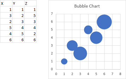
Here is an Excel bubble chart made with a simple three-column data set. the first column contains the X values, the second contains the Y values, and the third contains the Z values that set the bubble size.

Here is an Excel scatter chart made using the first two columns of the range.

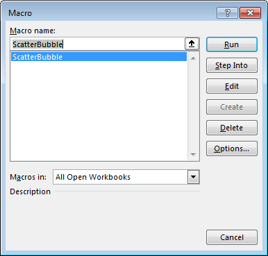
Press Alt+F8 to open the Macro dialog, select the macro ScatterBubble, and click Run.

The macro asks how large the largest bubble should be.

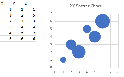
Finally, here is the scatter chart with resized markers.

Nearly indistinguishable from the bubble chart shown above. I used a largest bubble size of 37 to make it match so closely.
Here is the VBA procedure ScatterBubble which created the Scatter Bubble Chart above.
Sub ScatterBubble()
  ' convert a scatter chart into a scatter bubble chart
  Dim sFmla As String, sYvals As String
  Dim vFmla As Variant
  Dim rYvals As Range
  Dim rBubbles As Range
  Dim iPt As Long
  Dim Zmax As Double, Zmin As Double, Bmax As Variant

  Const BubbleMaxDefault As Double = 40

  If ActiveChart Is Nothing Then
    Exit Sub
  End If

  ' extract Y value range from series formula
  sFmla = ActiveChart.SeriesCollection(1).Formula
  vFmla = Split(sFmla, ",")
  sYvals = vFmla(LBound(vFmla) + 2)
  Set rYvals = Range(sYvals)

  ' determine bubble size data range
  If rYvals.Rows.Count > 1 Then
    ' multiple rows, must be one column -> use next column
    Set rBubbles = rYvals.Offset(, 1)
  ElseIf rYvals.Columns.Count > 1 Then
    ' multiple columns, must be one row -> use next row
    Set rBubbles = rYvals.Offset(1)
  Else
    ' one cell only -> indeterminate
    MsgBox "Cannot determine the bubble size data range.", _
      vbOKOnly + vbCritical
    GoTo ExitSub
  End If

  ' validate
  If WorksheetFunction.Count(rBubbles) <> _
    WorksheetFunction.Count(rYvals) Then
    ' inconsistent data
    MsgBox "The bubble size data is not consistent with the Y values data.", _
      vbOKOnly + vbCritical
    GoTo ExitSub
  End If

  Zmax = WorksheetFunction.Max(rBubbles)
  Zmin = WorksheetFunction.Min(rBubbles)
  If Zmin <= 0 Then
    ' can't have negative diameter bubbles
    MsgBox "The bubble size data range contains negative values. " _
      & "Bubble sizes cannot be negative.", vbOKOnly + vbCritical
    GoTo ExitSub
  End If

  ' ask user for largest bubble size
  Bmax = Application.InputBox("What is the largest bubble size (max = 72 points)?", _
    "Bubble Size", BubbleMaxDefault, , , , , 1)

  If TypeName(Bmax) = "Boolean" Then
    ' user canceled
    GoTo ExitSub
  End If

  Bmax = Val(Bmax) ' make sure it's numeric
  If Bmax < 0 Then
    ' can't have negative diameter bubbles
    MsgBox "The maximum bubble size must be positive.", vbOKOnly + vbCritical
    GoTo ExitSub
  ElseIf Bmax > 72 Then
    MsgBox "The maximum bubble size is 72 points.", vbOKOnly + vbInformation
    Bmax = 72
  End If

  ' loop through and resize markers
  For iPt = 1 To ActiveChart.SeriesCollection(1).Points.Count
    ' scale area of bubble to area of largest bubble
    ActiveChart.SeriesCollection(1).Points(iPt).MarkerSize = _
      Sqr(rBubbles.Cells(iPt) / Zmax) * Bmax
  Next iPt

ExitSub:
End Sub


Worm says
Interesting.
I have previously come at this from the other direction, when I needed to add a customised (linear) trendline to a bubble chart. (quite why bubble charts are not considered available as combination charts is something of a mystery)
I solved this by adding a new bubble series to the chart that plotted on the required trendline, then displayed it with zero bubble size and added a linear trendline to the new series which produced the required line.
This obviously only works for a linear trend, and has some limitations – trendlines are always plotted last for instance) but
derek says
Excellent, Jon!
derek says
Oh, Comment is working for me again.
This just highlights how irrational the restrictions on Bubble chart is in Excel. Come on, Microsoft, sort it out. And don’t get me started on how you can have scatter charts in Excel Tables but not Pivot Tables, so that I end up creating a pivot table, then a helper table reading the pivot columns just to get a chart.
Microsoft could atone for their sins by making every circular chart format (pie, doughnut, radar) be available as a marker on a scatter or bubble chart. It would be just as easy to arrange in table form as any other combo chart format, like high-low-open-close. As with this solution, pie bubbles are possible if you know how to write the VBA.
Jon Peltier says
Worm –
I thought of that, about how you could draw line segments to do what you want with invisible bubble series and their trendlines. But that seemed like even more work than writing a few lines of code.
Derek –
I think the more complex data requirements for bubble charts (ranges for X, Y, and Z series) make it harder to combine bubble charts with other charts. Perhaps some manager at Microsoft looked at the engineering requirements, and decided to do Sunburst Charts instead.
Craig says
Interesting,
This got me thinking, as an engineer I often use XY scatter charts for drawing diagrammatic cross sections of reinforced concrete members on sheets and was wondering is there a way to relate a scale (say x axis displaying a total length of 400mm) to the size of the markers, so markers are roughly to scale for simplifying rough drawing of solid circles to scale (to represent the steel reinforcement)?
As far as I can tell markers/line widths all work in points, so how would one get the length of the axes displayed in ‘points’ units for a chart that’s a fixed size to work out the relationship to provide a scale for adjusting marker size via VBA that then displays to the same scale more or less (if it’s even possible)?
Craig says
In response to my own question, … .PlotArea.Width was what I was after. Not related directly to the axes which is why I couldn’t find anything as was searching for the wrong thing! Axes is the same width/height as the plot area for a chart.
After that revelation it was all simple maths to get markers of the correct size. Many thanks for the great info.
Avi Nahir says
Thank you very much for your code. This really made a difference for me.
I’ve modified this a little, to avoid having to manually insert the bubble values:
Jon Peltier says
Craig –
.PlotArea.InsideWidth (and .InsideHeight) might be what you want, since .Width (and .Height) include the additional real estate taken up by axis labels. Here is what you get for a chart selected at random:
aliris says
HI – I am trying to get your sub to work for a chart with several separate series. I’d like them all to be “bubbled” but distinct if possible?
TIA