Histograms with Ugly Category Labels
Most histograms made in Excel don’t look very good. Partly it’s because of the wide gaps between bars in a default Excel column chart. Mostly, though, it’s because of the position of category labels in a column chart. The labels are centered below the bars, but it would look nicer with the bin value labels positioned between the bars.
To illustrate, I generated fifty random values between 4.95 and 6.45. The values are summarized in this table. The gold shaded range is the list of bin values, actually the value at the top of each bin. The blue shaded range is the result of the FREQUENCY function, which tells us the number of values below the first bin value, the number of values between each successive pair of bin values, and the number of values above the top bin.
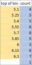
Used as is beneath each column of the histogram, these bin values make misleading category labels.
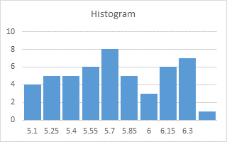
To make category labels, people often add some text to each bin value, and then make their chart.
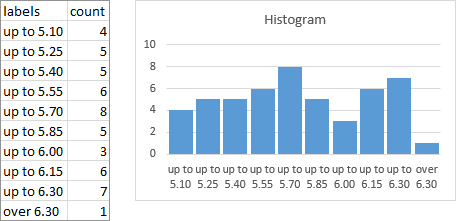
It’s descriptive, and it’s better than single unqualified values, but it’s not elegant.
The labels can be “improved” by putting consecutive values together, separated by a dash to indicate a range.
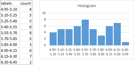
This is arguably better than the previous labels, but it’s still not what we’d really like. But stay tuned, because I’m going to tell you how to make a conventional histogram in Excel, with bin labels between the bars.
Histograms with Nice Labels
As before, we’ll use the FREQUENCY results to plot the bars of our histogram. Then we’ll add another series as a line chart on the secondary axis, and this axis will provide the nice labels.
Here’s our slightly modified data range. There is a line inserted above the top FREQUENCY value, and the two extreme bin values have been added. I’ll assume that any values beyond the highest and lowest bin values fall within a bin width of these extremes.
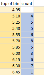
Select the blue shaded range and insert a column chart.
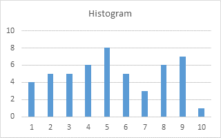
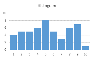
Those bars are too thin for a histogram. A histogram’s bars typically touch each other (gap width of zero), but I’m not using bars with borders, so I’m using a thin gap (10 or 15%) to delineate the bars.
Select the first gold shaded range, then hold Ctrl while selecting the second gold shaded range, so that both ranges are selected. Copy this range. Select the chart, then use Home tab > Paste dropdown > Paste Special to add the copied data as a new series, with category labels in the first column. You don’t see the new series, because it’s a series of bars with zero height. But you should notice that the wide bars have been squeezed a bit to make room for the added series. Also the generic 1, 2, 3 category labels have been overwritten by the pasted labels.
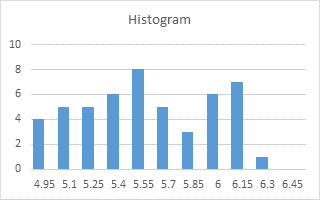
Select the added series (select the visible series and press the up arrow key, or use one of the chart element picker dropdowns on the ribbon or right click menu), then click the menu key between the Alt and Ctrl keys to the right of the Space bar. This pops up the right click menu. Select Change Series Chart Type, and select one of the Line types. It shouldn’t appear, because Excel doesn’t plot blank cells, but I added them in these illustrations so you can see what’s going on.
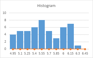
Format the line series so it is plotted on the secondary axis. Excel adds a secondary vertical axis.
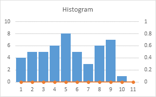
We need the secondary horizontal axis, so use the plus icon in Excel 2013 or the Chart Tools > Layout tab > Axes dropdown to add it.
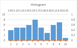
Format the secondary (right) vertical axis, so the secondary horizontal axis crosses at the automatic position (zero).
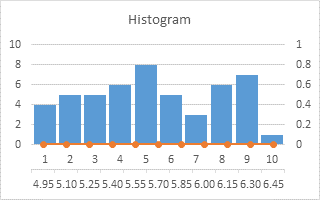
Format the primary (left) vertical axis, so the primary horizontal axis crosses at the maximum axis value.
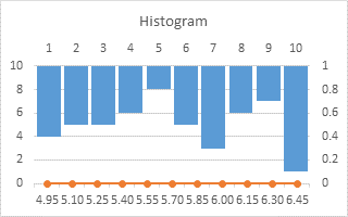
The bars are now dancing on the ceiling. Delete the primary (left) vertical axis to spoil their fun.
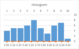
Format the primary (top) horizontal axis so it uses no line, and has no labels or tick marks.
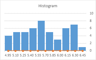
Format the secondary (bottom) horizontal axis, so the secondary vertical axis crosses at the automatic position.
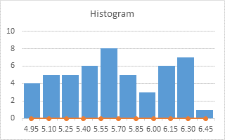
Format the secondary (bottom) horizontal axis, to position the vertical axis on the tick marks.
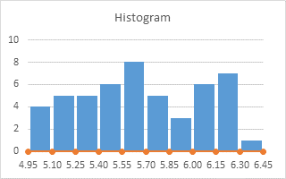
Finally, if the line chart is visible, format it to use no markers and no lines.
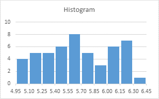
That’s a lot of small steps, but they go quickly, and the results are a vast improvement over all the ugly histograms that have ever been created in Excel.


Aaron says
Can you clarify how the ranges work? I’m not certain which bin I should expect a result of 5.10 to fall into…
Jon Peltier says
Aaron –
Good question. I was planning a follow-up post, but I’ll give a few short examples here.
The FREQUENCY function has syntax
where
data_arrayis the range containing the data you want to put into bins, andbins_arrayis the range containing the upper limit on each of the bins.FREQUENCY must be array-entered. That is, the entire output range (E6:E12 in the following examples) must be entered, the formula typed into the Formula Bar, and Ctrl and Shift held down while Enter is pressed. If this is done, the formula will appear to be enclosed in {curly braces}. If you type these curly braces, you’ll get an error.
The following example has simple bins_array containing {1,2,3,4,5,6}. These are shorthand for “less than or equal to 1”, “greater than 1 but less than or equal to 2”, “greater than 2 but less than or equal to 3”, “greater than 3 but less than or equal to 4”, “greater than 4 but less than or equal to 5”, “greater than 5 but less than or equal to 6”, “greater than 6”. Note that the last bin, “greater than 6”, does not have an explicit bins_array entry; if there are six bins_array elements, these divide the number line into seven regions.
The data_array contains 2 values “less than or equal to 1”, 0 values “greater than 1 but less than or equal to 2”, etc.
The values in the bins_array do not need to be equally spaced, though if you want your histograms to be clearly understood, it is customary to use bins of equal size.
Another example with unequal bins.
O says
Hi,
I’ve had a problem with bar-chart x-axis category label formatting in Excel 2007.
I’ve tried to format 1hr; [=0,0416][t]” hours” mm” mins”
But what should become 05min, 10min, 15min, … becomes 01min, 01min, 01min. (Excel misinterprets mm as MM).
I could change to time to text , but don’t like to feel defeated so I change mm to t:mm, which works it ain’t pretty.
Any other suggestions?
O
Jon Peltier says
O –
I don’t understand your number format. Could you list some of the data you have, both in actual time units and in the format you want to display.
djschenk says
A question…”Select the first gold shaded range, then hold Ctrl while selecting the second gold shaded range, so that both ranges are selected. Select the chart,”… I can’t seem to select the chart without losing the data selection, so there’s nothing to paste special with using Excel 14.0.7106.5001. Help is appreciated.
Jon Peltier says
DOH!
”Select the first gold shaded range, then hold Ctrl while selecting the second gold shaded range, so that both ranges are selected. Copy this range. Select the chart,..”
O says
I’ll make a new try. The formula included ‘less than’ LT and ‘greater than’ GT.
[LT0,0416]mm” mins”;[GT=0,0416][t]” hours” mm” mins”
5min=0,003472, 10min=0,006944, etc (I’ve shortened the digits here, originally step=5min=1/(24*12), 10min=2xstep, etc).
I think, it’s an Excel bug.
O
I also regret negative time display limitation, since it’s needed for so many ‘lean’ problems.
Jon Peltier says
I don’t know what the [t] means in your number format.
When I tried:
[<0.0416666]mm” mins”;[>0.416666]hh” hours “mm” mins”
If the value was one hour or greater, I get the expected output, e.g., ’01 hours 01 mins’.
If the value is less than one hour, Excel thinks the mm means months, so it always just says ’01 mins’.
But if you put mm in square brackets, it’s like Excel’s code to show total minutes ignoring hours, so 1:10 is treated like 70 minutes.
So this format does what I think you want:
[<0.0416666][mm]” mins”;[>0.416666]hh” hours “mm” mins”
O says
Thanks, [mm] was new to me.
[mm] stops Excel from confusing mm with MM.
O
Also, to summarize the main 3 negative time options:
1. The 1904 time format enables to show negative time hh:mm, but not in a chart.
2. The 1900 time format allows [mm] or [hh] to show negative time format, but not together like [hh]:[mm], and not in a chart.
3. The only option to show negative time format in a chart is to use =IF(A1>=0;TEXT(A1;”hh:mm”);TEXT(-A1;”-hh:mm”))
Messy but that’s Excel.
Jon Peltier says
Using negative times is itself messy. What’s your context?
O says
The [mm] problem was a service availability chart (shortest time distances – UDF in Excel 2007 that makes distance (time/km) requests to Google maps).
The negative times is a disturbance system; to follow time disturbances (+/- time) from the agreed times (0=no disturbance). An Excel 2010 pivot chart with bar chart primary axis, accumulated disturbance line chart secondary axis (only PivotTable formulas).
Fun as a challenge, but to be frank, from a simplicity point of view, Excel should be able to do better here.
Todd Werner says
Thanks Jon, the labeling had always bothered me.
I think histograms demand one exception to your ‘tips&tricks’ rules:
– No gradients, shadows, glows, false 3D etc.
– Any effects that did not exist in Excel 2003 should be avoided.
The poor ol’ histogram is trying to tell a story about probability while looking all structurally solid, deterministic and mired in Euclidean space, which is NOT the right mood.
Histograms are built by fishing from a pool of probability, the catches measured and discretely binned by size.
Fish for long enough and together all the bins start to describe the probability density of the whole pool.
Histograms attempt to describe the shape of something that is and always will be fuzzy, no matter how long you fish.
I use linear gradient fill swashing up to white inside histogram bars, outlined in same hue a little darker.
The result intuits a pool of uncertainty bounded only by the certainty of measures and counts.
Especially with adjacent columns (convention for bins of a continuous parameter), together they all make a nice warm glowing ethereal blob of almost unknowable nebulosity – that’s the “mood” for statistics!
Said another way, the collision between the DISCRETE and the PROBABILISTIC should be depicted exactly where it happened. The histogram bin outline/fill choices are a chance to do that, I argue.
Here’s one tricked out for grain size distributions. I don’t bother with a histogram vertical scale because it is always arbitrarily scaled anyway… to peak around 48% chart height.
The hisogram is there only to help you get a better feel for the distribution and show things not obvious from a cummulative line, especially multiple modes.
The other line intersections mark the values that have fed into the graphical mean calculation (Swanson mean, Folk and Ward mean… same things I think)
https://plus.google.com/photos/111215851774416194460/albums/5951068315201756385
I hope my use of the glim-glam doesn’t offend.
Jon Peltier says
Todd –
I don’t think the gradient really gives the impression of a probabilistic fuzziness of the data. it’s only decoration. And while you can use any decoration you like, I’d say the need for decoration is either the need for more interesting data or for a more interested audience.
Jake L. says
Jon,
I just want to give you a huge thank you for figuring this out. I wanted to point out that I needed to add an extra data point to my “invisible data set” in order to make everything line up correctly.
Rob Jackson says
Thank you, thank you, thank you!
yopichoi says
This is very useful. Thank you.
Broderick says
This guide teaches how to do exactly what I am looking for, thanks. My problem is that you are very specific the whole time until the very end where you say:
“Format the secondary (bottom) horizontal axis, to position the vertical axis on the tick marks.”
This is basically the whole point of the post, but how do you do this? You cant resize the axis, I cant find any options that allow you to position the tick marks correctly. Any help is appreciated.
Jon Peltier says
You aren’t positioning the tick marks, you’re positioning where the other axis crosses the one being formatted with respect to the existing tick marks. Here is where the setting is controlled in the Excel 2010 Format Axis dialog and 2013 Format Axis task pane:
Broderick says
Thanks for the reply,
I understand what you are saying needs to be done, but not how to do it. I can change the option of positioning the axis on the tick marks or between them, but that doesnt seem to help.
This is my histogram:
http://i1068.photobucket.com/albums/u448/perelopex/Capture_zpsshhs6ppt.png
It looks to be like in your second to last step where the labels (and ticks) are slightly offset from the bars.
The visible labels are indeed the secondary horizontal axis, set to cross the secondary vertical axis at category 1, On tick marks. The histogram is plotted on the primary horizontal axis, while the line of zero values is on the secondary. Am I missing something?
Thanks a lot.
Jon Peltier says
I don’t see the data, I don’t know where the primary and secondary axes are.
Colm says
Hi Jon
Thanks for this clear explanation.
May I please suggest a slight improvement.
If we instead plot the line graph on the primary axis, and the column graph on the secondary axis, then we can skip a few of the steps (those where we change where axes cross each other).
Hopefully that will be easier to do and understand.
Even with that improvement, this feels like a “hack”. Microsoft should really add an element to the UI to simply enable this plotting style.
Best regards,
Colm
Jon Peltier says
Colm –
Yes, this is a hack, and your suggestion simplifies the protocol significantly. I should rewrite…
Phil says
Worked great. Thanks for helping me git rid of ugly histogram labels!
Jasmine McAllister says
Note: I’m using Excel 2013, and you need to select “combo” to change the chart type for only the labels and not the bars.
This may be obvious to some, but it took me a second to figure out and I’m posting here in case that saves anyone else some time.
I’m referring to this step:
Select the added series (select the visible series and press the up arrow key, or use one of the chart element picker dropdowns on the ribbon or right click menu), then click the menu key between the Alt and Ctrl keys to the right of the Space bar. This pops up the right click menu. Select Change Series Chart Type, and select one of the Line types. It shouldn’t appear, because Excel doesn’t plot blank cells, but I added them in these illustrations so you can see what’s going on.
Jon Peltier says
Jasmine –
Yes, the new Chart Type dialog introduced in Excel 2013 is much more powerful than before, but it can be a bit confusing until you’ve used it a few times. What is nice is that you can modify the chart types of each series in the chart and also change whether each series is plotted on primary or secondary axis, all in one trip to the dialog.
If you just right click the chart and choose “Change Chart Type”, the dialog will open with the whole chart’s chart type selected (unless it already has a mixture of chart types). If you select a series and choose “Change Chart Type”, the dialog opens up in Combination Chart view. This is more clear if you right click: if you right click on a series, the pop up menu says “Change Series Chart Type”.
Niall says
Thank you for providing this solution, I’ve spent over a week looking for the answer. However, I get stuck at the first step: You say ”Select the first gold shaded range, then hold Ctrl while selecting the second gold shaded range, so that both ranges are selected. Copy this range. Select the chart,..”
When I select both ranges as you described, the try to copy, Excel says “This action won’t work on multiple selections.” that is, it won’t allow me to copy two selections of different size from the same column. So I tried making two columns, one with the original bin values and another column with expanded bin values, but that didn’t work either, perhaps because they’re different sizes.
Maybe I misunderstood, and you mean to only select the expanded range, but when I copy that and paste it as a new series the generic 1, 2, 3 category labels are not overwritten by the pasted labels but remain the same, 1-10.
I’m using Excel 2016 but following your instructions precisely. Any help would be appreciated.