Today I’m happy to present a guest post by Dr. AnnMaria DeMars. AnnMaria is the intelligent and entertaining author of AnnMaria’s Blog about statistics, technology, and work and also of AnnMaria’s Blog on Judo, Business, and Life, which is about “achieving success in business, sports and academics [and parenting] without ever actually having grown up.”
“If all you have is a hammer, everything looks like a nail.”
Hard to believe Bernard Baruch died before computer graphics, because he hit the – um, nail – right on the head. Some days, it seems the world is comprised of people who fit into one of two categories …
- “Find Excel not sufficiently sophisticated for real statistics, don’t you agree?” (Said in the same tone as Thurston Howell III – look it up, youngsters!)
- Believe every problem can be solved by Excel.
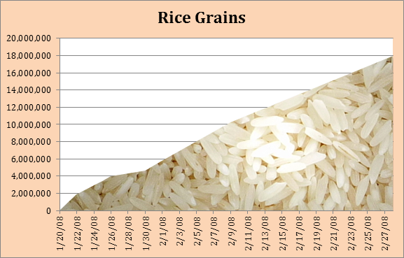
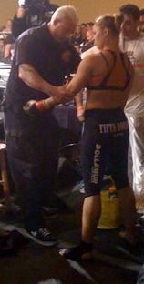
What’s really interesting is that I fall into both of those categories, not just some of the time but almost every day. Let’s start with last week. My darling daughter fought for the 135 lb world title on Saturday, and a few weeks ago, she started a free rice group. You can read a bit of the story at RondaMMA Free Rice. In a nutshell (or should I say grain of rice), this is a wonderful site where you can answer questions and for every one correctly answered, 10 grains of rice are devoted to the world food program. Ronda sent free t-shirts, autographed pictures and other swag to fans who were part of her free rice group. Below is one of three Excel charts I did to track the progress at different points in the competition.
Her fans have donated over 20,000,000 grains of rice so far, and God love them for that, but it is safe to conjecture that the average mixed martial arts fan is not a doctoral student in statistics so my challenge was to come up with easy to follow graphics for tracking the results. Even though I am usually using SAS or SPSS all day, I selected Excel for this chart for a couple of reasons. First, the free rice site allows me to download the group data in a .csv file each day, making it easy for me to open in Excel. Second, it is blissfully easy to insert a picture in an Excel chart.

Should you have your own Excel free rice group you want to chart (or anything similar) here are the steps.
1. Create your data. In my case this meant having one column with the dates and a second column with the number donated as of that day.
A. Each day, I downloaded the csv file that had three columns, a userid (A), a username (B) and number of grains donated (C). I computed the number for that day by entering into a cell =SUM(C2:CN) where N was however many group members had donated as of that day. This gives me the data for one day.
B. In my master file, type the date, copy the sum from the day’s file and use Paste Special to paste the value only.
2. Format the cells. I went to Format, then Cells, then Number and formatted the cells to have zero decimal places and a comma to separate 1,000.
3. Make the chart: Select the Date and Rice Grains columns. Click Charts and select the first option, which is an area chart.
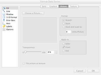
4. Double-click on your chart and the FORMAT DATA SERIES window shows up. It has an option I have never used because I am a “Serious Academic” (Thurston Howell III accent again) and I don’t work for USA Today and insert pictures in my chart. Until now, when I click on the PICTURE tab and choose insert picture. I also click on the option to TILE PICTURE AS TEXTURE.

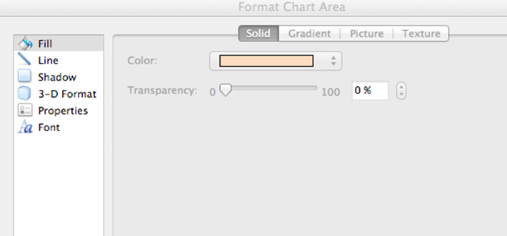
Because it looks awfully plain with white rice and a white grid, I double-click on it again and choose FILL this time, changing the background color to a pale orange.

I click on the legend and delete it, because it really is superfluous, add a title, and I have the chart to post to track the contest.
One person asked, “It takes 3,500 grains of rice to fill one bowl. If you raise 1,000,000 grains it’s only fed less than 300 people. How much difference does that make?”
Ronda’s answer was, “If you’re one of those people, it makes a lot of difference to you.”

As of now, the group has raised enough rice to give a meal to over 5,500 people who otherwise would have gone hungry.
You can see the fight at Ronda Rousey vs. Miesha Tate – caution: graphic violence.


Carol Miers says
I really loved this piece. the project itself to find enough free rice to feed hungry people and the way it is explained really simply. I made my own graphic based on the direction here. Thank you
excelunusual says
Jon, This is a very interesting post. I personally believe that every problem can be solved in Excel (well, almost any problem).
The rice photo trick on the chart can be used to create a “sky” in flight simulator a based on a scatter chart for instance. All the best, George Lungu