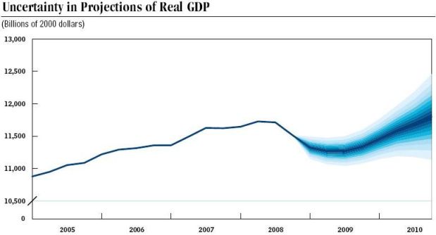
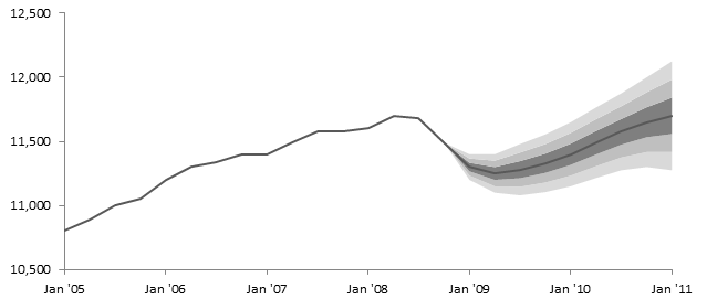
A reader emailed me this chart of GDP, with actual values through late 2008 and projected values for the next two years. To illustrate the uncertainty in the predictions, colored bands were drawn alongside the solid line prediction. The bands become lighter as the distance from the prediction line increases. Because of this appearance, showing the data fanning out, this type of chart is called a Fan Chart.
The reader wondered how to create this shaded-band effect in a fan chart. This tutorial was developed using Excel 2010, but the procedure is applicable to all Excel versions.
The chart comes from page 34 of A Preliminary Analysis of the President’s Budget and an Update of CBO’s Budget and Economic Outlook, published in March 2009 by the Congressional Budget Office.
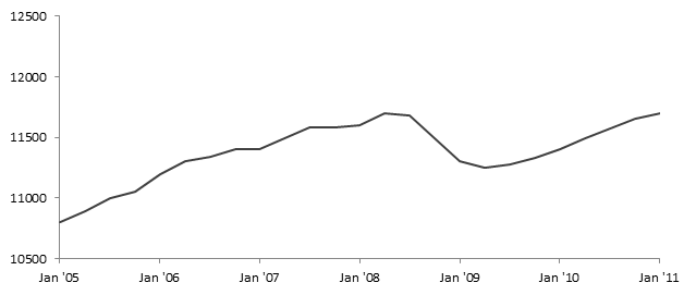
I’ve manually digitized the actual data up to 10/1/08 and the projections from 1/1/09 onward into this tall thin tower of numbers.

Here is the data plotted in a line chart.
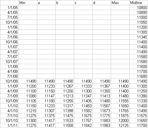
I’ve set up the following table to capture the data for the fan. Midline contains the actual and projected values from above. I made up Min and Max so that the fan would grow wider for each successive quarter. I then created values in a and b to split the fan below the midline into three shades of gray, and in c and d to split the fan above the midline into the same three shades of gray. You can use more or fewer calculated columns to increase or decrease the number of shaded regions.
My numbers are arbitrarily calculated. If you have some probabilistic means of generating such values, you should use your calculations instead.
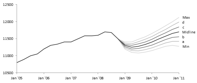
When I add these columns of data as additional lines in the chart, I get the following chart. I’ve changed the default kaleidoscope of line colors to shades of gray that lighten with increasing distance from the midline. The labels indicate which column in the table above contains data for each line. This chart is fine, but it doesn’t show the filled area effect.
To achieve filled regions, I will use a stacked area chart. In an adjacent range I’ve added the following table. The dates are the same, as are the minimum and midline predictions. The rest of the data are calculated differences between each line and the previous line, to capture the height of each colored band (distance between lines). For example, the Max value for 1/1/09 in the table below (33) is the difference between the Max value for 1/1/09 in the table above and the d value for 1/1/09 in the table above (11400 minus 11367).
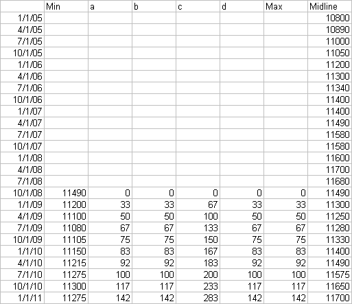
I’ve created a stacked area chart using this table of data. Here are my colored bands.
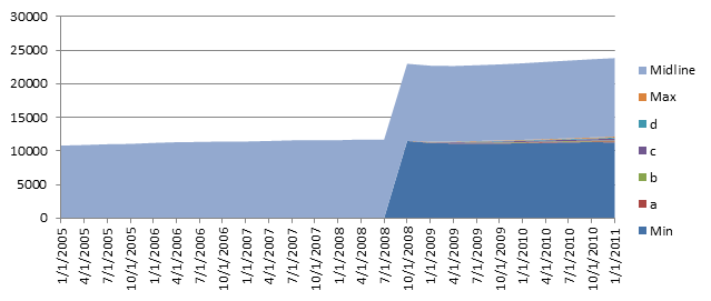
The first thing I did was format the axes and delete the gridlines.

Then I converted the Midline series to a Line Chart. This is done by right-clicking on the series, choosing Change Chart Type (or simply Chart Type in older Excel versions), and selecting a line chart style.
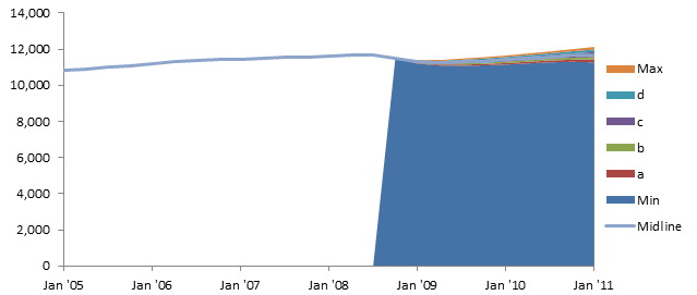
Next I made the Min series invisible by formatting it to have no fill.

Then I rescaled the vertical axis, because I don’t want all that empty space at the bottom.
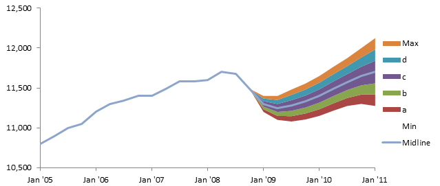
Finally I formatted the Midline to use dark gray for its line, and the area series to have lighter and lighter gray fills the further they are from the midline. I’ve also deleted the legend.


Juan Pablo González says
I really love your tutorials Jon. You really have a talent for making it look simple!
Tom says
Hi, I have a little Problem with this Chart. In the final stage I have an unexpected line, Starting in a junction and going down strait to the (X) Axis… Could you help me to hide this unnecessary line?
Thanks in Advance.
Jon Peltier says
Tom –
The line might be a border if your area series have borders. Remove borders and the line should go away.
Tom says
Jon—
Thanks, I turned off every border and in the end, finally there was no line :) Thank you for your support. Actually I might use this chart type for some report in my work.
Dustin says
Jon- This was great. Thank you very much!
Katerina says
Or one can just use the Area Band in E-views to create the fan graph without having to do any calculations or adjustments
Jon Peltier says
Wow, E-views is over $1000 per user.
Paul says
Does anyone know the technique/fomula used to produce the data that generates the fan? Is it somekind of “weighted” confidence interval?
“My numbers are arbitrarily calculated. If you have some probabilistic means of generating such values, you should use your calculations instead.”
Jon Peltier says
You ask for “the” technique or formula used to generate the fan. I’m sure the approach used by most people is wild-ass guessing. Other than that, some kind of confidence interval at least sounds good. It’s more likely that people decide on some kind of +/- percentage which increases the further out you go.
Maz says
This is fantastic! I can see myself using this. Has anyone written a macro to automate this?
Anonymous says
This is far too hard to follow. Needs to be made clear but thanks for trying
Random says
Prob best site on web for fan chart, but every time I want to make it, it takes ages, really fussy. Could you please upload a template perhaps? or re-do with just 3 columns or something?
Thanks
Jon Peltier says
If you’ve made even one fan chart, you’ve already got your template.
Dominik says
Hello,
Does anyone know how to create a fan chart with both negative and positive values on the Y axis?
Dominik says
OK, thanks to the ‘trial and error’ method, I have done it. :-)
Zameer Ahmed says
Please provide us the detail charts of axial fan calculation charts with motors and accessories.
I hope the above mention articles are send us.
Thanks
Jon Peltier says
Zameer –
Wrong kind of fan. This has nothing to do with HVAC.
Louise says
This is a really helpful tutorial – thankyou – I am struggling with the stacked chart stage
“In an adjacent range I’ve added the following table. The dates are the same, as are the minimum and midline predictions. The rest of the data are calculated differences between each line and the previous line, to capture the height of each colored band”
If I create a new chart using that as stand alone data (not using the first set of data at all) my fan numbers sit at the bottom of the chart and don’t join the midline numbers
I feel as if I am missing something basic or not putting the data together in the right way…
Thanks!
Jon Peltier says
The first set of data in my chart “Min” is transparent, and all the other data floats on it.
Blanca Romero says
Hi Jon! Thank you for the tutorial, it is very good. However, i am having problems to do it in my Excel. Once I have the simple line and all de data, I don’t know how to add extra data. Could you please send me your Excel book so I have the version in excel? Thank you very very much. I am really lost.
Thanks!
Jon Peltier says
Blanca –
Did you generate the data range with the differences? This is the last worksheet screenshot in the tutorial.
From this data range, create a new chart using the stacked area chart type. Right click on the Midline series, select Change Series Chart Type, and change it to a line chart type. Then format the other area chart series.
derek says
I guess I should feel smart because I was trying to create a similar concept on my own and ended up with something similar to your methodology. First, for an unanswered question above (for posterity, I guess), Tom’s problem in 2012 was that he needed to have the fan’s data equal to the historical data in the last period of history; if you do not have any lower bound (the “no fill” area) data for the final period of history, you will get that line.
My question is if there is a clever way to do this for multiple series on the same chart. I can’t figure one out.
Jon Peltier says
1. Do you mean Tom’s question about the vertical line line? That went away when he removed the border of the area chart series. If not, I don’t see the question.
2. My tutorial Fill Under or Between Series in an Excel XY Chart shows how to fill between multiple sets of lines, including those that overlap.
Peter Franczak says
Jon
Beautiful chart and approach. Quick question – do you happen to know why the x-axis range changes when you go from a line to a stacked area? I see that once you convert mid-line series to Line it goes back. Curious.
Peter
Jon Peltier says
Peter –
The default Axis Position setting for most charts, including the line chart, is Between Tick Marks. For area charts, this default is On Tick Marks. When you change chart type, Excel may decide to change this and other settings. You can change it whenever you want.