I built an interesting example of the Excel Chart With Horizontal Bands this morning. A user on Excel Forum wanted a way to present soil analysis data, where the typical values for each element tested were very different, and the cutoffs between different ranges of results (i.e., low, medium, high) were not only different, but also not proportional. A single set of bands wouldn’t work, but we can used stacked columns to generate staggered bands.

Two blocks of data are shown below. In the range A1:G6, I’ve entered results and qualitative values for five elements in the soil sample. I made up some of the ranges in the table, and I’ve already adjusted the maximum values in column G so that the “Good” range is roughly aligned across the chart.
I skipped a few rows, and put normalized values into A10:G15. I normalized by dividing by the value in the High column, and I also adjusted the values in Low through High so they show the normalized width of each step. This makes the sum of the values from Very Low to High equal to 1, and relates the new results value to a fraction of the High value.
While I was at it, I combined the element name and result, so the result will appear in the chart labels.
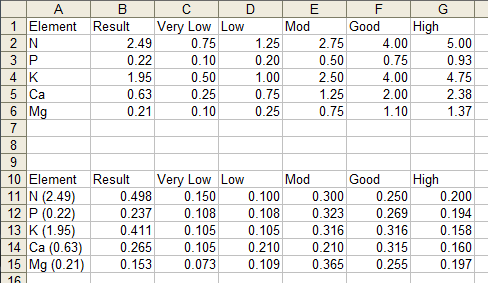
The formulas in the first row of this normalized table, which are filled down through all rows of the table, are:
A11: =A2&" ("&TEXT(B2,"0.00")&")"
B11: =B2/$G2
C11: =C2/$G2
D11: =(D2-C2)/$G2
E11: =(E2-D2)/$G2
F11: =(F2-E2)/$G2
G11: =(G2-F2)/$G2
Once you enter the formula in D11, you can fill it into E11:G11.
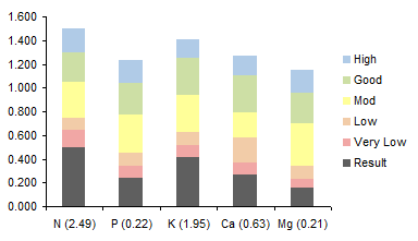
Now the fun begins. Select this normalized data range and create a stacked column chart. In Excel 2003 and earlier, in step 2 of the Chart Wizard, select the Series in Columns option. In Excel 2007 and later, you just have to let Excel make the chart wrong, then on the Chart Tools > Design tab, click Switch Rows and Columns.
This produces the chart below. I’ve already color coded the Very Low through High series to have light fills that will indicate these ranges in the final chart.
The next thing is to format the Result series, moving it to the secondary axis, as shown below.
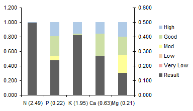
Now delete the secondary vertical axis on the right of the chart, so all data uses the primary axis. At the same time, change the scale of the primary vertical axis so its maximum is 1.

Format the primary vertical axis to hide it and its labels (i.e., no line, no axis ticks, no axis tick labels in the dialog).
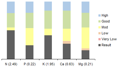
Finally, Format one of the Very Low to High series (it doesn’t matter which one because they will all follow), reducing its gap width to zero.


Joe says
Hi Jon,
Do you think that adding in a few sites (3-4) elemental data would make it too cluttered? Would the legend become too large or confusing? As always, good ideas and beautiful presentations.
Regards,
Joe
Bryan says
Nice graph idea – I use the same trick for other things (namely, to overlay outlined bars on top of other bars without using a stacked chart).
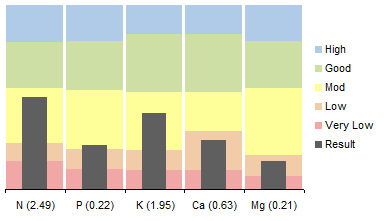
It might be nice to leave a thin sliver of white space between the stacked colored bars (by setting the gap to almost zero), since highs and lows aren’t related between the different elements. On first glance, it looks like the background bands are trying to be continuous when they really aren’t.
Otherwise, nice idea!
Jon Peltier says
Bryan –
Like this:
Jon Peltier says
Joe –
I don’t think it would be too cluttered to show 3 or 4 data sets.
Bryan says
Jon,
Exactly like that! The graph reads much more clearly now.
The multi-plots also seem to work OK – but with all those colors it’s getting a little busy. It might be better to use different shades of one contrasting color for the data bars (e.g., 3 shades of dark grey). Otherwise it’s possible to get lost in the rainbow.
Good work.
Kai says
Very elegant – a couple applications spring to mind – weekly data overlaid over the same from last year, weekly # overlaid over weekly %. Thanks for sharing!