Note
A new feature in Office 365 (and Excel 2019), Show #N/A As An Empty Cell, solves the pain and frustration experienced by generations of Excel users trying to avoid plotting what look like apparently blank cells.
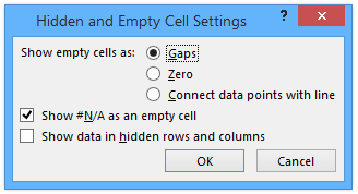
Read about it in Plot Blank Cells and #N/A in Excel Charts.
This new behavior in Excel makes this article obsolete.
In Mind the Gap – Charting Empty Cells I showed how the various Excel chart types treat blank cells, through various settings like Leave a Gap, Treat as Zero, and Interpolate.
In that article I wrote:
Area charts seem to offer both the zero and interpolation options, but in both cases, the chart plunges to zero without a corresponding data label. If we mess with the vertical axis, the chart still plunges exactly to zero in both cases.

A more suitable appearance for an area chart would be one that leaves a real gap, with vertical edges, as below. To get this I had to make a two-axis chart, with a hidden series on the primary axis to provide the A-B-C category axis labels, and an area chart on the secondary axis, with two points at the second category (Y=4 and zero) and two at the fourth category (Y=zero and 8). A date scale on the secondary category axis aligns these points above each other to produce the vertical-sided gap. This only took me three minutes to construct, but an average user might never quite get it.
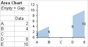
How rude of me to hint at an approach, but not to share it!
For this chart appearance, you need a line chart series to provide the visible category axis, and an area chart on a hidden date scale axis to provide the visible area chart. Here is the data range:
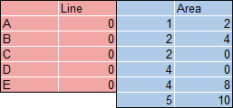
Recall a date scale axis shows multiple Y values on the same category in a vertical line, which will provide the vertical sides to the gap in the area chart. Start by making a line chart with the red-shaded range. Copy the area chart data in the blue range, select the chart, and use Paste Special to add the data as a new series.
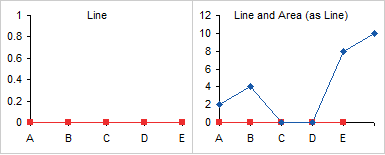
Change the area chart series to an area chart type, then assign the area chart tot he secondary axis.
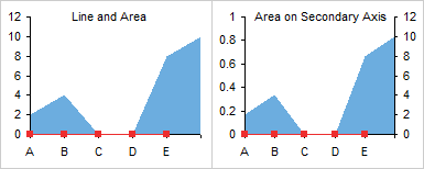
Excel probably only provided a secondary Y axis, so add a secondary X axis, using a date scale rather than a category scale. Hide this secondary axis by using no line, no axis tick marks, and no axis tick labels.
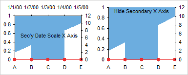
Format the secondary Y axis so that the secondary X axis does not cross at the maximum (it will default to zero), then delete the secondary Y axis.
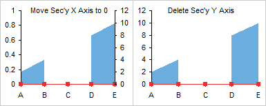
Hide the line chart series by formatting it to have no lines and no markers. Add data labels to the area chart series.
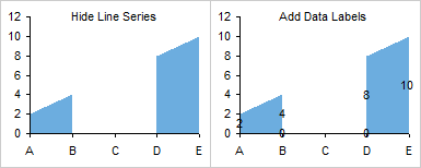
Use a number format like 0;;; for the area chart data labels, to hide labels for zero values.
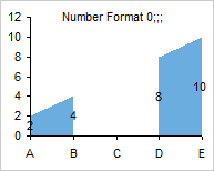
As I said, it’s easy, if you know how.


dermot balson says
Jon, it may be slightly simpler to
1. replace all blanks with (say) -999999, using a formula
2. format the Y axis to have a minimum of 0
Jon Peltier says
Dermot –
Yeah, that would work. I think I would always know about the vast reaches of false data down to -999999 though. Me and my OCD.
Barb says
I was attempting to recreate what you have done. But I am unsure how to add a secondary x-axis, excel 2007 can be tricky sometimes!. Could you please explain how to add the second x-axis?
Jon Peltier says
Barb –
Select the chart, then on the middle Chart Tools tab, click Axes, and select the variation you need to add or remove.
Isik says
This is very helpful Jon, thank you. I have an area chart that needs to stack to 100% (http://postimage.org/image/2xga16o6c/), with the years where there are missing data dropping straight to zero like in your post. But I couldn’t get your technique to work with this type of chart – any suggestions?
Thank you very much,
Isik
Jon Peltier says
It works the same. In this tutorial, it shows how to convert your horizontal axis to a data-scale axis. It’s okay to still just use years. Excel treats them as days, but format as General or Number with no decimals, and it will look like years.
Now, for the left vertical edge of the gap each series needs two points for that year, the first with the pre-gap values, the next with zeros. For the right vertical edge of the gap, each series also needs two points, the first for zero, the second for post-gap values.
Isik says
Perfect! Thank you very much.
Paul says
3 years later and this post is still helping people. I spent hours trying to get rid of the stupid 0s in my graph for what appeared to be blank cells. I actually got this working perfectly, and natively, in Excel 2013 and then opened it in Excel 2010 only to be greeted with [CELL RANGE] wherever a 0 should have been. Custom formatting using 0;;; solved my issue! Thank you thank you thank you.
Michael van Duren says
Jon Peltier, this is brilliant work. Completely solved a display challenge I was facing. It took several tries before I got the hang of it, but now I understand why you delete the second Y axis, but not the second X axis, and instead make it invisible: because you need the X-axis to modify where the Y crosses! Thank you for the clear instructions.