After using Excel 2007 for a while, getting used to the idea that everything had changed and we weren’t going back to 2003 ever again, I started fooling around with charts and chart elements. I began to find lots of little changes, most of them actually good ones, even if they were implemented in a funny way (at least until service packs and Excel 2010 cleaned up things).
Anyone who used my first charting utility knows things ain’t always done right the first time, and mine were tiny bits of software. I can’t imagine Microsoft’s task trying to coordinate thousands of developers and a bazillian lines of code.
One of the neat changes I discovered was that error bars were now treated as AutoShape lines, just like any lines in any shapes in Office. This means you had a lot of formatting options available to you, including nice embellishments like arrowheads on the ends of the error bar line segments. Then I forgot about it until a colleague brought it up recently.
To show this nice formatting, let’s look at a simple line chart with simple error bars. For clarity, and to avoid spoiling the story before I’m ready to tell it, I’ll start with positive error bars only.

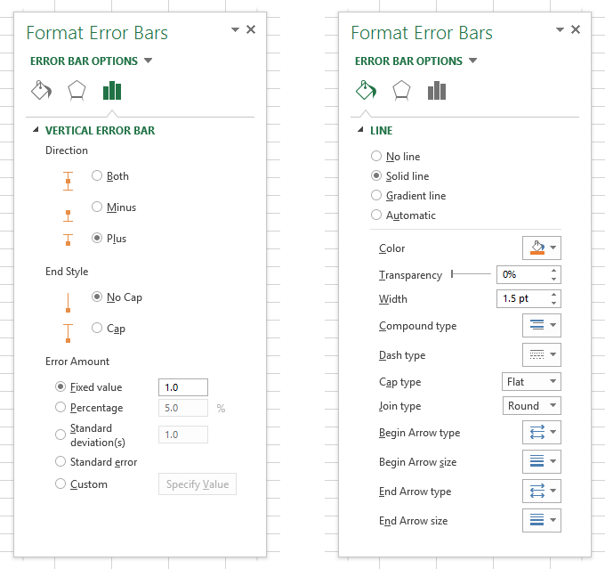
Select the error bars and click Ctrl+1 (numeral one) to open the Format Error Bars task pane. In the main tab (below the bar chart icon, shown below left) change End Style from Cap to No Cap. Then on the formatting tab (below the paint can icon) check out the Begin and End Arrow Types.
This is the Format Error Bars task pane in Excel 2013; the Format Error Bars dialog in Excel 2007 and 2010 is substantially the same.

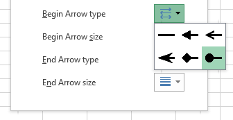
The error bar begins at the point, right? And ends at the, uh, end of the error bar, right? At least that’s what seems to make sense. So let’s pick a nice big round ball for the Begin Arrow Type.

And let’s pick a nice big old arrow for the End Arrow Type. I’ve chosen the largest size for both ends of the error bar.

And here’s our line chart with error bars, where the markers of the line chart could be replaced by the balls at the beginning of the error bars, and the arrows point away from the line.

This is a very nice embellishment. I’ve used it in several projects already, and shown it to many people.
Anyway, back to the beginning of the story: the message from my colleague was that Excel 2010 and 2013 seem to define the beginnings and ends of the error bars differently.
Well, for positive error bars, Excel 2007, 2010, and 2013 all look the same.

But if we look at negative error bars, only Excel 2013 shows them beginning at the points and ending at the ends of the error bars, pointing downward. Excel 2007 and 2010 show the balls at the ends of the error bars and the arrowheads at the points, pointing upward. That’s bizarre.

Even more bizarre, if the error bars go both ways, only Excel 2013 has symmetric arrows. Excel 2010 shows both sets of arrows pointing upward, the negative ones toward the points, the positive ones away from the points. And Excel 2007 only has one set of arrows, beginning at the end of the negative error bars, ending at the ends of the positive error bars. Though if you had to, you could just pretend the end was the beginning and vice versa. Whatevs.

Excel 2007’s charting infrastructure was finished quickly at the end of the development cycle, so a few glitches weren’t ironed out of the final product. Excel 2010 fixed a lot of inconsistencies in Excel 2007’s charts, but these error bars show that not everything was totally fixed. In Excel 2007 or 2010 you could fake it with a second, hidden plotted series, and format two sets of error bars so they looked right. Excel 2013 has gotten the error bars working nicely, though.


Ethan S. says
Huh, really cool. I like the 2013 version the best I think.
pault says
I’m using Excel 2013 (for Windows) and I’m using a range of formulas to drive the Error bars (with arrows) – 1 row of data to drive both up and down ‘error’ arrows depending on integer to basically show the delta from 6 weeks previous, and by how much. I’ve found that the values that are less than about 8 appear with the arrow pointing at the line rather than away from it so I’m tweaking the values to shift the positives up by 8 and the negatives down by 8 – it’s early days and it might change based on scale, but I found this thread whilst looking for a fix.