I’ve written often about panel charts, and I’ve made some simple ones, but I don’t seem to have explained the process in enough detail for people to reproduce these simple ones with their own data. Easy Two-Panel Column Chart in Excel was the first of several quick tutorials on easy panel charts. This article shows the instructions for a two-panel line chart.
Let’s use the following simple data for this exercise.
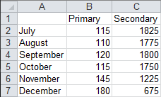
Values for the two data series fall within vastly different ranges, as seen in this line chart.

Problems with Primary and Secondary Axis Line Charts
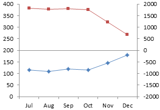
When we move the Secondary series to the secondary axis, there is an apparent relationship between the series, which changes as the axis scales are changed. It is hard to separate the data, despite the presence of the two axes. Who can figure out, let alone remember, which data should be measured against which axis? Our eyes see the series overlapping, and our brain interprets them as having overlapping data ranges.

Here the series start out far apart, one much higher than the other for several months. By the end of the year, they have switched places.

In contrast, the data in this chart starts the same, but after several months the two series suddenly diverge.
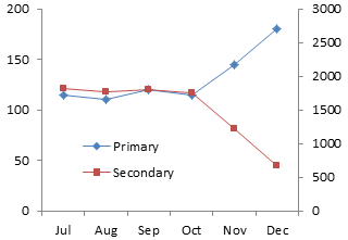
But it’s the same data in both of the previous charts. Through intentional or inadvertent axis scale dishonesty, you can tell any story you want.
The Panel Chart, Step-by-Step
You can avoid the problems with two-axis charts by plotting the data in separate panels. Start your panel chart by making a line chart with the data.

Right click the Secondary series, choose Format Series (or similar, it varies with Excel version), and select the Secondary Axis option.

We have primary and secondary Y axes, but only the primary X axis. Add the secondary X axis. In Excel 2007/2010, go to the Chart Tools > Layout tab, click on Axes, and for Secondary Horizontal Axis, select Show Left to Right Axis. In Excel 97-2003, go to the Chart menu > Chart Options, and on the Axes tab, under Secondary X Axis, choose the Category option.

Explanation of Required Axis Formatting
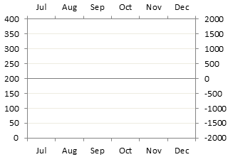
What we want is a chart divided into two panels like the chart below shows. I’ve temporarily hidden the plotted data, but you don’t need to.
The primary axis above spans 0 to 200. To plot the Primary series in the bottom panel, the primary Y axis must span 0 to 200 in the bottom panel, or 0 to 400 overall (the same amount in the top and bottom panels).
The secondary axis above spans 0 to 2000. To plot the Secondary series in the top panel, the primary Y axis must span 0 to 2000 in the top panel, or -2000 to 2000 overall (the same amount in the top and bottom panels). Since the secondary axis crosses at zero, it forms the dividing line in the middle of the chart.
If you have nice data, or if you’re good at algebra, you can pick axis scale parameters that align the axis tick marks on the left and right sides of the chart. The temporary gridlines in this chart show how nicely aligned these tick marks can be.
So the Primary series fits into the bottom panel. . .
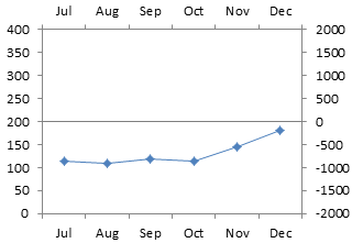
. . . and the Secondary series fits into the top panel.

Apply Axis Settings and Continue
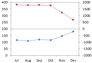
Here is how the chart looks with the desired axis scales applied, and with the data unhidden.

We will use the secondary horizontal axis as the panel separator. Right click the secondary (right) Y axis, choose Format Axis, and change the Horizontal Axis Crosses setting to Automatic (which means it crosses at zero).

We still need to do some cleanup. The month names in the middle of the chart are redundant, and easy to remove. Right click on the axis, choose Format Axis, and for Axis Ticks and Tick Labels, choose None.
There is now an open space across the top of the chart where the secondary horizontal axis was. We can close it by applying an appropriate border color to the plot area.

We need to apply some number format magic to the Y axis labels: we only want primary axis labels in the bottom, and secondary axis labels in the top, of the chart. I’ve written an article about Number Formats in Excel, but there’s room for a quick refresher class.
The secondary (right) axis is easy. We need a format like “0;;0;”. A number format has up to four elements, separated by semicolons. The first indicates what format to apply to positive numbers, the second to negative numbers, the third to zero values, and the fourth to text. A number format of “0” means simply show the numerical value without any decimal digits; “0.0” would mean show one decimal digit, “0.00” two decimal digits, etc. A missing format means don’t show anything. So this format tells Excel to format positive and zero values as whole numbers, and don’t show anything else.
The primary (left) axis is a bit trickier, but we can use simple conditions to turn formats on and off. The format we need is “[<=200]0;”. The expression in square brackets is the condition that sets the format. It says to display any number of value equal to or less than 200 as a whole number, and don’t display anything else. These conditions override the default positive-negative-zero sequence, but we can only apply two conditions, like “[one condition]format;[another condition]format;[all other numbers]format;[text]format”.
Right click each axis and choose Format Axis. Select the Number tab of the dialog, click on Custom, and enter the appropriate format into the box (without the quotes). Don’t forget to click the Add button, or Excel will discard your carefully typed format.

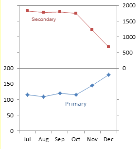
You can apply data labels to identify the series in your chart. Here I’ve applied series name labels to point 4 of the Primary series and to point 2 of the Secondary series.

We can’t resize the data labels, but I’ve removed that unsightly line wrapping in the Secondary label by shrinking the font size by 0.5 points. A better decision would have been to use free-floating text boxes for these labels, but I like to use data labels which are anchored to the data points.

You can stretch the chart if you want more resolution in the Y values. (My data labels needed further shrinking. Should have used text boxes.)
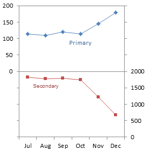
It would have been easy enough to switch the panels. In the next chart, the primary Y axis is scaled from -200 to 200, and the number format is “0;;0;”. The secondary Y axis is scaled from 0 to 4000, and the number format is “[<=2000]0;”.


Eric says
Jon,
How does Excel determine the min and max values for axis limits? That, for me, is the one key information item missing from what is needed to automate this two-panel process. I guess that I could just read the MaximumScale values and do the algebra you refer to (which is easy enough, actually), but what happens when data is added to the chart and the maximum or minimums change? Would the best thing to do be to reset (in VBA) the min/max calculations to automatic, read the values again, and then set them?
Your thoughts?
Thanks,
Eric
Jon Peltier says
Eric –
Microsoft explains the axis limit determination in XL2000: How Chart Axis Limits Are Determined. At least it explains how the minimum and maximum of an axis are determined given the major unit. How major unit is determined is not explained, but it appears related to font size, chart size, range of data values, and other magical parameters.
The VBA syntax of interest when scaling a value axis are:
I have some algorithms I use to spit out “nice” axis scaling parameters. I should write about them some day.
Eric says
Re: Algorithms.
Yes, please do!
Thanks for all… each new post is an intellectual gem!
derek says
Brilliant as usual!
You can get quite fancy with mixed lines and areas, as I did with a graph that was trying to mix fifty two weeks of a year’s values, the cumulative mean of this year’s values, RAG areas for the cumulative mean, and RAG thresholds for the current week’s values. Naturally the final requirement broke the model, semiologically speaking, so while the cumulative RAGs could be represented by two areas green and yellow, against a background of red, the weekly RAGs had to be lines. Then they added last year’s weekly values, a bunch of labels, and bad color choices for everything. Unreadable.
I proposed a panel with the weekly line on top with RAG areas, the cumulative below with semiologically-consistent RAG areas, and the previous year in the top panel, all with sensible colors. But they got scared of spooky paneling, and so are still using the old mess. (The fact that the mess was sold to them by an expensive consultancy whose name you’ve heard of, while I’m just one of the staff, had something to do with it, too. Switching would have embarrassed the board member who hired the consultants)
Gohar Mehmood says
Dear Jon
One very minor question.
How are you showing Horizental Gridline for Zero (which is dividing the chart) and Top & Bottom only.
Thanks for your help.
Regards
Gohar
Jon Peltier says
Hi Gohar –
If you follow the protocol, you’ll see that the dividing gridilne is really the secondary category axis.
Noah Helenihi says
Great post! Everything is working well except the number format for the primary series. For some reason, the third-digit of every number is wrapped to the next line– as if it was in a text-box set to wrap-text.?? What is going on here? It is not the font-size, alignment, chart-size or plot-area-size– the sec Y axis is fine . . . what is going on?
200 looks like this:
20
0
DaleW says
Neat approach, Jon! I was already a fan of your earlier stacked panel chart design, but that involved more effort to construct the dummy axis labels.
Here I ran into the same label wrapping issue as Noah, on two different attempts in Excel 2003 on different PCs. Applying a format of [<=200]000; for the axis that needs to display from 0 half-way up was a partial fix, readable despite the extra zeros.
ADRIA THERIOT says
Helpful suggestions ! I Appreciate the insight – Does anyone know if my company would be able to find a sample a form version to work with ?