Dynamic ranges (or “Names”) are commonly used to identify a range of the appropriate length, so that a chart will plot the right number of points. For example, you may want to plot year to date sales, without blanks for the months which are still in the future. The dynamic range uses COUNT or similar function to determine how many cells to include. As you add data, the range expands, and the chart automatically adjusts, so it plots all the months to date, but no months beyond that.
You can also use dynamic ranges if you don’t know what column your data is in. You can use MATCH and similar functions to determine which column has a particular header, and selectively plot the data in that column.
I was once given the following task:
We have two systems that produce similar data and need to chart both in a similar manner. However, the exact columns are not the same in each system’s output files and may even move from time to time. I need to do the following:
Find the columns containing “Elapsed Time”, “Azimuth”, “Elevation” and chart them with an XY chart with lines connecting the points. The column “Elapsed Time” must the the X axis, while “Azimuth” and “Elevation” are antenna pointing angles that must be plotted on the Y axis.
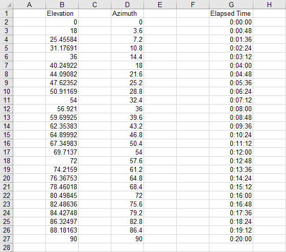
The following is a sample of the data, with irrelevant columns blanked for this exercise.

This can be done with dynamic ranges. Assuming the labels are in row 1 of Sheet1, here are some defined names that construct the X and Y value ranges for your chart. Press CTRL+F3 to open the Defined Name dialog, and define these names:
Name: Sheet1!ET
Refers To: =MATCH(“Elapsed Time”,$1:$1,0)
Name: Sheet1!AZ
Refers To: =MATCH(“Azimuth”,$1:$1,0)
Name: Sheet1!EL
Refers To: =MATCH(“Elevation”,$1:$1,0)
(ET, AZ, and EL are the column numbers where these labels are found.)
Name: Sheet1!Xrows
Refers To: =MATCH(1E+307,INDEX($1:$65536,1,ET):INDEX($1:$65536,65536,ET),1)
(This is the number of rows used in the Elapsed Time column)
Name: Sheet1!TheX
Refers To: =(INDEX(Sheet1!$1:$65536,2,ET):INDEX(Sheet1!$1:$65536,Xrows,ET))
Name: Sheet1!TheAZ
Refers To: =(INDEX(Sheet1!$1:$65536,2,AZ):INDEX(Sheet1!$1:$65536,Xrows,AZ))
Name: Sheet1!TheEL
Refers To: =(INDEX(Sheet1!$1:$65536,2,EL):INDEX(Sheet1!$1:$65536,Xrows,EL))
(These are the data ranges under the labels.)
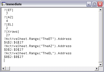
Let’s go to the VB Editor’s Immediate Window to see what we’ve got:

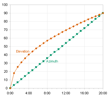
Now use the chart wizard to create a chart. In step 2, click on the Series tab, Select or Add the first series, name it “AZ”, and enter =Sheet1!theX in the X Values box and =Sheet1!theAZ in the Y Values box. Add the second series, again enter =Sheet1!theX in the X Values box, and enter =Sheet1!theEL in the Y Values box. No matter which column has the particular labels (and the left to right alignment doesn’t matter), the dynamic ranges will find the appropriate data for the chart.


Ryan says
Dynamic Chart Series Controlled by Numbering Columns
——————————————————————————–
I have a large block of data and I want to be able to number columns like 2,2,2 1,1,1,1 3,3,3,3,3 and have each of the columns numbered 1’s, 2’s, and 3’s each be automatically plotted as a series in an xy scatter plot.
The numbers will be consecutive as far as 1,1,1,1 each column will be next to one another, but then between 2,2,2 and 1,1,1,1 there could be data/blank columns in between. And the numbers groupings may not be consecutive as I showed in my first example in the paragraph above.
Thanks for any help!
-Ryan
Jon Peltier says
Ryan –
I show something similar in Split Data Range into Multiple Chart Series without VBA, where I split two columns into separate series based on the city name in a third column.
Ryan says
That helped, Thanks!
Ryan says
Here’s one maybe you could help me with, if you would be so kind.
I have a chart with a dynamic range. I have certain marker/line types/colors I would prefer each series in the chart to have.
For example if my dynamic chart has 5 series and I do the traditional double click on the series 5 line and change the marker from an x to a triangle, then I take away series 5, and if I bring back series 5 again the marker type is back to the default x in the chart.
The funny thing is I have another workbook with a dynamic chart where the chart remembers what my settings were when I take away and then add a series back to it….. Not sure if there is a setting/option I am not aware of…
One idea I had was to record a macro of me going into each series and changing it to the settings I want… then I would have to have an if statement to skip the operation if a series did not exist… that solution seems like a real pain and I am hoping someone has a better idea for me.
Jon Peltier says
Ryan –
You can take the table-based approach further. The table would have one row for each series, and one column for marker shape, marker size, marker foreground color, marker background color, line color. Loop through each series in the chart; series 1 uses the info in row 1, etc. If there are more rows than series, no problem. If there are more series, you just need to bail out when a row is blank.
mike selman says
Jon
I am attempting to create some “almost dynamic charts” in Excel 2007 where column parameters I set control the monthly data that is charted. The data is from financial statements and is in the following layout
Rows/Columns E F G H … BB BC
6 Jan 09 Feb 09 Mar 09 Apr 09 … Feb 13 Mar 13 (etc)
7 Gross Revenue 1100 1200 1300 1400 … 2150 2000
8 Returns 20 20 30 30 … 20 50
9 Net Revenue 1080 1180 1270 1370 … 2130 1950
10 Costs (etc)
My workbook contains numerous worksheets; each worksheet contains data organized in a similar fashion for Actual results, budget, forecast, rolling forecast, etc.
I need to create numerous sets of charts that can be updated when I change a parameter value that designates a Begin_Month and a End_Month. I hope to use your ChangeSeriesFormula routine to expedite the creation process.
#1 – What combination of Excel functions within a Defined Name can be used to make the SERIES function automatically update when my parameter data is changed? In the following Series function:
=SERIES(“Variable Costs”,’Key Parameters’!$G$61:$BB$61,’IS History’!$E$22:$AZ$22,4)
How can I set the COLUMNS within the IS History range to use a defined name (Begin_Mo) rather than hard coded $E and a defined name (END_MO) rather than the hard coded $AZ?
#2 – I am currently using the SUMIF function to return a single value based upon the contents of the Defined Name “Current Period” (see example below). I have learned that SUMIF is much more efficient as it does not recalculate each time my workbook is updated.
=SUMIF(‘IS Forecast’!$E$5:$BX$5,current_period,’IS Forecast’!$E10:$BX10)
Is there a similar function that will return the ADDRESS of the column that can be used within the Series Function? I have tried the OFFSET function, but it degrades performance whenever the workbook is updated and/or changed.
Thank you,
Mike Selman
Jon Peltier says
You can’t do much with the series formula. Any formula-type elements can only be references (cell addresses or defined names) and nothing intended to perform any calculations.
Do all the sheets have the same layout, or similar layout? If it’s the same, I’d start with a range the same size and position on a new sheet, with formulas like this, where this formula is assumed to be in cell A1 and cell XYZ15 contains the name of another worksheet:
=INDIRECT(“‘”&XYZ15&”‘!”&ADDRESS(ROW(),COLUMN())
When you change the sheet name in XYZ15, the cell will contain the contents of the same cell on the sheet named in XYZ15.
Then for my range of X values (or dates, whatever), I’d define a name called (for example) myXvalues which refers to:
=OFFSET(A1,myXrow-1,begin_mo,1,end_mo+1-begin_mo)
where myXrow is the row number of the X values. You may have to adjust the exact arguments to make it line up with the data.
For each range of Y values, contained in row myYrow1 (myYrow2, myYrow3, etc.) I’d define a name called mYvalues1 (..2, ..3, etc.) which refers to:
=OFFSET(A1,myYrow1-1,begin_mo,1,end_mo+1-begin_mo)
Then I would edit the chart data so it uses myXvalues for X and myYvalues1 etc. for Y.
If you don’t know which Y rows you want, you can use match with the desired Y data header to find which row within the column of headers contains the data you want.
Matt says
I have a data base that is hidden from the users within an excel workbook. On a dashboard area I have a drop down data validation box that you can select a date (in a mmm yyyy format). There are two of these boxes so that a start and end date can be selected. From this I have used MATCH to determine which rows withing the database the dates are. Now I want to plot the data in a graph between these dates. How do I make a graph to display only the data between these dates and will automatically update when the dates are changed to only show the specified range.
I would really appreciate the help!!
Jon Peltier says
Matt –
Assuming your dates are ascending in the first column of the hidden sheet and the dates go down to row 500:
first cell of date range:
INDEX(HiddenSheet!$A$2:$A$500,MATCH(StartingDate,HiddenSheet!$A$2:$A$500))
last cell of date range:
INDEX(HiddenSheet!$A$2:$A$500,MATCH(EndingDate,HiddenSheet!$A$2:$A$500))
Define a Name (Formulas tab > Define Name):
Name: TheDates
RefersTo
=INDEX(HiddenSheet!$A$2:$A$500,MATCH(StartingDate,HiddenSheet!$A$2:$A$500)):INDEX(HiddenSheet!$A$2:$A$500,MATCH(EndingDate,HiddenSheet!$A$2:$A$500))
Define a name for the values, assuming they are in column B:
Name: TheValues
RefersTo
=OFFSET(TheDates,0,1)
Make your chart with arbitrary data. Right click the chart, click on Select Data.
In the dialog, select the series on the Left, click Edit. Change the Y values to WorkbookName.xlsx!TheValues
Click the Edit button above the X values on the right, change these to WorkbookName.xlsx!TheDates
Click OK. The chart should now point to the dates and values based on the selected start and end dates.