A reader emailed to ask whether you could make a dynamic chart using OFFSET-function-based Names in Excel 2016 for Mac. Good question, and I wondered if he’d encountered some unexpected problem, perhaps a bug, in Mac Excel. So I dusted off my MacBook Pro and tried it out.
Bottom line: There are several ways to make dynamic charts in Excel, and there seems to be no difference other than cosmetic in how they work between different versions of Excel, and between operating system. The protocols are the same for Mac Excel and Windows Excel, and perhaps it’s time for a quick review. This exercise was done completely in Mac Excel 2016, and other than not knowing a few of the shortcuts I use everyday, it was not very different from working in Windows Excel 2016.
Dynamic Charts in Excel
It’s pretty easy to set up data and create a chart in Excel. But once you’ve created a chart, it keeps plotting data from the same cells. If the data in the cells changes, so does the chart, but if the data extends to more cells (or shrinks to fewer cells), the chart doesn’t seem to notice.
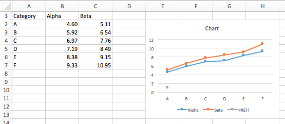
There are a couple ways to create charts that will grow with your data. The easiest way is to use Tables as the chart source data. A bit more complicated is to use Excel’s Names to define the series data for your chart. Using Names can lead to more flexibility in defining the data in your charts. I’ll describe how to make dynamic charts using Tables, using Names, and using Names in a more flexible way.
Dynamic Charts Using Tables
The easiest way to make a chart’s contents reflect the size of a range of data is to put the data into a Table.
Tables made their appearance in Excel 2003, and were called “Lists”. These lists were a more structured container for your data, with a database structure of fields (columns) and records (rows), field headers (column headers) and filtering tools. You could sort and filter your data range easily, and any formula that used a whole column of your List updated to automatically keep using that whole column of the list. Lists became the favored source data for charts and also for pivot tables.
In Excel 2007, Lists became known as “Tables”, and their capabilities have been expanded in every version since.
The screenshot below shows the same data and chart as above, but the data is now in a Table.
To get your data into a table, you select it (or select one cell and let Excel figure out how far it stretches), and on the Insert tab of the ribbon, click Table. Excel asks if your table has headers, then it applies a Table style (the yellow style is shown below), it adds AutoFilter dropdown arrows to the field headers, and it puts a small backwards “L” bracket at the bottom right corner of the table.
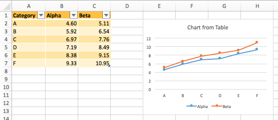
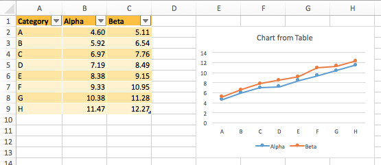
You can change the size of the Table by clicking and dragging the bracket at the bottom left corner of the Table. If you type or paste data directly below the Table, the Table will automatically expand to include this new data. And a chart that uses all rows of the existing Table will expand accordingly.
If you type or paste data directly to the right of the Table, the Table will also automatically expand to include this new data. A chart that uses all of the existing Table will expand accordingly.
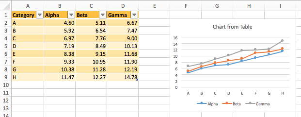
This little trick of adding a new series if the data expands accordingly is nice, but it requires that the chart already contain all of the Table’s data.
Names (a/k/a “Defined Names”, “Named Ranges”, etc.)
A Name is what Excel calls a variable that resides in a worksheet or a workbook.
Names are often assigned to cells or ranges; for example, you might place a sales tax rate into a cell and name the cell SalesTax, and subsequently use the cell’s name rather than its address in a formula. Because of this Names have been nicknamed “Named Ranges”.
However, the definition of the name includes a formula. If my sales tax rate was stored in cell A1, then my Name SalesTax would have a definition of “=A1”. Because of this, John Walkenbach proposed that Names should be called “Named Formulas”, but he’s smarter than the rest of us, so his suggestion didn’t stick.
We can use Names in our charts, but we need a distinct name for each dynamic range that the chart will need. We’ll need one Name for the X values if the series use the same X values range, and we’ll need one Name for the Y values of each series. In our sample, we will need three Names. I’ll call them XValues, Y1Values, and Y2Values, and I will define them as follows:
XValues
=OFFSET(Names!$A$1,1,0,COUNTA(Names!$A:$A)-1,1)
This OFFSET formula uses cell A1 of worksheet Names as a starting point, offsets the range down by one row and right by zero rows, then makes it as many rows tall as the number of alphanumeric cells in column A minus one (we don’t want to include the “Category” label), and one column wide.
So starting with cell A1, our range begins in cell B1, and is 6 rows tall and one column wide; our final range is A2:A7. It’s easy to see that adding another value into cell A8 will expand this range to A2:A8. However, if we add a value in cell A57, it will also expand our range to A2:A8, so we need to make sure the rows below our data are kept blank.
The other two definitions are easier:
Y1Values
=OFFSET(Names!XValues,0,1)
Y2Values
=OFFSET(Names!XValues,0,2)We’ve already figured out how large each range needs to be, since the X and Y values have the same number of cells, so both of these OFFSET formulas start with the first name XValues as an anchor, and offset no rows down but one or two columns to the right. If we don’t specify sizes, then the new Names will define ranges the same size as the anchor.
Okay, that’s how to build a formula definition for a Name. Let’s actually create a Name.
On the Formulas tab of the ribbon, click the Define Name dropdown, and select Define Name… This pops up the Define Name dialog, shown below for the Mac. The Windows dialog is a bit more extensive, and Windows Excel has a much better Names Manager (this dialog happens to serve as the Mac’s Names Manager). For a truly powerful Name Manager, you should try out the free Name Manager add-in at the website of my colleague, Excel MVP Jan Karel Pieterse.
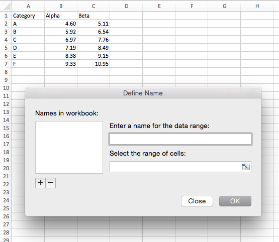
If you’ve selected data before opening the dialog, Excel tries to guess how you want to name data based on labels in the top row and left column of the selection. But I’ve cleared all of this so we’re starting fresh.
Here I’ve typed the name of the Name. Note that I’ve included the worksheet name and exclamation point, which means the Name will be “in scope” (i.e., available) for the worksheet “Names”. Otherwise it would be “in scope” for the entire workbook.

Then enter the formula where it says “Select the range of cells”. You can enter any formula that refers to cells, or a formula that calculates a value, or a constant value. I don’t capitalize my function names when I enter them; that way, if there’s an error, Excel won’t capitalize a bad function name. A misspelled keyword is easier to recognize if it is not capitalized (“offfset” vs. “OFFFSET”).
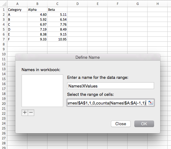
Click the OK button to add the Name and exit the dialog, or click the Plus icon to add the name and keep the dialog open.
The name is listed in the box at the left; the worksheet name is listed as well to remind us that the scope of the Name is limited to that worksheet. The sheet name is removed from the name in the top right box.
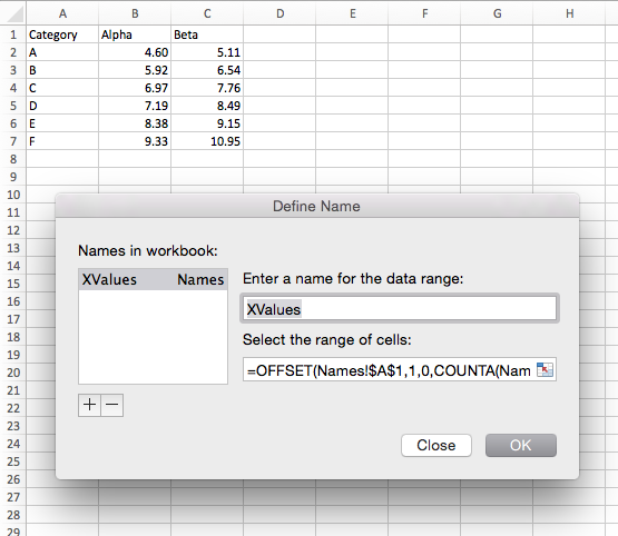
You can make sure the name refers to the intended range if you click in the box with the formula defining the Name. With the cursor in the formula, the range A2:A7 is highlighted in the worksheet. Perfect.
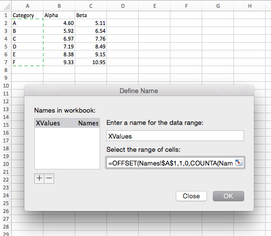
Now enter the name and formula for the next Name, and don’t forget to include the worksheet name.

Click the plus icon to add the name, and click in the formula to make sure that the Name references the desired range, B2:B7. Check.
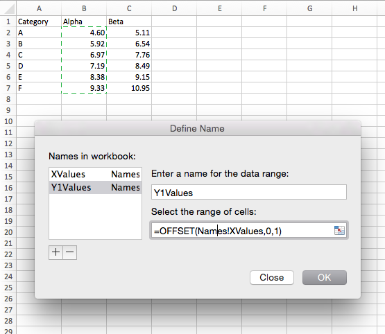
Enter the name and formula for the last Name, remembering to include the worksheet name. Click the plus icon, and check that the formula refers to C2:C7.
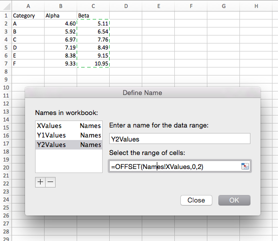
Whew! Now we’re finally ready to make our dynamic chart.
Dynamic Charts Using Names
Every chart series has a formula that defines the data in the chart. The blue series in the static chart below is
=SERIES(Names!$B$1,Names!$A$2:$A$7,Names!$B$2:$B$7,1)This means it uses cell B1 of the sheet Names for the series name (“Alpha”), A2:A7 for the X values, B2:B7 for the Y values, and it’s the first series in the chart. The formula for the orange series is
=SERIES(Names!$C$1,Names!$A$2:$A$7,Names!$C$2:$C$7,2)We can use the Select Data dialog to modify these, but it’s easiest to simply edit the formula directly.
Select the blue series of the dynamic chart, and observe the formula in the Formula Bar. It probably looks like the first SERIES formula above (I invariably start with a static chart of the data I want to plot dynamically). Edit the formula to read as follows, and press Enter.
=SERIES(Names!$B$1,Names!XValues,Names!Y1Values,1)If Excel doesn’t like the new formula, make sure you’ve spelled the Names correctly.
Similarly edit the formula for the orange series to read
=SERIES(Names!$B$1,Names!XValues,Names!Y2Values,2)At first the two charts look the same.
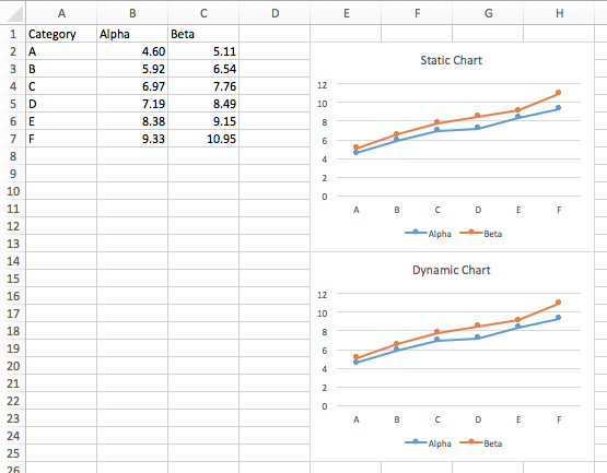
When we select the static chart, we can see the chart’s source data highlighted in the worksheet.
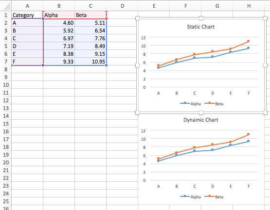
We see the same data highlighted when the dynamic chart is selected. It’s convenient that Excel is smart enough to highlight the chart data even if it is defined by dynamic Names. I’ll select the dynamic charts in the rest of this tutorial to show the range included in these charts.
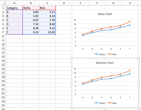
Now let’s extend the data by a couple of rows. The static chart isn’t clever enough to notice, but the dynamic chart keeps up nicely, illustrated by the highlighted data in the worksheet.
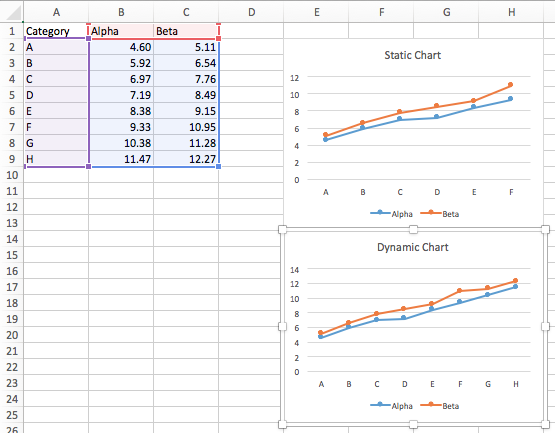
If we extend the data by a new column, the static chart doesn’t change, and the dynamic chart doesn’t add a series to represent the new data.

I’ve added a third chart which shows the new data. I had to add an extra Name to the worksheet:
Y3Values
=OFFSET(Names!XValues,0,3)
and then I had to add a third series to the chart with the following SERIES formula:
=SERIES(Names!$B$1,Names!XValues,Names!Y3Values,3)My new chart contains all the data, though I had to include it in the chart manually.
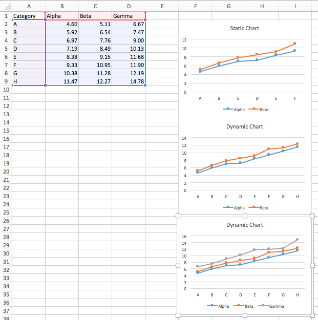
Before Excel 2003, the only way to get a dynamic chart was by using Names. It’s a lot of work, and hardly seems worthwhile if using Tables is so easy. But if we know how to make a chart using Names, we can make a dynamic chart that’s more complicated than just expanding to add a row.
Dynamic Charts Using Complicated Names
How about a chart that doesn’t show all the data, but only the last several points. This might be useful if you want to show the last six months of sales, or high temperature for the previous week.
We’ll make a dynamic chart that plots the last five values. The setup is almost identical to the previous dynamic chart, but our definition of XValues will change.
XValues
=OFFSET(Names!$A$1,COUNTA(Names!$A:$A)-1,0,-5,1)
This OFFSET formula uses cell A1 of worksheet Names as a starting point, offsets the range down by the number of alphanumeric cells in column A minus one, and right by zero rows. This means now we’re starting at cell A7 instead of A2. Then we make the range -5 rows high, meaning we count upward, and one column wide. Our new X values range should be A3:A7. After entering the new name as before, check to make sure the correct range is highlighted.
Edit the SERIES formulas of your dynamic chart as we did above. We see that our static chart shows all six points of the data, but the dynamic chart shows only the last five points, categories B through F.

Let’s add a couple rows of data. The static chart is, well, static, but our dynamic chart shows the new last five points, categories D through H.

Summary
Dynamic charts can easily be created in Excel using data ranges from Tables.
With a bit more work dynamic charts can be created using skillfully defined Names. These charts can be more flexible than Table-based dynamic charts, depending on the formula skills of the Excel user. There are a few gotchas that I didn’t mention: some Name definitions seem like they should work, for example, but Excel charts won’t recognize certain functions. Also, some Name names may cause problems, especially those beginning with the letter “c”; you can’t enter them into the SERIES formula, but you can use them in the Select Data dialog.


Ben Collins says
Very informative article, thanks! Happy I could inspire a blog post on Peltier Tech ;)
When creating a dynamic chart in Excel on a Mac, I’ve found the biggest frustration is the rather feeble name manager popup. I found it helped to create the formula in a cell first, then simply copy that into the name manager popup. So thanks for the heads up on the name manager add-on, I’ll be sure to check that out.
Jon Peltier says
Jan Karel’s website claims that the Name Manager add-in works on a Mac as well as in Windows. I haven’t tried it, and didn’t even think of it until your comment.
Dory Owen says
I’m lazy & afraid of too much hidden complexity underlying charts. I’d screw it up. ;-)
Power Query can generate a chart data source for “Last 5 Rows” from the original table.
I’m starting to rely on PQ more & more for this kind of trick because its all documented in the PQ definition.
Only downside is PQ has to be Refreshed. But since a lot of my dynamic data is coming in via PQ anyways, no problem with a Refresh All.
let
Source = Excel.CurrentWorkbook(){[Name=”Table1″]}[Content],
#”Changed Type” = Table.TransformColumnTypes(Source,{{“Category”, type text}, {“Alpha”, type number}, {“Beta”, type number}}),
#”Kept Last Rows” = Table.LastN(#”Changed Type”, 5)
in
#”Kept Last Rows”
Jon Peltier says
Dory –
You could also hack a pivot table to give you the “Top 5” records based on a certain field, but this field has to be in the Values area, and “Last 5” doesn’t necessarily mean “Top 5” unless one of the fields is the date or time.
So far I’ve been too lazy to really learn Power Query, but I can rely on all the charting tricks I’ve taught myself.
William says
Thank you for the helpful and informative article))))
I have been struggling with something for quite a long time now. I have a similarly structured data. In your post you mentioned that if we add a new column to the data the dynamic chart won’t add a series to represent it. How can we overcome this problem? Is there a way to do it? Many thanks)))
Jon Peltier says
William –
It depends on how much of the table is plotted in the chart.
For a chart that plots series in columns:
If a series uses all rows of its column of the table, the number of points will change as the table adds or loses rows.
If the chart uses all rows and columns of the entire table, the number of series will change as the table adds or loses columns.
For a chart that plots series in rows:
If the chart uses all rows and columns of the entire table, the number of points will change as the table adds or loses columns.
If the chart uses all rows and columns of the entire table, the number of series will change as the table adds or loses rows.
Richard says
What I’ve noticed is that named dynamic ranges are getting replaced by the actual static range when you press OK. Using Excel for Mac Version 15.31. So I’m losing the dynamic reference everytime. Any solution for this or is it a bug?
Jon Peltier says
Richard –
If you define the names for X values and Y values, the names are retained in the series formulas, just like in Windows.
If you define a larger range for the whole source data range of the chart, the name is replaced by cell references, just like in Windows.
Olivier L says
Thanks Jon for this instructive article.
I tried to reproduce it but without any success. I’m using Excel 2016 on Mac, I’m ok with the Named formulas but I want to create a chart, a wizard appears and when I put my Named formulas in the X area, Y area, … it failed.
I don’t understand how you can create a chart from a formula like : =SERIES(Names!$B$1,Names!XValues,Names!Y1Values,1). Do you type this formula in a cell ?
any help would be appreciated.
Jon Peltier says
Olivier –
It’s easier (and probably more reliable) to create the chart with a static range first, then edit the series formulas.
When you select a series in a chart, you should see the SERIES formula in the formula bar. Edit the series like any other formula.
Here is a static chart from this tutorial. I’ve selected the first series and the formula appears in the Formula Bar.
Here is a dynamic chart with the first series selected. Note the series formula with Names.
I just tested this (again) and you can edit the series formulas, replacing cell addresses with names.
IF says
Fantastic info as always!! Hey Jon, Is it possible to have the actual chart width expand automatically when new data is entered? I’m using the Define Name tool and any new data entered shows up in my chart just fine, my line graph extends, etc…but the physical size of the chart itself stays the same. The more data entered, the more congested the chart.
Jon Peltier says
Unfortunately, there is no way do change the actual dimensions of a chart through the actions of formulas.
Timur says
Can dynamic range be used for Pivot table. I followed the same method to setup a Defined Name with offset formula. But when I went to the Pivot table and updated the resource, I got an error message. What I am trying to accomplish is that the data in the source can change every week. The number of columns doesn’t change, but the number of rows change. How can I set it up to auto update with the new number of rows.
Jon Peltier says
Timur –
Sure, you can use a defined name as the source data for a pivot table. You can also use an Excel Table as the source data for a pivot table, and this might be a bit easier.
What error did you see when using a defined name?