We’ve been dissing pie charts and donut charts quite a bit. So why then would we want a donut-pie combination chart? In Jorge Camoes’ How to create better pie charts, he showed a chart like this one. It’s not so much a pie chart as it is a donut chart with about 40 series, the inner 30 sharing the same data, so they seem to make a single wedge. Here’s Jorge’s chart:
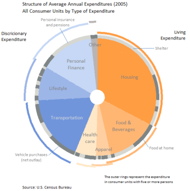
Jorge shows personal expenditure portions in the pie part of the chart. The band of light and dark gray shows a breakdown of the wedges within. The arcs lying around the periphery of the chart show how the values change for larger families. It’s complicated and takes a few minutes to really decode, but it puts a lot of data in one place. Some people will scream at this type of chart, and I may have tried for a non-pie configuration myself. But it’s not horrible, like some discussed in my recent post Leave the Donuts for the Cops, and Stick with the Bar.
There was some discussion in the comments of my post regarding the construction of Jorge’s chart. Here is a protocol to create a simplified version of Jorge’s chart, as a donut chart with many rings. It uses this data:
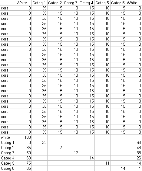
Why are there so many series named “core” with the identical data? That’s how we get a very thick donut-like wedge. The data row labeled “white” will produce a blank ring between the large internal wedges and the outer arc segments. The last six rows have data for one point only, and the columns labeled “white” provide space to position the arcs around the larger wedges.
Below left is a donut chart created with this data. I’ve left the borders on the donut arcs to help show the construction of the chart. The central hole is 10% of the total diameter. The “white” categories have been filled with white. When the borders are removed (below right), this chart resembles Jorge’s at the top of the page.
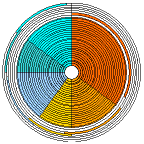

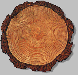
That left hand image looks like a dendrochronograph.

Here’s how to make a similar chart with donut and pie series in the same chart. This uses less data and removes the central hole. Make a donut chart first with all of the data (three series in this case). Right click one series (the innermost in this case), choose Chart Type from the pop-up menu, and change it to a pie series. The two remaining donut series are hidden behind the pie.
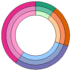

At first glance we seem to be stuck, but never fear, the chart doctor is here (the “voodoo” doctor, that is).
Explode the pie. Select the pie series, then in one motion, click and drag one wedge outward. Outlines of all of the series’ wedges will move outward, even to the point of disappearing beyond the chart border. When you release the wedges will have shrunk, and they will be touching the outside of the donut series. The amount the wedges shrink depends on how far outward you drag them before releasing them. If you have not selected an individual point (wedge), all wedges will move outwards by the same amount. The wedges in the chart below left have not shrunk too much, so repeat this drag to move them further, as in the chart below right.
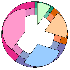

Now one-by-one move the wedges of the pie inwards (if you move the entire pie series en masse, the pie segments will remain stuck to the outer edge of the donuts). You need to click to select the series, then again to select a single wedge. The result is a pie chart that is smaller in diameter than the donut chart diameter. You may have to fine tune the dragging above and adjust the size of the central hole of the donut if you need it to fit more exactly.
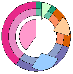
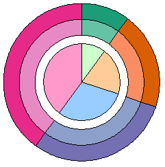
Using the pie-donut combo procedure described above, we can get by with a lot less data:

We only need one “core” row, because the core of the chart is a single pie series rather than a 25 tree-ring circus. We also don’t need the “white” series. Instead we get a blank ring between the outer circumference of the pie and the innermost donut ring.
Below left is a donut chart with this data, with a central hole of 85% of the total diameter. Below right the first segment has been converted to a pie series; to save a step, the series was changed directly to the exploded pie type.
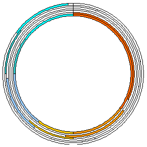

Below left, the pie segments have been moved to the center one wedge at a time. Below right, without borders this chart again resembles Jorge’s, except it has no bite taken from the point of each slice of pie.


This is a fancy looking chart, which has the potential to convey a lot of information. As you see, it’s not quite as difficult to build as it might have seemed at first. As with all fancy chart types, this can be used for good or for evil.
Here’s a practical application for this kind of combination chart. I used 23 donut series, one pie series, and a small red circle. The scoring numbers around the rim are data labels on about the fourth ring from the OD. Make sure you hang it so the center of the bulls-eye is 1.74 m (5′ 8″) from the floor.

Please note that these charts are designed and constructed by trained professionals. Do not try this at home.


Chris says
“Please note that these charts are designed and constructed by trained professionals. Do not try this at home.”
…you made my day, great line, my co-workers must think I’m dellusional laughing at a dart board.
Nevertheless, I like the technique behind these charts, but I doubt if they help to explain data or just make it much more complicated to read a chart.
—
derek says
When I set out to reproduce Jorge’s graph, I just kept the innermost donut series on the primary axis, and moved the other donut series (plural) to the secondary axis, where they would overlay the first. The primary axis series was given a hole 0f 10% in Options, and the other series were given a hole of 90%. That way there was no need for a large number of dummy series labeled “core”.
I was very pleased with this, and went to try it with a pie in the centre. But I discovered (as Jorge no doubt had) that Excel misbehaves, and won’t put the pie under the donut in any circumstance. Pie always covers and obscures donut. Which is a shame, as it would be a cost-free feature for Microsoft to allow it. Personally I don’t understand why they didn’t just merge the donut and pie categories together and allow a “hole” of zero percent, or a check box for “no hole”. So much for the vaunted redesign of Excel graphs.
Thanks for your workaround, using explosion to create and shrink a pie that overlays but does not obscure the donuts.
Jorge Camoes says
Wow… I actually was going to ask you how to remove the hole. I go stuck in the hidden series step (grrrr..), but I was sure you could solve that.
I must find something more challenging for you… let’s see… can you create the darts also? :)
Jon Peltier says
Derek –
The Excel 2003 chart engine was designed probably in the late ’80s. Changes made up to 2003 were carefully strapped onto the engine, but I’m sure they were afraid to muck it up. The redesign that led to Excel 2007’s chart engine was based on the outward workings of the 2003 engine. There was so much involved with merely copying the existing externalities, that they probably didn’t have time to consider changes to how it really worked. The number of bugs in 2007’s charting underscores the complexity they were trying to reproduce. They couldn’t or wouldn’t change anything real, but the formatting options have gone through the roof.
Re some types always appearing in front of others: bars and columns always appear in front of areas, lines in front of those, XY in front of those. Apparently in the hierarchy, donut falls under pie.
Michel Gerday says
Jon,
I would appreciate that you quote me as regards the darts board ;-)
Thanks for your blog and all your precious charts tips.
Michel
—-
Below, the transcript of your reply to my email
Hi Michel –
Slow day?
I’ve adjusted the label format for the labels covering the black segments.
– Jon
On 3/10/06, michel at some site dot com wrote:
Dear Jon,
I attach a completely useless excel spreadsheet which uses Doughnut charts.
I have always asked myself what they were useful for …
Now I know.
Have a nice WE
Michel
Jon Peltier says
Hi Michel –
That goes back aways. I remember the exchange, but I can’t find any record of the email or the workbook on my computer. I’m not sure I even had my current computer at that time.
derek says
I owe Microsoft an apology: it *is* possible to get a pie to sit under a donut, completely avoiding the exploding pie manouevre. The trick is to make your donut into *two* pies. One of them is forced to sit on top, and by careful choice of the order you convert them (the one you want to turn back into a donut must be the last you turn into a pie), you can make that last one be the donut.
Say you have n series, where n is two or more. Start by using the Chart Wizard to make a donut, on the worksheet, out of *two* of the series. Only two, the rest come later. Now convert one series to a pie; this is the series you want to eventually be the pie in the middle underneath the donut. This will jump to the top, obscuring the other series. Now select the other, hidden, series (I prefer to use the keyboard to step through, but if you really prefer the mouse, you can use explosion to expose the hidden donut)
Convert that series to a pie also. It will now jump to the top in its turn, obscuring the first pie. Convert it immediately back into a donut: the point of making it a pie was only to get it to the top. Finally, you can use the range handle to drag the chart range to include the other series, which will then be added as extra, outer donut rings. If you prefer your charts in chart sheets, now is the time to use Location.. to move it. If you do make your combo graph in its own sheet at first, you’ll have to use Copy.. Paste Special to add the other ranges at the end.
You can move the donut hole in and out to your taste, with no danger of exposed midriff, since the pie now covers the entire field, underneath the donut.
Jon Peltier says
Derek –
Clever detective work. I had tried making a pie chart with two series, and while the source data range included both ranges, and the Source Data dialog showed two series, there was only one apparent series in the chart. So I just assumed it didn’t work that way. However, now I can think of easier ways to get what you want.
Make a line or column chart with two series, A and B. Move series B to the secondary axis. Change series A to a pie chart. It appears in front of the line chart, but it remains on the primary axis. Change series B to a donut chart. The series B donut will appear in front of thee series A pie.
derek says
I see you don’t even need the step of moving B to the secondary axis first. Just change A to pie, then change B to pie.
Jon Peltier says
Ha, even with Excel, everything’s easy if you know how.
I meant to say that you don’t owe Microsoft an apology for any behavior, intentional or otherwise, which they have neglected to document anywhere. The weakness with these undocumented behaviors is that they have a greater chance of being left out of future versions when substantial changes are made. I need to check out how Excel 2007 handles this unorthodox mixture of chart types.
In the last beta, I commented on a number of behaviors which had changed or disappeared. The question invariably was, “Why would anyone want to do that?” When I described a scenario for exploiting the behavior, the response invariably was “Oh.” The point is, once you have a behavior in place, people are going to find it and use it. You should have a very good reason to change (and especially to remove) this behavior. And “I didn’t know” is a poor excuse.
derek says
I see what you mean. In interface design, an “affordance” is, as near as I can tell, a fancy term for “a thing you can do”. A skilled interface designer can build some very neat and subtle affordances into an interface, but if they’re undocumented, they’re vulnerable to being disappeared or broken by the next designer, who may not be as talented.
I just found a good use for the exploding pie slices: one of the things that the pie-donut combo is not so good at is labeling the sectors. You can choose to put the data labels for the pie in the center of each sector, or the “inside end” or “outside end” (bar chart terminology)
But donuts don’t have this option for label position, which means I have to resort to e.g. dummy series. However, a pie-pie combo with the top pie exploded and shrunk enables me to have center labels in the top, inner pie and outer labels on the bottom, outer “donut”.
Sjoerd Hoogwater says
Here’s yet another incomprehensible pie chart: http://www.voltagecreative.com/blog/2008/11/scary-bailout-money-info-graphic/
Jon Peltier says
Sjoerd –
Yeah, that one’s pretty bad. Maybe I’ll post about it.
Hans Lammers says
Dear Sir,
At the moment we have a dart program that uses buttons to enter the score
i’m looking for a way to make a Dartboard and enter the score by clicking on the image.
Would it be possible to receive to code for this dart board
Jon Peltier says
Hans –
I don’t have this in ready-made form, though I know how I would do it. It would take a couple hours to hack it together, though, and I’ve been rather busy. Well, maybe less than two hours, since the dartboard chart itself is already built.
If any of my readers happen to have built something like this, let Hans and me know. Otherwise, maybe I could do it as a demo sometime soon.
David Chambers says
I was able to replicate this nicely, but what I really wanted was a one line donut on the outside that showed groupings of the inside pie segments (also not a one-to-one relationship between the pie segments and the donut segments). I was able to do it mostly with the full donut chart (with multiple outside donuts), but after realizing you can overlay two charts visually was able to create it much more easily and with just one outside donut just by creating one donut chart and one pie chart from different data sets and then overlaying them with the top one being transparent fill at the full chart level. Thanks for the ideas. This really helped me get started and I love the end result.